
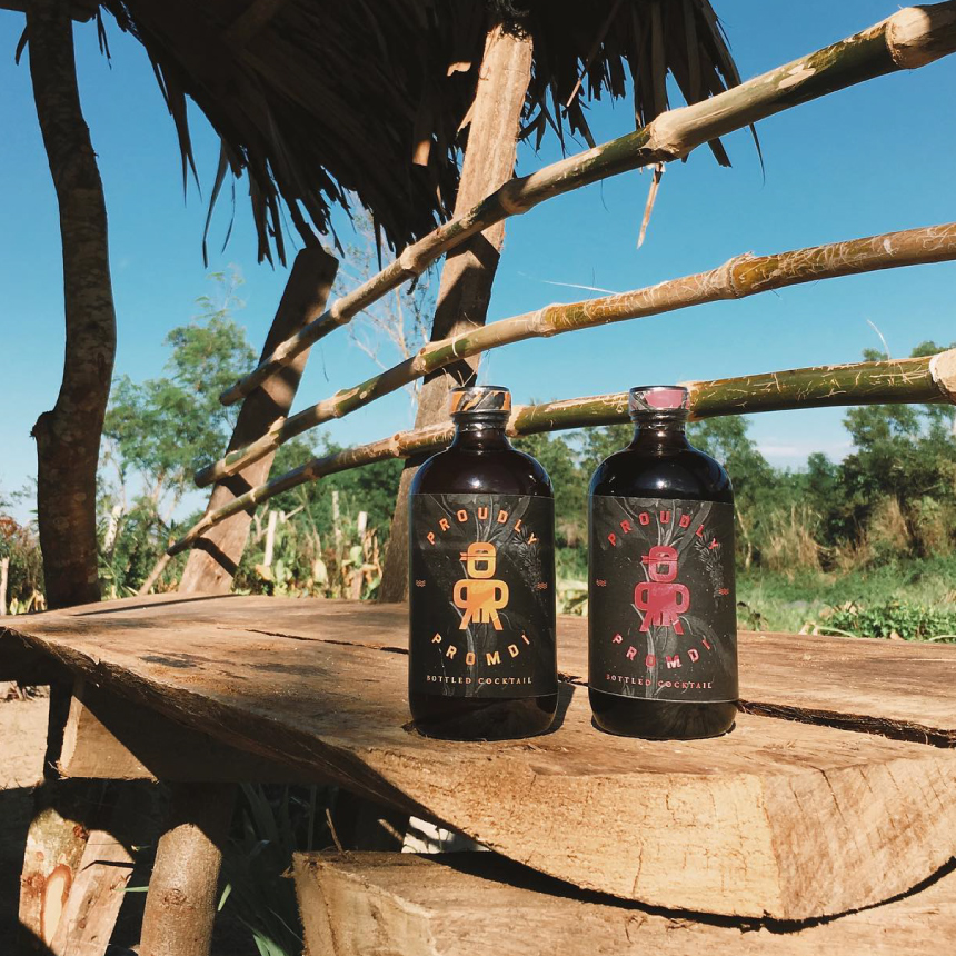
How might we express Filipino heritage to feel personal, refreshing, & refined?
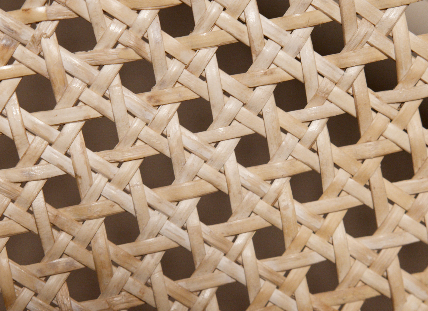
With a brand narrative rooted in heritage, we took inspiration from weaving techniques to match the handmade processes behind the spirits.
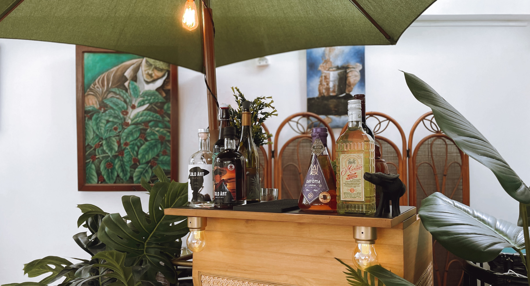
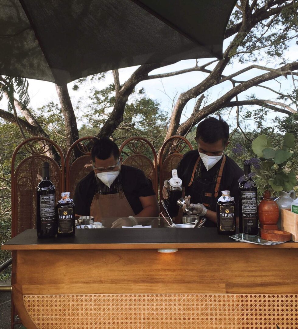
Solihiya is a familiar style of rattan weaving that they already feature in their booths.
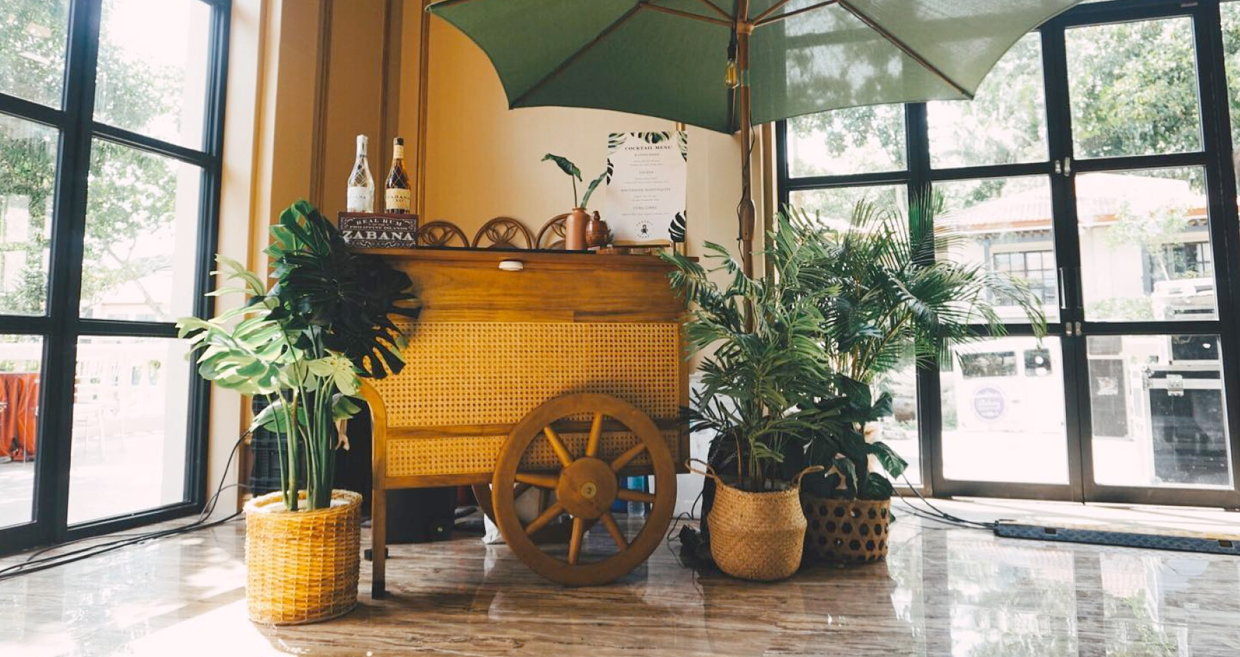
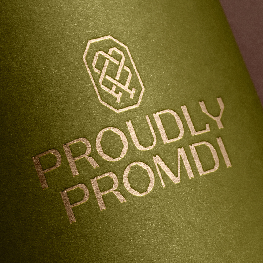
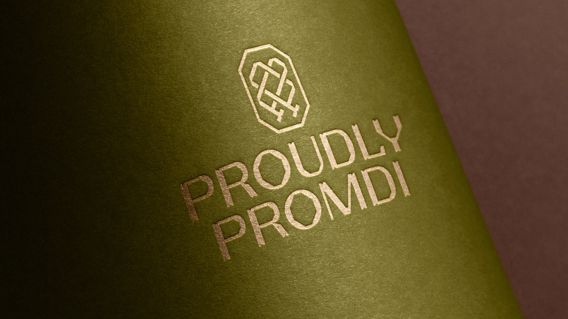
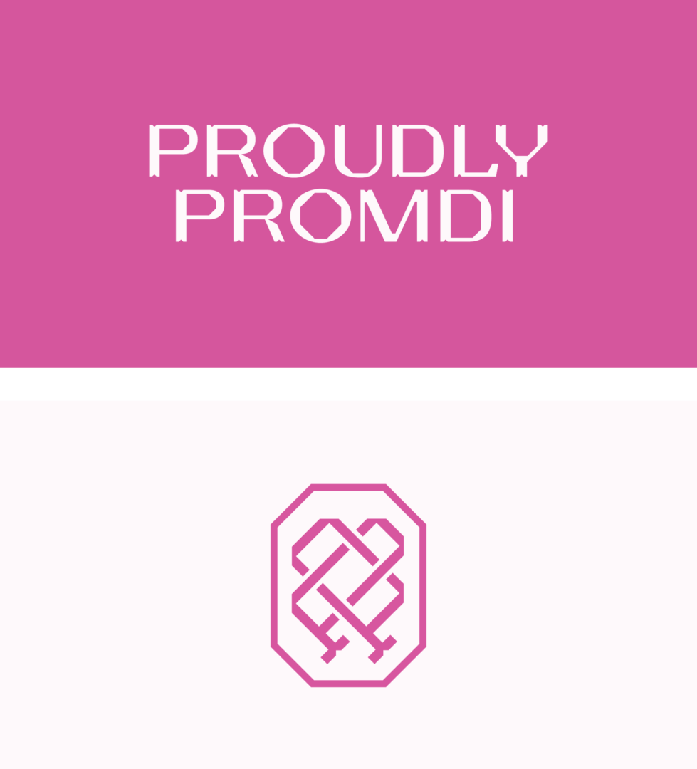
The wordmark stacks the two words of the brand name. It’s a sans serif with contrasting thicknesses, tempered by the defined wedges & cuts.

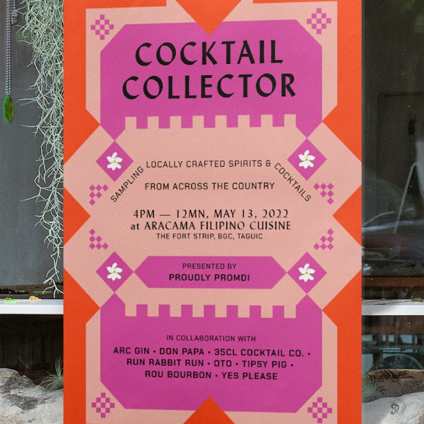
The generous palette of Proudly Promdi is an abundant & earthy mixture of light, breezy colors punctuated by more fiery and intense warm shades. There’s enough range to evoke different ways of enjoying spirits — from intimate laidback siestas to festive celebrations.
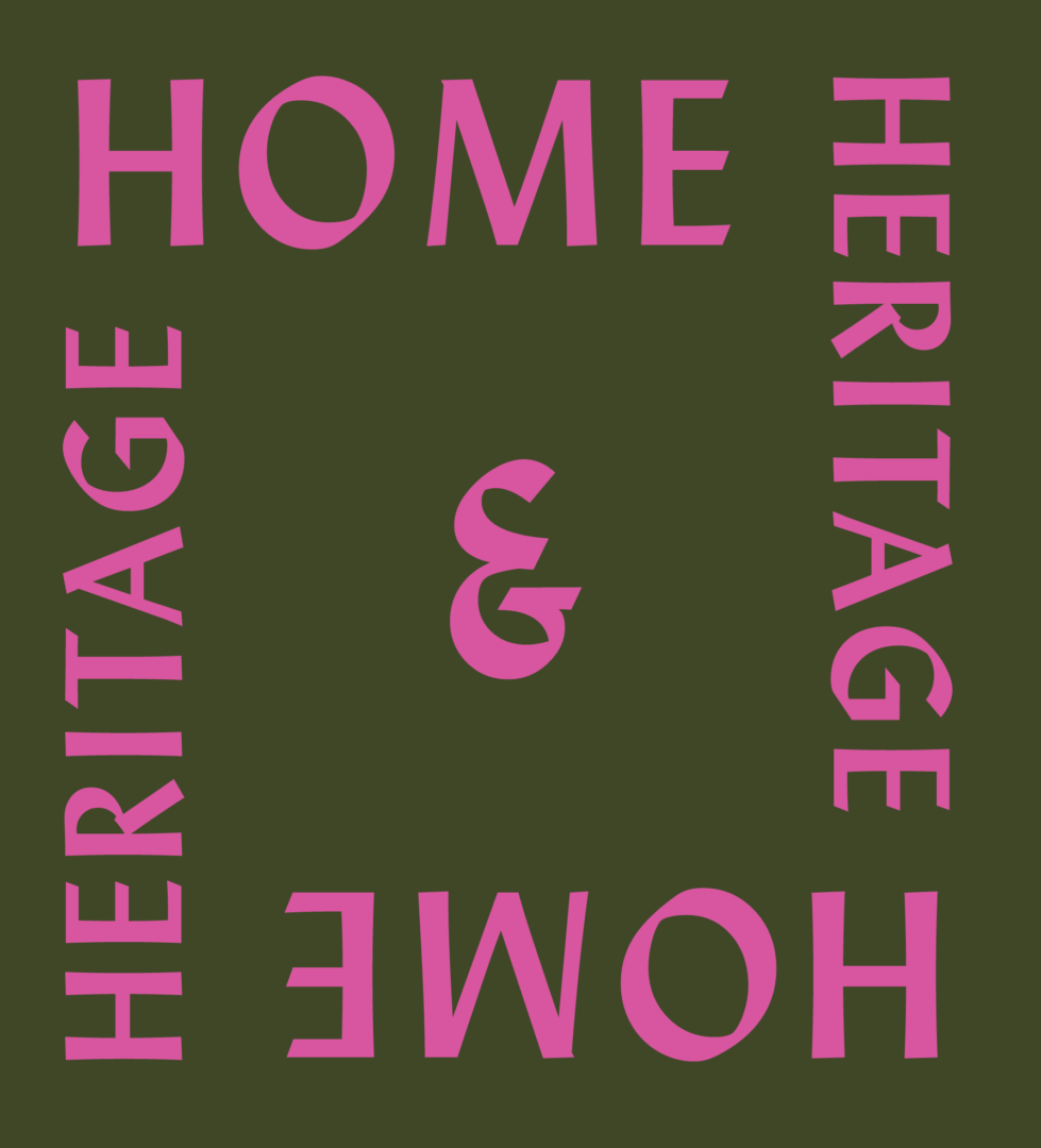
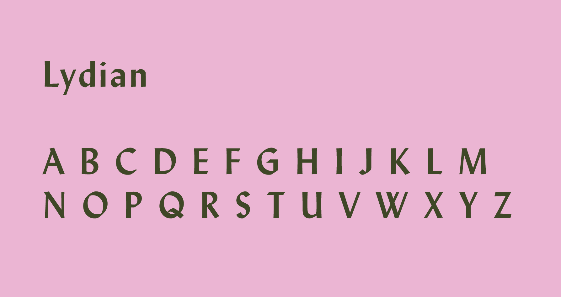
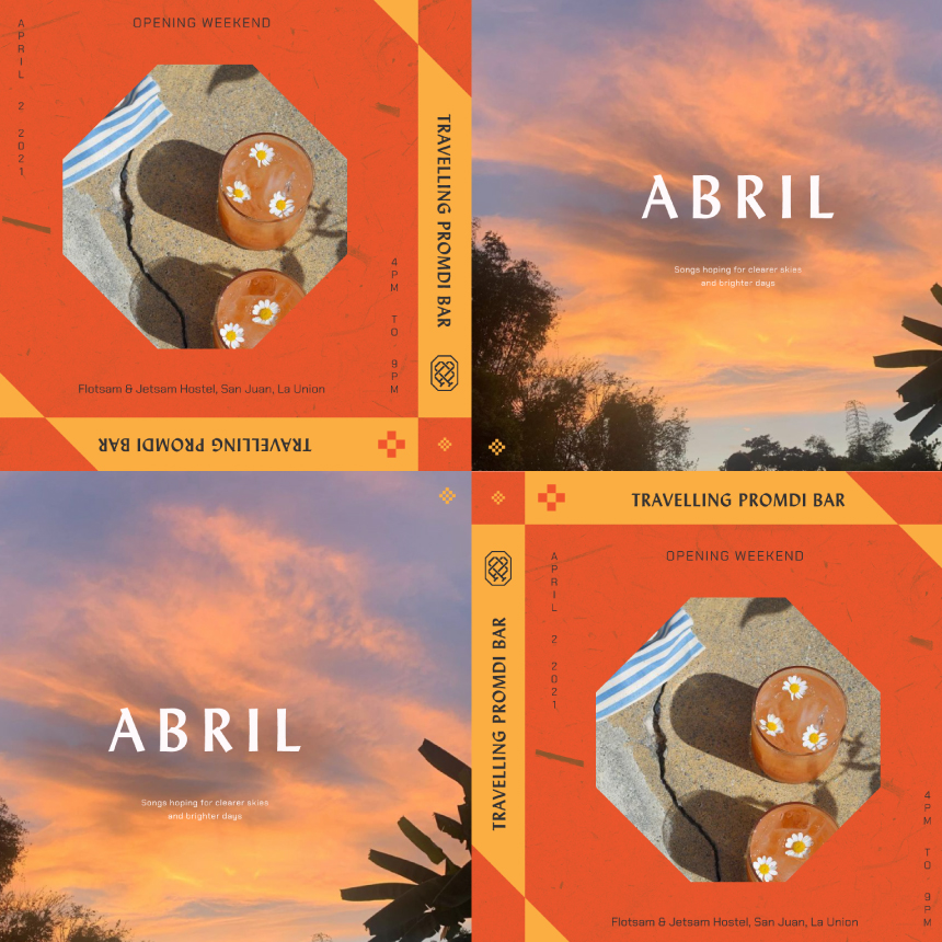
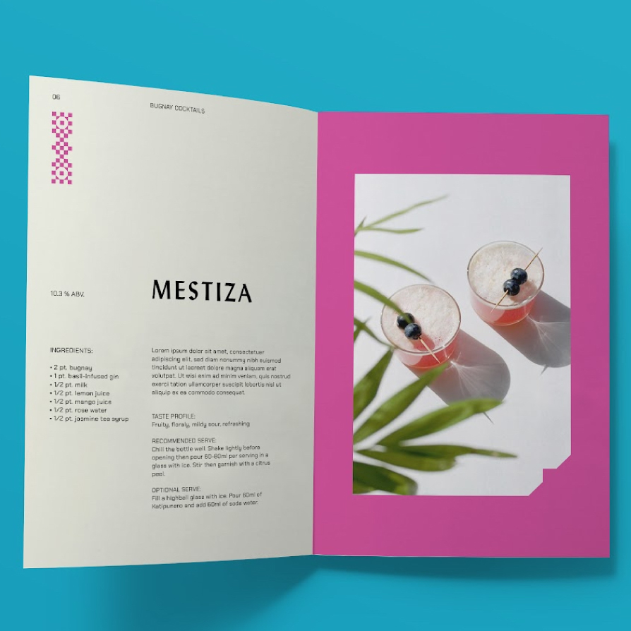
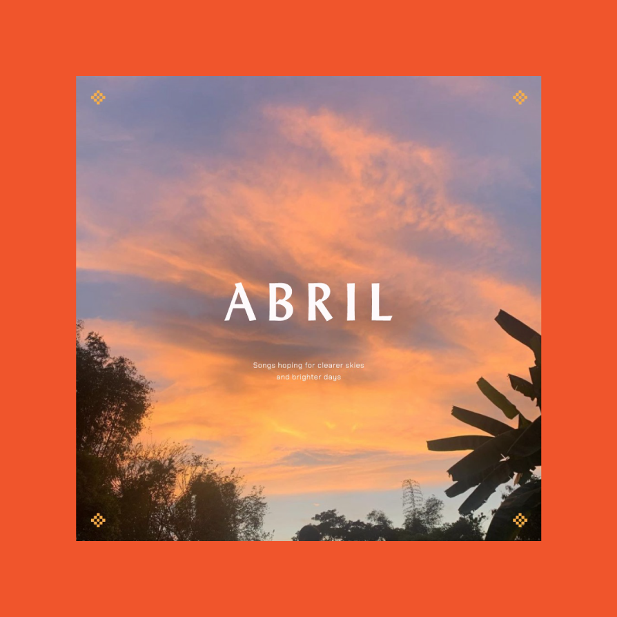
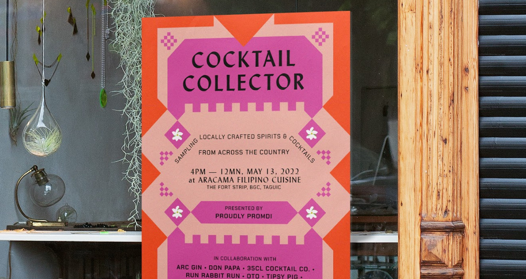
The duality of the chosen typeface, Lydian, visualizes the way Proudly Promdi speaks. It feels handwritten and personal, yet appears refined and elegant. It behaves both to elevate and to be read with warmth.
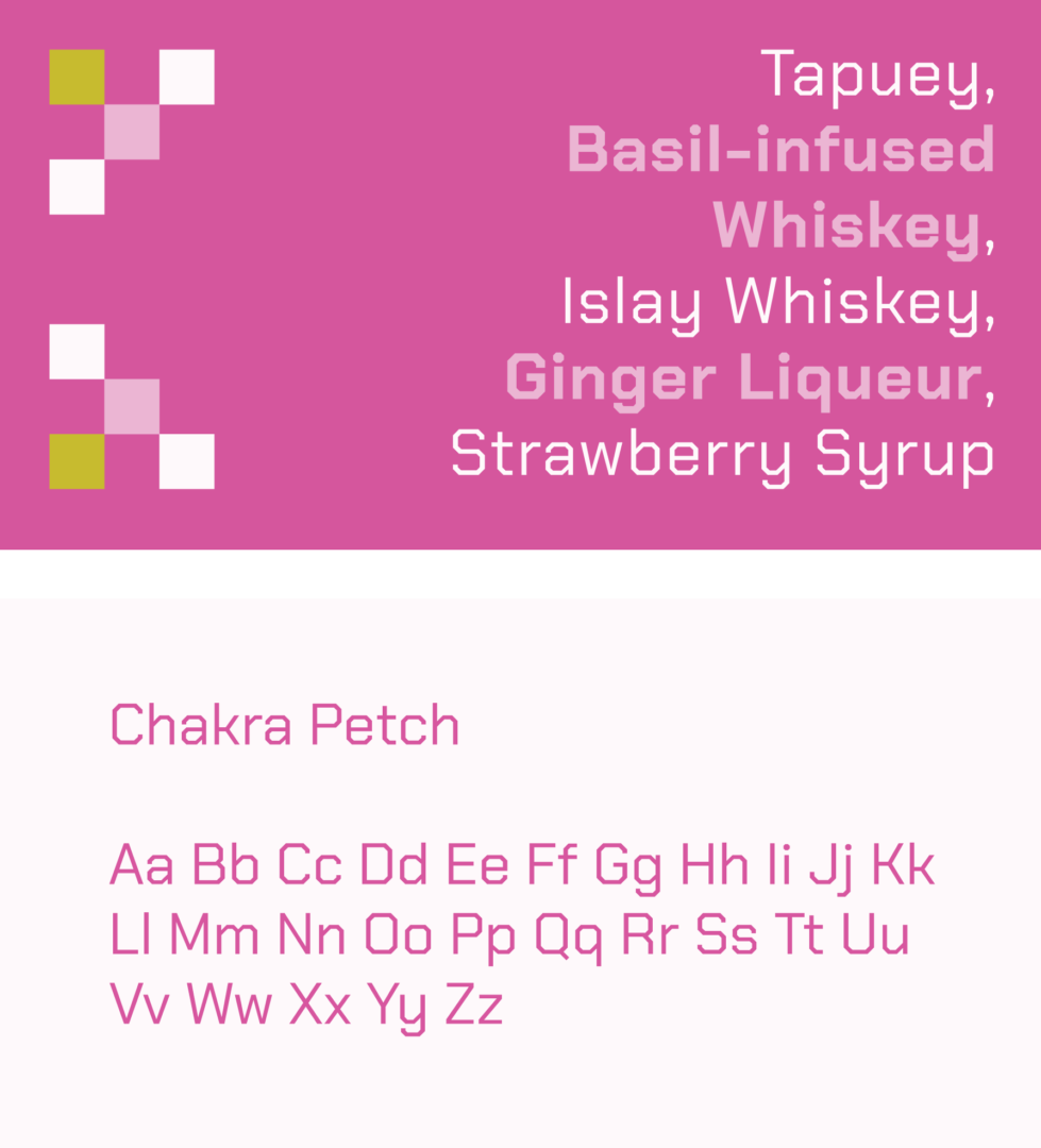
The secondary font, Chakra Petch, complements the octagonal solihiya shapes that are used across the brand. It excels as a descriptive voice, tempering the elegance of Lydian as a voice that is less complicated and easy to understand.
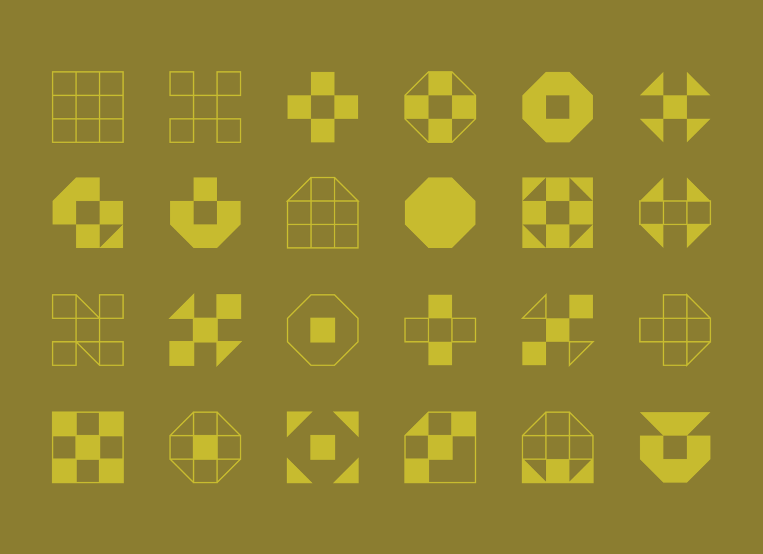
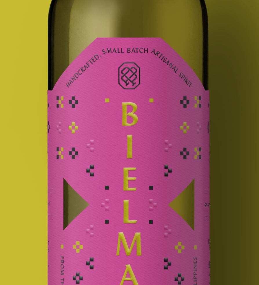
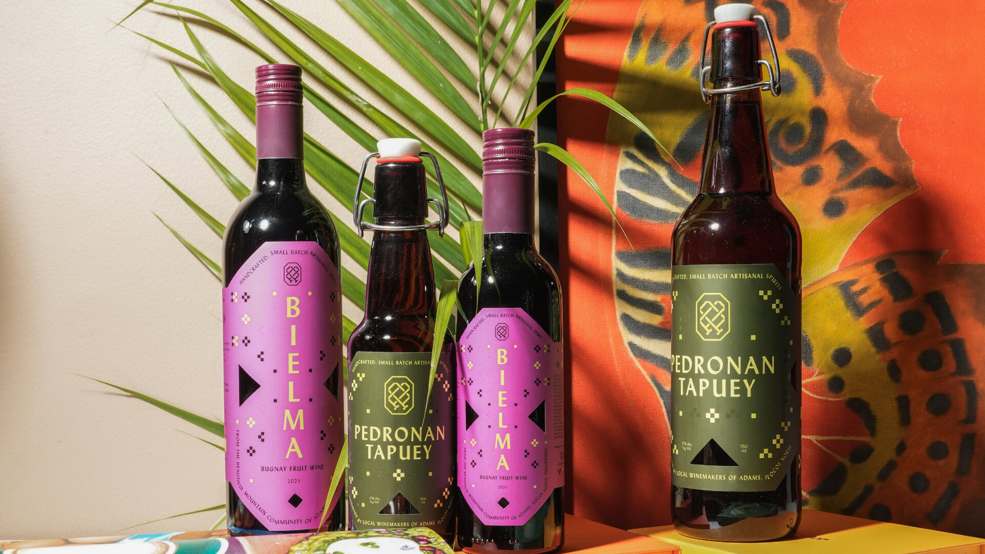
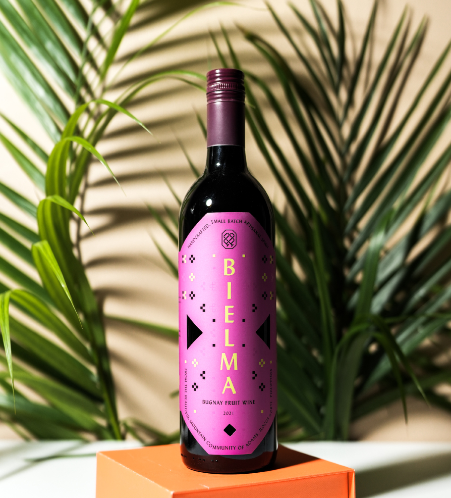
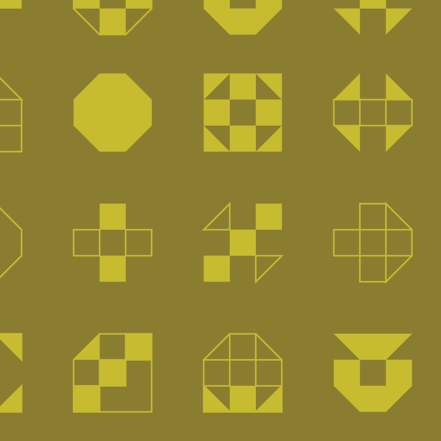
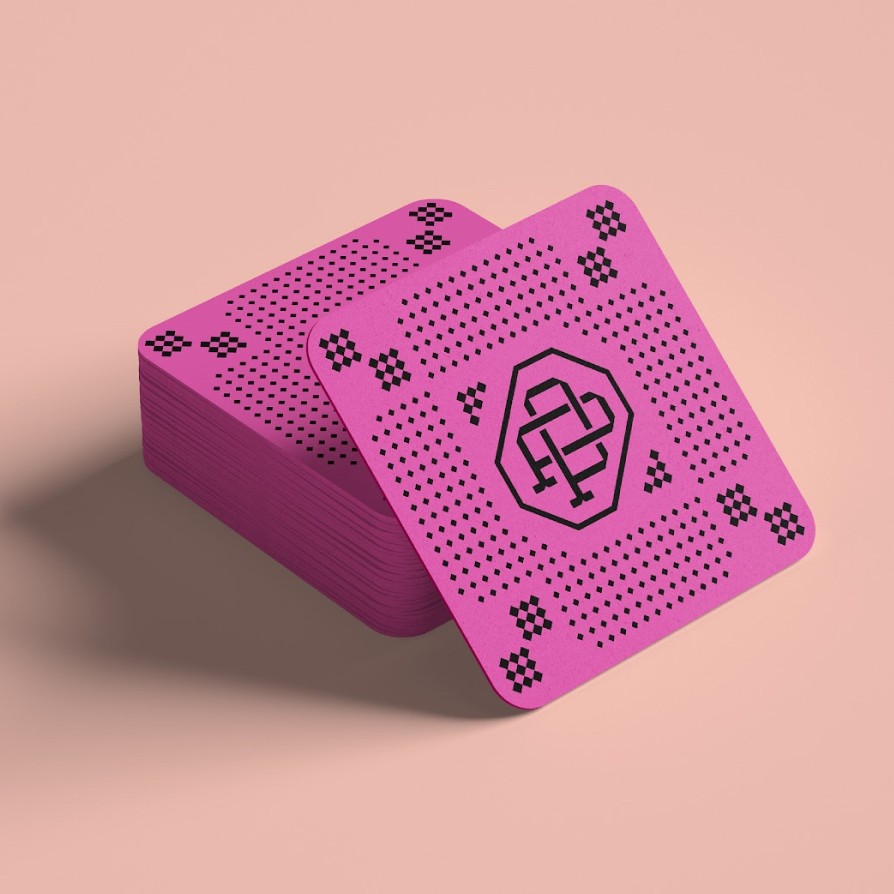
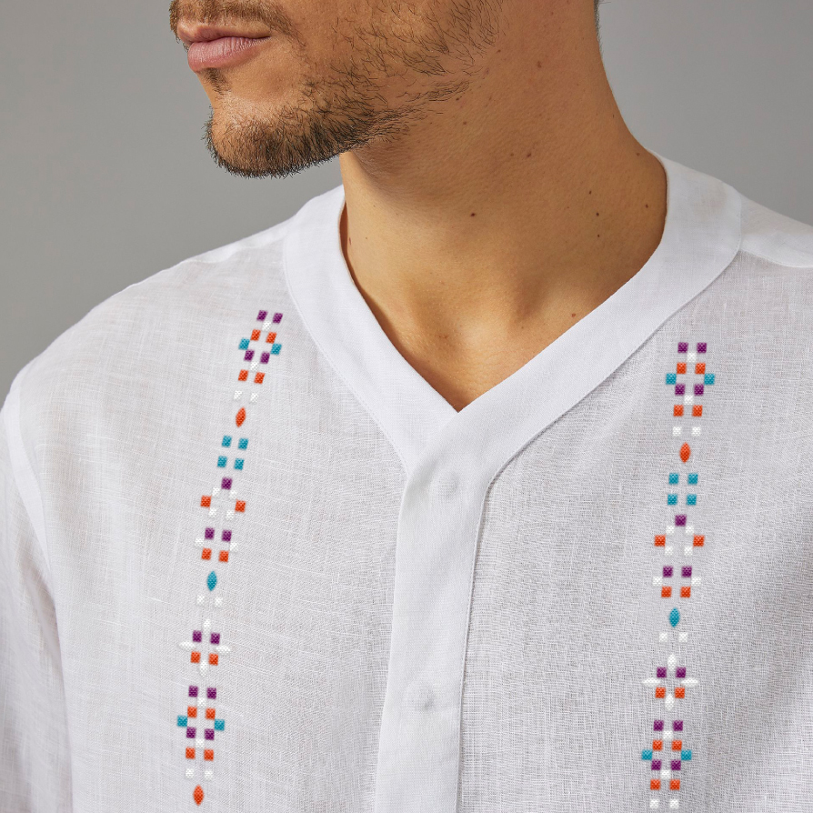
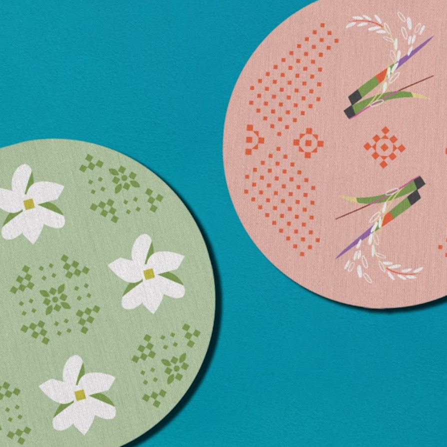
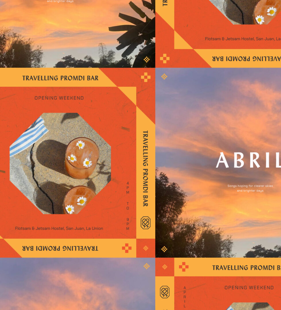
We broke down the solihiya octagons into smaller quadrilaterals and triangles. Their various iterations solidified the Proudly Promdi look in a number of executions.
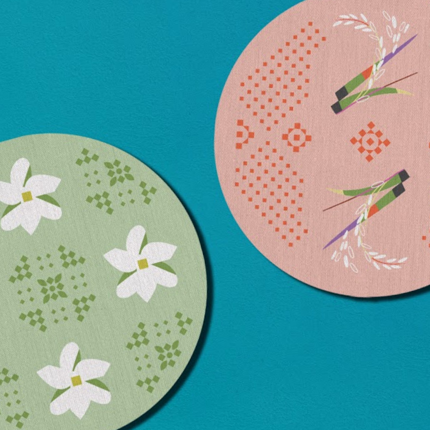
They behave like floral accents or callado, the embroidery on barongs. They can be subtle and gentle or larger and more complex by combining different flourish designs together.




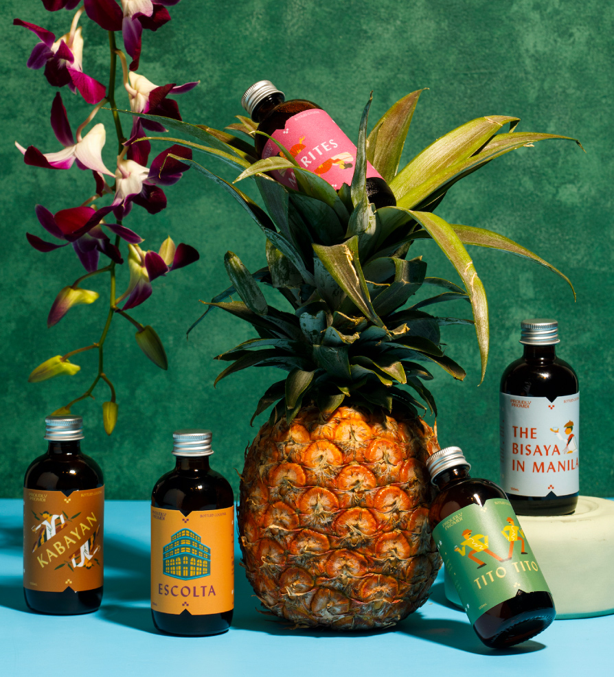
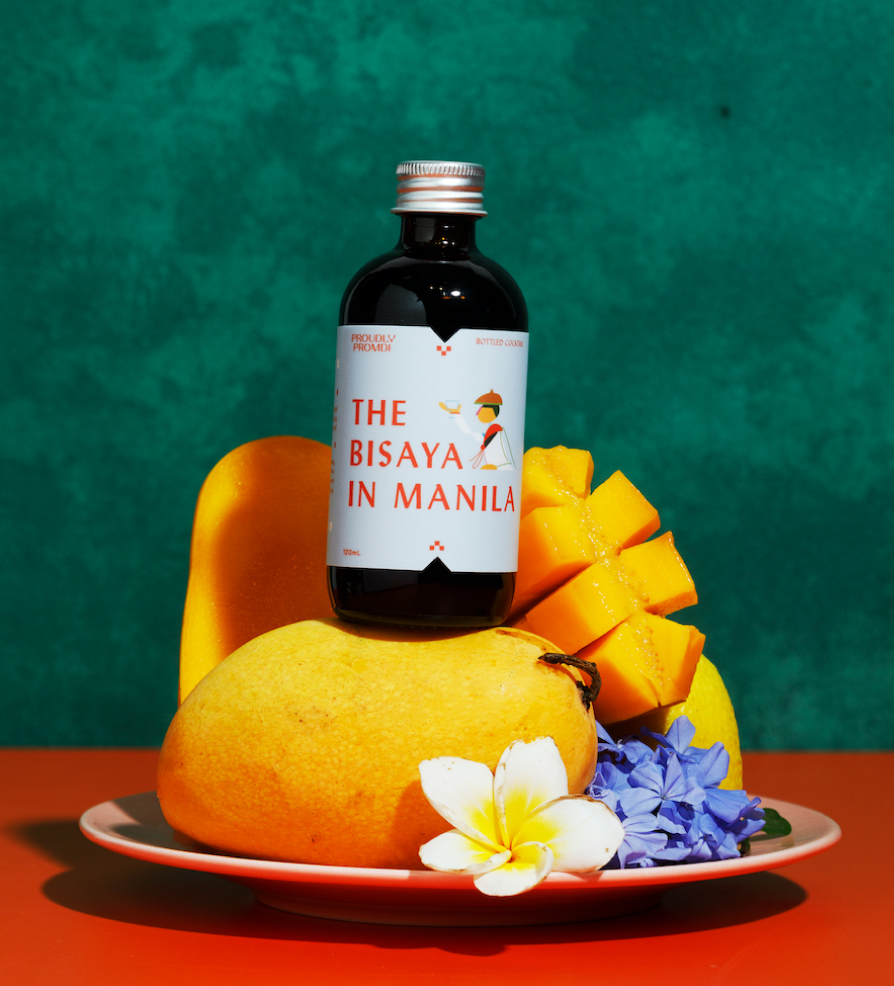
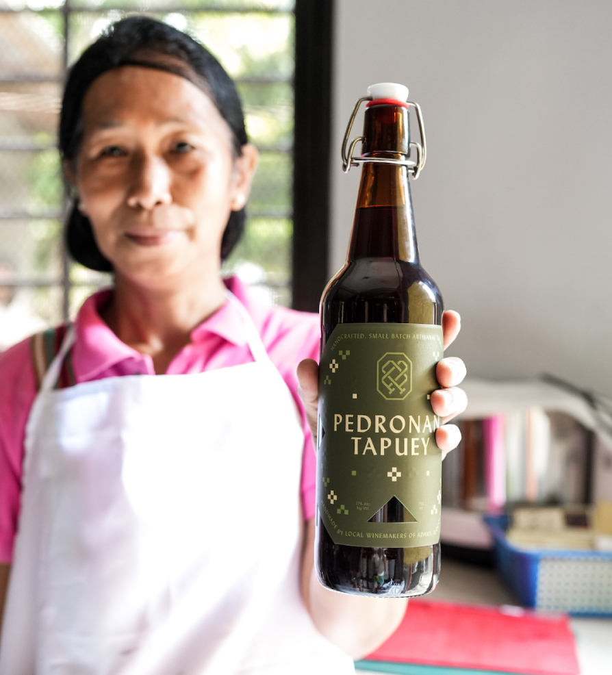
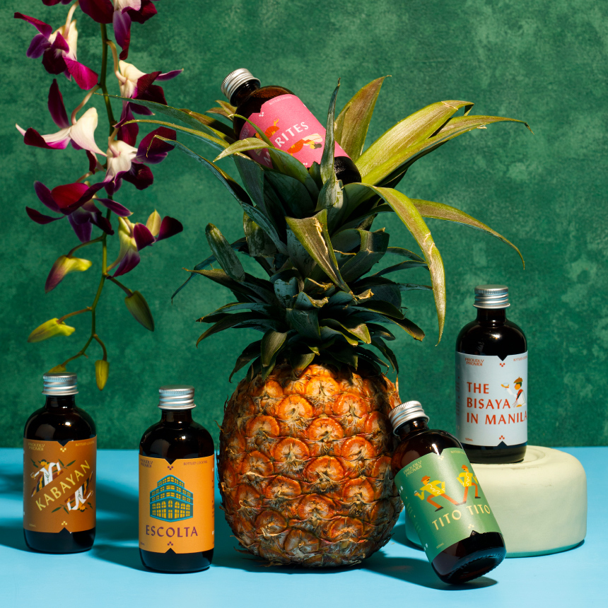
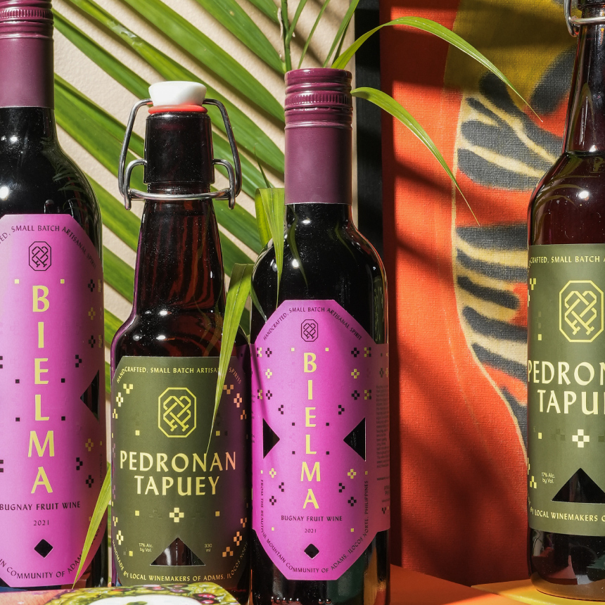
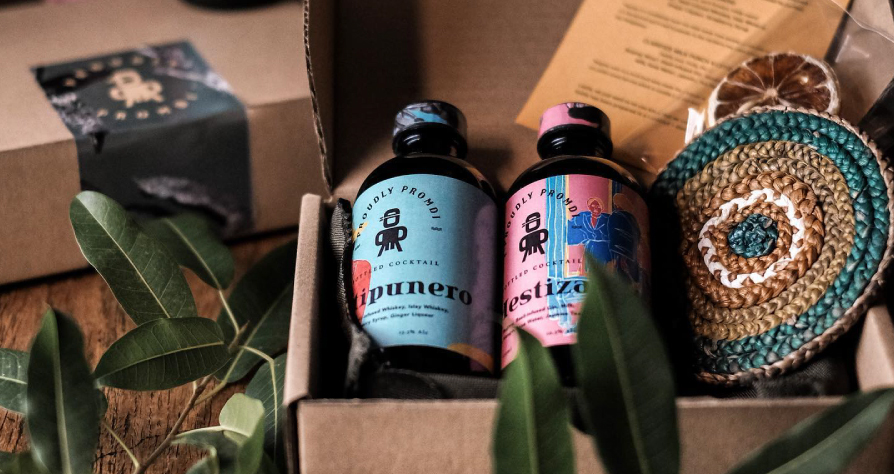
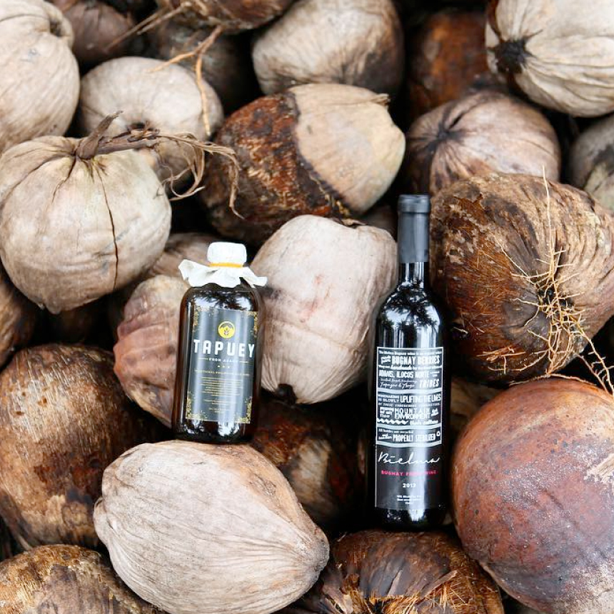
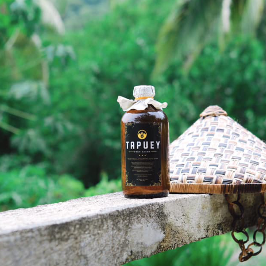
The packaging was a vital touchpoint for both the winemakers & the brand. This is why we focused our energy on developing the labels, in order to elevate how people experience and serve tapuey. Ultimately, we want to do justice to winemaking process.
