Tags:
2022
View on their website:
https://www.cebupacificair.com/
Website Design by:
Make Technology
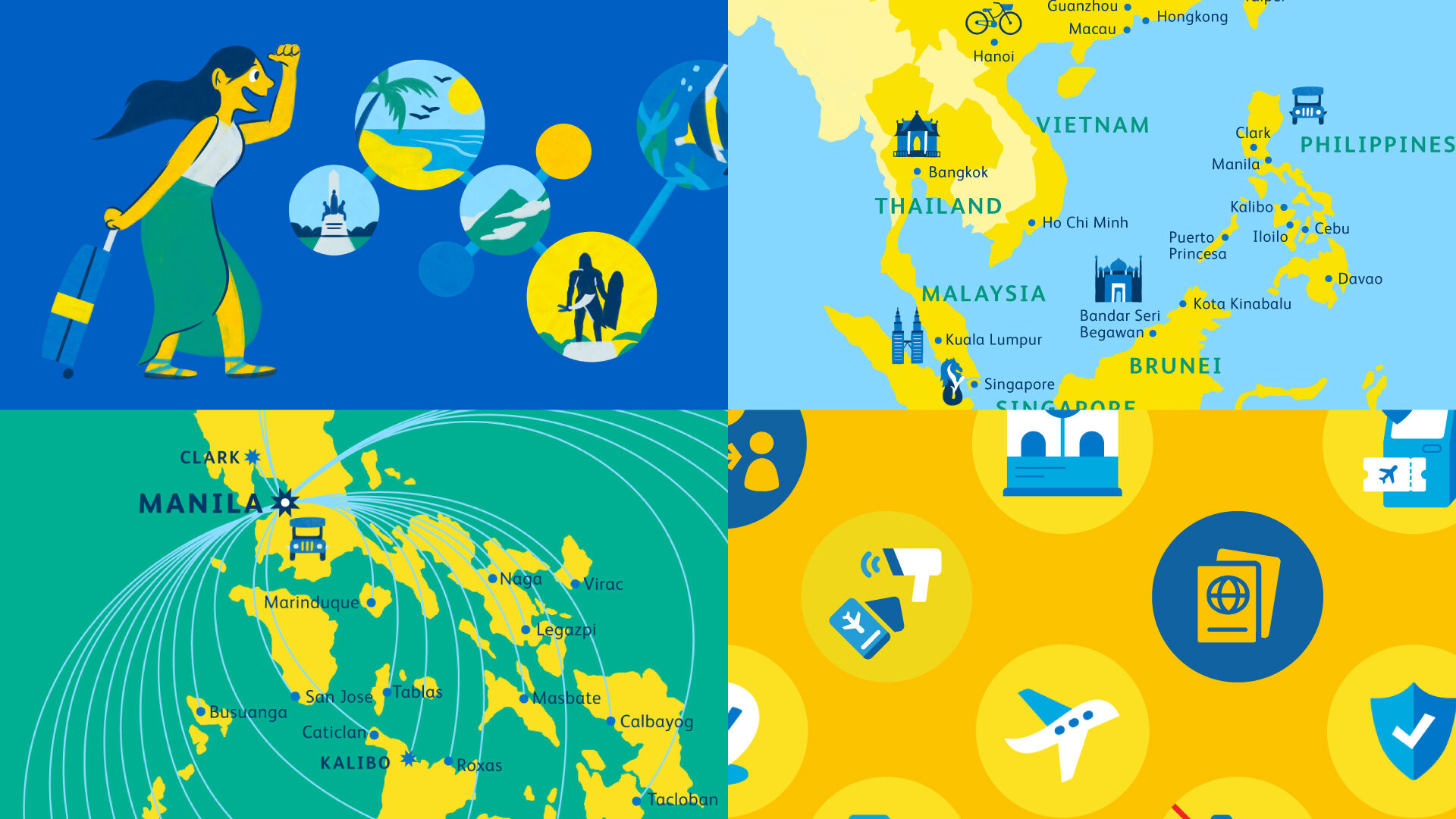
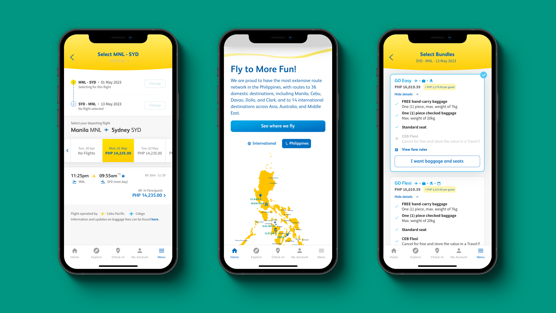
How might we make booking a flight feel like an exciting and guided experience?


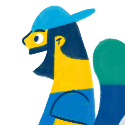


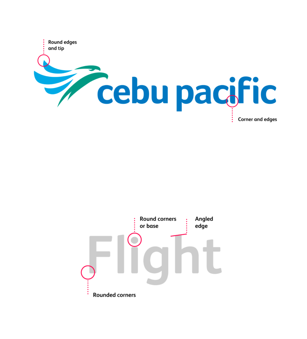
Part of the project goals was to make the illustrations sync seamlessly with the existing brand. We borrowed characteristics from Cebu Pacific’s logo and the visual of contrails left by planes to create a style that sits comfortably on the website.
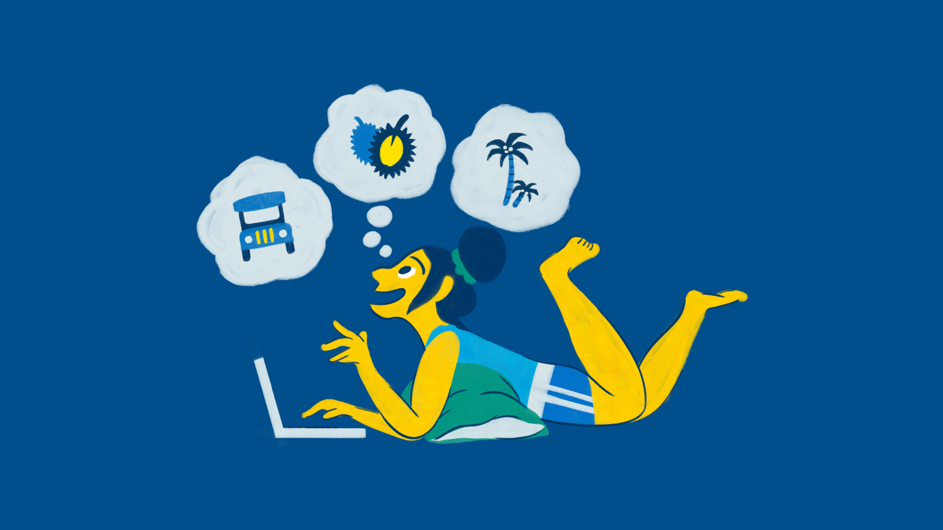
To further drive the experience of a smooth flight, each character has wide flowing curves that glide through their bodies.
Rounded corners and the occasional pointy tip convey energy, movement, and dynamism.
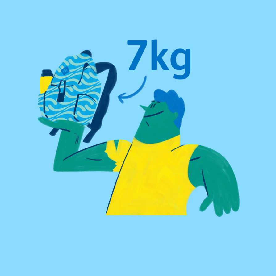
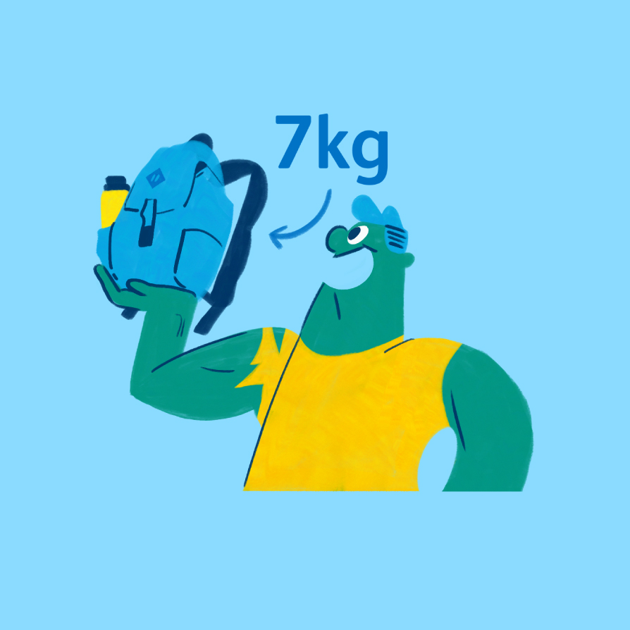
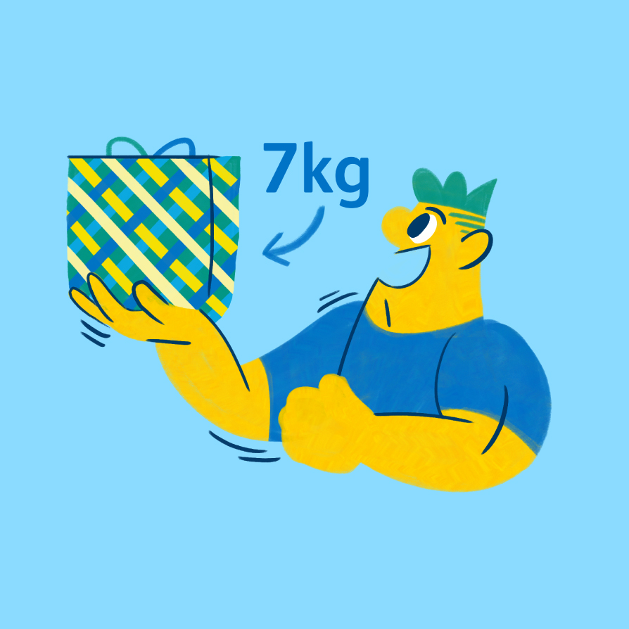
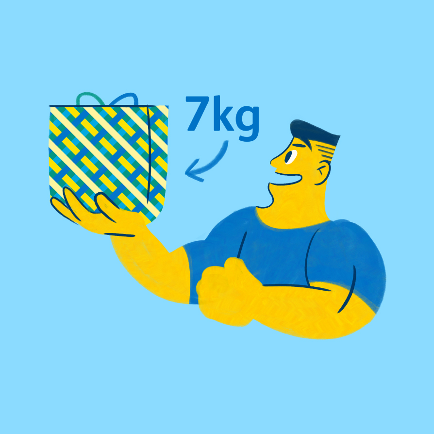
The cast of characters are bright and expressive, while also being diverse through a large library of facial features. The style went through rounds of feedback with the Cebu Pacific team to nail a character that is familiar to users, but also distinct to the brand.

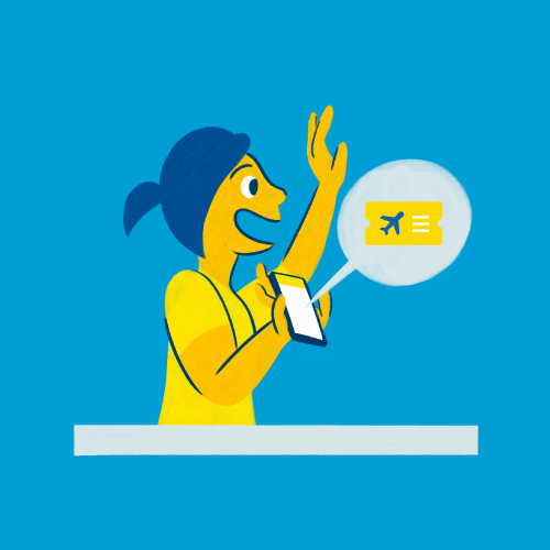
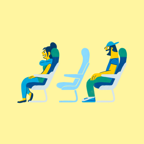


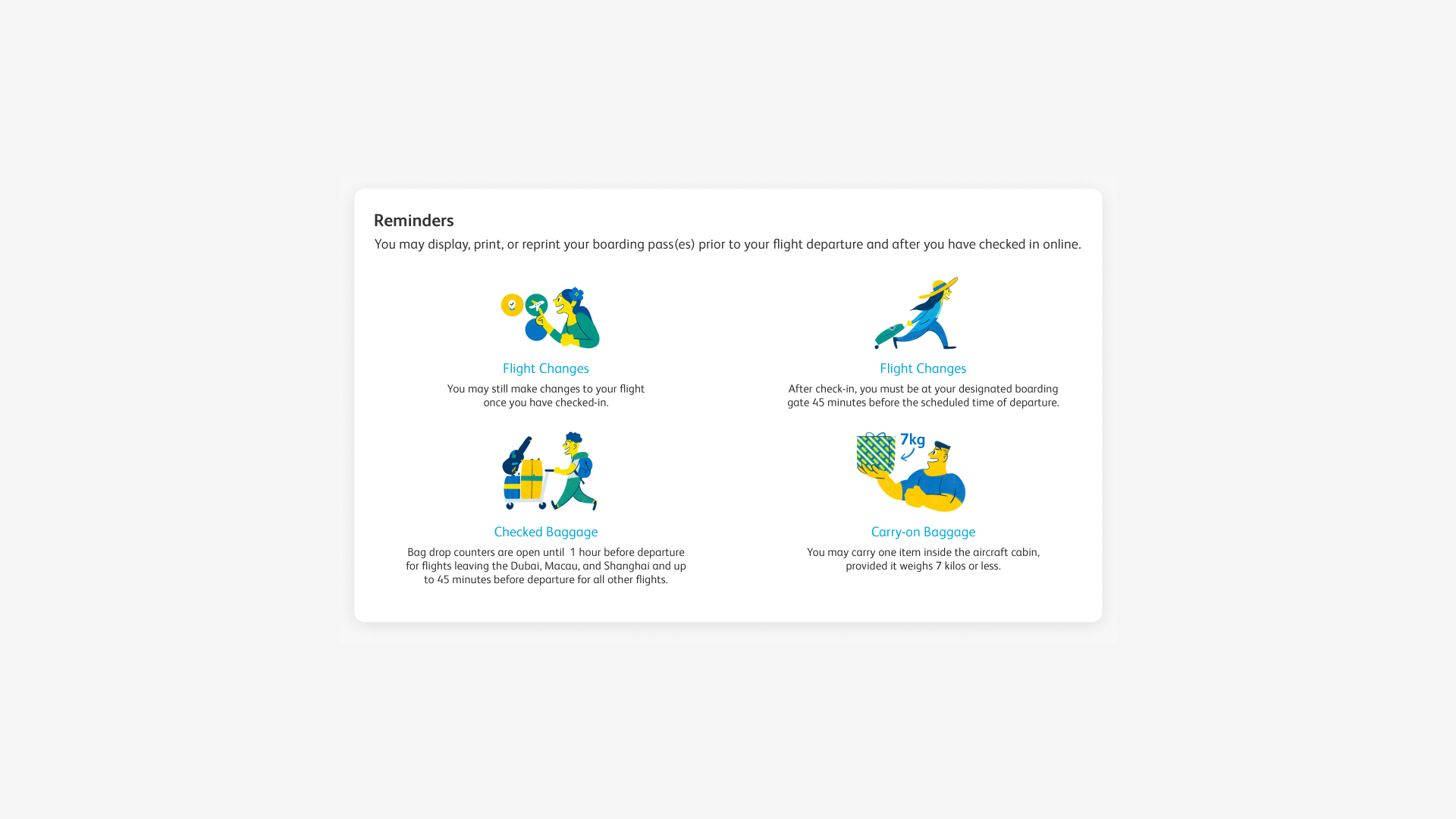
Scenario-specific illustrations were made to match the user’s emotional journey throughout the booking process.
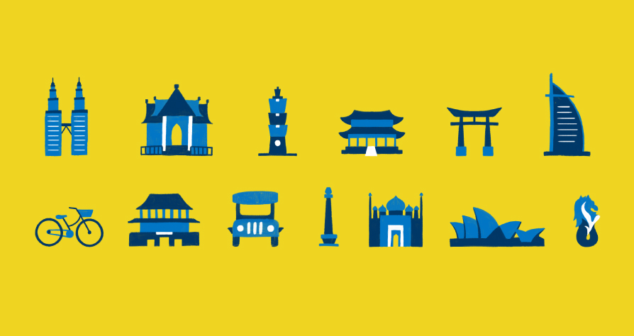
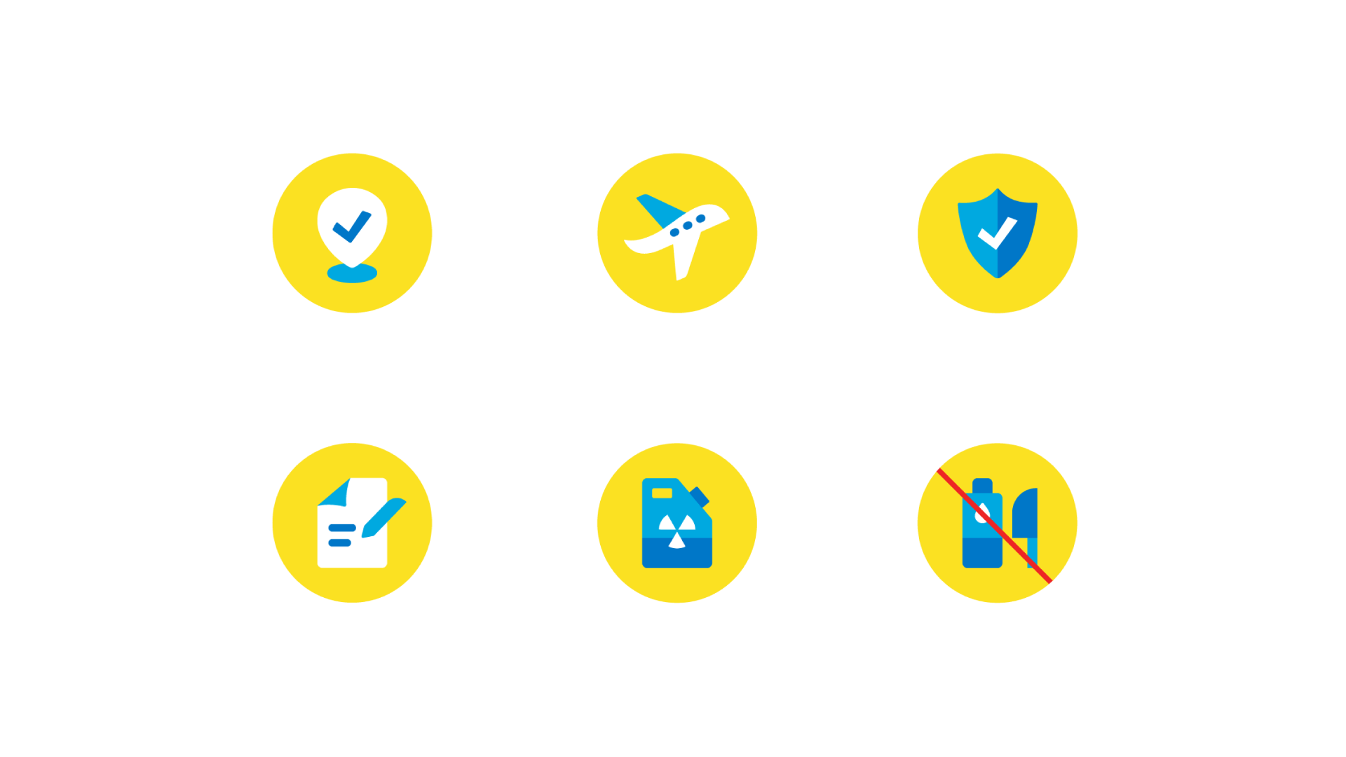
The icons resemble the Cebu Pacific logo and FS Albert (the typeface used throughout the website & app) to keep a consistent look and feel throughout the platform.
The icon system was configured based on how large or small certain icons would appear on the web pages. Different versions were also created to accommodate hovering and button interactions.
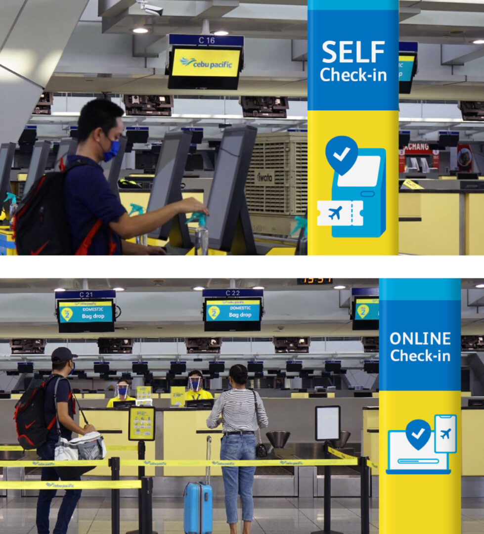
The Cebu Pacific team also expanded the use of these icons to their wayfinding and informational signs within their terminals.


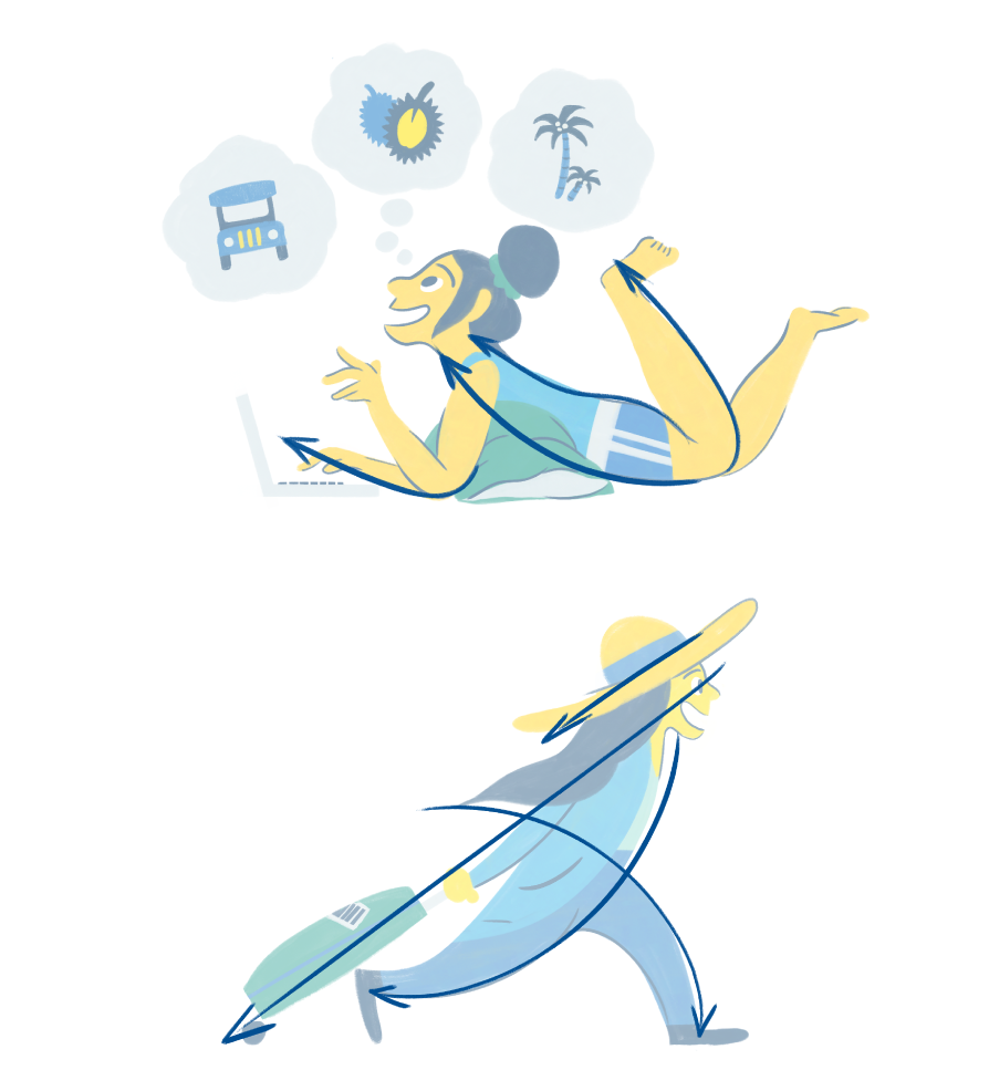
In crafting the voice of the booking experience, we imagined the type of person that would reassure you and excite you at the same time. We identified the persona of a Backpacking Friend – someone who can guide users to getting the best value out of every trip.