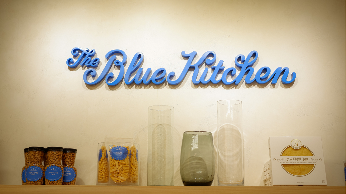
The Blue Kitchen
2025
BRANDING
PACKAGING
BRAND IDENTITY
Kay Aranzanso
Jenny Rala
Gianne Encarnacion (C.O.P.)
ILLUSTRATIONS
Addi Panadero
Gianne Encarnacion (C.O.P.)
PHOTOGRAPHY
Sara Erasmo
Celebrating its 30th year, The Blue Kitchen came to us with this challenge: to modernize the ever-familiar concept of merienda and pasalubong for a new generation.
As their creative partner, we helped TBK reimagine itself, exploring the warmth, community, and unique Filipino-ness of food shared.
Every product on TBK’s shelves has shaped memories and experiences for countless Filipino families, and we believe that this new identity honors this exact mission: How might we frame food as the ultimate expression love, shining a light on Filipino flavors and culture along the way?
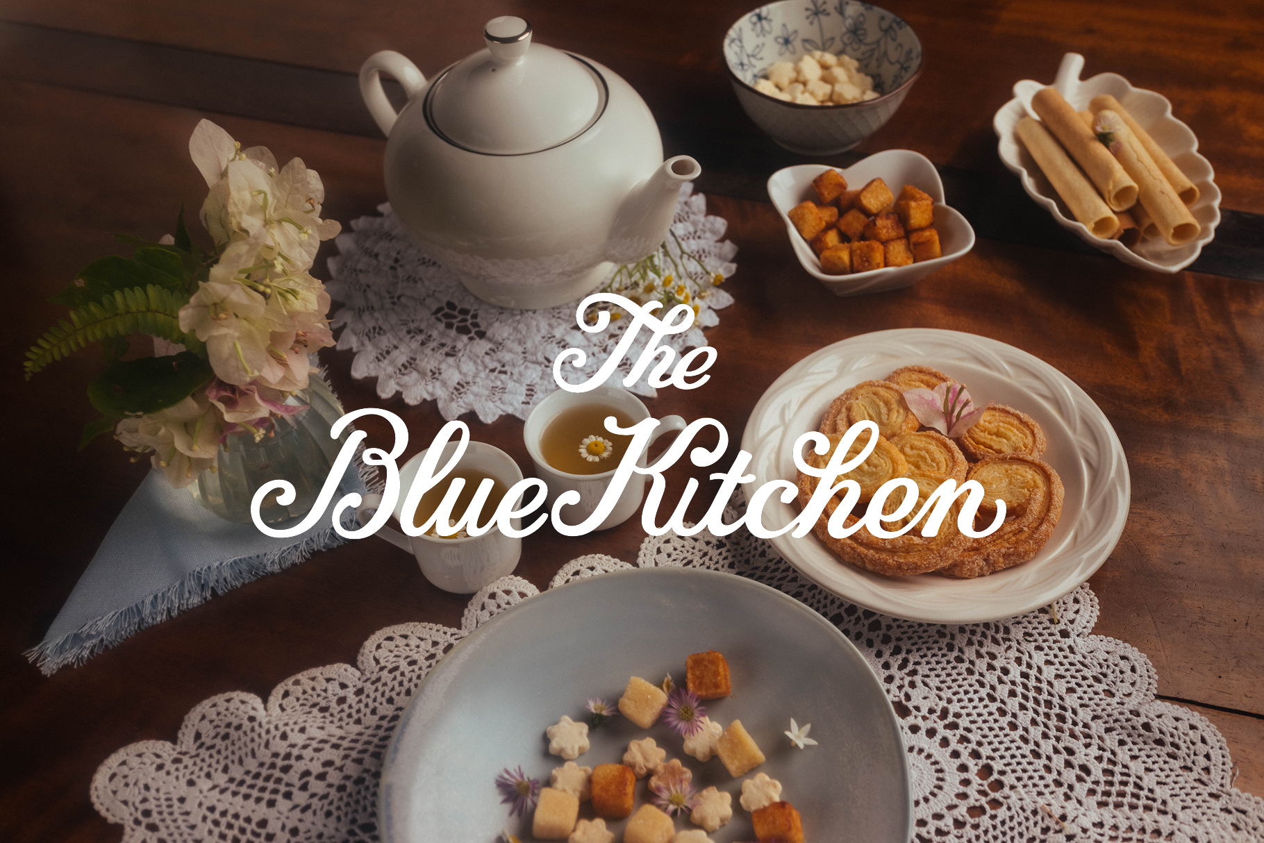
Specializing in artisanal, homemade regional specialties and international foods since 1995, Blue Kitchen’s mission is to make the best of all Philippine cuisine known in Metro Manila and beyond.
How can we modernize the Filipino merienda experience for the Tasteful Filipina?
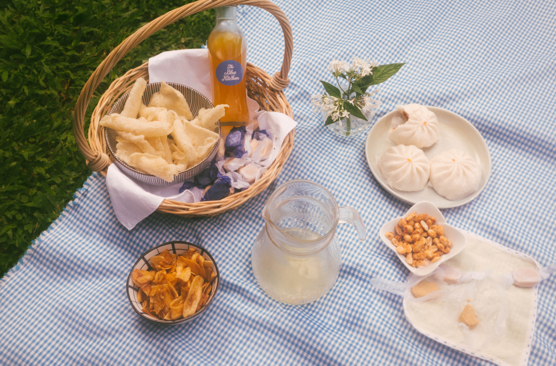
A feeling of home
The Blue Kitchen can be found in the homes of families across time and generations. We wanted its key brand elements to reflect this timeless quality, honoring the warmth of traditions handmade and shared.
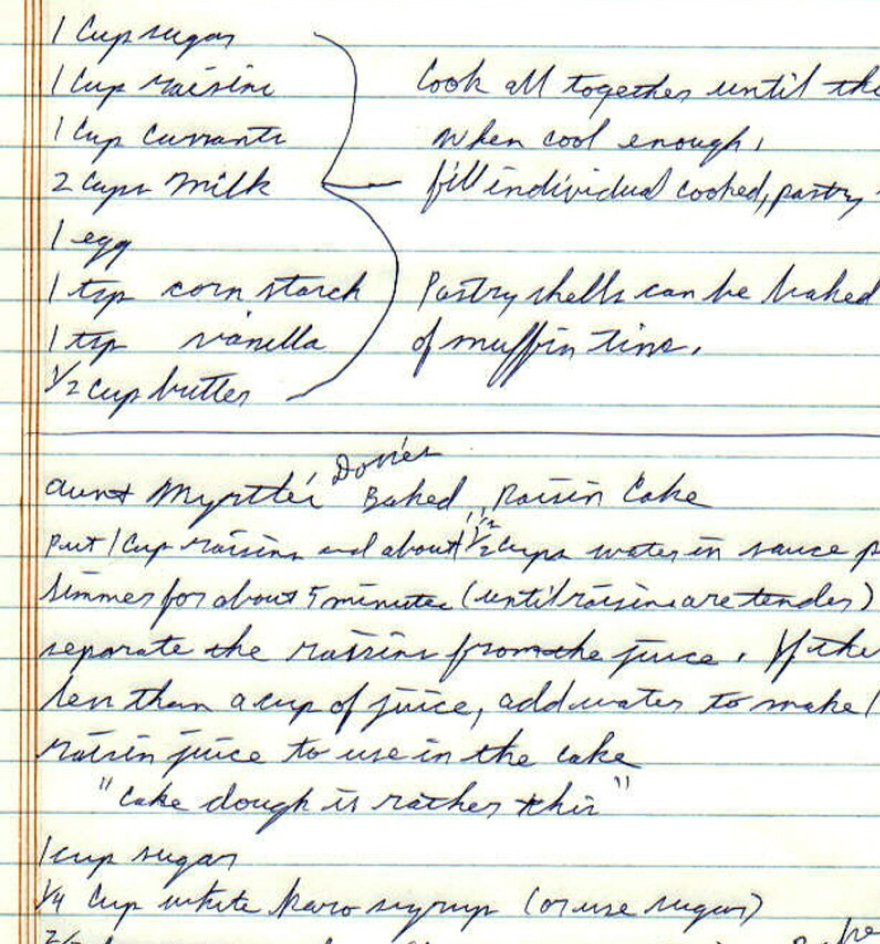
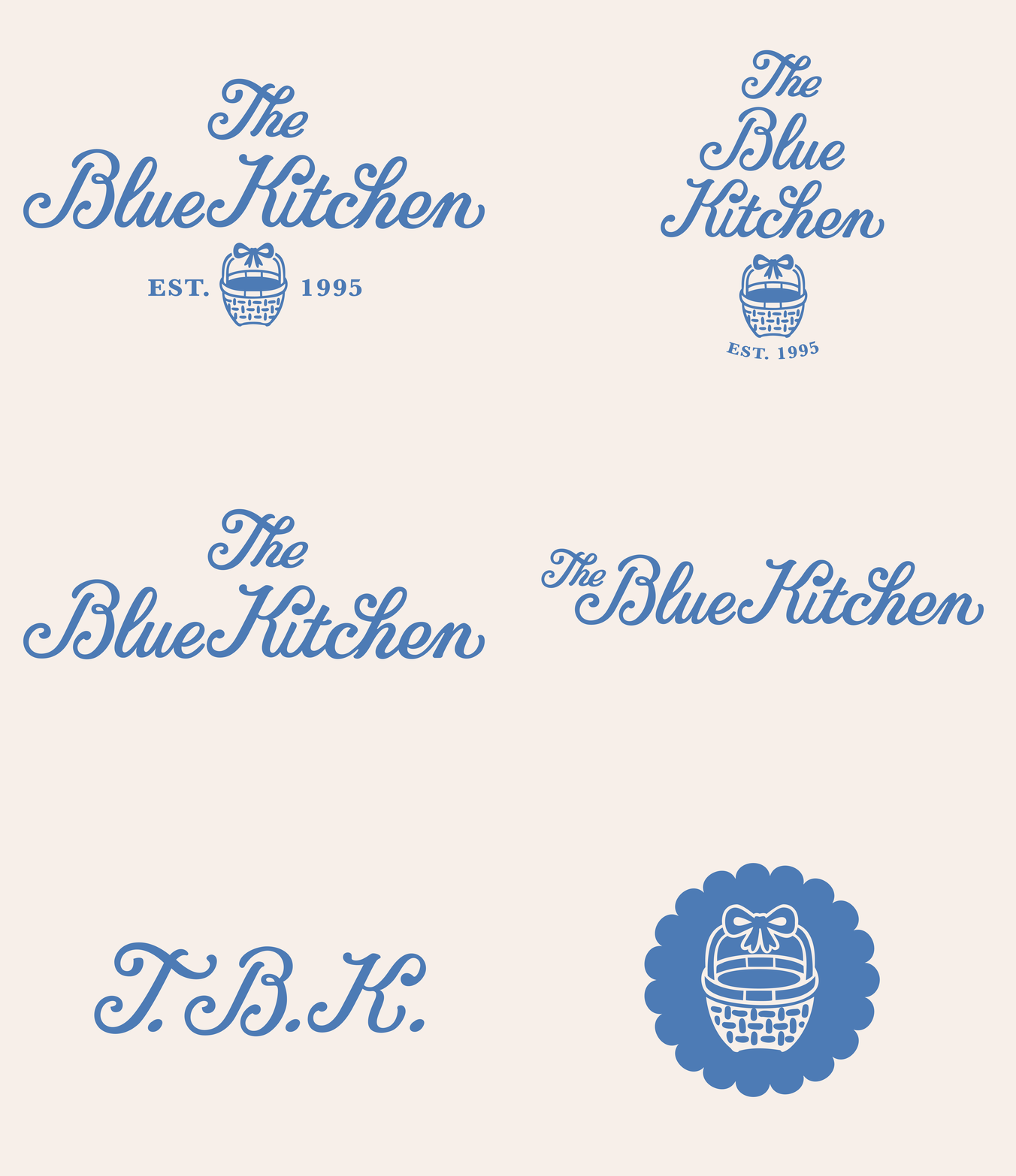
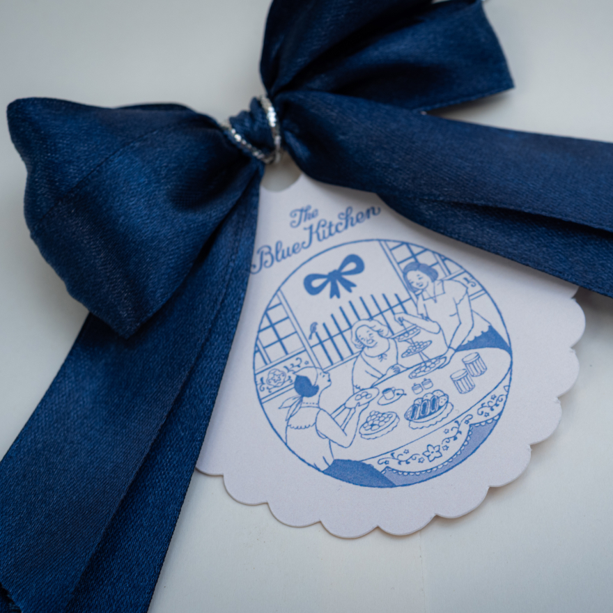
The custom-made logo is an homage to hand-written notes and recipes, a written history and tradition passed down through generations of Filipina women.
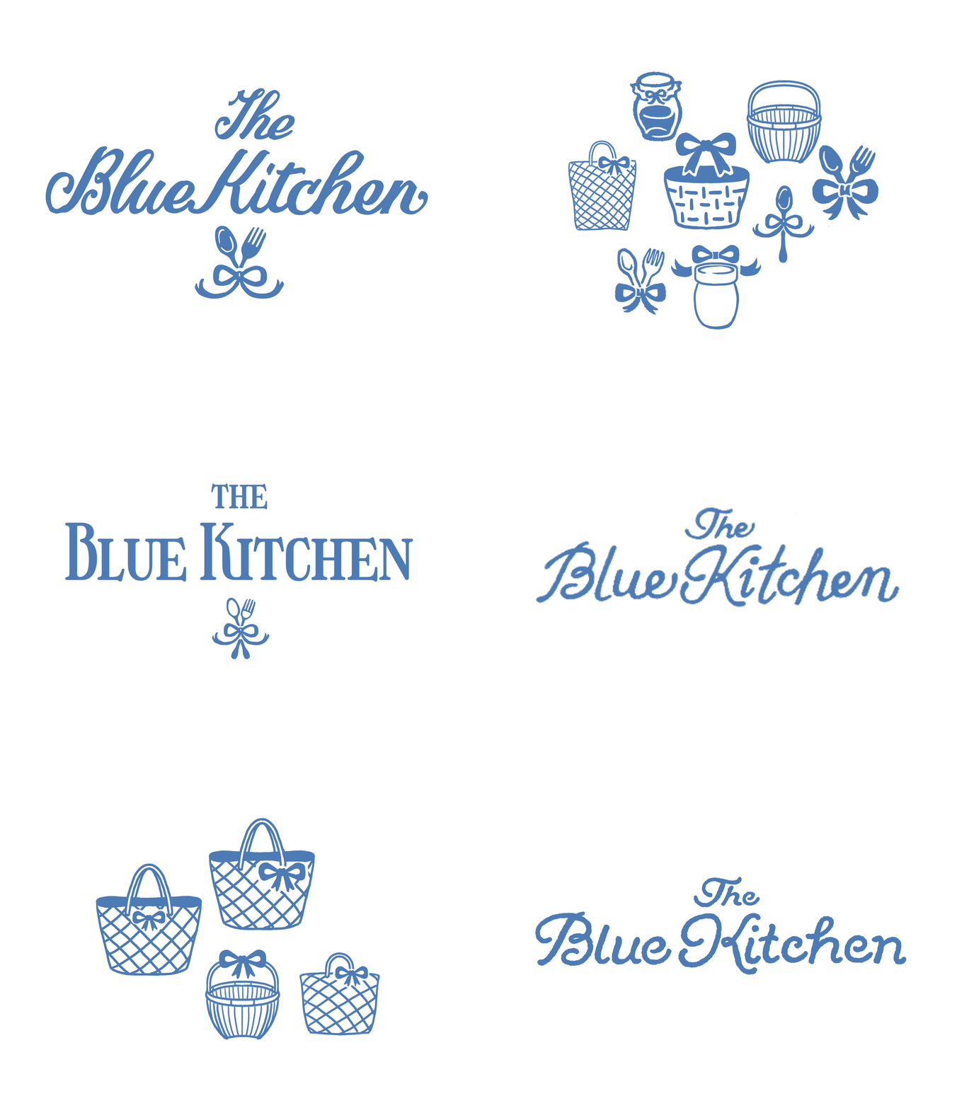
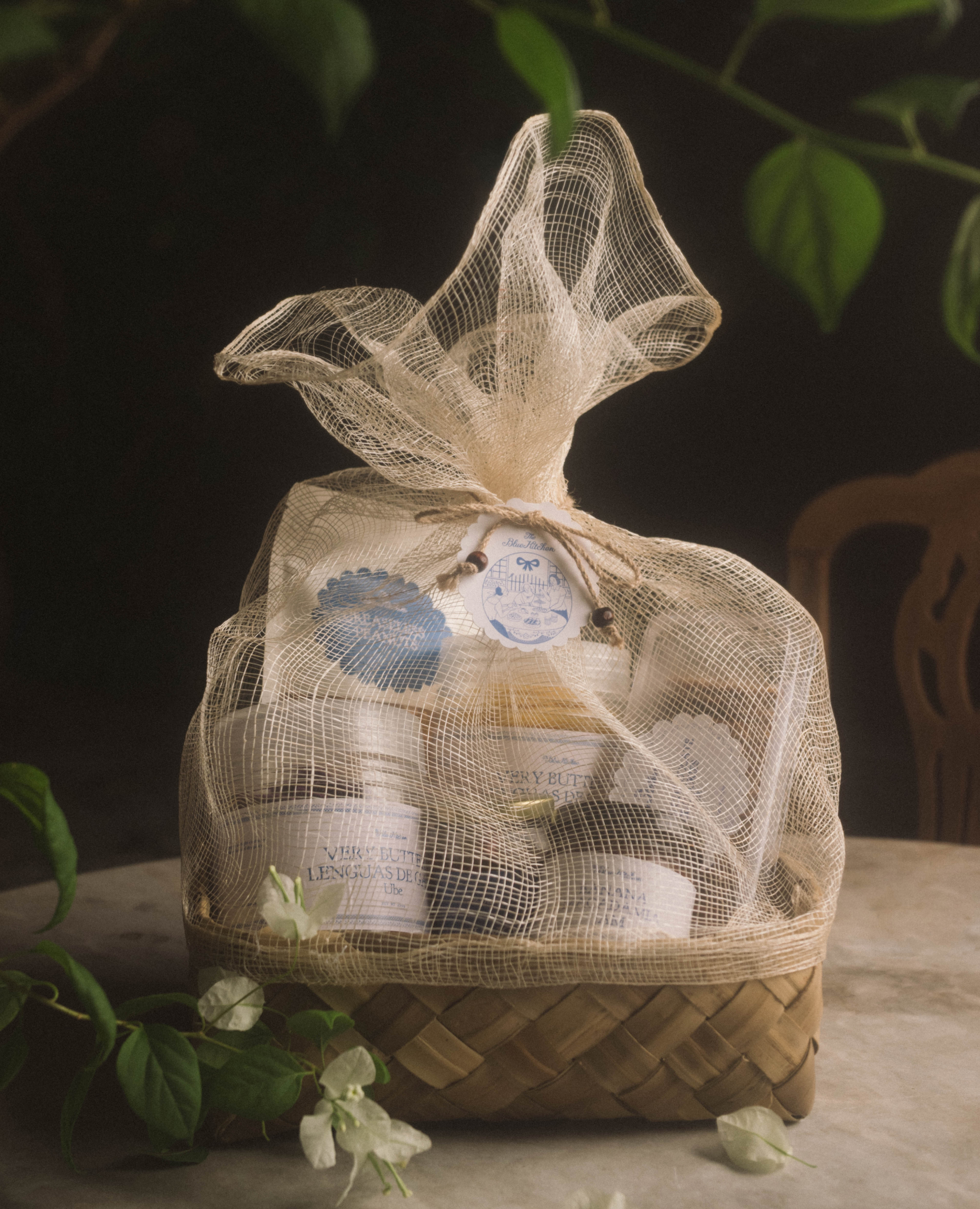
Even through numerous iterations, the basket and blue ribbon remained constants in TBK’s logo system as representations of home and heritage shared.
Whimsical elements
With various illustrative and intricate elements, we wanted to add a touch of whimsy to the legacy brand, asserting what The Blue Kitchen has known for decades: that family and tradition are magical.
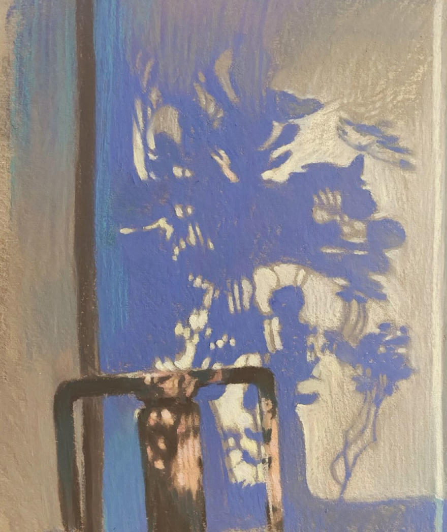

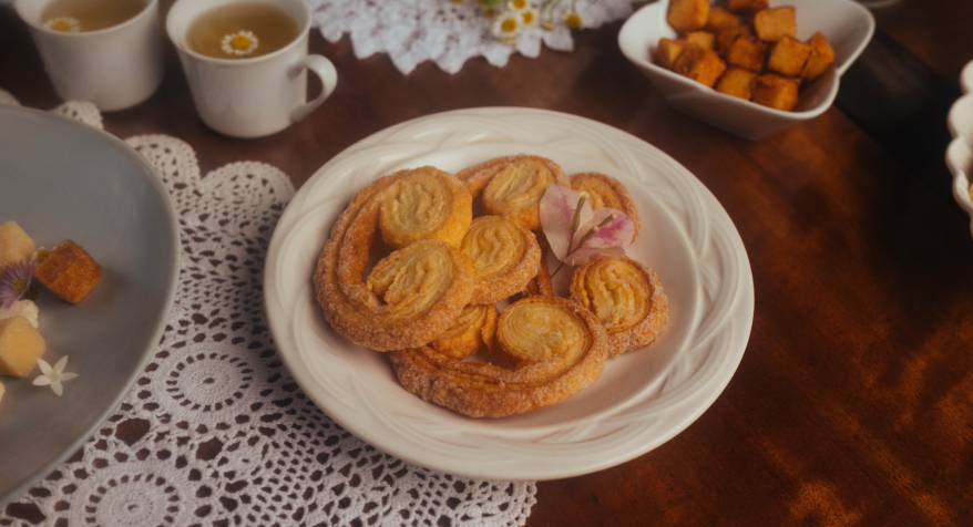

With a pale blue as its foundation, the TBK color palette is an ode to serene skies — the best to have merienda under.
We blended in additional shades of blue, a buttery yellow accent, and soothing neutral tones to create a warm and inviting tone.
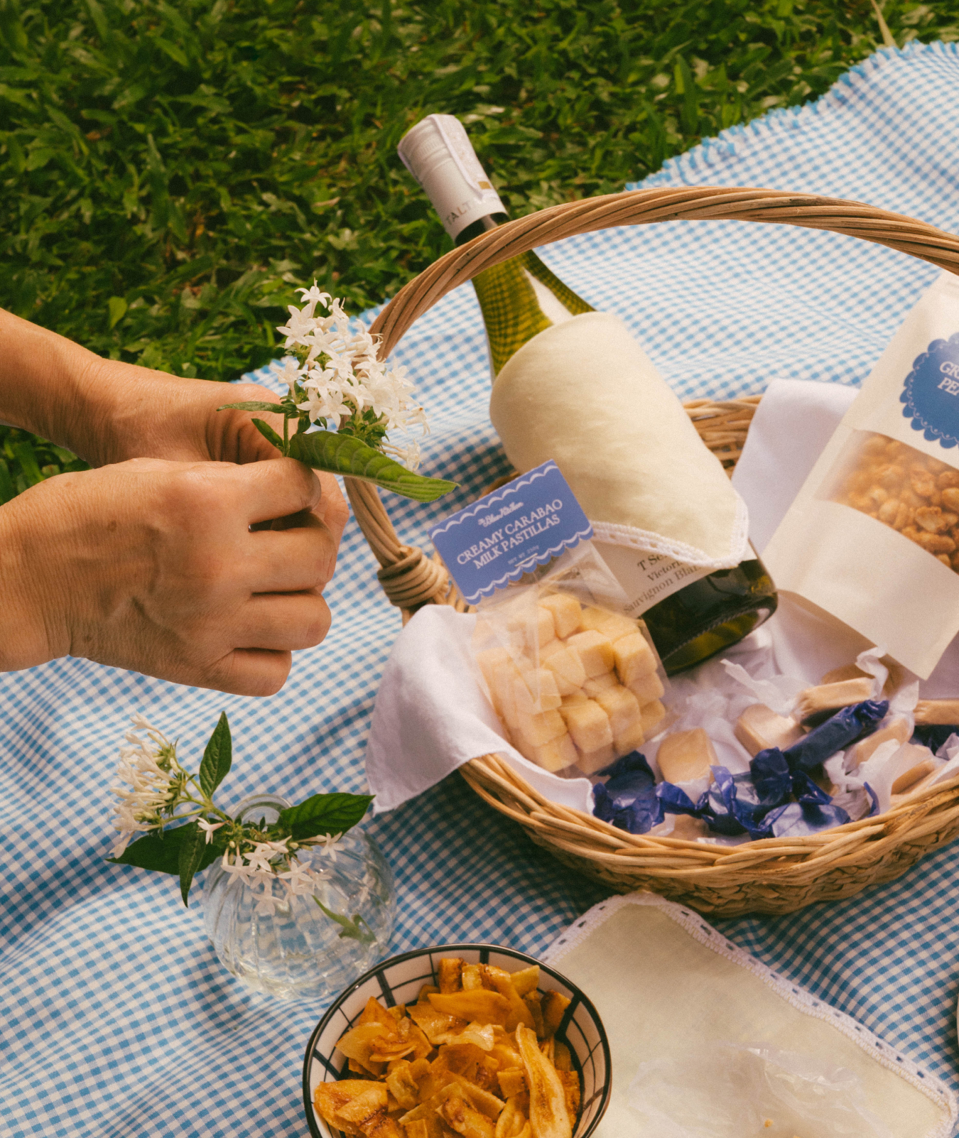

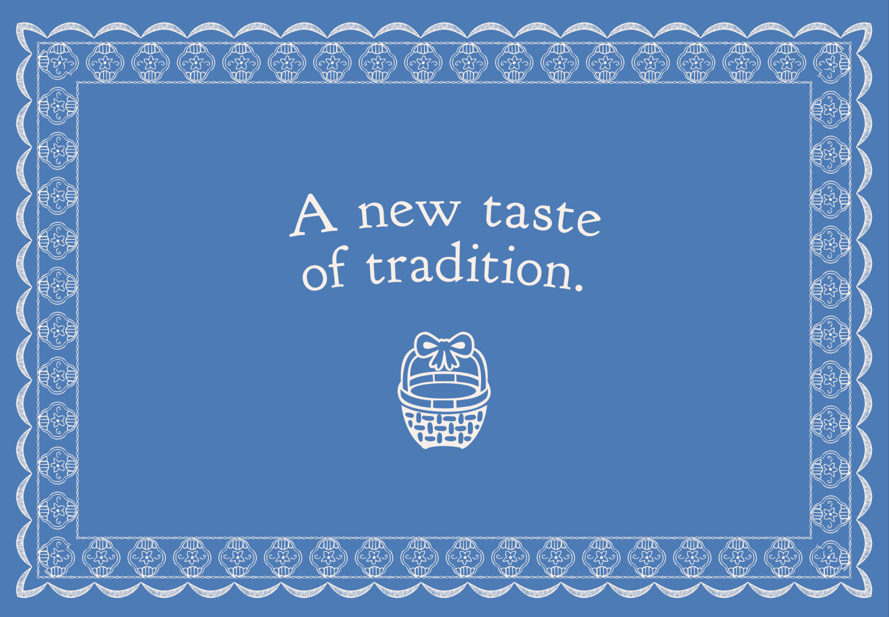
Intricate illustrations and borders weave a timeless elegance into this cozy brand.

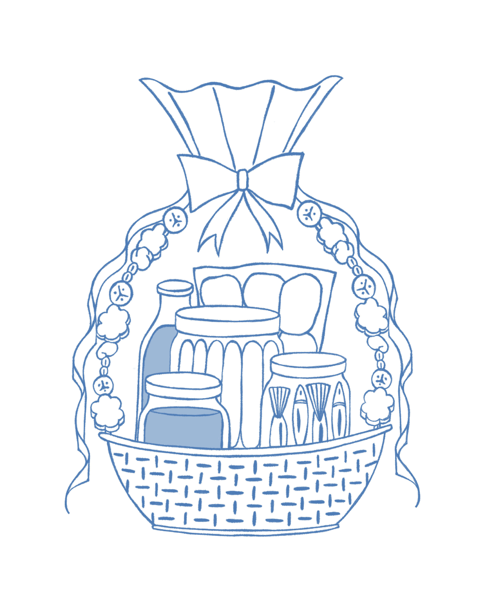
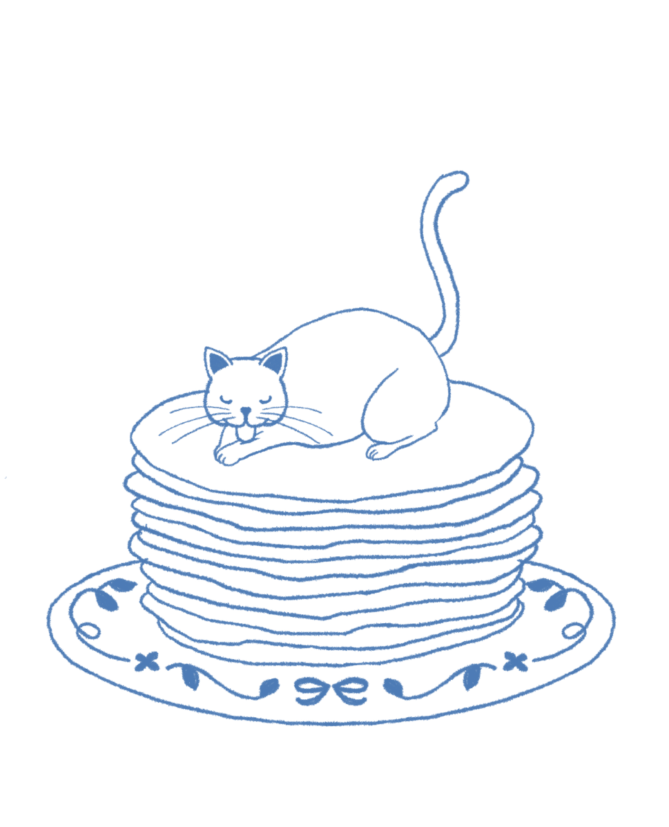
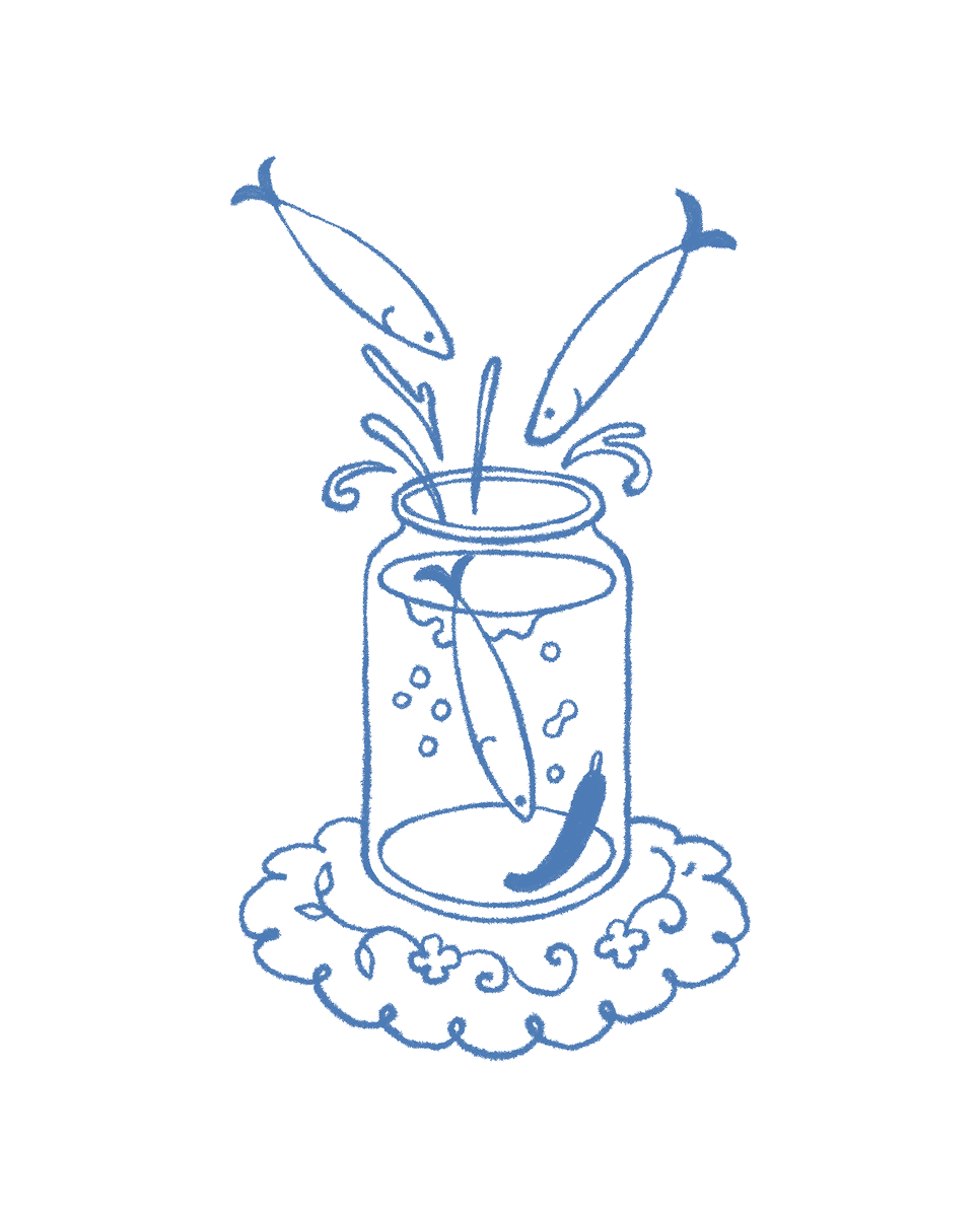
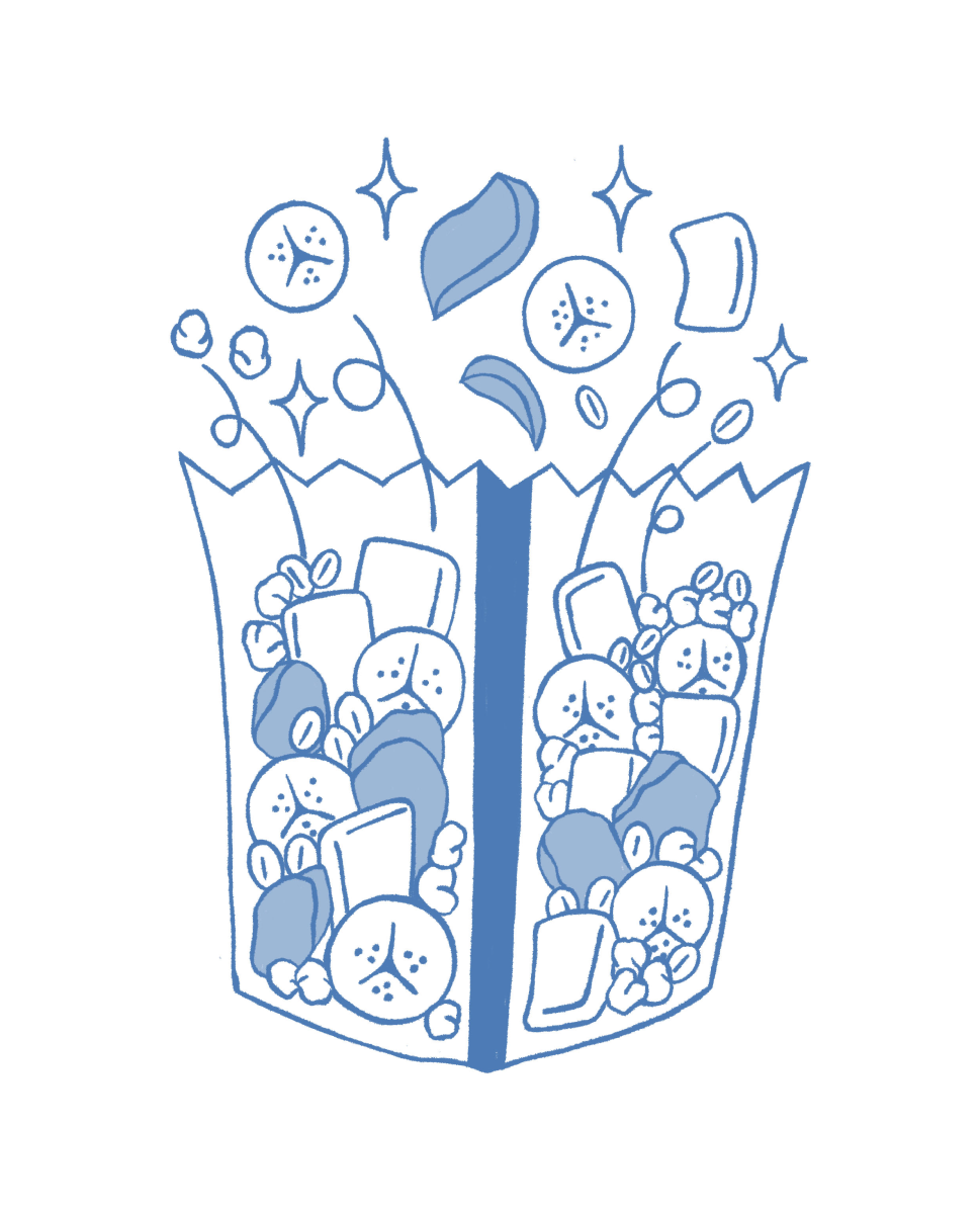
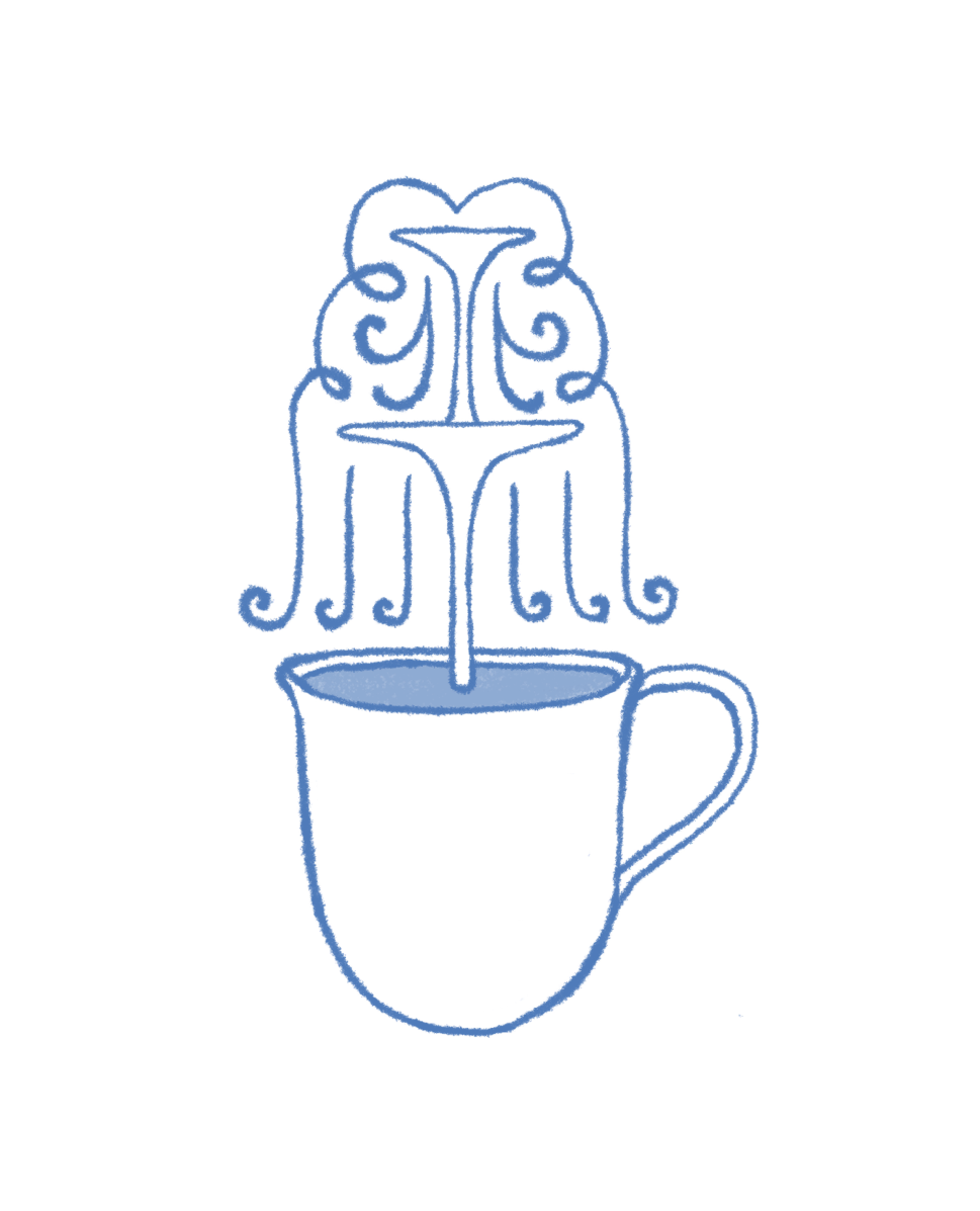
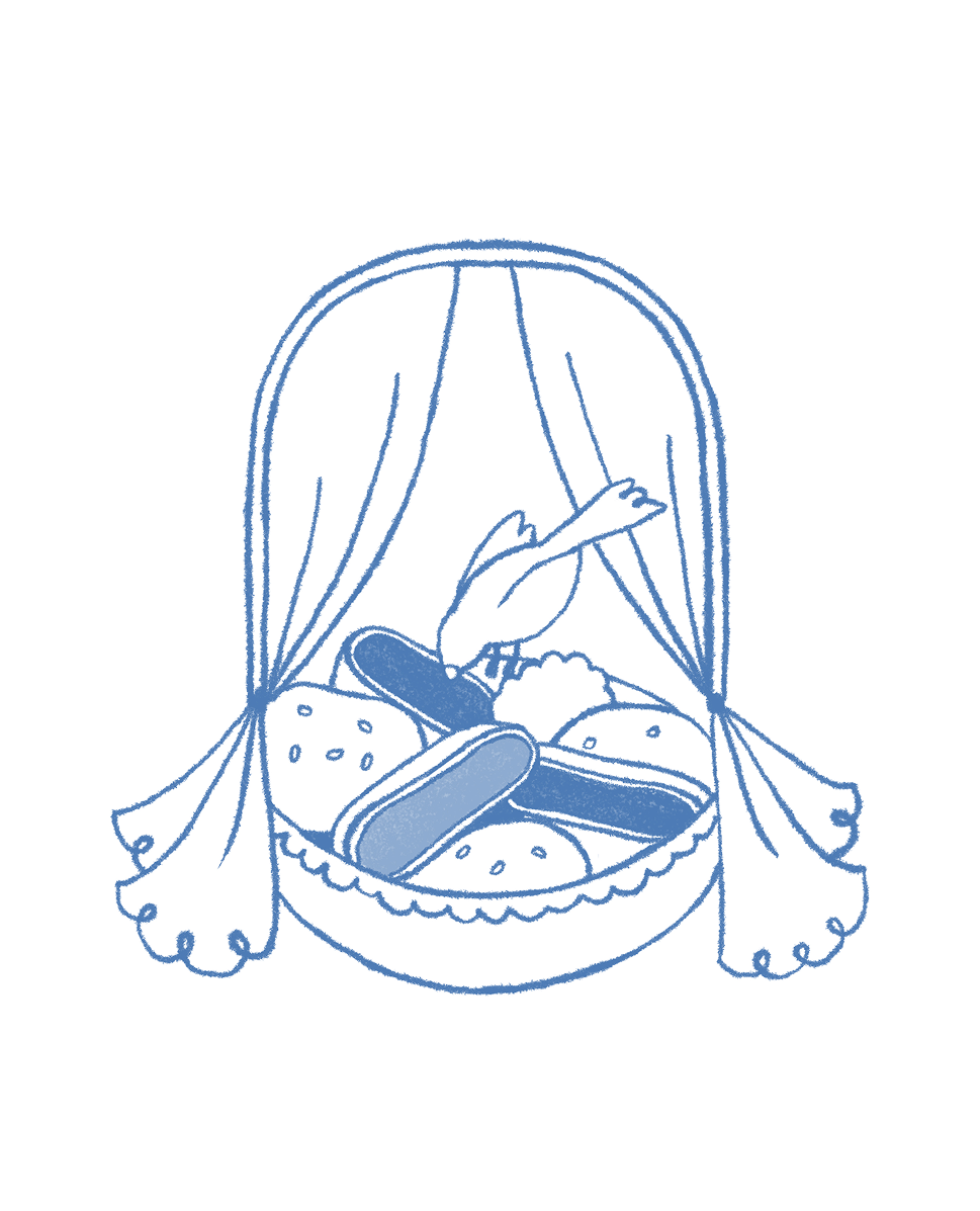
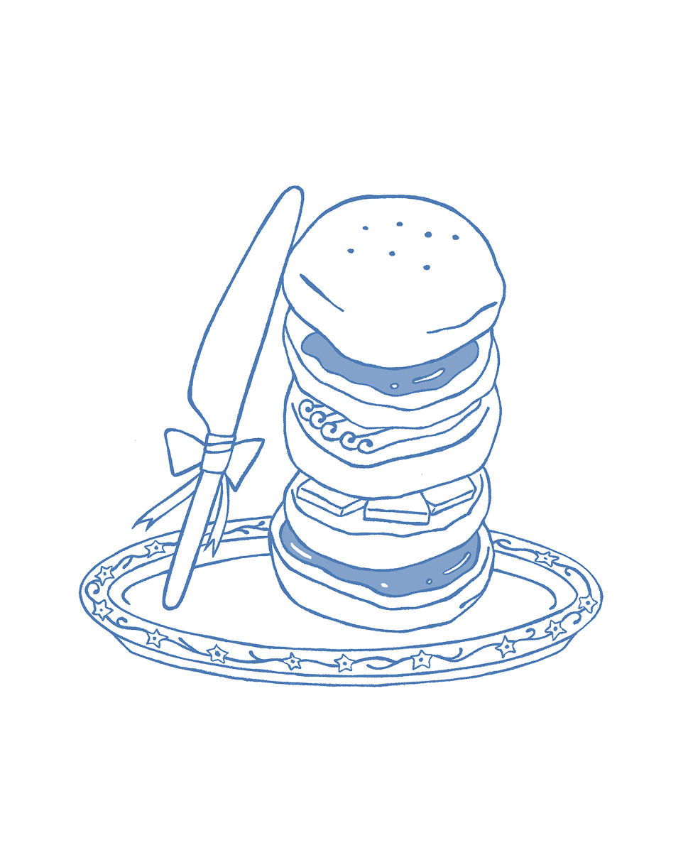
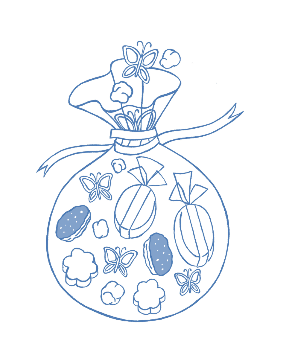
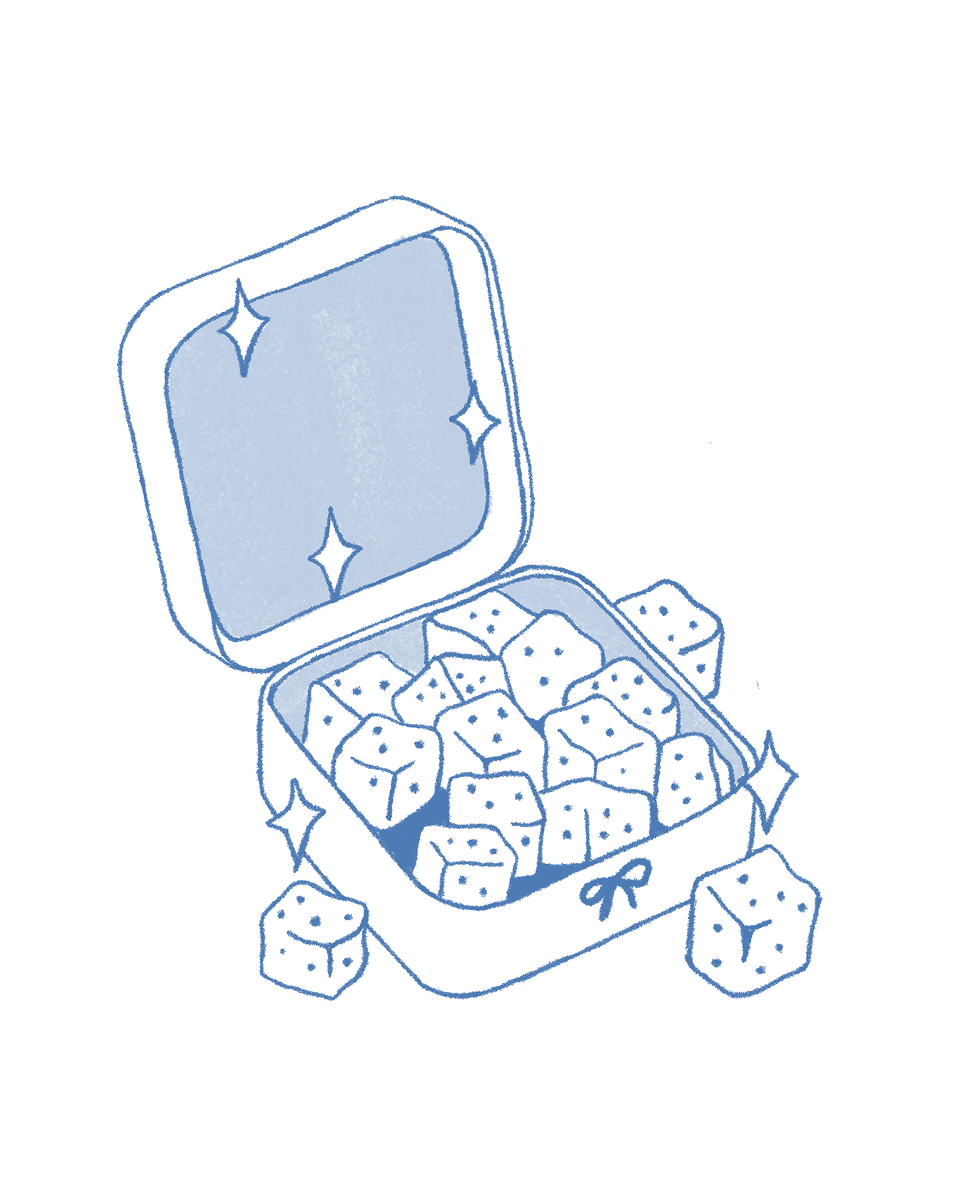
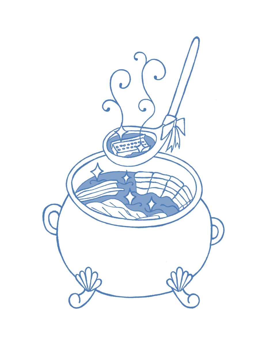
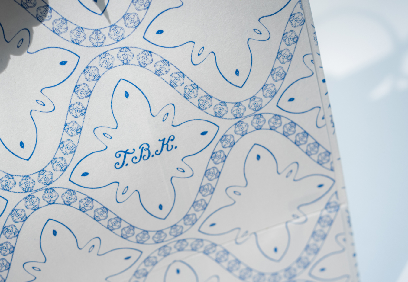
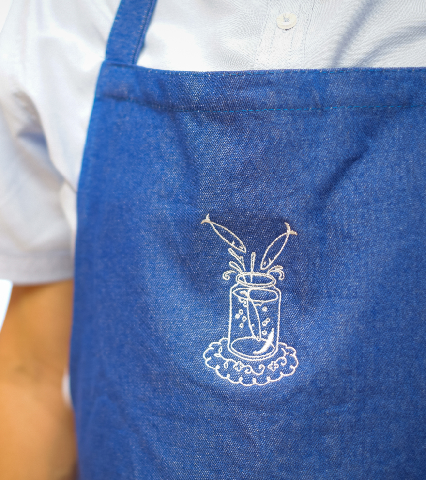
Inspired by Piña weaving and romantic embroidery, custom patterns were used to create completely unique borders and frames for The Blue Kitchen.
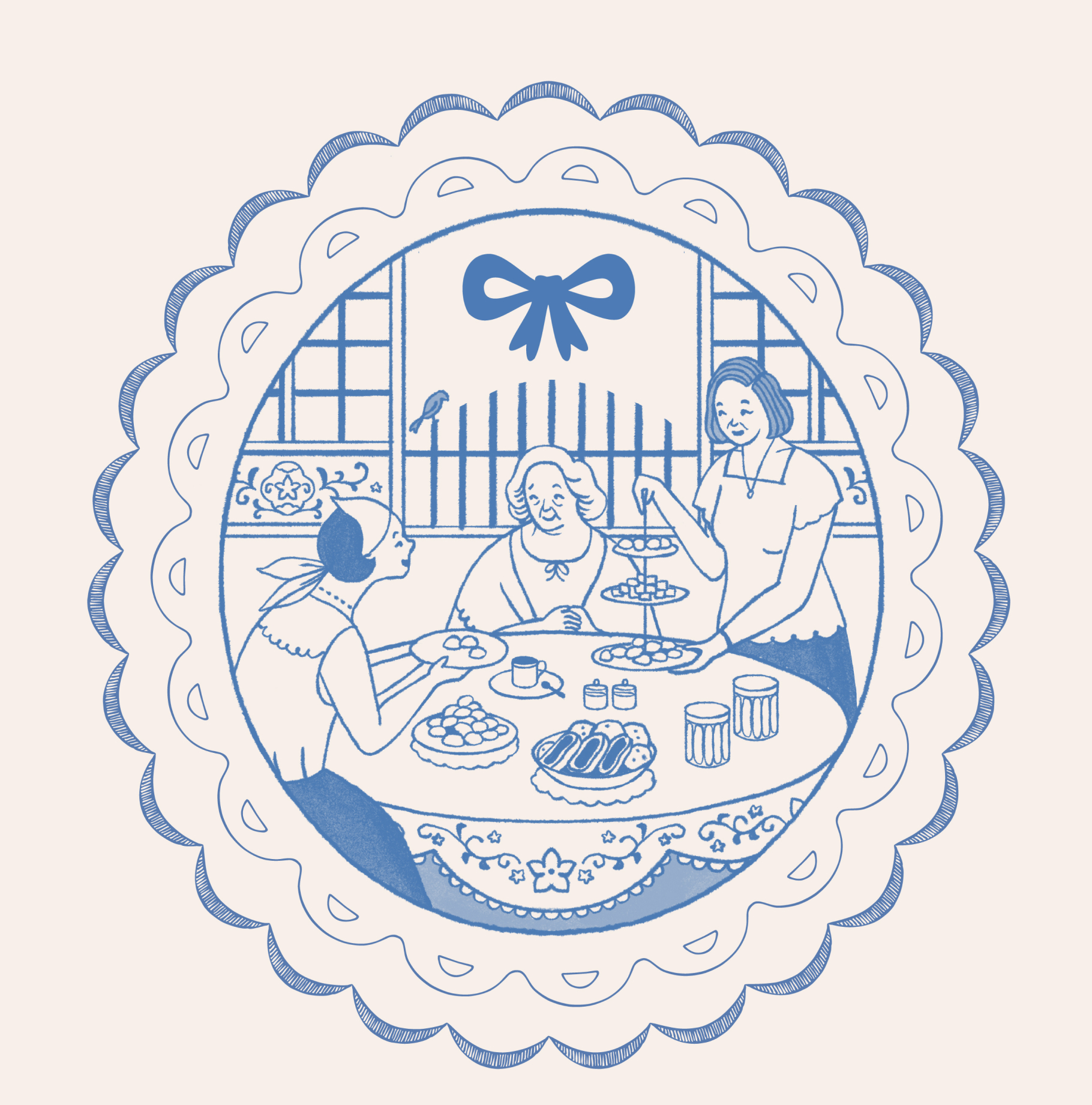
The Blue Kitchen’s Tres Marias — generations of Filipina women through which food, love, and family move and grow.
Packaging system
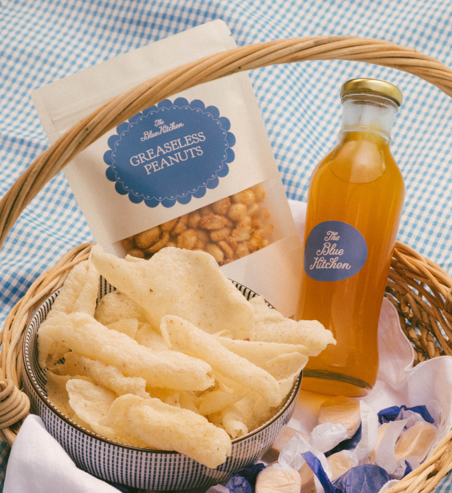
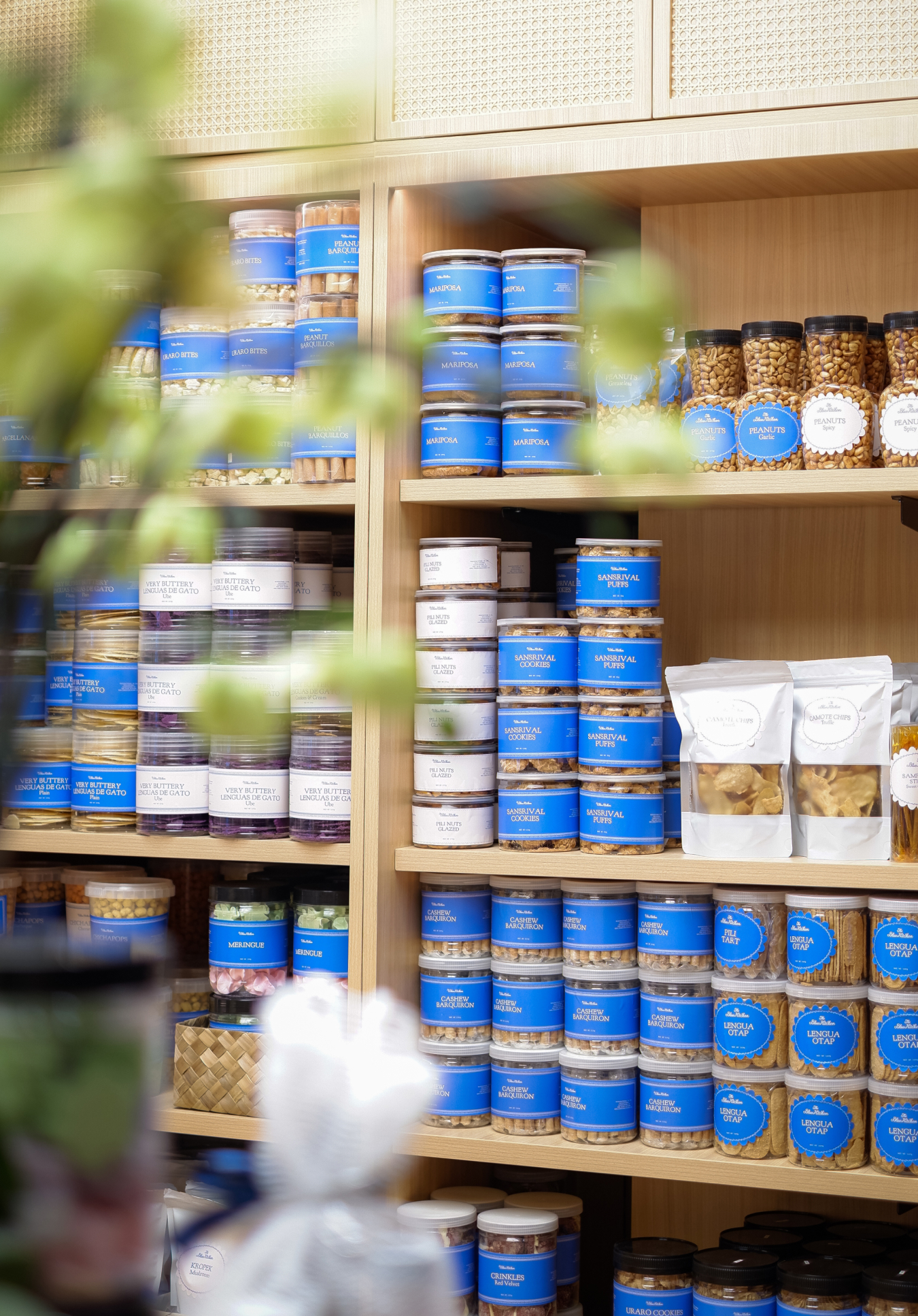
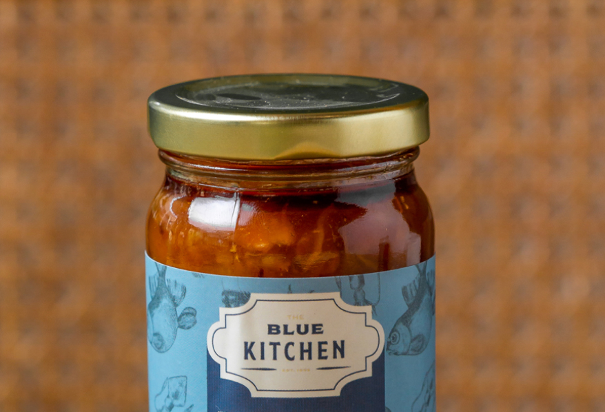
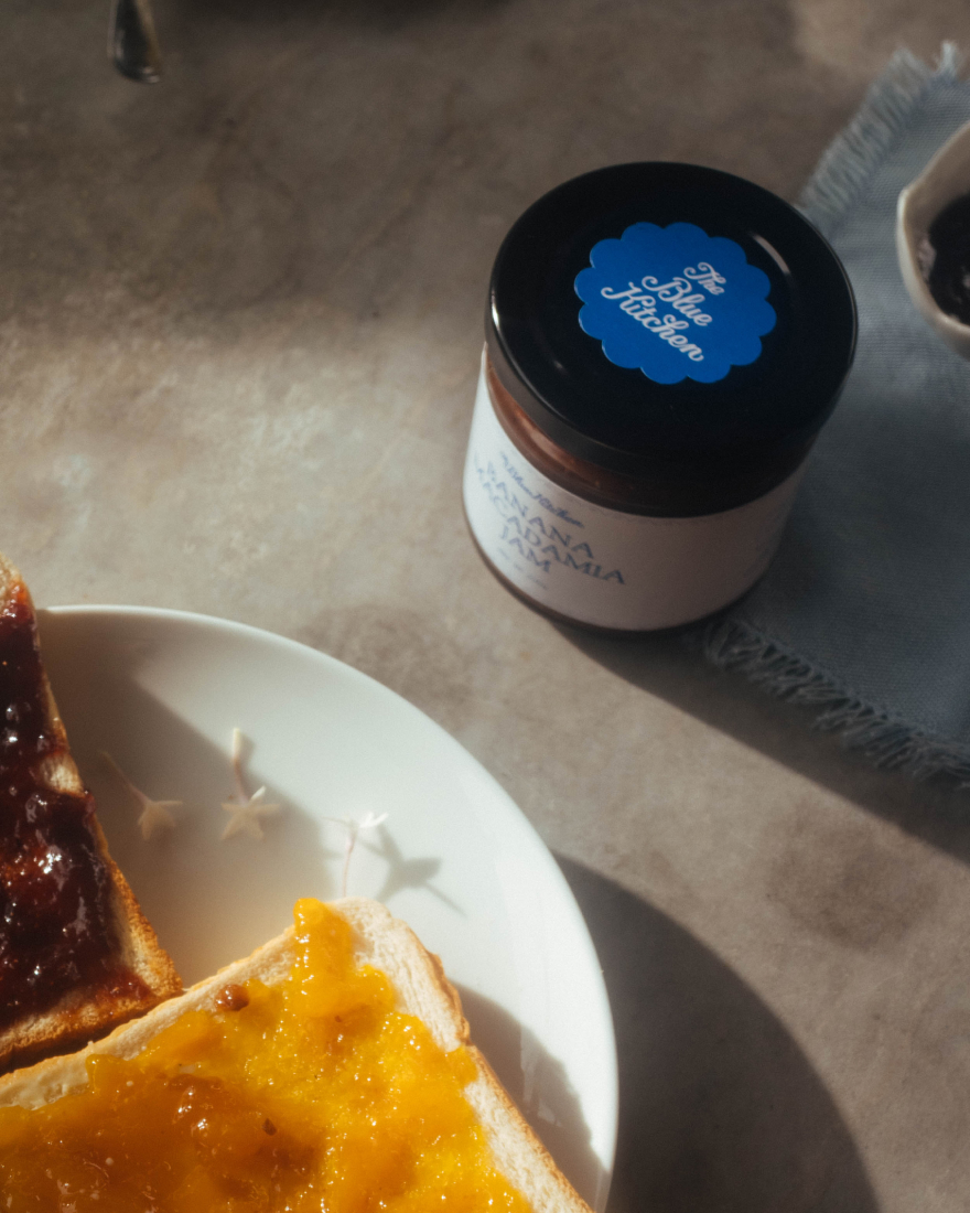
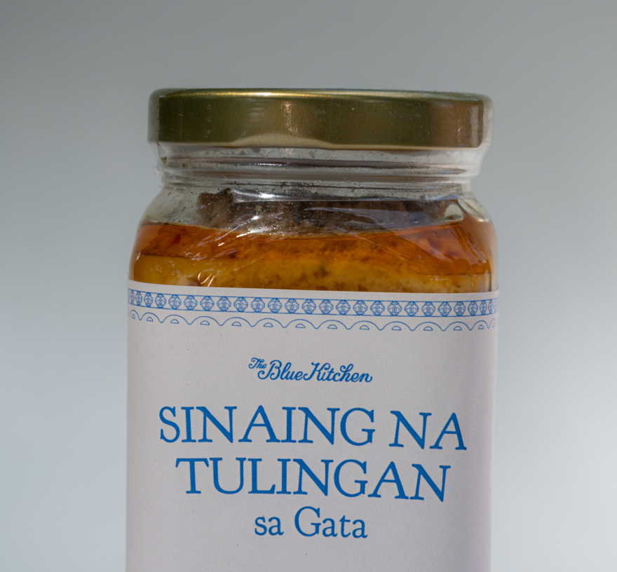
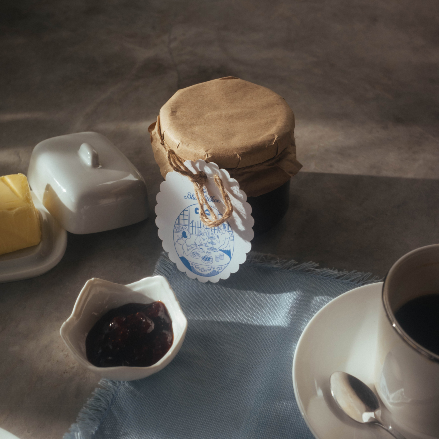
We created a straightforward packaging system for The Blue Kitchen, one that allows the textures and quality of the food inside to radiate through.
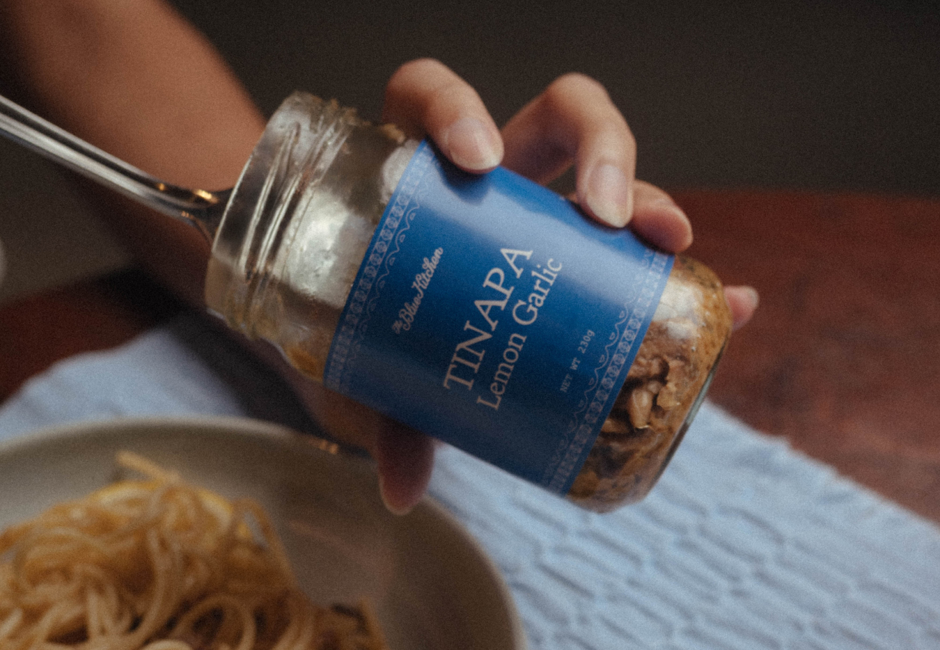
Elegant detail comes through in every TBK product, from jar to tub to bag.
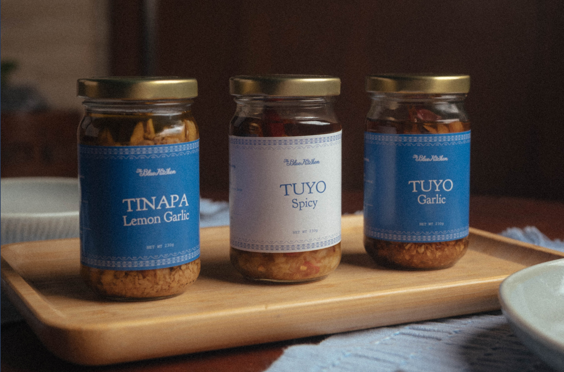
While the packaging system remains easy on the eyes, the brand’s visual elements are intricate and detailed, giving each product a nostalgic, almost storybook-like feel.
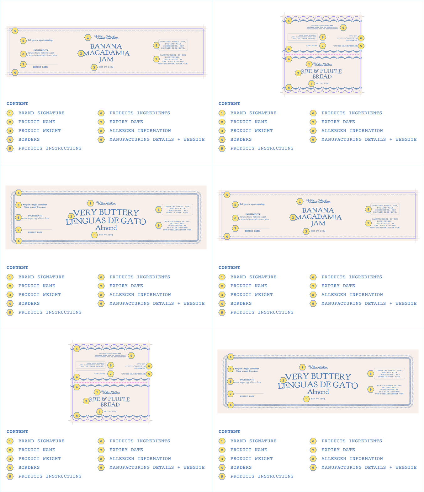


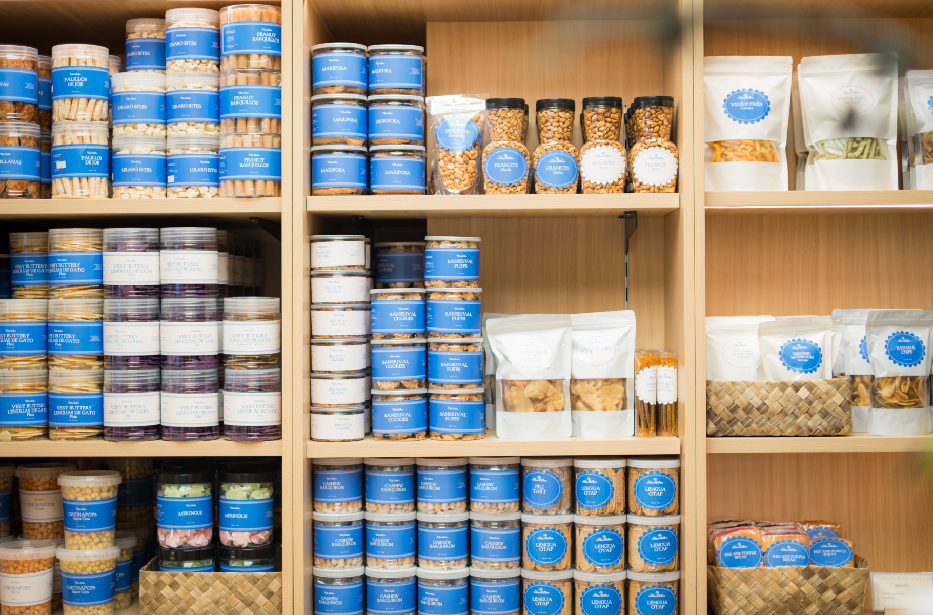
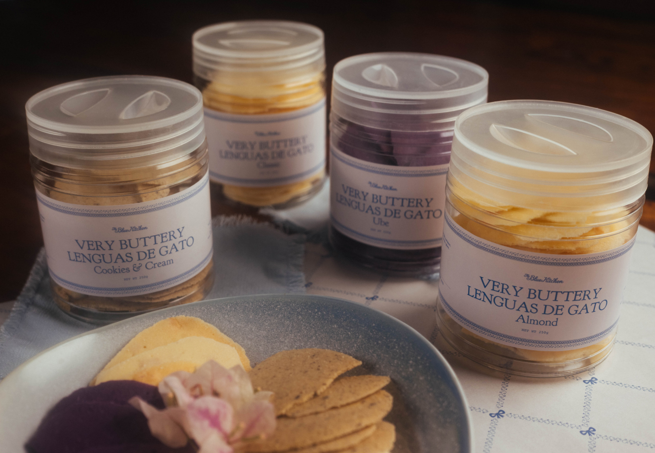
By keeping every label monochromatic, the colors and flavors of each TBK food item shines through. Our brand and packaging were not made to compete with the products, but were made to let them shine.