Archipelago
2016-2021
Branding, Identity System, Illustration, Typography, Packaging
PETRA GANA
MARK ANDRES
KAY ARANZANSO
ADDI PANADERO
We partnered with Full Circle Distillers to design the label for ARC (Archipelago) Gin, the Philippines’ first internationally awarded craft gin. Made with native botanicals, ARC balances local character with global ambition. We drew from visual art history, archival typography, and Letras y Figuras to frame a contemporary spirit with a rooted identity. The design was recognized at the 2019 Adobo Design Awards for excellence in typography and branding.


ARC is a balanced botanical gin made up of over 28 botanicals. It uses local fruits such as pomelo, calamansi, and dayap and flowers such as ylang-ylang, sampaguita, and camia. Matthew went all over the Philippines in search of the right flavors for this one of a kind spirit.
Filipino culture and landscape, distilled


With such a unique product, Full Circle wanted an identity and packaging design that matches its complexity. The label should convey the uniqueness and richness of the Philippine terroir, distilled into a bottle and showcased to the world in an authentic way.
We first looked to Flora de Filipinas by Fr. Manuel Blanco, the first illustrated compendium of Philippine botanicals, for inspiration.
Letras y Figuras
We drew from Letras y Figuras, a painting style with deep roots in Filipino culture, where letters are formed using everyday scenes from colonial-era life.
For Archipelago, we used this style to illustrate the gin-making process and highlight the regional origins of its ingredients. We built a custom wordmark as the foundation, with each letter depicting a scene that spells out the brand name.


Numismatic elements also play a big part in the overall look of the packaging design. It directs the custom typeface, font choice and style of illustration.


The full Archipelago wordmark depicts steps in the gin making process; from picking the produce, preparing the ingredients, distilling the spirit, to finally enjoying the drink.
We also expanded the characters to a whole alphabet, showing a more well-rounded image of the Philippine archipelago.


Label Design
The label reveals key ingredients and origins woven into the artwork, like Benguet pine, pomelo, and sampaguita. The Lava Rock Vodka was named after the volcanic rocks sourced from Taal, which are used in the distillation process to create a distinct flavor profile.


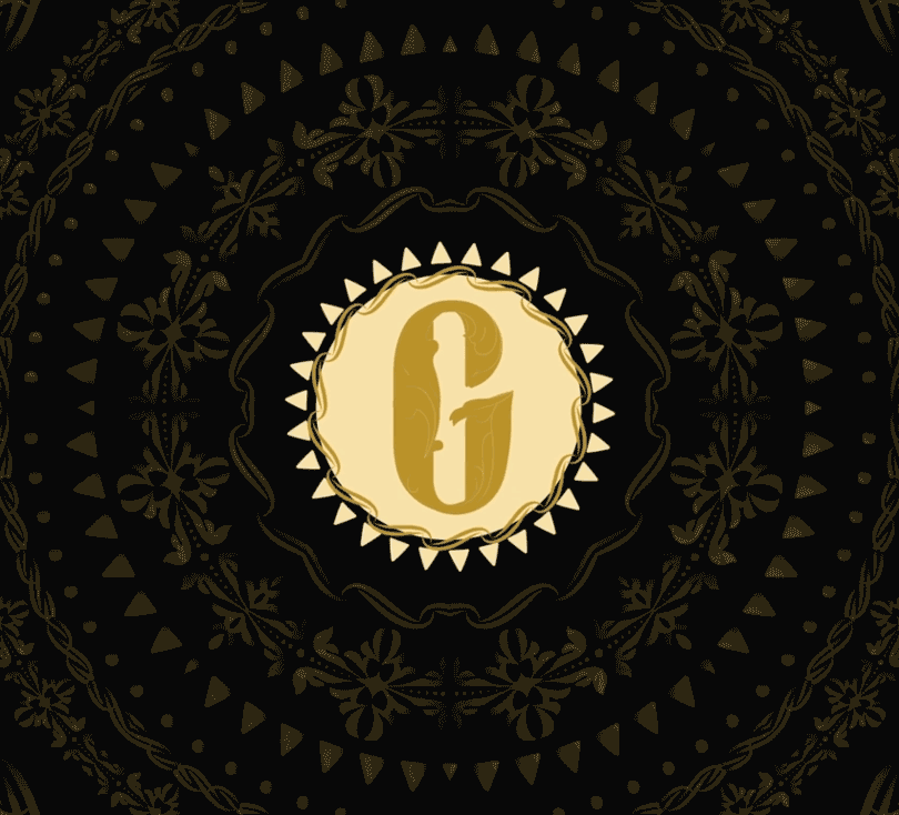
We also designed an emblem for Archipelago's distiller, Full Circle Craft Distillers.


The label we designed for Archipelago was awarded at the 2019 Adobo Design Awards for excellence in typography and branding.