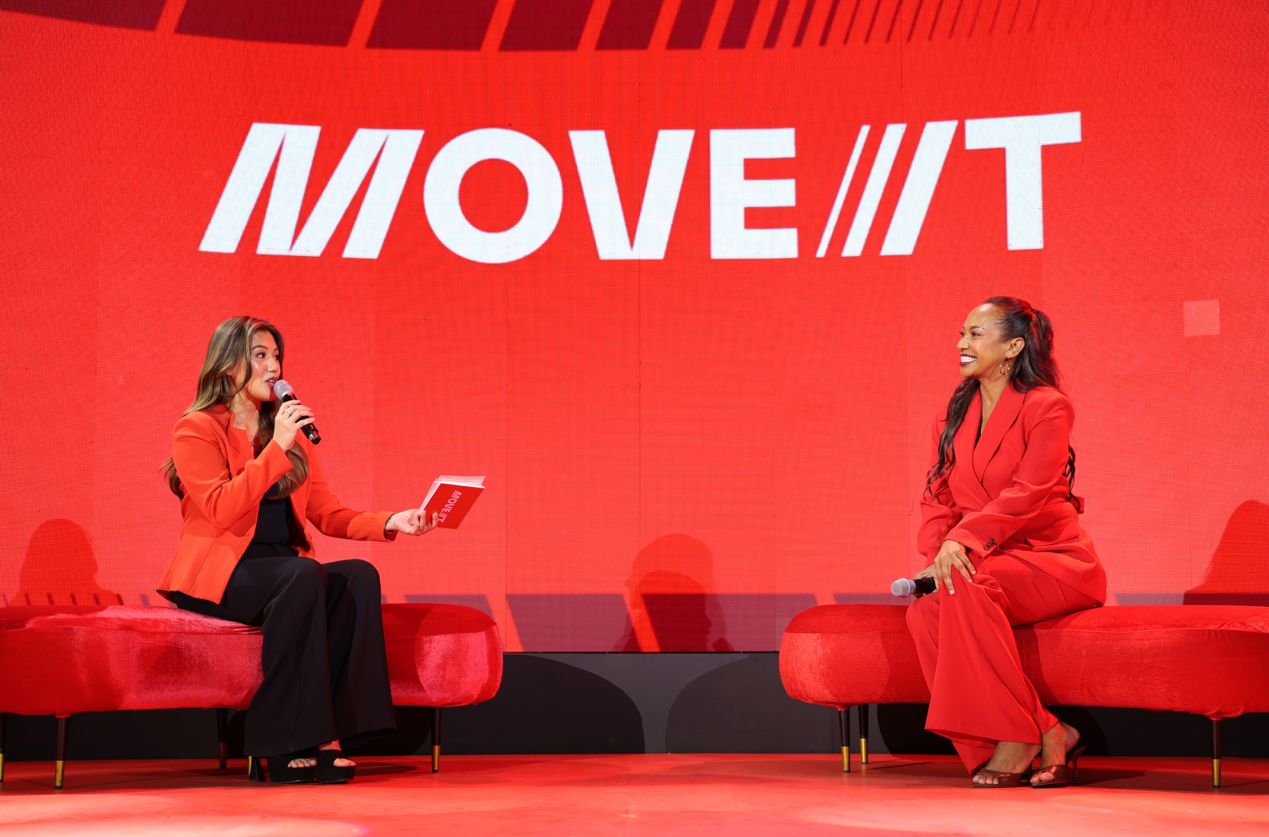
Move It
2026
BRANDING
BRAND IDENTITY
Benjamin Abesamis
Jenny Rala
Sofia Abrogar
Tim Lopez
Mark Andres
Jo Malinis
Craig Halili
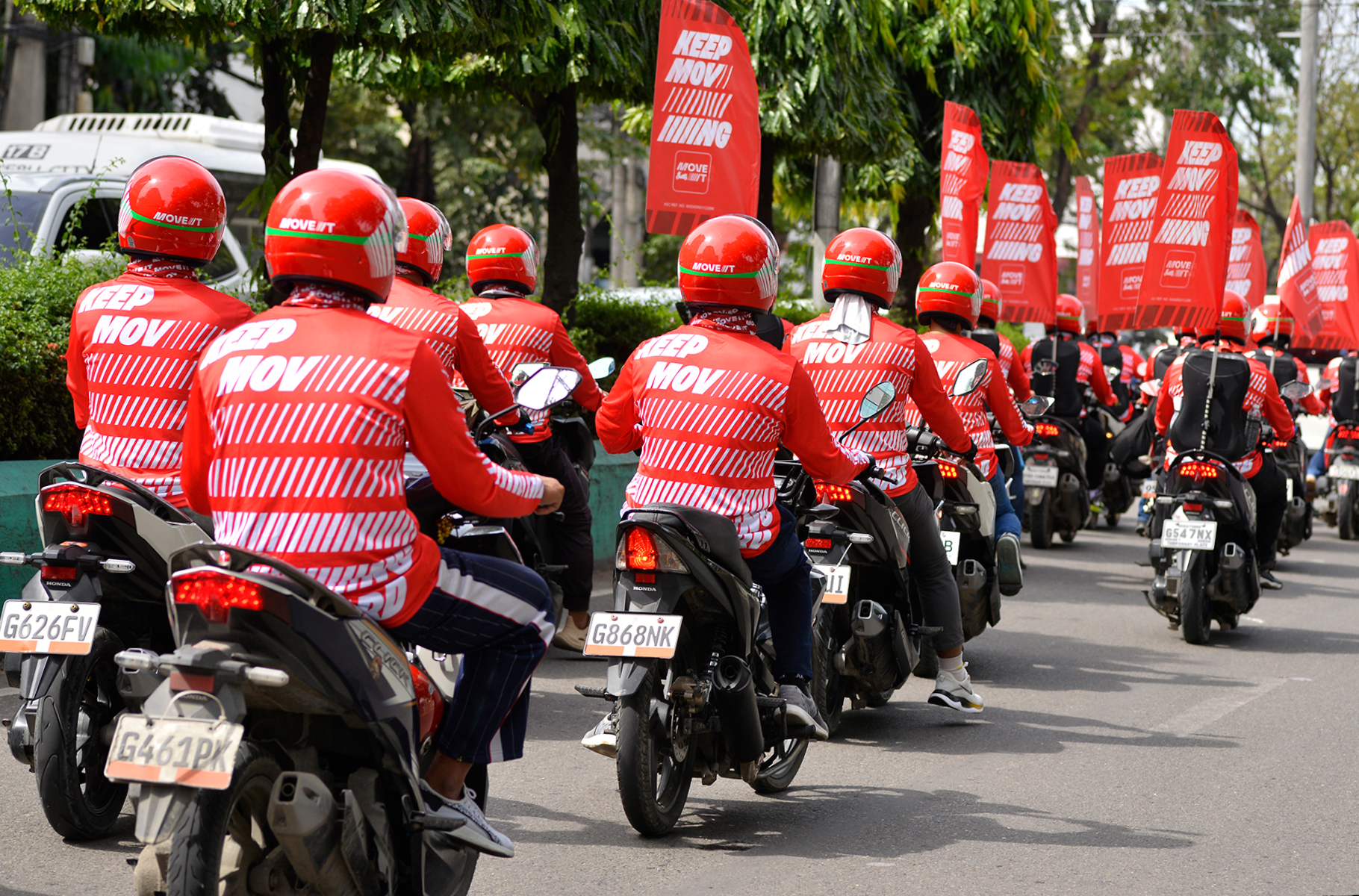
As more and more Filipinos begin to choose moto-taxi rides as their transport of choice, Move It saw an opportunity to strengthen their credibility as the country’s leading two-wheel provider.
By reimagining the visual language of speed, safety, and solidity, their rebrand now positions them as the modern Filipino’s loyal teammate in winning their time back.
How might we reposition Move It as the smart transport choice for working professionals?
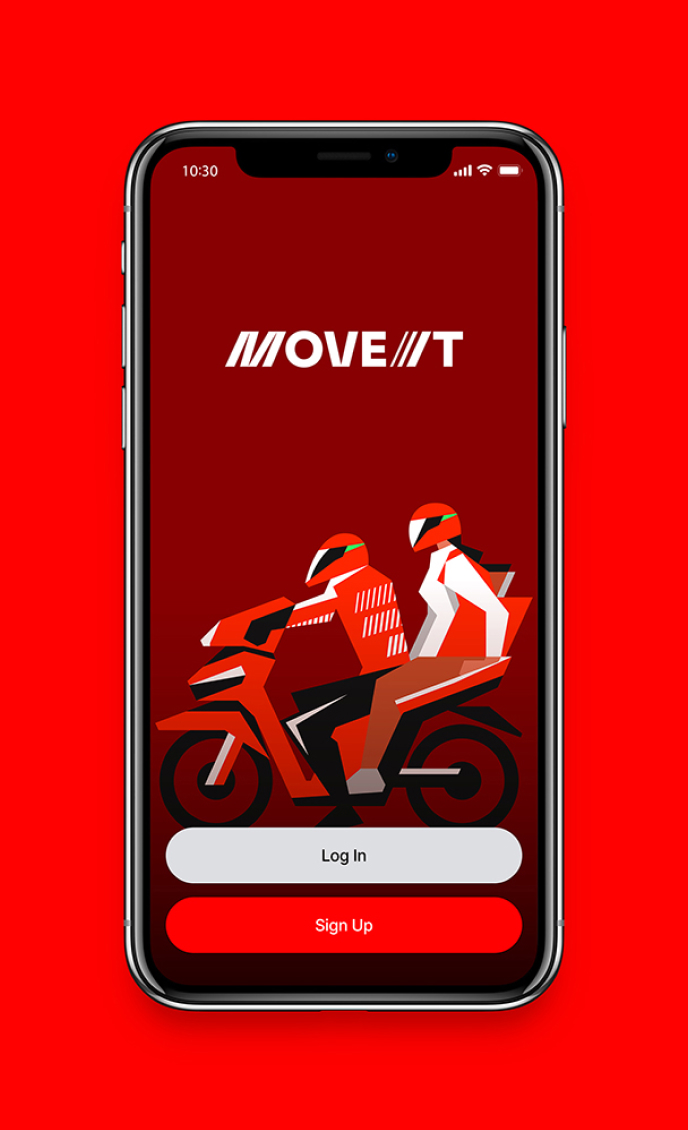
An identity that matches the speed & movement of the country’s top moto-taxi app.

By using bold, confident, and straightforward elements, our rebrand aimed to more clearly communicate Move It’s commitment to speed and reliability.

An ambitious spirit and intentional sense of pace — these concepts are made visual throughout Move It’s identity.
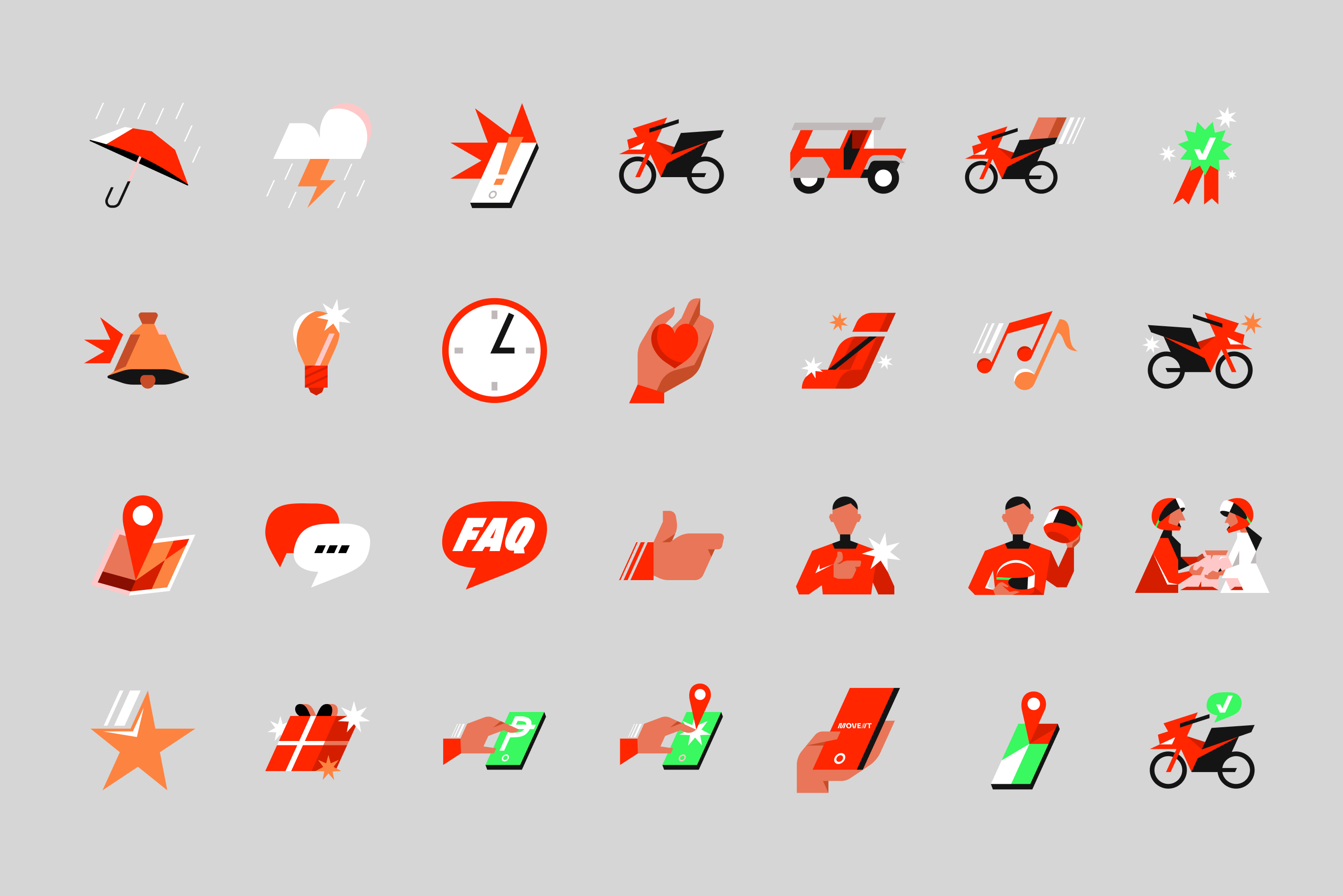
Visual Elements
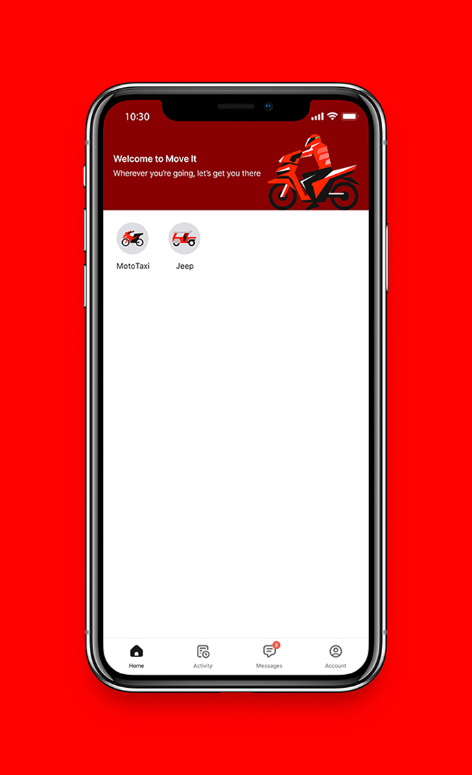
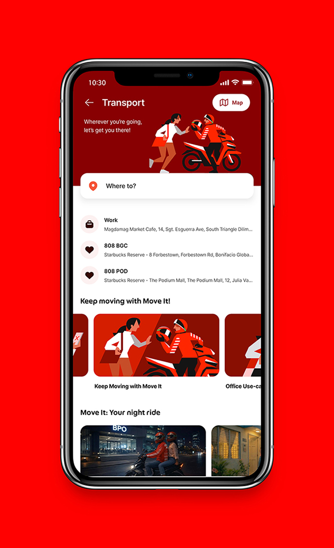
Playing with bold colors, dynamic type, and punchy imagery, our rebrand gave a fresh face to the old friend that many Filipinos have already found in Move It.

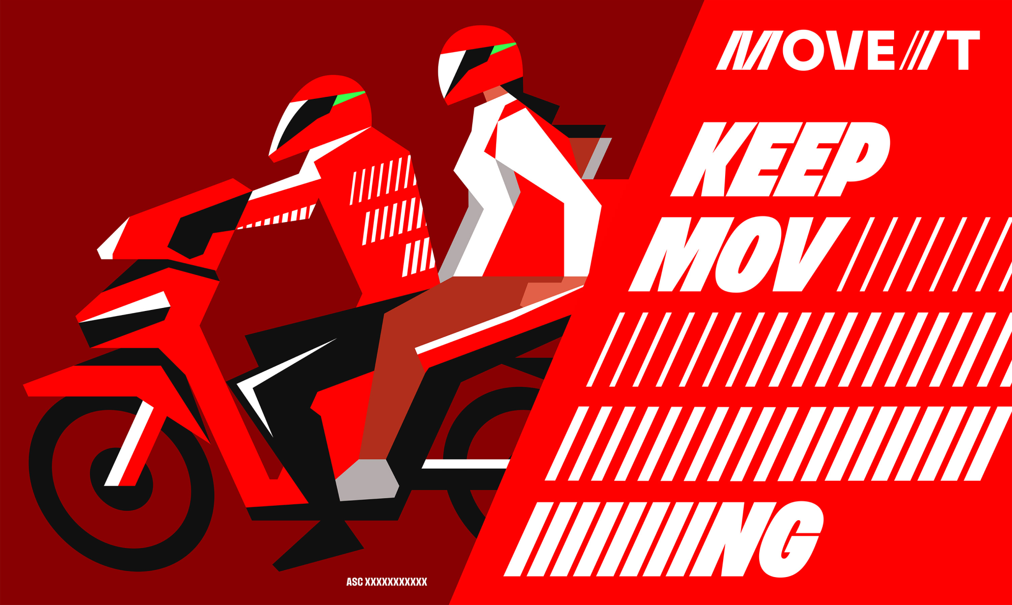
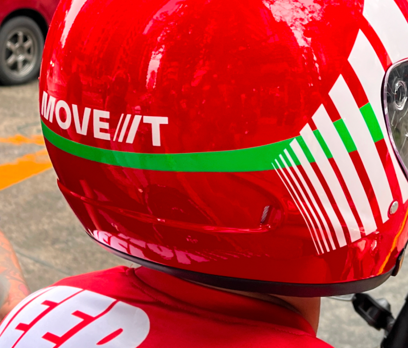
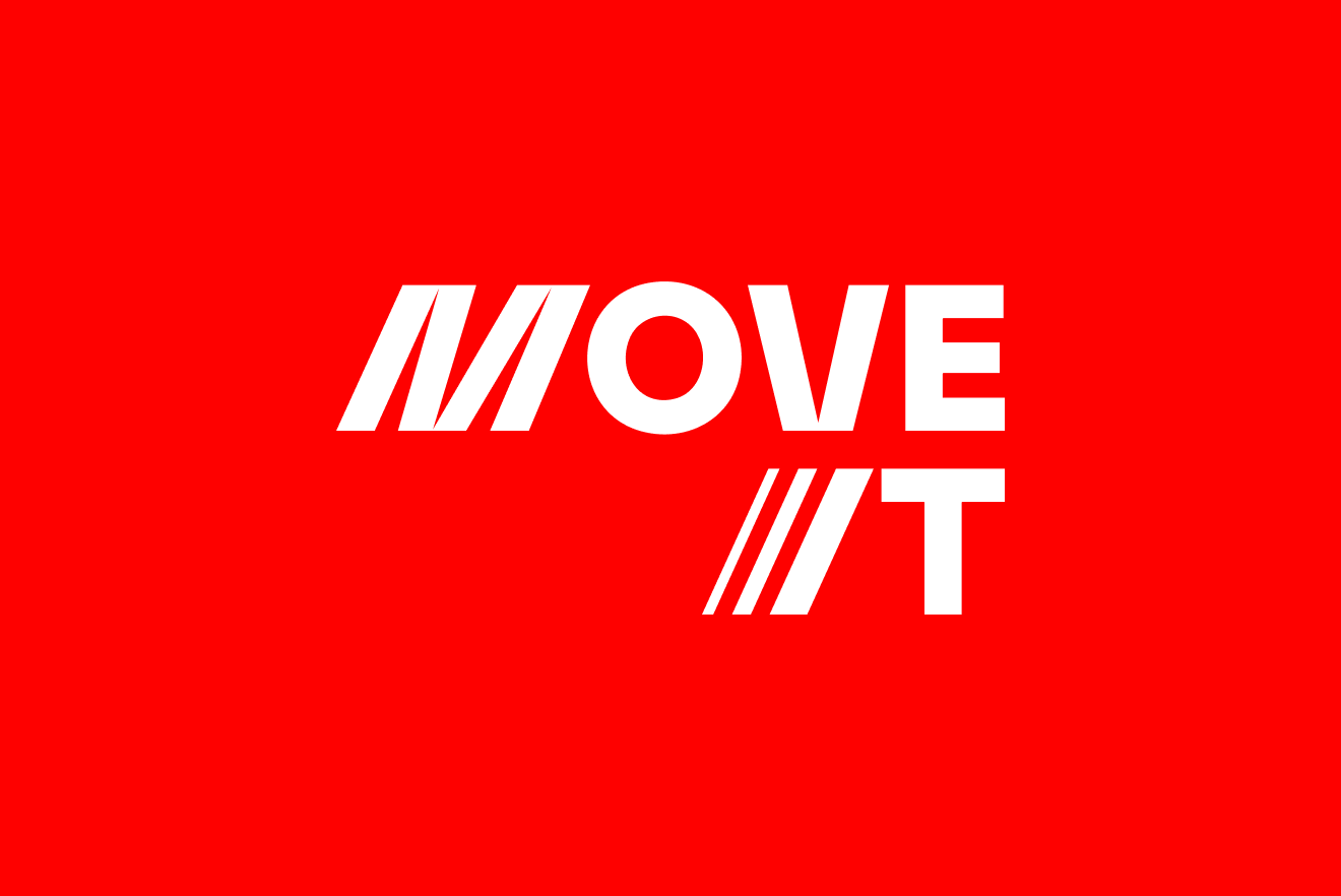
Move It’s commitment to speed and reliability are communicated through the confident red and bold typography that run through the brand.
The type and key visual shapes strengthen each other when used in tandem, effectively showing movement through simple cascades.


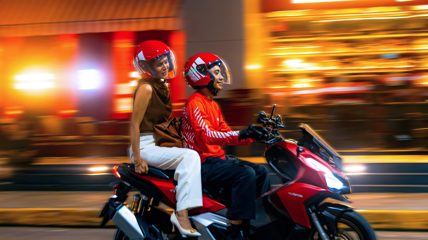
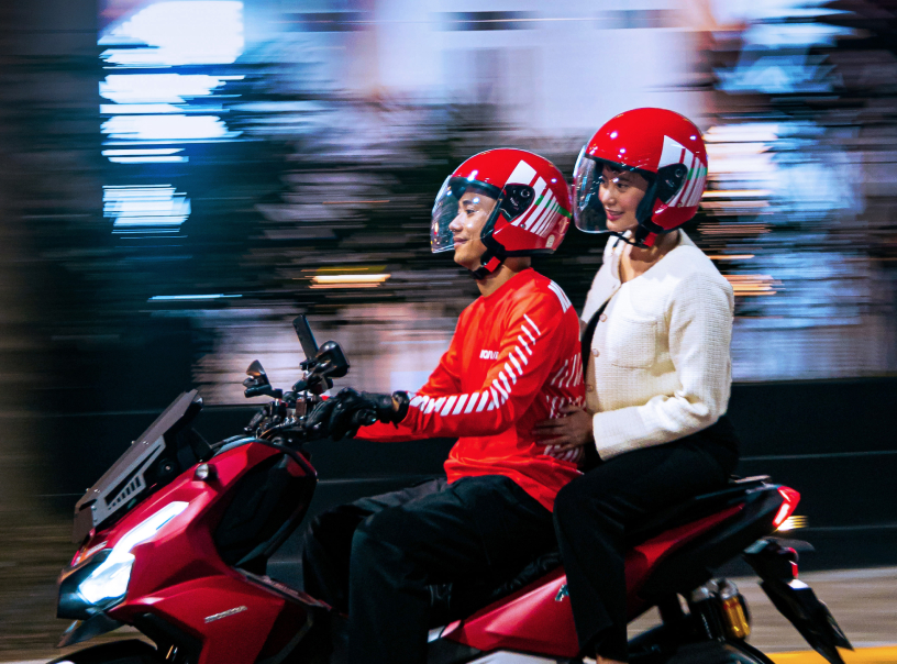
Motion blur, light streaks, and tilted angles in its photography style bring out the brand's speed and dynamism.
Application
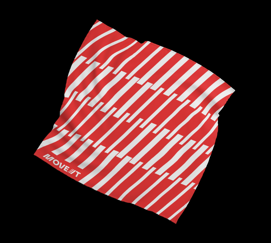
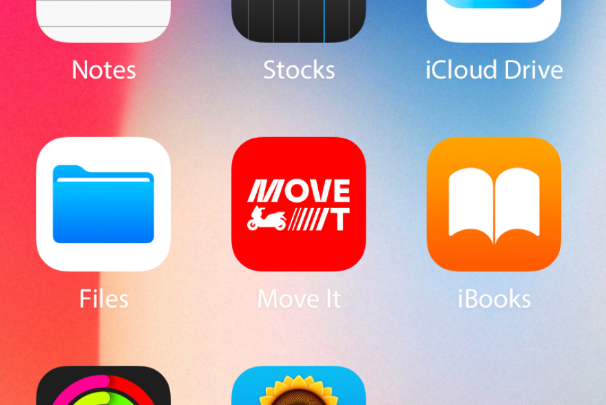
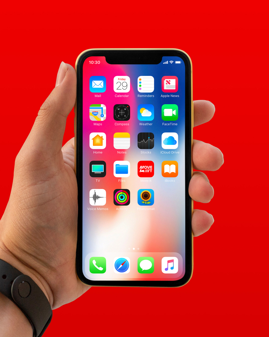
It was crucial to the rebrand that the new visual system flowed seamlessly from digital applications, such as the Move It app, to printed applications like billboard placements and other marketing materials. We used tight animation to bring the brand’s new elements to life as Move It appeared in high-traffic areas and transit hubs.
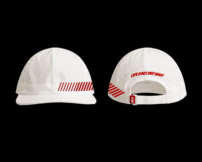
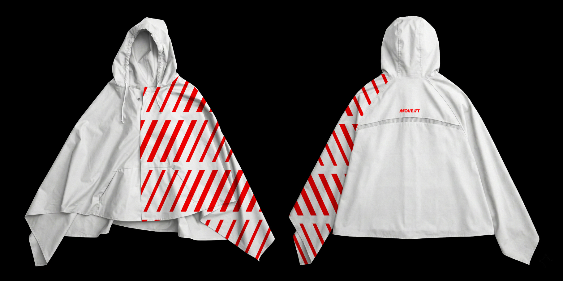
Move It was also committed to creating a lifestyle line for the brand, allowing us to create more playful takes on the new identity for relevant merchandise like scarf, merch, and poncho.