Glorietta
2025
BRANDING
BRAND IDENTITY
Benjamin Abesamis
Petra Gana
Jayrene Cruz
Tim Lopez
Mark Andres
Jo Malinis
Long established as one of the most connected malls in Makati’s CBD, Glorietta has served as a key meeting point for city life for decades. Looking toward the future, Ayala Malls saw the opportunity to transform this icon into a vibrant urban hub—one that better reflects the energy, movement, and convergence of the city’s communities.
How might we activate Ayala Malls Flagship Stores as the vital centers of vibrant city activity and movement?
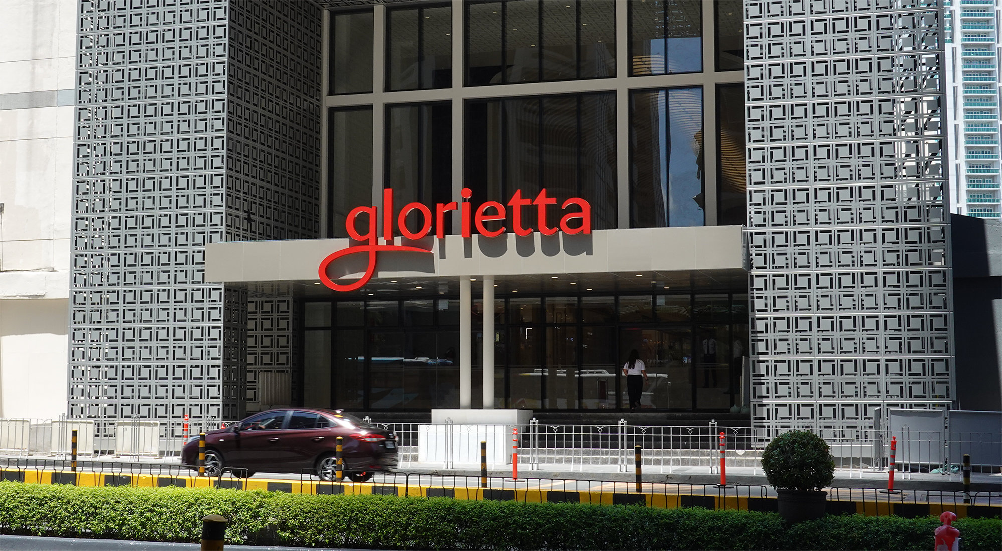
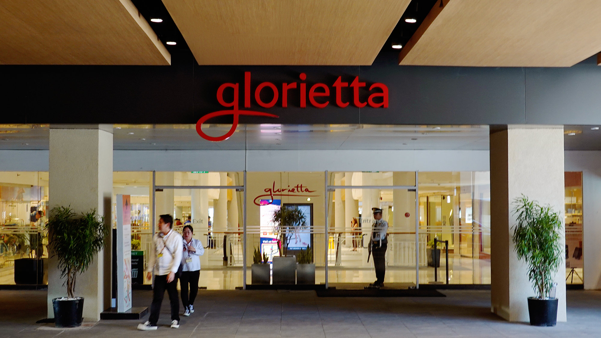
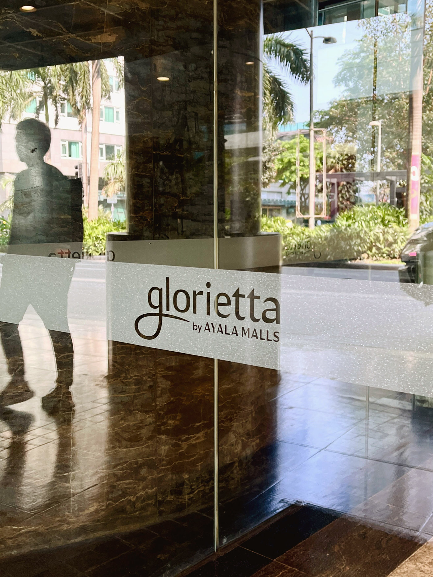
Our rebrand considered the history of the wordmark, retaining the iconic flourish of the 'g' while applying our custom Ayala Sans.

Logo
Glorietta was reimagined as The Heart of Activity—the city’s center of gravity, where movement, energy, and people converge. The visual language reflects this through a system that is dynamic, electric, and brimming with life.
The Heart of Activity
The Glorietta logotype features the mall’s name in Ayala Malls Display Regular.

The ‘path’ is a continuous visual element stemming from our primary key visual, Enriching Spaces, which draws inspiration from the organic forms and sprawling architecture found throughout Ayala Malls.
Glorietta carries this “path” into its wordmark in a way that honors the mall’s history.

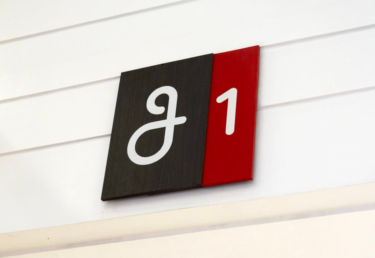
The logotype features a custom lowercase “g,” designed as a subtle nod to the mall’s previous identity.
The typography extends the bold, energetic essence of the logotype while incorporating soft, approachable details. Its flexibility in weight allows versatile applications, seamlessly adapting to the brand’s dynamic needs.
Graphic Elements & Illustrations
The movement and energy of the city come alive through Glorietta’s visual elements. Our concept of enriching spaces is expressed through overlapping, intersecting pathways that form dynamic, ever-shifting gradients. These elements function as borders, containers, frames, and backgrounds throughout the identity.

The color palette drew inspiration from lush gardens and Filipino festivals, showing a range of warm and vibrant hues.


Inspired by the brand’s key visual elements and typography, the illustration style, Dynamic Cubism, contributes bold yet elegant imagery to the assets of Glorietta.
The illustration style maximizes gradients with a bold, dynamic approach, translated into a range of scenes including close-ups, stock objects, full figures, and immersive compositions.