IM Skin
2025
Branding, Identity System
PETRA GANA
JENNY RALA
BEA PANGANDIAN
SOFIA ABROGAR
Amid misinformation and distrust in skin health, many forget that dermatologists (like all doctors) are healers by vocation. Patients are looking for long-term partners in the doctors that they choose, trusting that they can guide them back to a state of wholeness in their own skin.
This is where IM Skin comes in, bridging the gap between effective, scientific solutions and deep, long-lasting personal care.
How might we bring out the warmth and personal care of a family doctor in a professional, world-class dermatologist clinic?


IM Skin is the premier, multi-generational family clinic for cutting-edge dermatologic solutions and personalized aesthetic care—trusted across generations for their warmth, expertise, and respect for our clients.
In reflection of their 35th year, they came to the studio looking for a brand refresh that reflects both the expertise and warmth with which they treat their patients.
At IM Skin, dermatologists are masters not only of science, but of the art of healing – an intimate practice strengthened by a deep doctor-patient relationship.
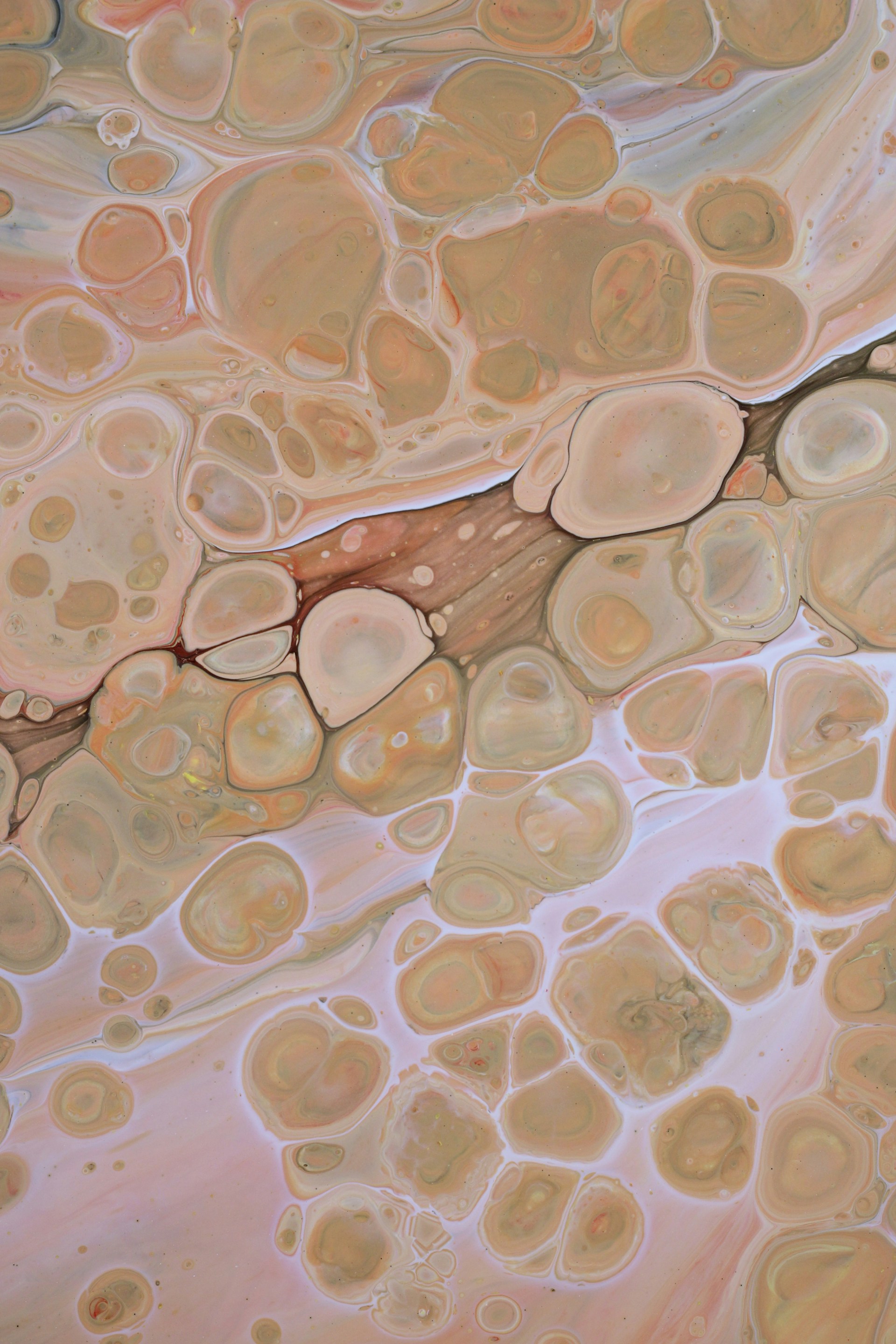
The entire identity was inspired by the different layers and cells of skin, rooted in their various shapes, opacities, textures, and hues.
Our challenge: to bring out the warmth and personal care of a family doctor in a professional, world-class dermatologist clinic.
We wanted to create a brand that went beyond the cold or sterile air of a typical clinic – an IM Skin that provided a much deeper level of care than simply treating skin. There is an emotional and deeply personal aspect to the services that IM Skin provides, especially in their commitment to long-term relationships with their patients.
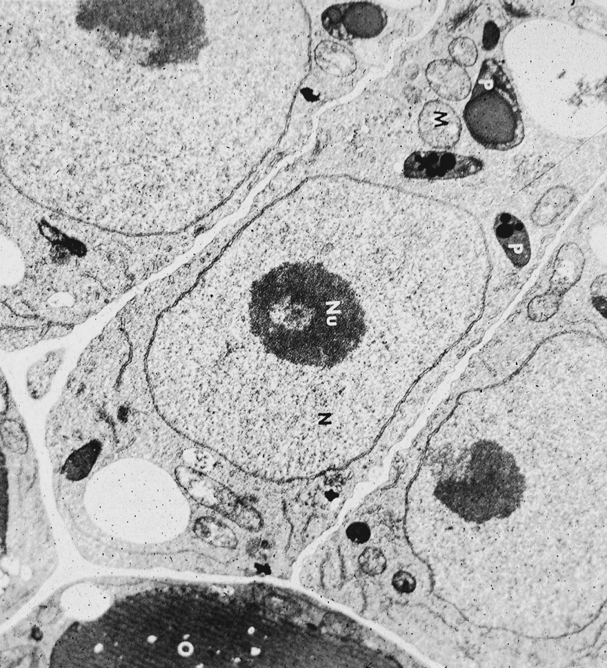
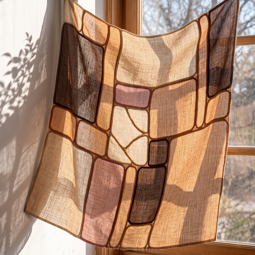
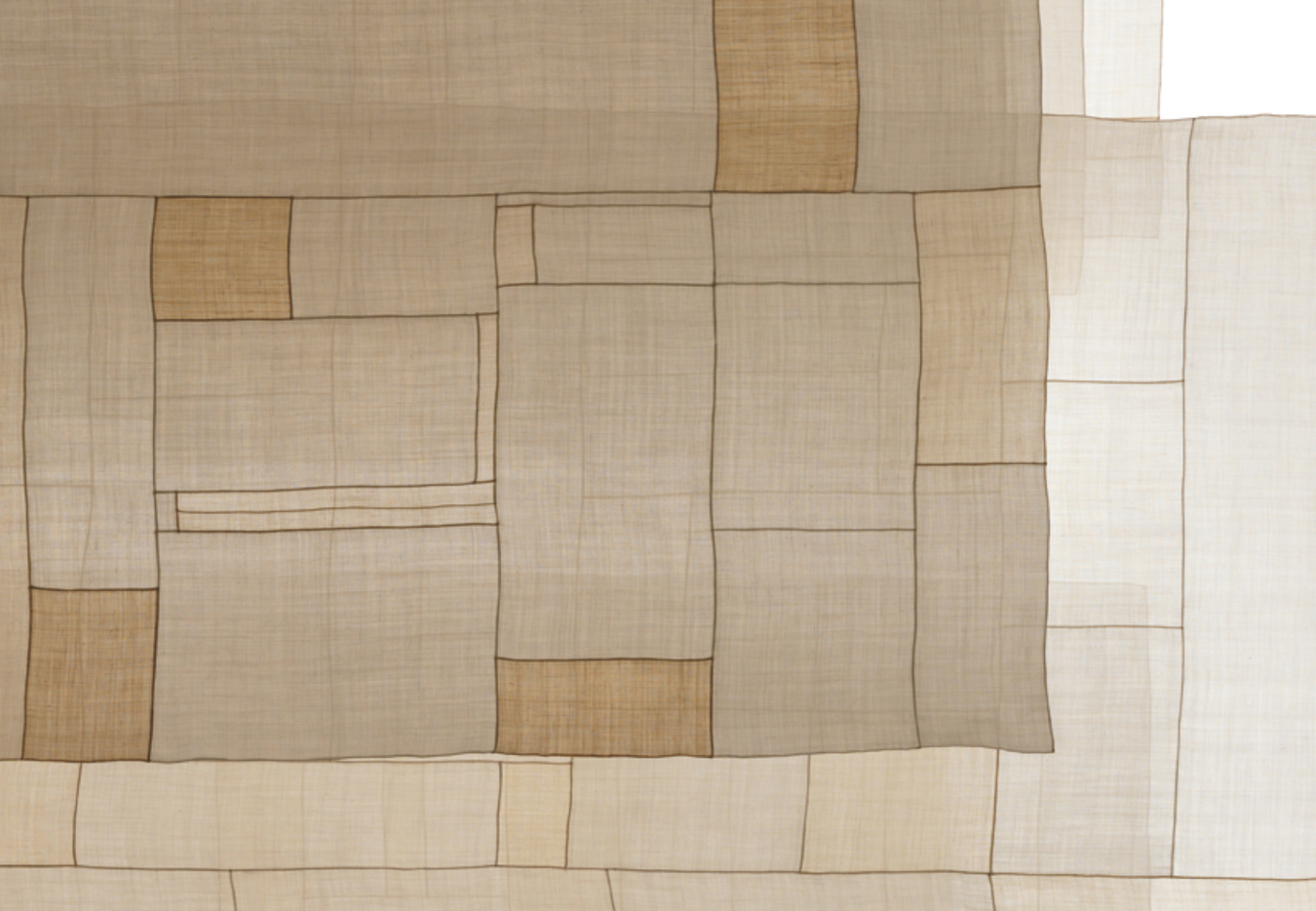
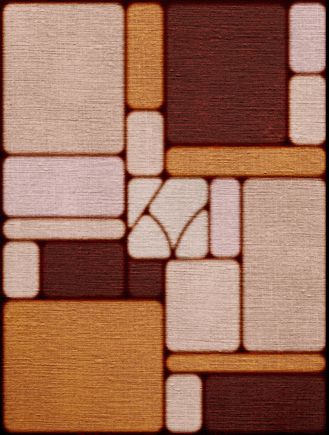
IM Skin draws inspiration from the patterns formed by the layers of the skin, and how skin cells form walls of irregularly shaped grids.
The pojagi pattern also carries a sense of lightness, translucency, and texture.
Combining both together merges science with a sense of familiarity and comfort.
We discovered that the pojagi pattern – a Korean patchwork technique that loosely resembles skin cells under a microscope – was the perfect way to visualize these scientific concepts in a more artistic way.

.gif)
At IM Skin, dermatology is not about inventing imperfections to correct, nor forcing superficial perfection. Healing here is a return to wholeness, an integrity we all are born with that gets chipped or faded by the busy-ness of life.
Use of diptychs throughout the brand are an ode to this devotion to wholeness – two images that may seem incomplete or unrelated come together to create a beautiful whole.
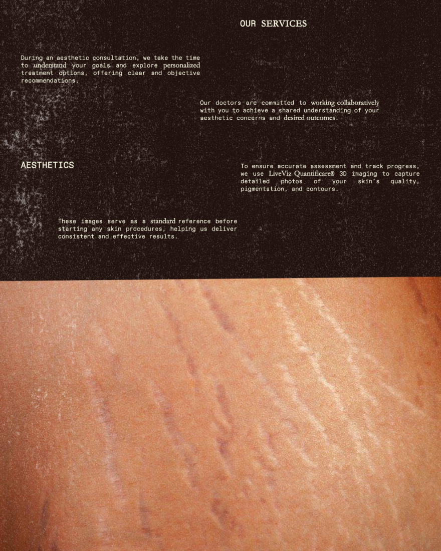

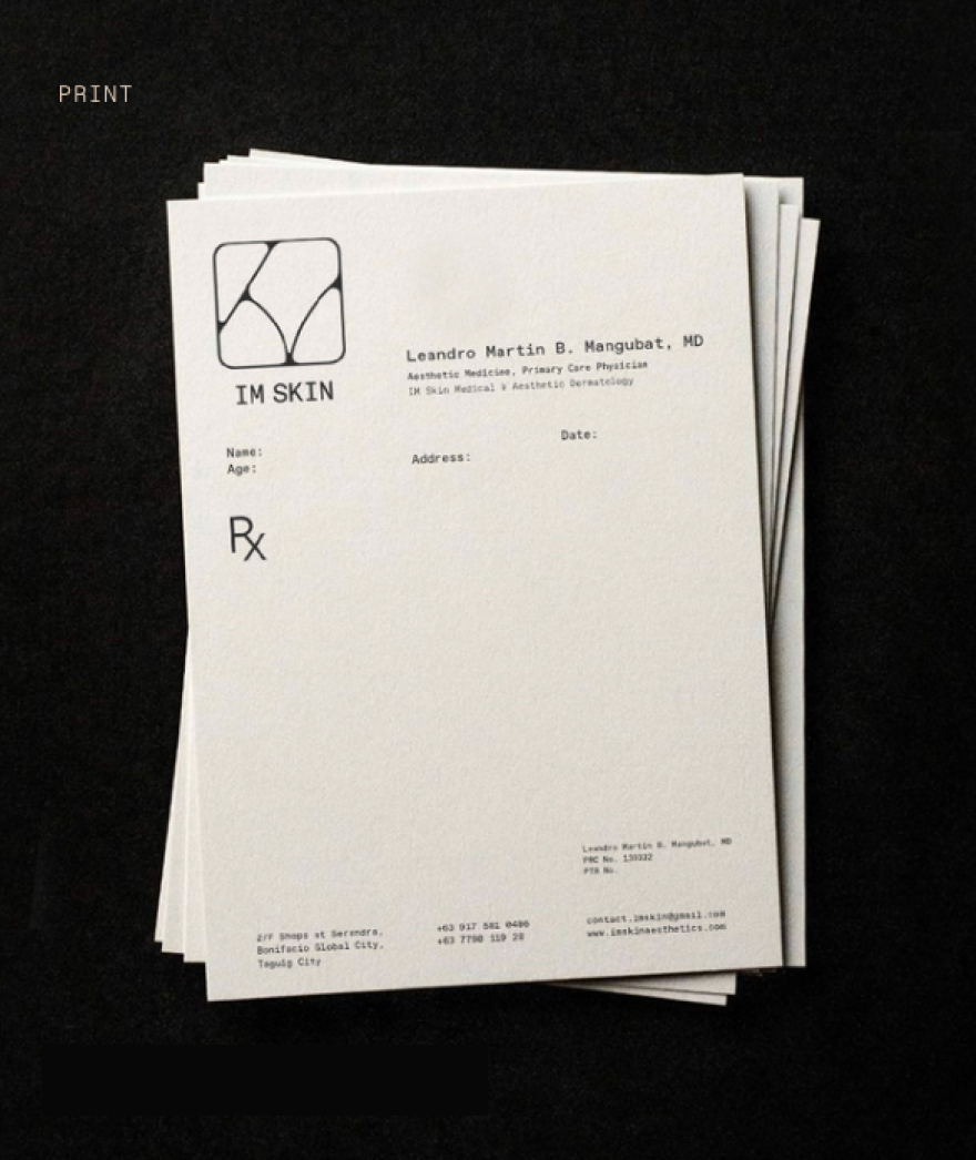
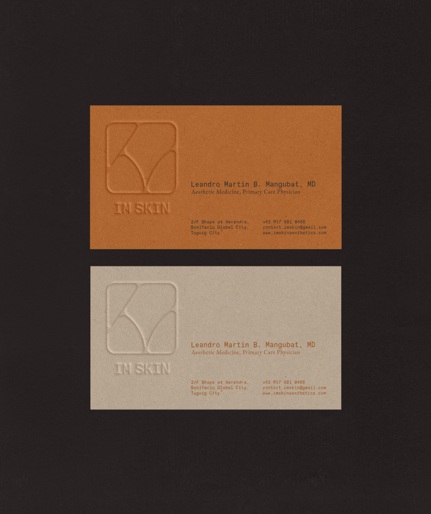
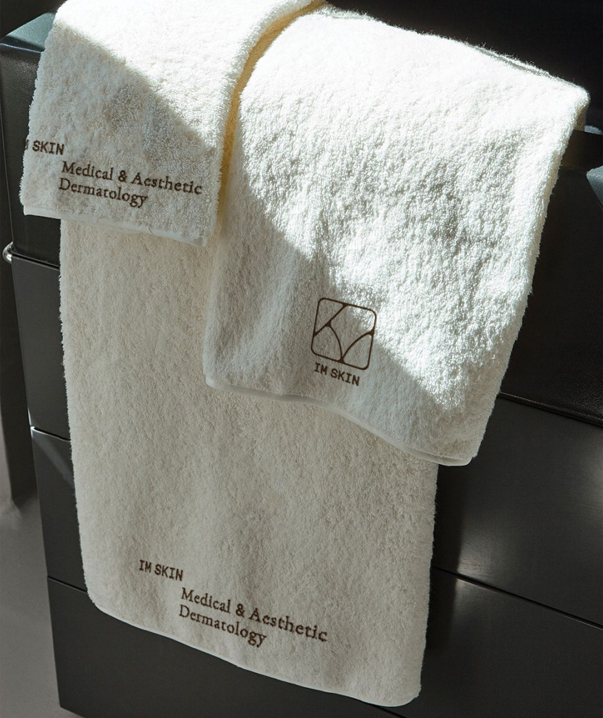

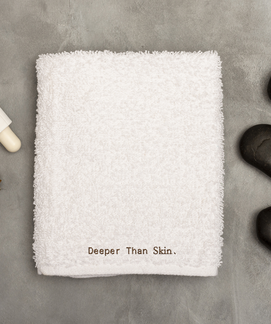

Color’s vital role in this brand is, quite literally, communicating warmth. IM Skin’s brand palette is comprised of different brown, beige, and other flesh tones that reflect the diversity of colors that paint human skin.
The brand palette intentionally strays from 1) the blacks, whites, and greys of a typical medical establishment, and 2) the flowery colors of your usual cosmetic or wellness clinic.
The combination of a humanist serif and clean monospaced type is also used to reflect IM Skin’s authority without sacrificing the intimate, personal feel that makes them unique.