Alluyon Coffee
2024
Branding, Identity System, Typography, Illustration, Packaging, Participatory Design
JAYRENE CRUZ
COI SERRANO
ADDI PANADERO
KAY ARANZANSO
JO MALINIS (C.O.P.)
JAD MAZA
Alluyon Coffee empowers indigenous Cordilleran farmers and promotes sustainable coffee practices in the Philippines. We created a brand identity that captures the spirit of alluyon, a Kankana-ey and Ibaloi term for working together as a community, especially in planting and harvesting. Rooted in the idea of shared effort and mutual support, the brand reflects Alluyon’s mission to grow with and for the people it serves.
Collaborated with:
Katya Ramos — Photography


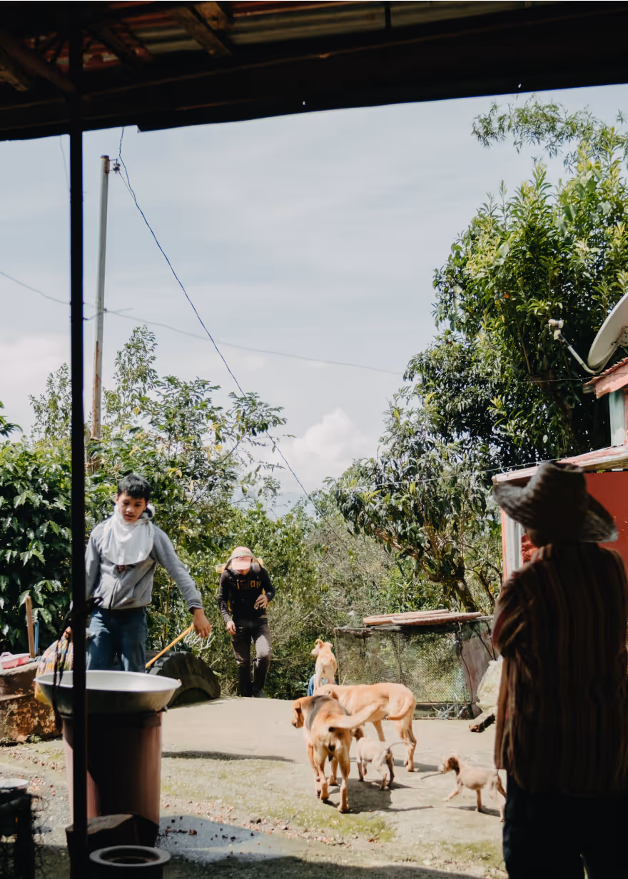
To begin the project, we met with farmers in Atok, Benguet to learn more about the coffee farming process, the local environment, and Cordilleran culture.
The branding process continued with constant dialogue with the Alluyon team and the community, allowing us to properly represent the traditional practices of the people and place.


From Root to Fruit
We crafted a brand narrative that tells the story of Cordillera coffee, from root to fruit. Indigenous coffee farmers taught us that their daily life and rituals are deeply woven into nature and community.
Coffee: The Root and Fruit of Interconnection
In the Cordillera highlands, earth, air, and water come together to nurture the coffee fruit. Grown at home and passed down through generations, coffee here is more than a crop. It’s shared labor, daily fellowship, and a living heritage. From root to bean, every harvest carries the story of land, family, and community.


To symbolize this deep connection, we designed a unique logo that visualizes the coffee fruit, the community, and the environment that sustains them.


Letters Woven With Meaning
A key feature of the Alluyon brand is its custom typeface.
To honor the Cordilleran tradition of symbol-making, we reimagined weaving as a writing tool and explored how it could shape letterforms.


Weaving tools primarily produce vertical shapes, so we used these to guide the typeface’s vertical strokes. Introducing subtle irregularities and a natural, fuzzy texture along the edges. This versatile typeface functions as both a readable font and a tribute to Cordilleran craftsmanship.
Community-Guided Brand Identity
Alluyon’s visual elements take inspiration from Cordilleran culture and the natural environment. Throughout the design process, we worked closely with the local community, consulting them at every step and seeking their guidance to ensure each element was an appropriate and respectful representation of their heritage.
We based the primary color palette on traditional Cordillera textiles, with black and red as the primary colors. Red in particular, holds deep cultural significance in Cordilleran traditions. A secondary palette of earth colors harken back to the team’s visit to Benguet.


The line patterns reflect the topography of the regions where Alluyon sources its coffee. Each set of lines draws from the motifs and colors of various Cordillera weaves, referencing the cultural identities of groups such as the Ibaloi, Kalinga, and Ifugao.


The pictograms, rendered in a hand-carved style inspired by Cordillera woodcarving, depict concepts, environmental features, and heirloom objects tied to coffee farming and local culture. Each one was developed through ongoing dialogue and feedback with the community to ensure respectful and accurate representation.


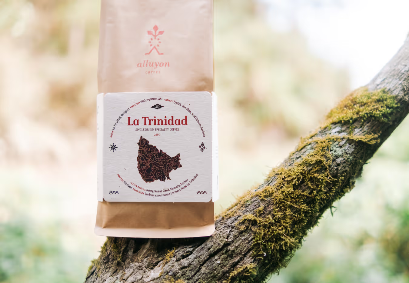


We designed the packaging to spotlight the origins of the coffee, both the land and the people behind it. Each bag features the topography of the specific farming community where the beans were grown. We also approached the packaging with sustainability in mind. The coffee bag bands use eco-friendly paper, while the front and back labels are designed to be repurposed as coasters or small art prints.