Mt. Camisong
2024
Branding, Identity System, Wayfinding, Illustration, Retail, Creative Direction
TONI POTENCIANO
CORINNE SERRANO
JAYRENE CRUZ
JAD MAZA
JO MALINIS (C.O.P.)
A benchmark for ecotourism in Itogon, Benguet, Mt. Camisong Forest Park and Events offers a mountain experience led by nature, community, and care. Scenic trails, open spaces, and thoughtful programming await first-time hikers to families looking to reconnect outdoors. Every visit supports long-term efforts to protect the land and uplift the local community.
Collaborated with:
Headroom — Architect
Hitchhiker — Brand Launch Comms

Ferns are among the oldest plant species on Earth, having survived by responding to their environment rather than reshaping it. They symbolize adaptation and serve as indicators of an ecosystem’s health, growing in harmony with their surroundings.


And thus, we based the Mt. Camisong logo on the fern. Its spores form a symbol of steady growth, rooted in Camisong’s philosophy: build with the land, not against it.
Mt. Camisong is more than a destination, it’s a shared commitment to stewardship.


Visual Elements
The visual and verbal system is built on the park’s slogan “Hiraya Manawari,” a greeting and a wish that translates to “may the wishes of your heart be granted.”
It is a preview of things to come, and the hope that they find the wishes of their heart on Mt. Camisong. “Hiraya Manawari” captures the spirit of every Mt. Camisong moment and reflects the way we invite guests to experience the forest park.

We designed the logo typography with bold forms and organic curves, echoing shapes found in nature. Its flexible weight makes it work across applications, from wayfinding to park signage.


Each area of the park is marked by a symbol, guiding visitors through a journey of Mt. Camisong.


We designed an identity that orients and invites, grounding each moment in the character of the place.


We designed each brand icon to mark a moment at Mt. Camisong, turning park areas into places of memory and movement. The symbols guide guests toward a more grounded experience of the land.


We use the brand icons across social posts and area-specific updates to keep the park experience cohesive, both online and on the ground.
Merchandise
Mt. Camisong’s merchandise is more than just park souvenirs, they’re a way to bring nature into the everyday. Designed to keep the park close through the things we wear, carry, and share, each piece is made with care and meant to carry the park’s values into daily life.

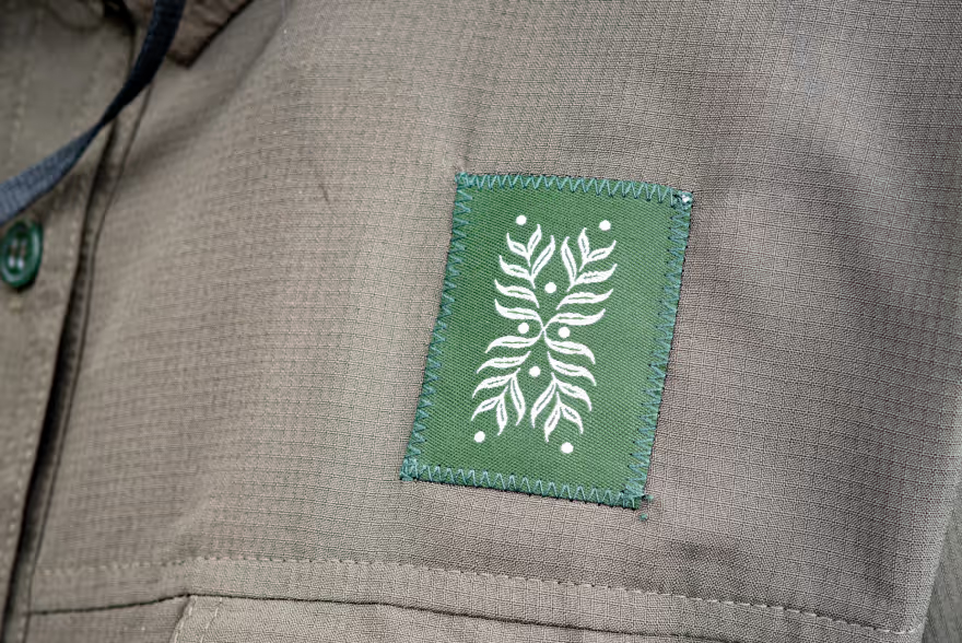
We introduced a new tag, drawn from the logo, to add depth to the merchandise line. It keeps the system visually dynamic while reinforcing the fern as a flexible, evolving emblem, whether on fabric, signage, or forest trails.


This approach also opens up space for future collaborations, allowing the brand to adapt and resonate across different creative partnerships, formats, and merchandise without losing its rooted identity.
Designed to reconnect people with nature through the things they wear, carry, and share

Wayfinding
Mt. Camisong’s wayfinding system is designed to guide visitors with clarity, warmth, and intention. Each sign does more than direct, it reflects the spirit of the park: thoughtful in design, grounded in place, and shaped by community. Here, branding becomes part of the experience, helping people navigate, connect, and feel at home in the landscape.


