

Ginto
2019
Branding, Packaging
KAY ARANZANSO
ADA LAUD
TRIXIA DELA CRUZ
Tanduay Distillers entered the gin market with Ginto, a barrel-aged gin that takes on the golden hue of the rum barrels it rests in. We built a bold, approachable identity that draws from Tanduay’s legacy while standing out in a category crowded with clear spirits.


Ibang Gin ‘To
We rooted the brand in our pre-colonial heritage, drawing from the artistry of Filipino goldsmiths to craft a gin that feels distinctly our own. The name Ginto evokes both the richness of our history and a playful nod to “gin to,” that made the product feel familiar, conversational, and memorable, creating something elevated yet accessible.


Premiumization doesn’t always have to mean more expensive.


Discover a New World of Flavor
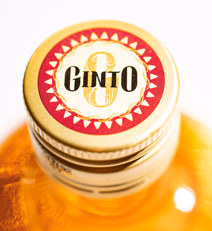
We designed the logo to feel ornate, opulent, and rooted in the craftsmanship of Filipino goldsmiths. This approach shaped the label’s rich detailing and visual weight. More than just a drink, we wanted Ginto to feel like a discovery, turning each bottle into a shared adventure.
The organic shape of the label is designed to make the bottle stand out in a saturated market.


When creating the ornate visual elements, we took care not to misappropriate and misrepresent the Filipino arts and crafts that we referenced.


The color palette of the brand is composed of deep and rich colors meant to evoke the brand’s story. The colors of the brand are inspired by the sweet, citrusy and spicy notes of the gin.


Ginto Barrel-aged Gin is the gold standard for barrel-aged spirits.
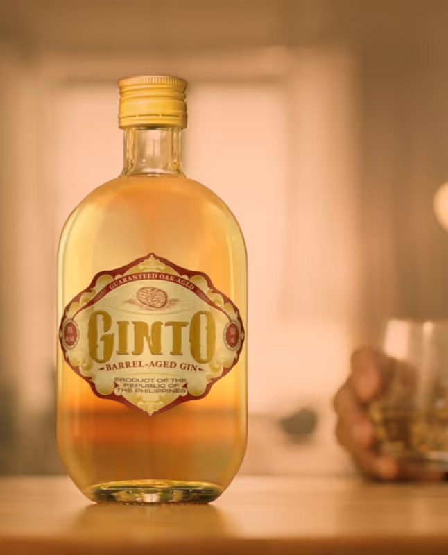


Made from freshly harvested sugarcane then blended and rested in a barrel for six months, Ginto is a golden spirit with acomplex suite of flavors found only in world-class gins. Sweet, citrusy, spicy, and a depth only Tanduay Distillers can provide, Ginto is best enjoyed over a glass of ice.


