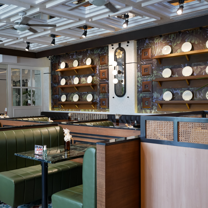
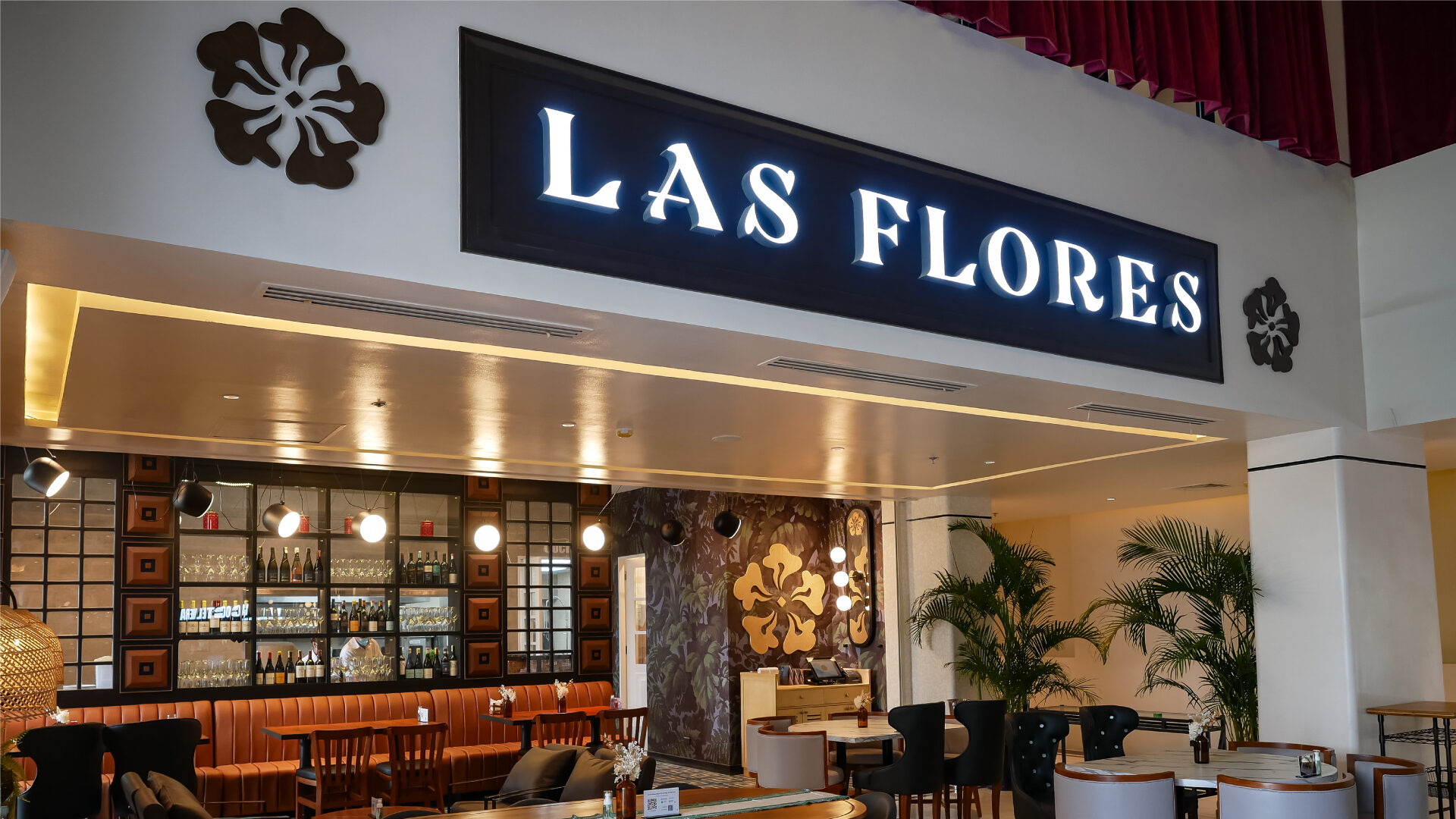
Las Flores was one of our earliest clients as a studio. But nearly a decade down the line, our clients at Bistronomia wanted a brand that could mature with its patrons. Our brief this time: How can we rebrand a 10-year-old modern Spanish restaurant into a timeless classic?
Tags:
2022
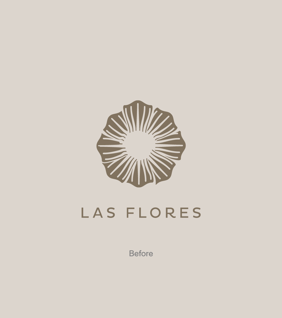
Bistronomia‘s Las Flores was one of our first clients as a fledgling design studio way back in 2013. The brief all those years ago was simple: To create a bold brand for a modern Spanish restaurant that could stand out from the local competition.
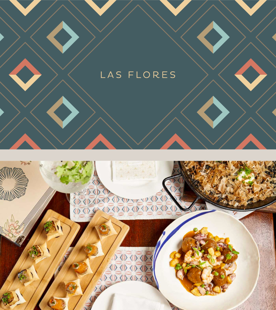
But businesses that are in it for the long game know that change and innovation are essential for survival. This is why we were asked to revisit Las Flores’ brand; to refresh and update our designs to match the restaurant’s maturing audience.
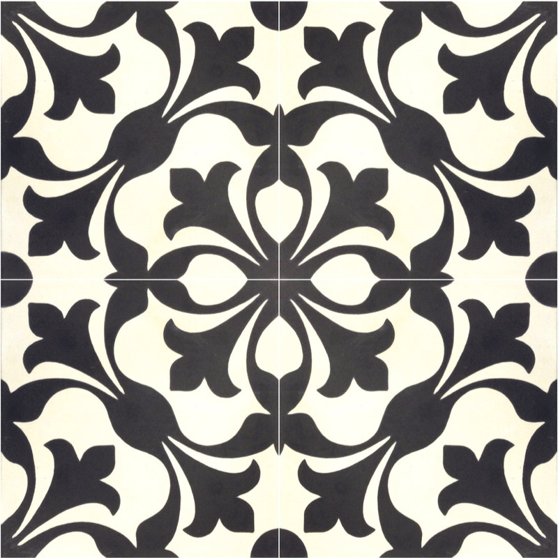
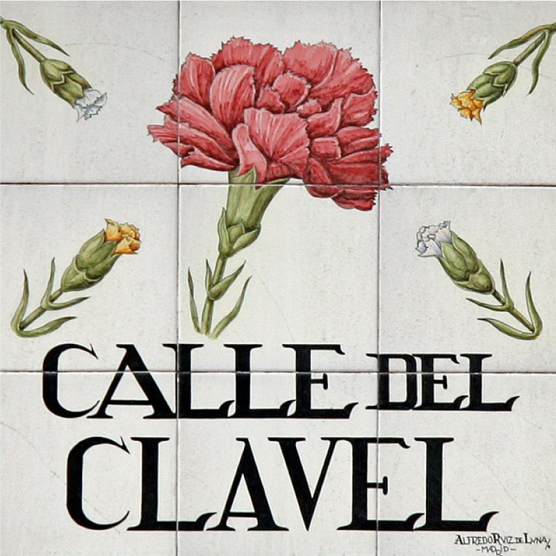
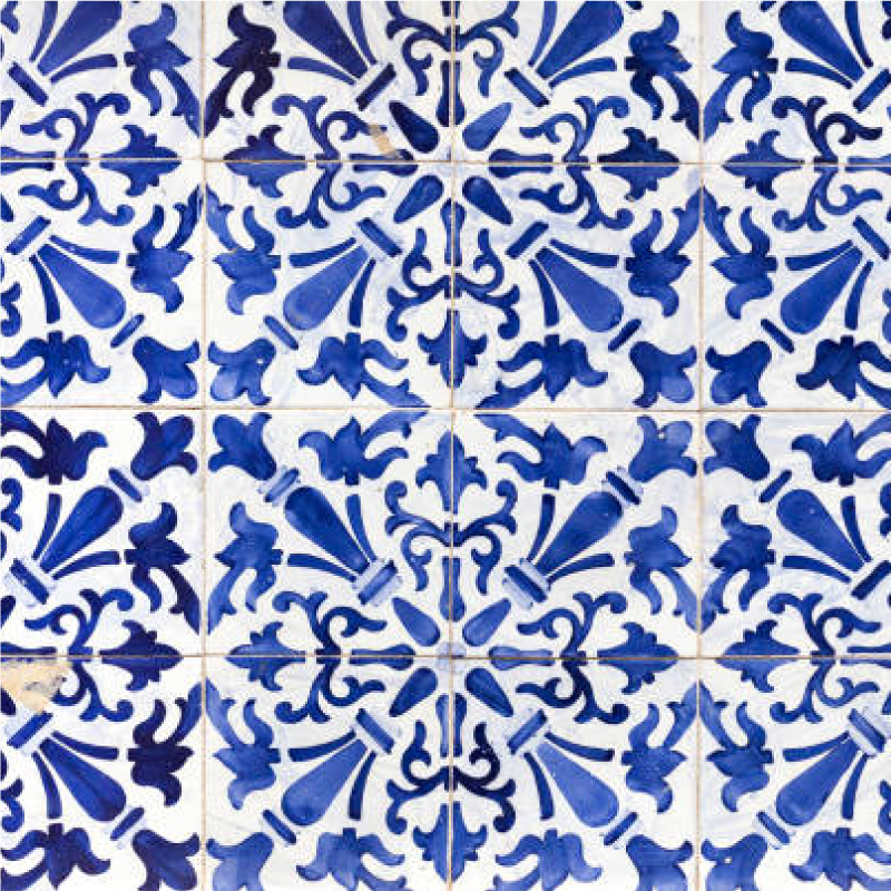
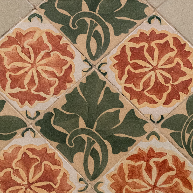
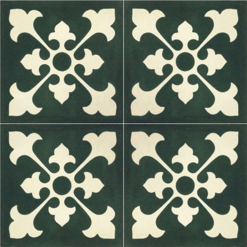
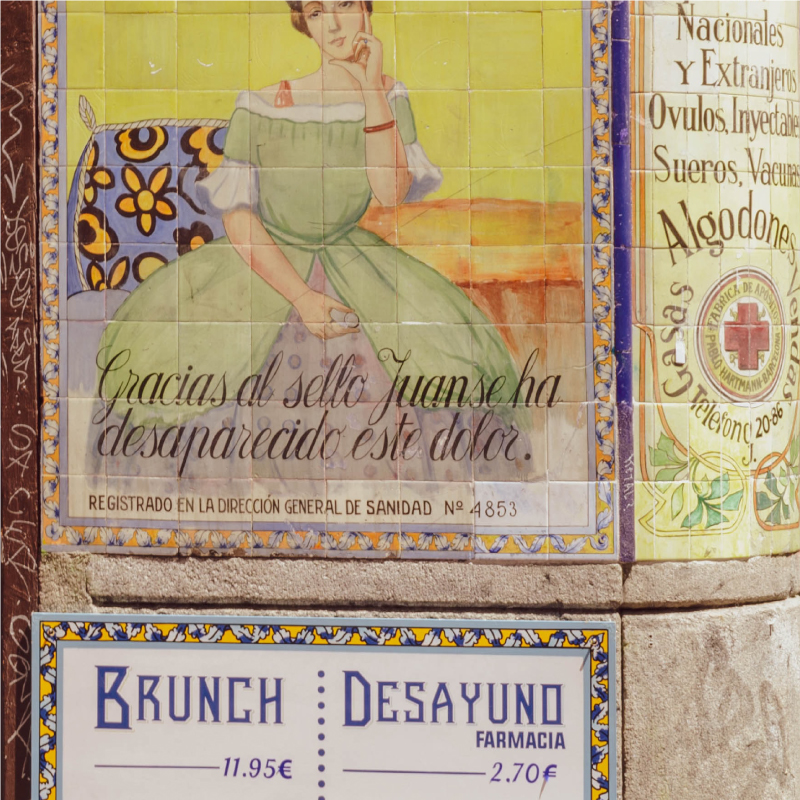
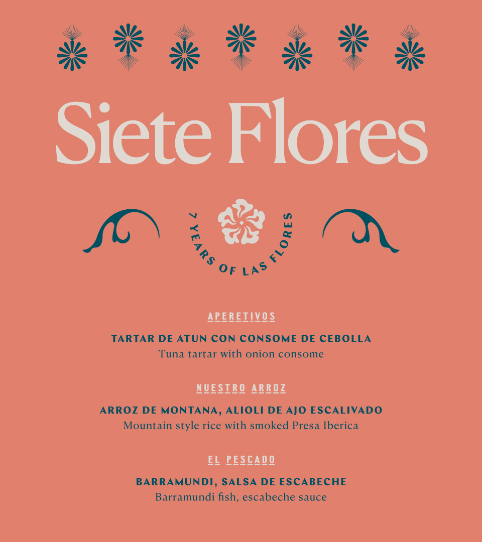
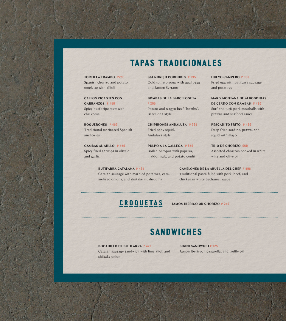
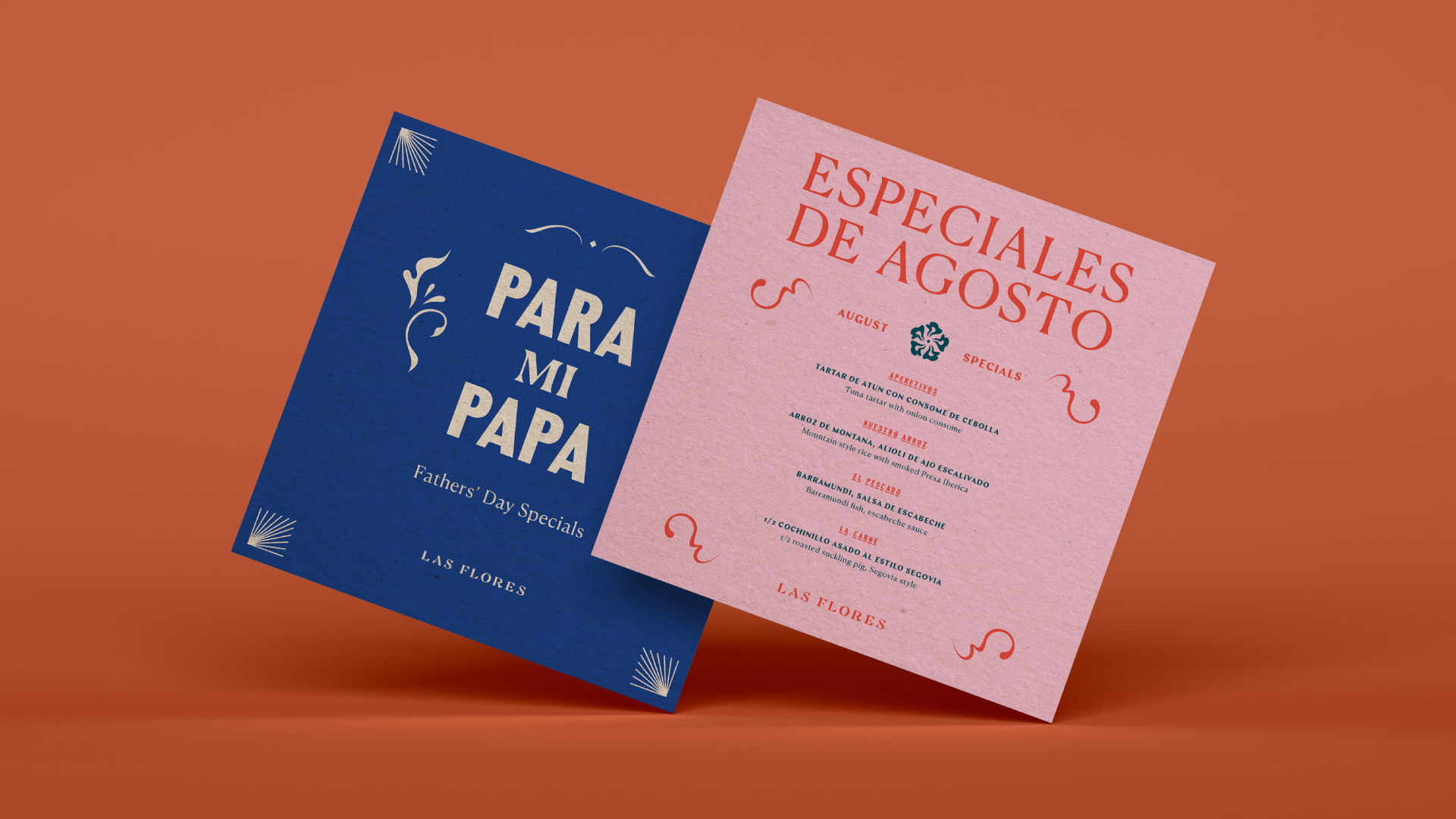
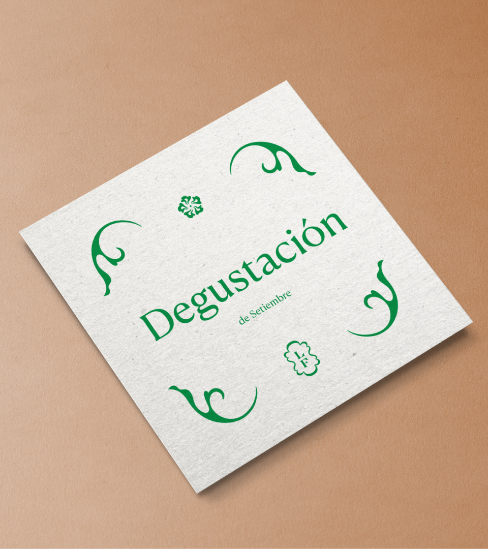
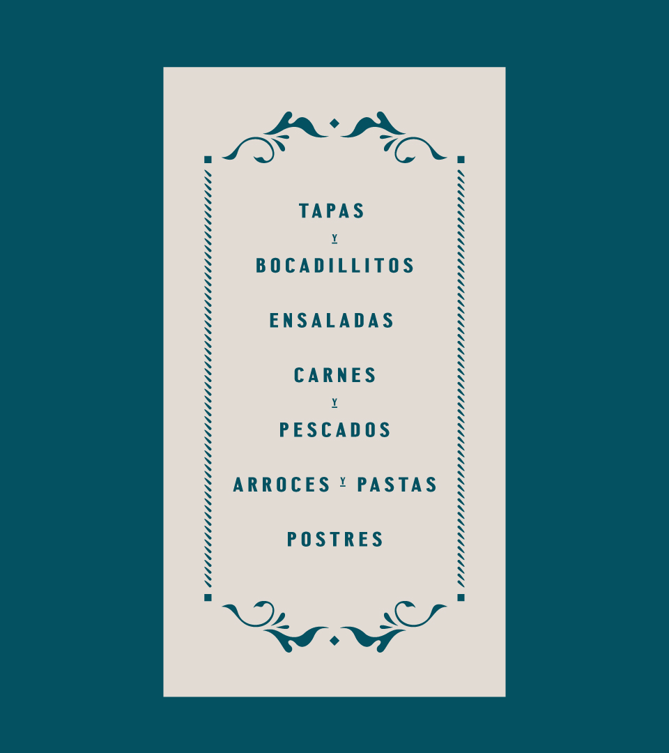
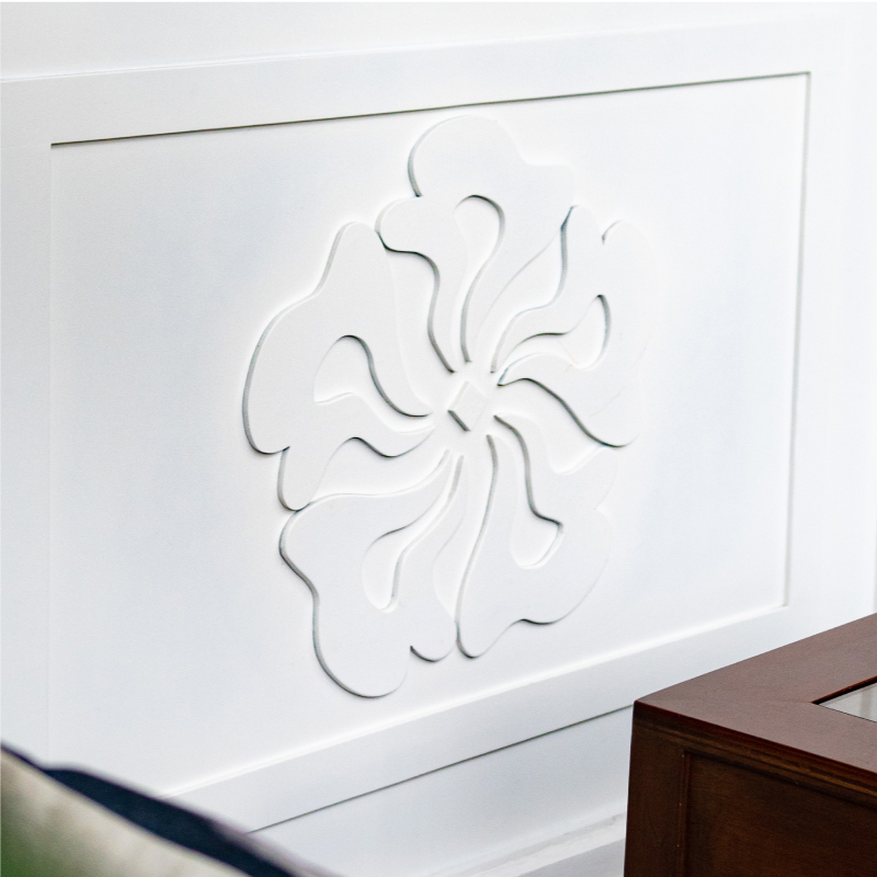
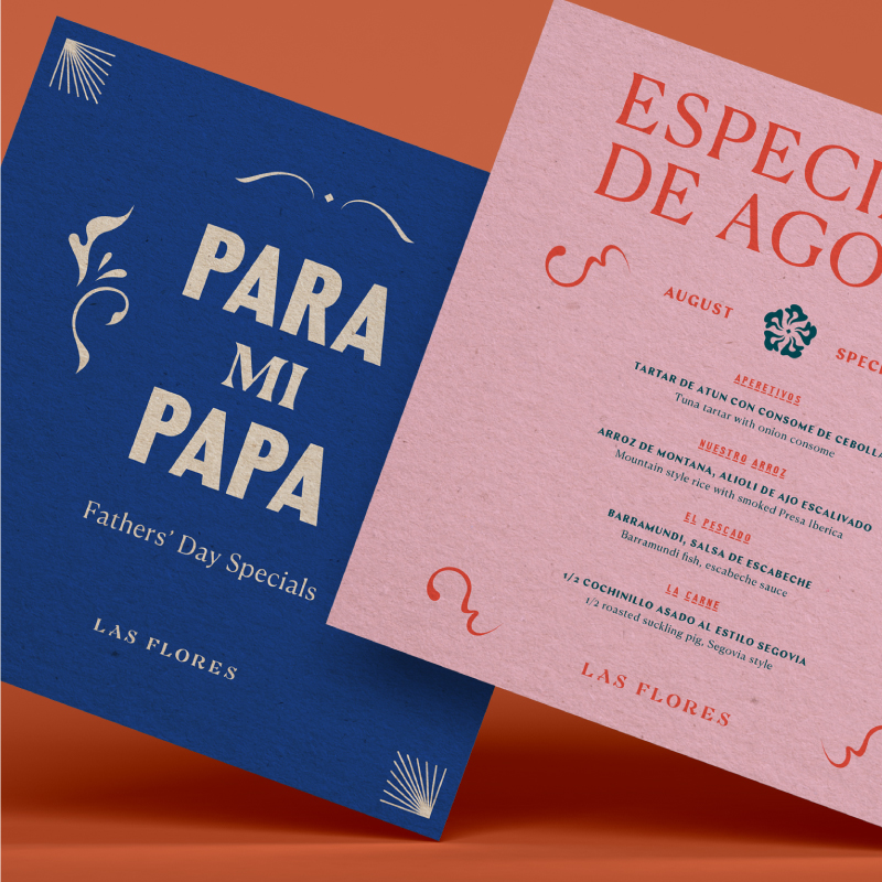
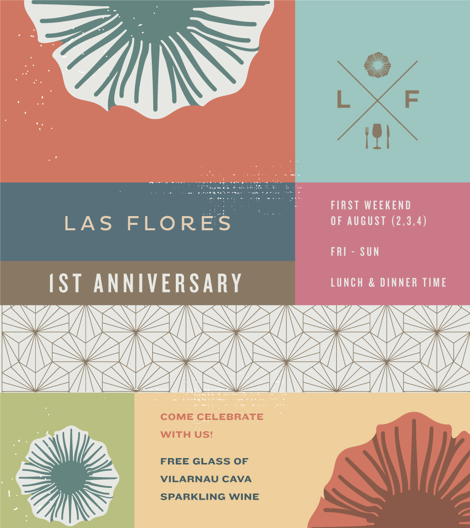
We leaned into Las Flores’ heritage as an authentic Spanish restaurant. We looked at the graphic quality of Spanish tiles and street signs, taking note of the curves and flourishes of different floral forms.
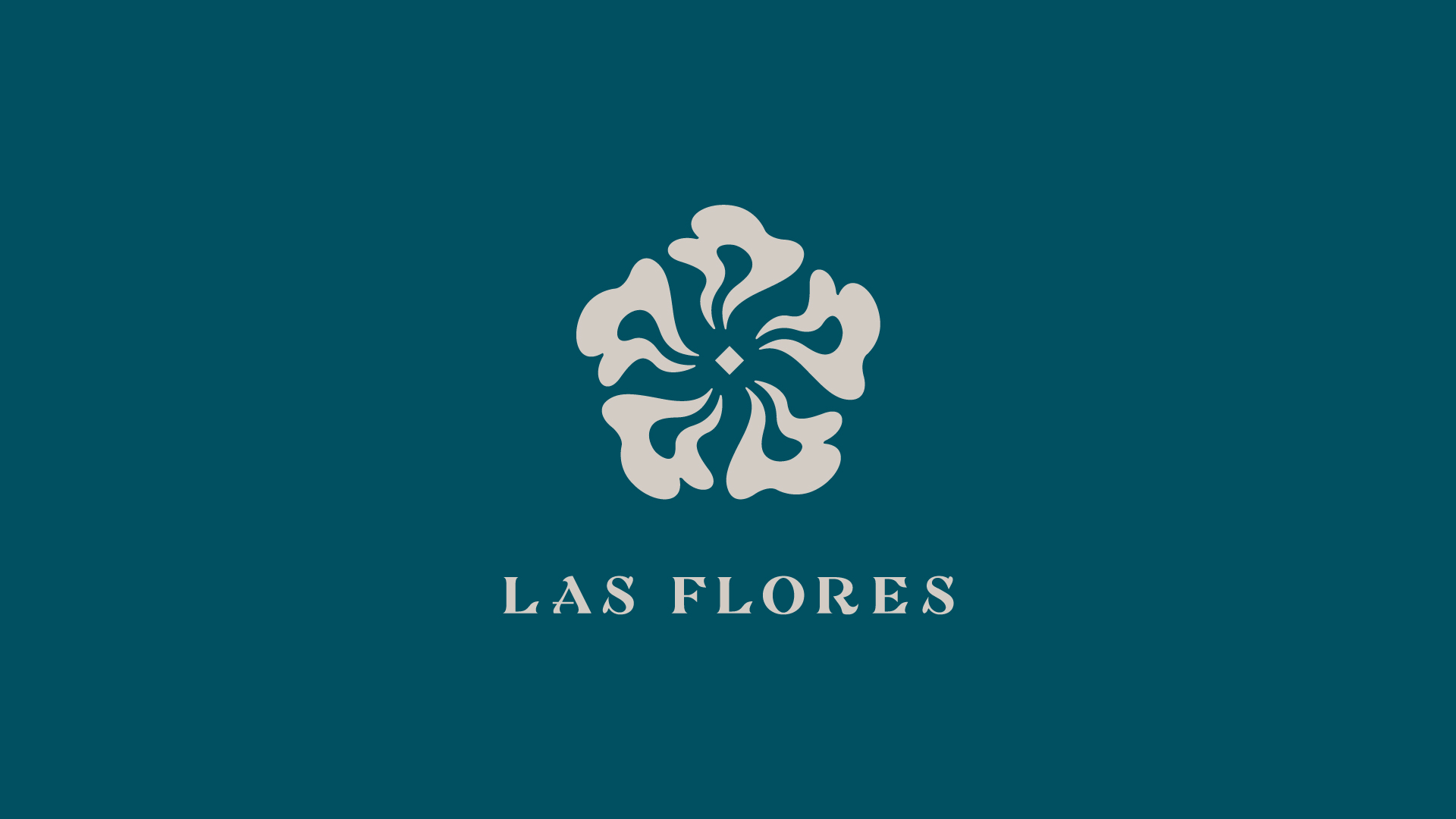
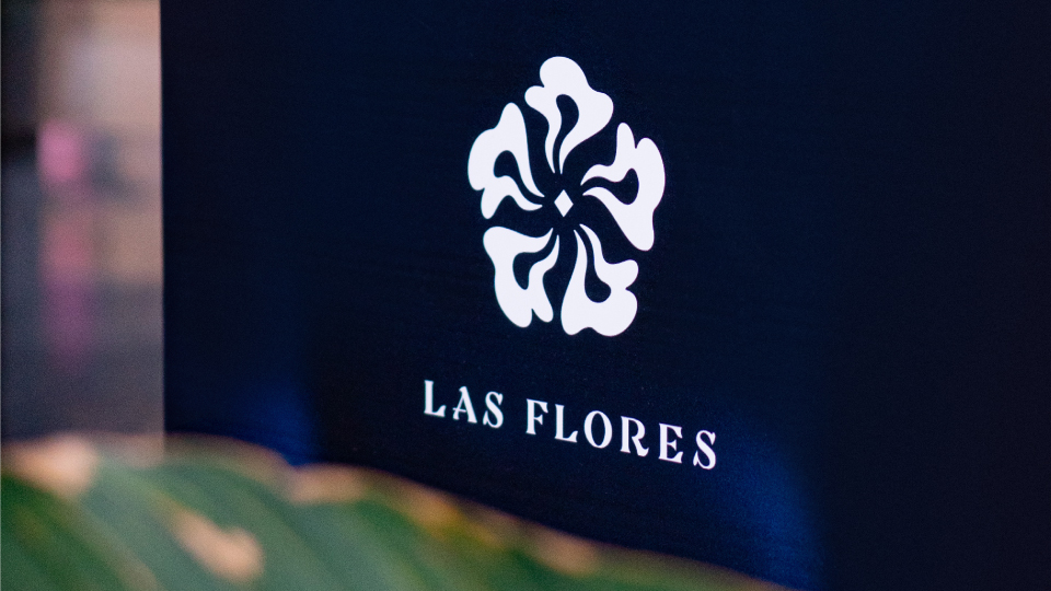
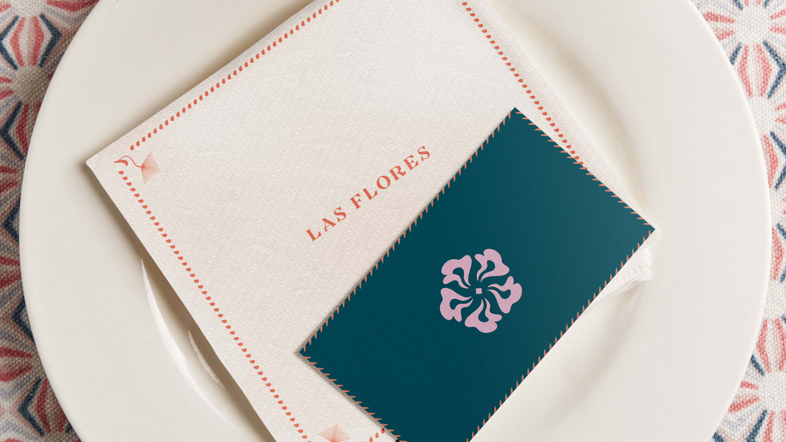
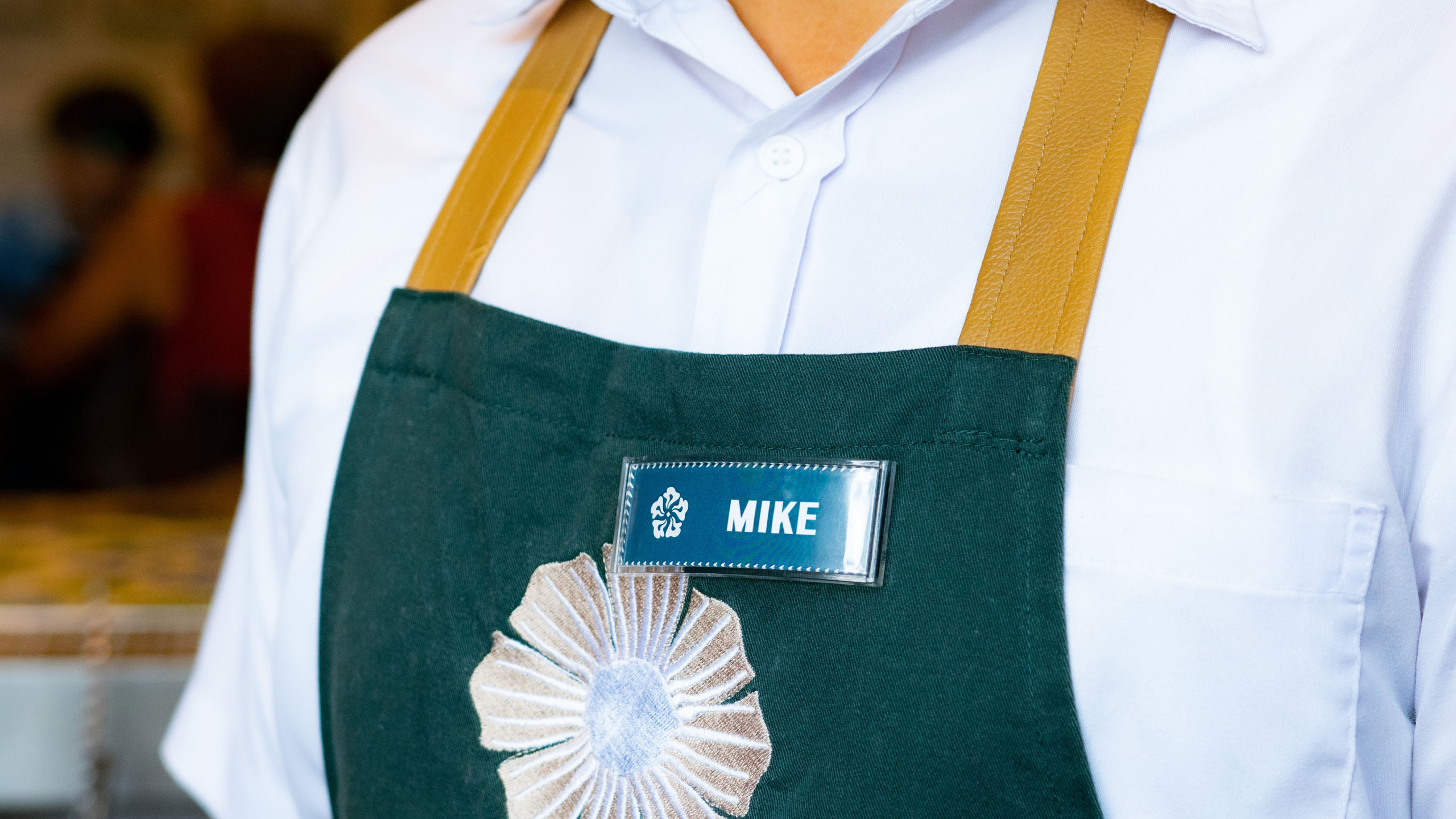
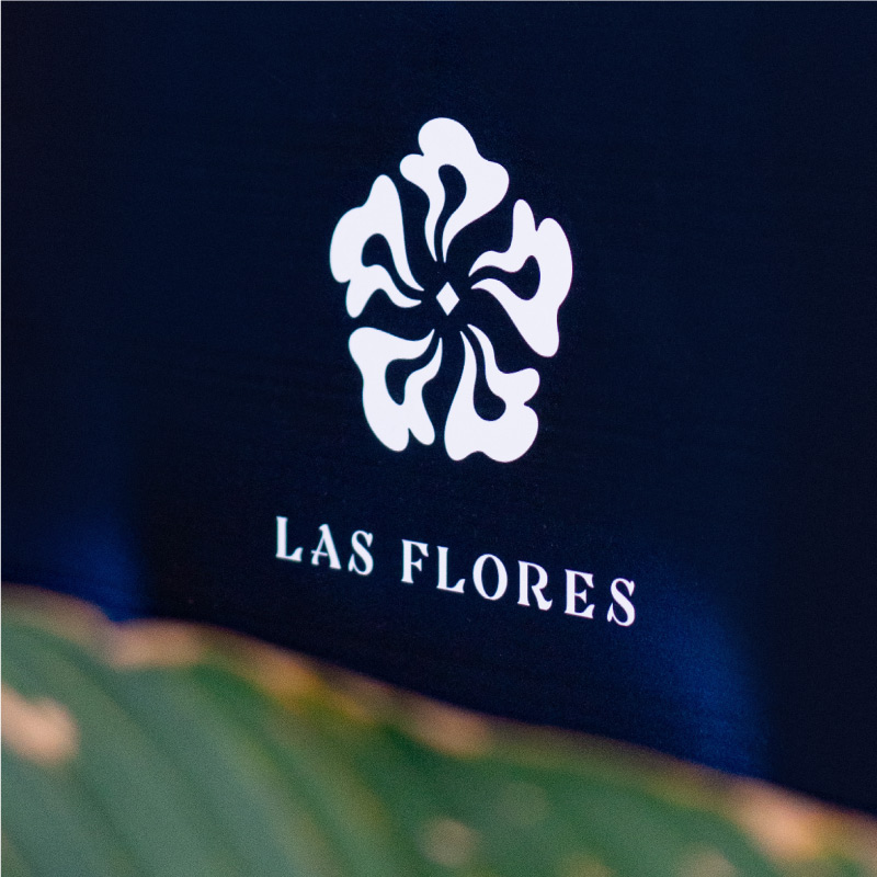
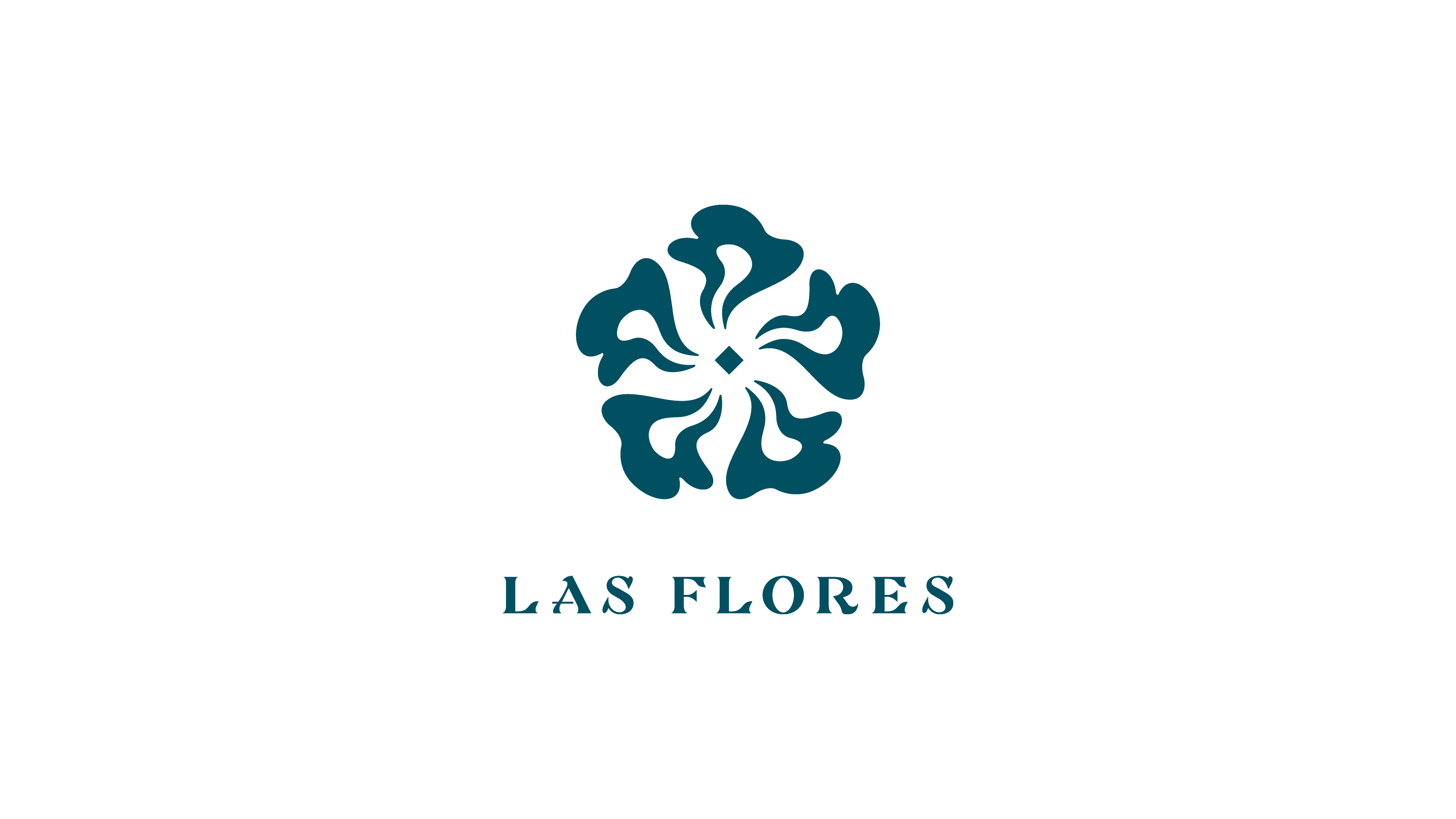
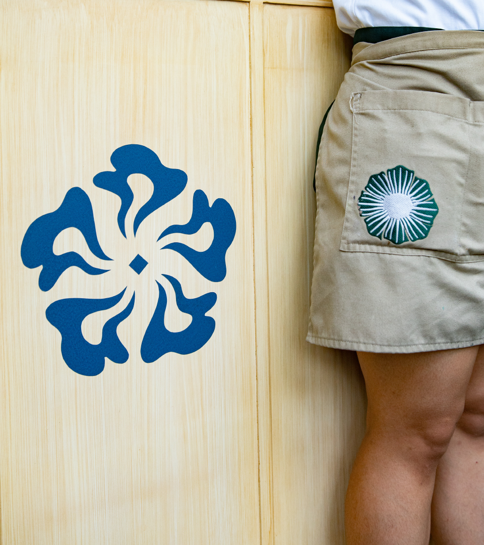
We updated the flower icon to become more dramatic, graphic, and bold.
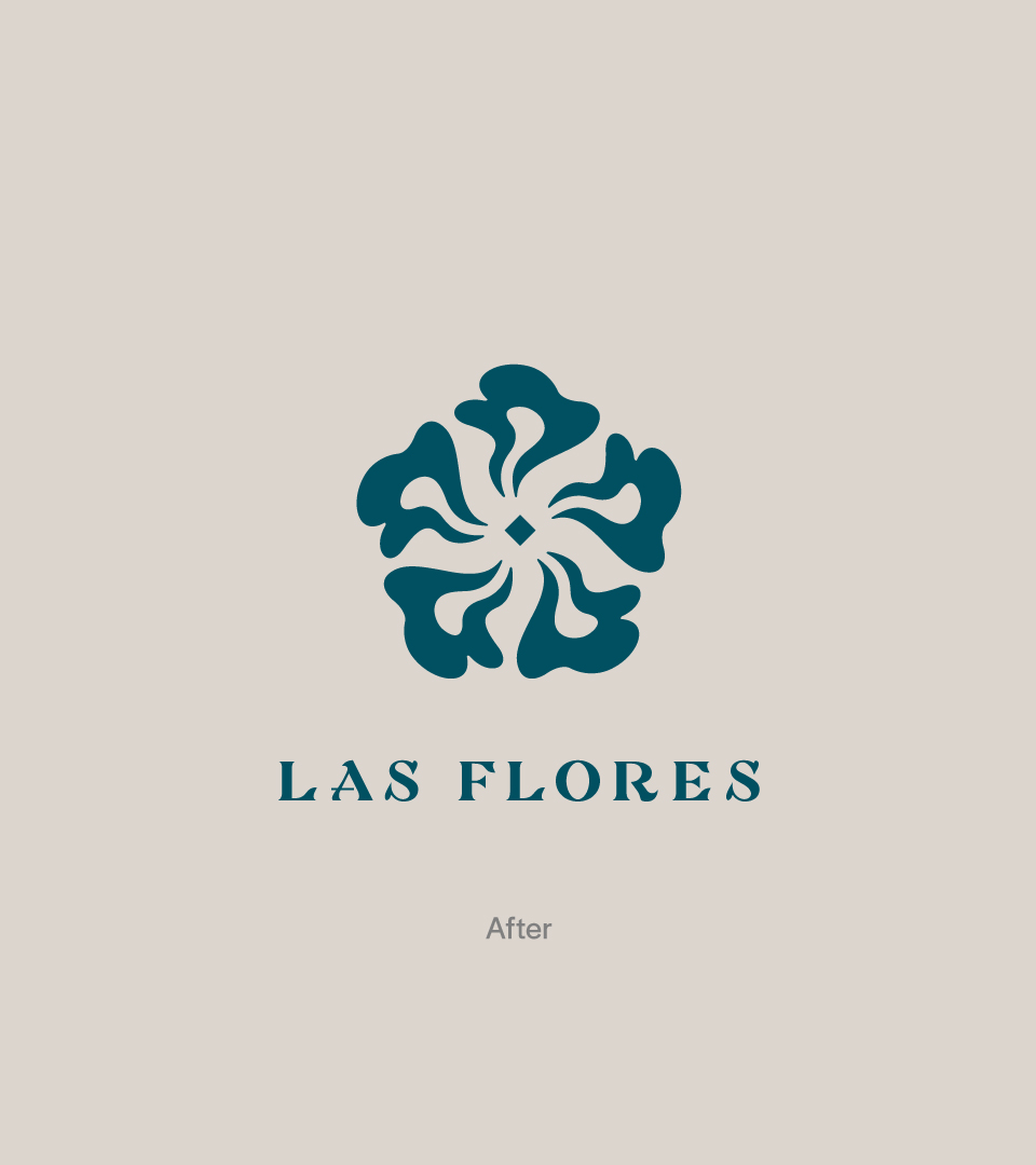
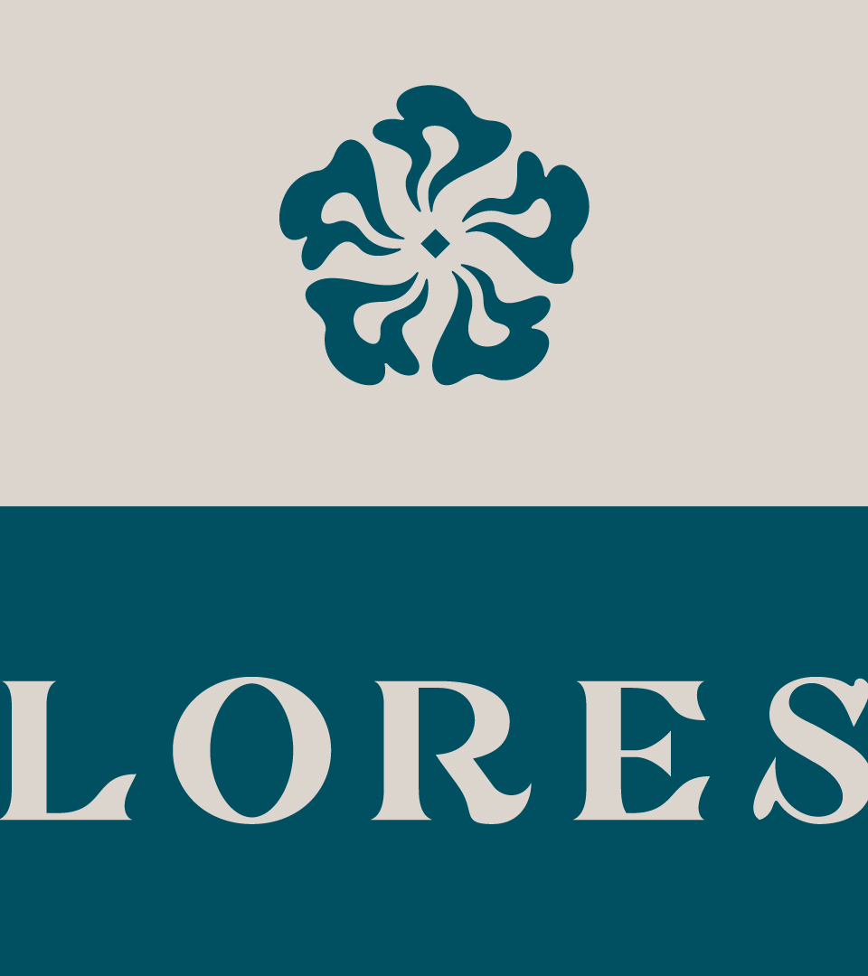
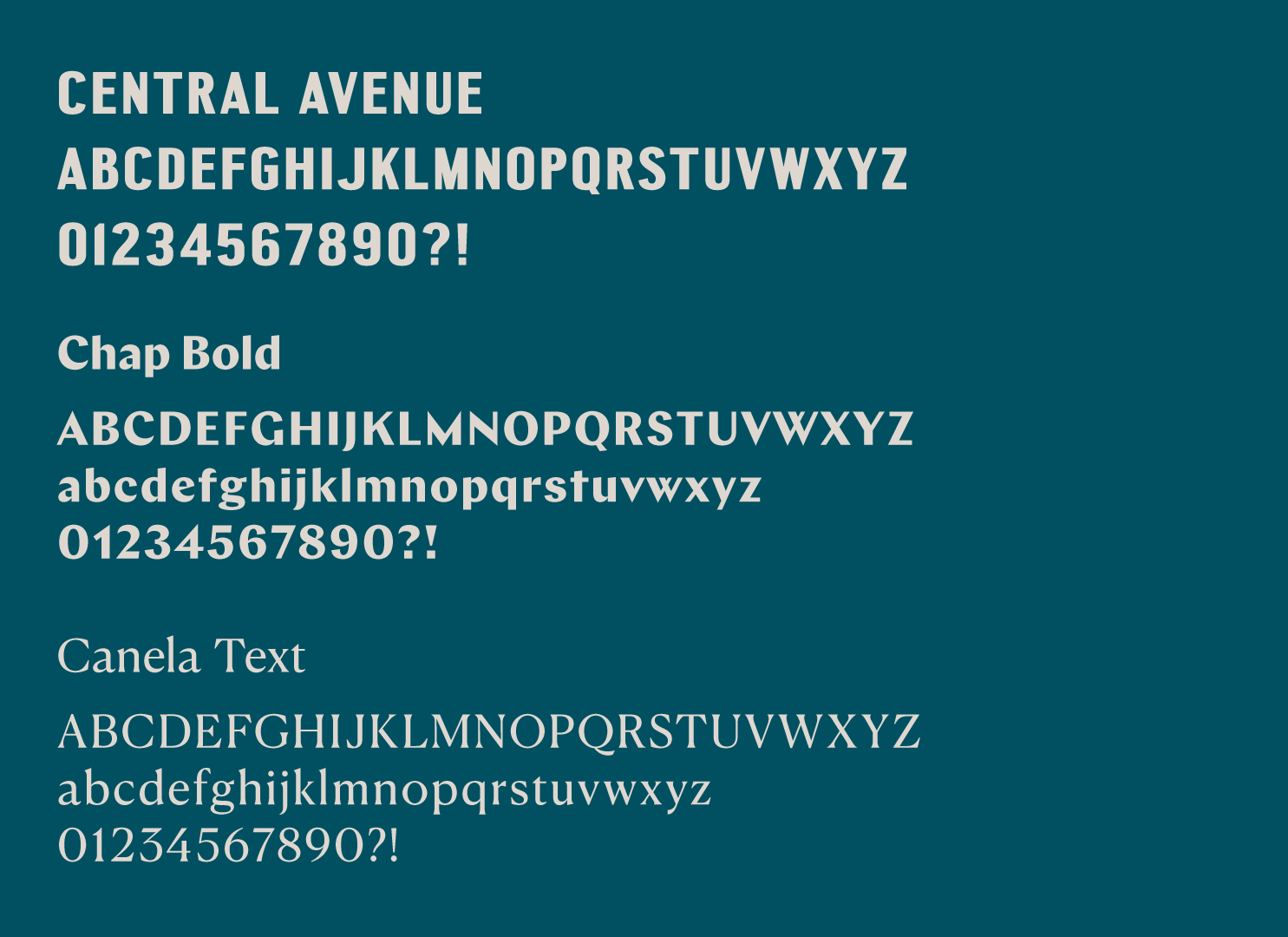
To go with the flower icon, we created a custom wordmark using forms reminiscent of petals and leaves.
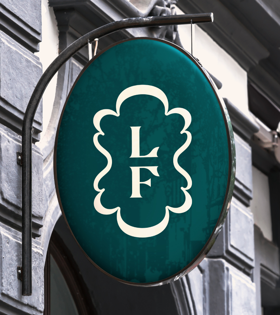
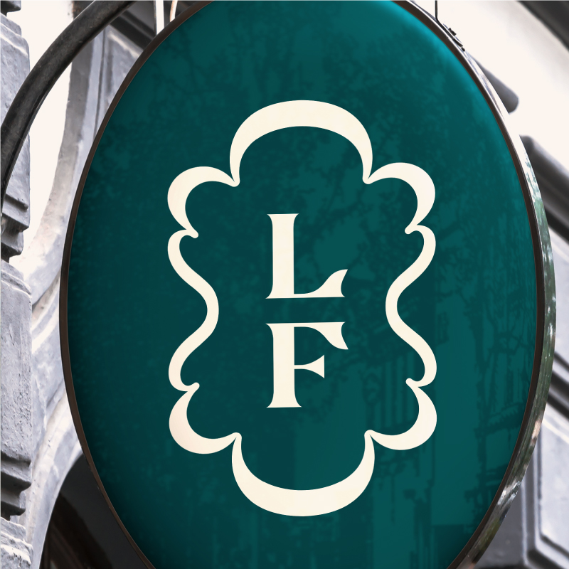
The monogram is enclosed in a curvilinear lozenge that ties all brand signatures back to the flower icon.