2023
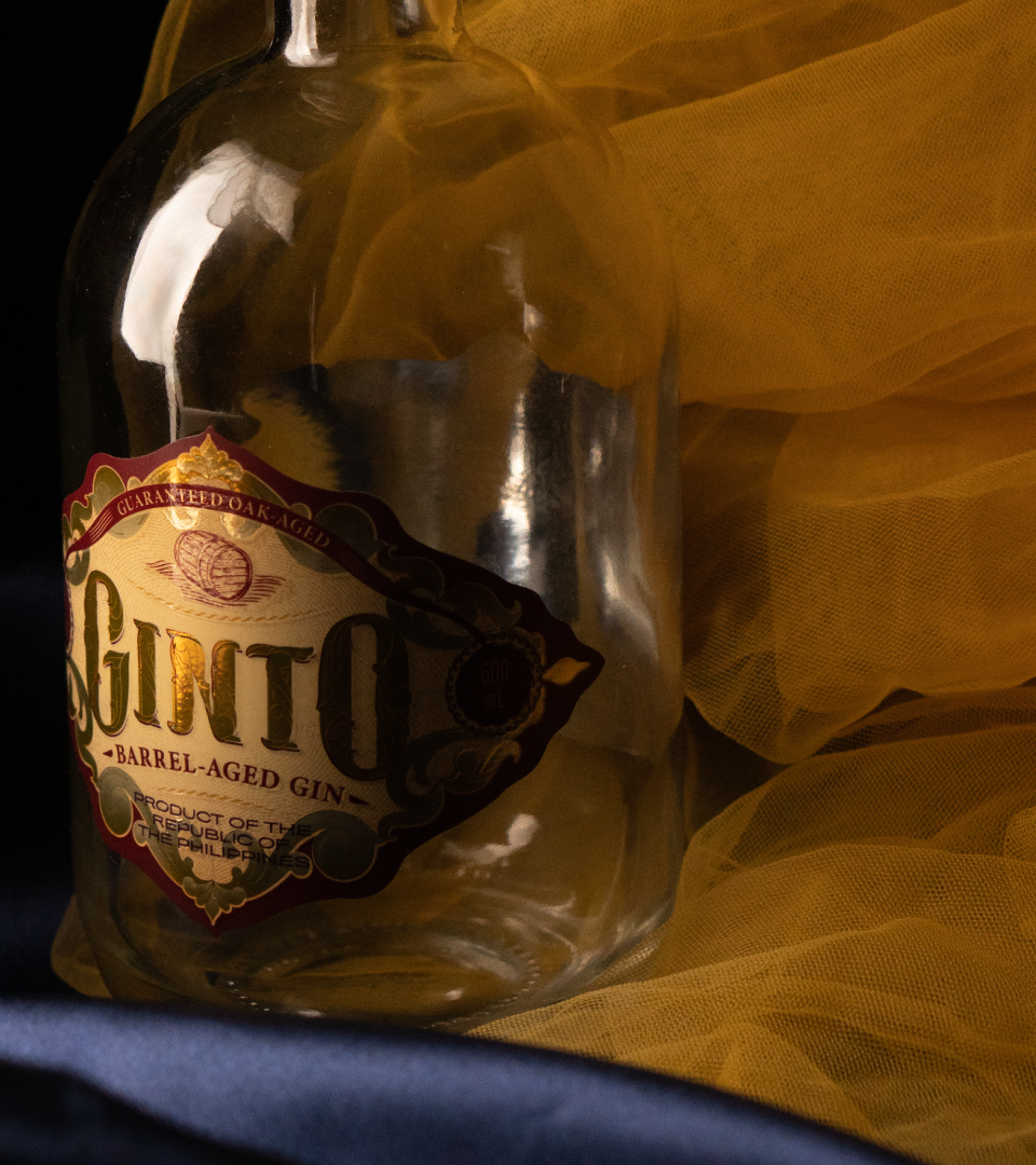
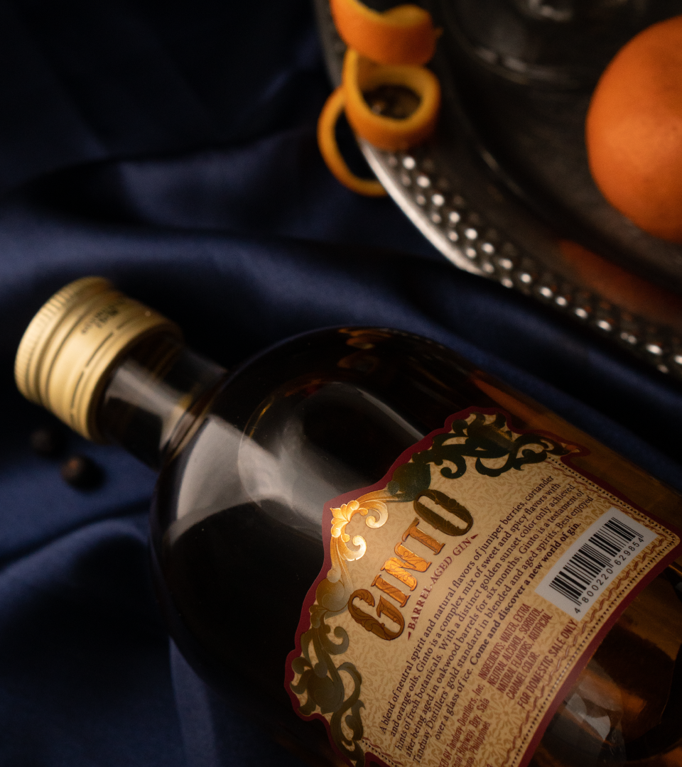
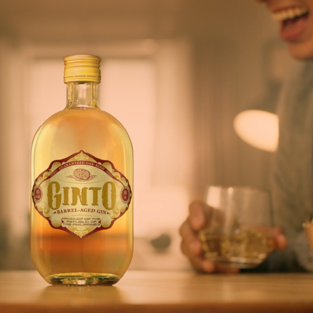
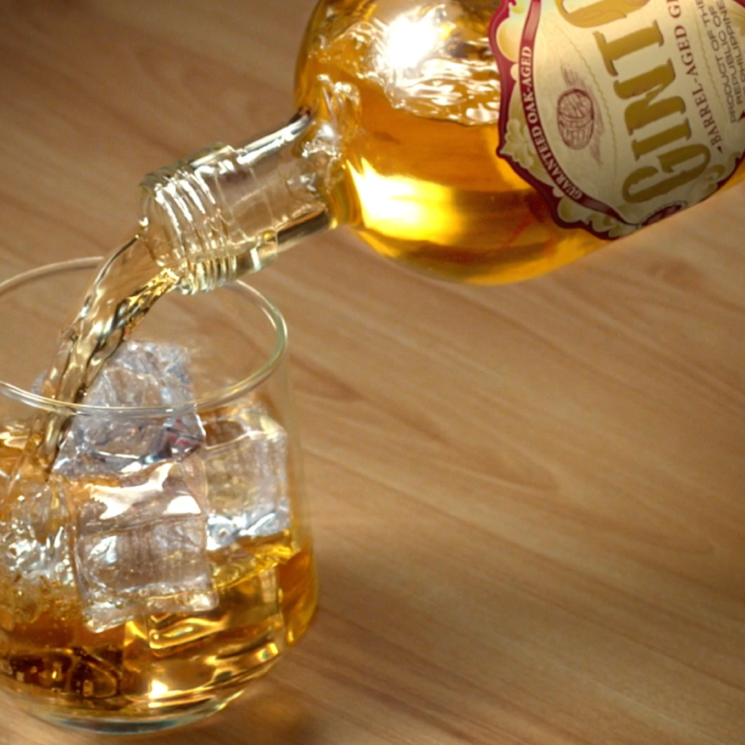
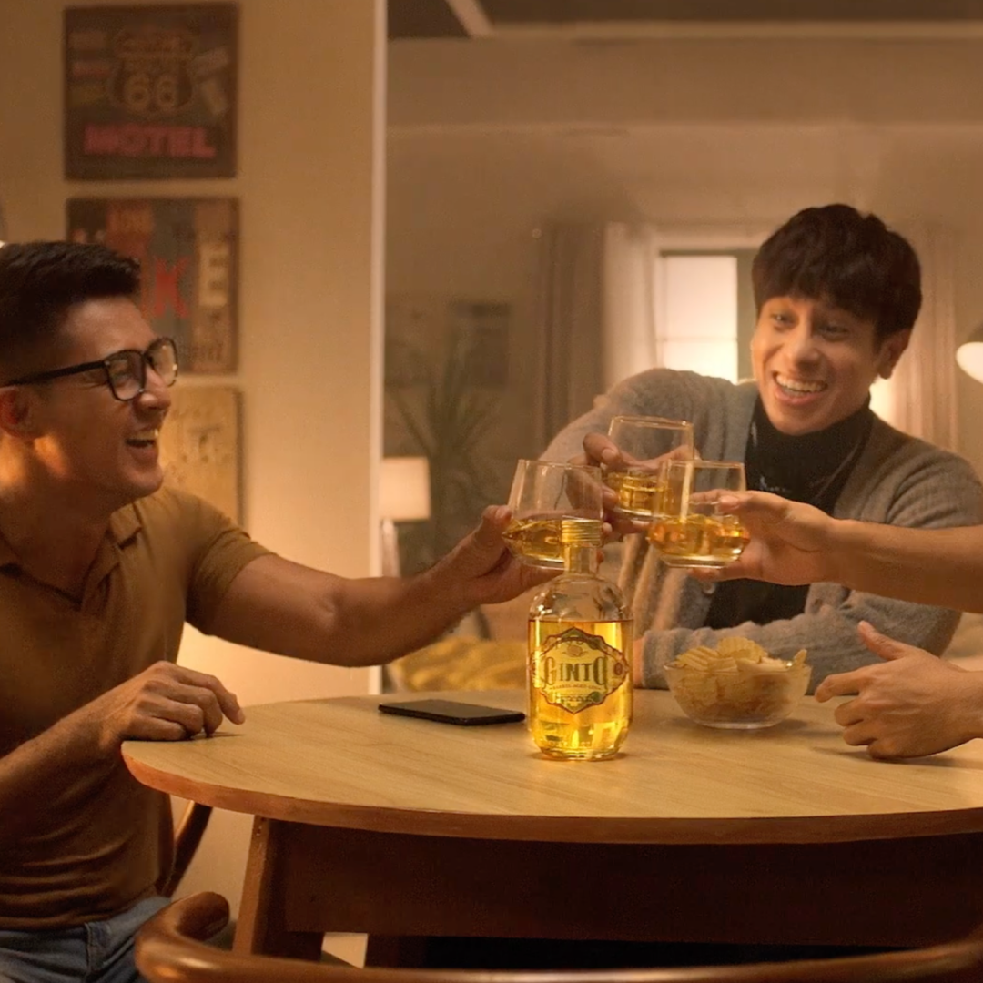
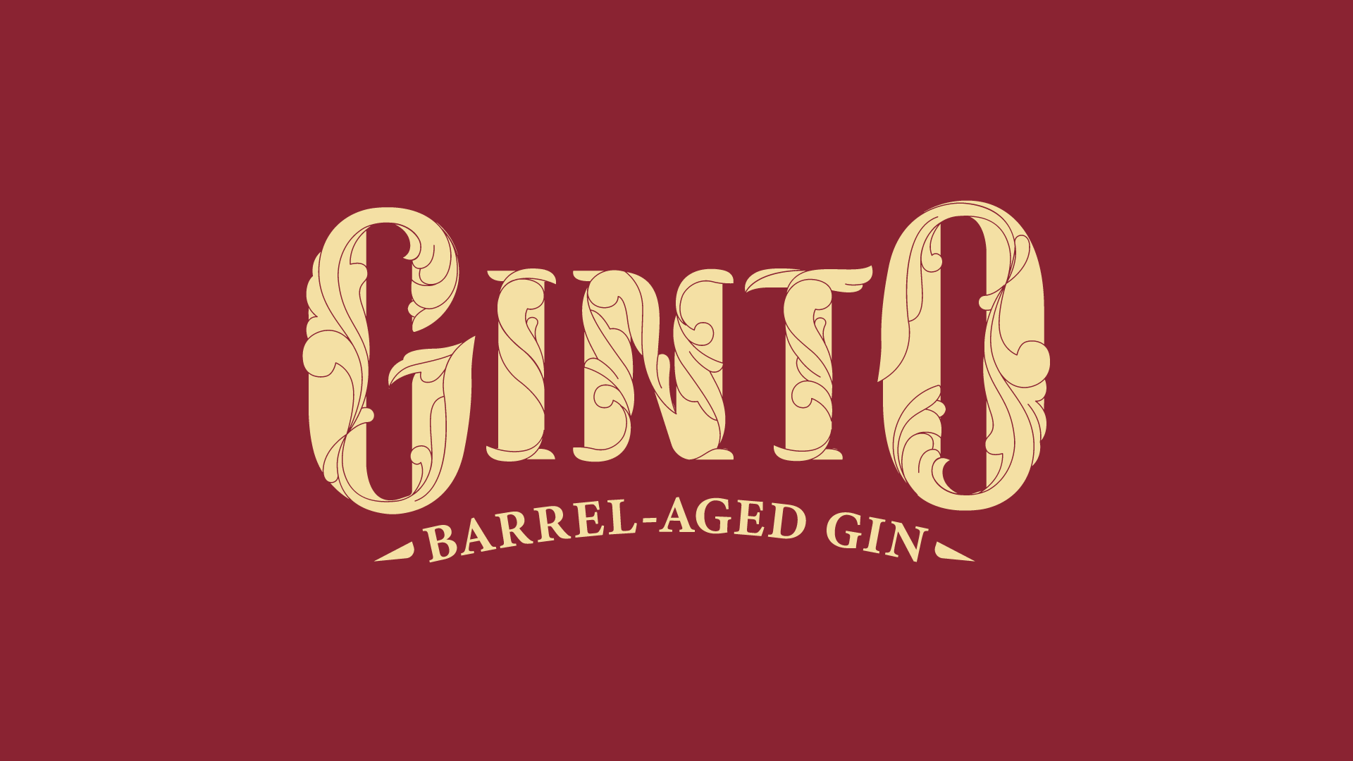
We were approached by Tanduay Distillers, Inc., a Filipino distillery most famous for its namesake rum, to brand a barrel-aged gin.
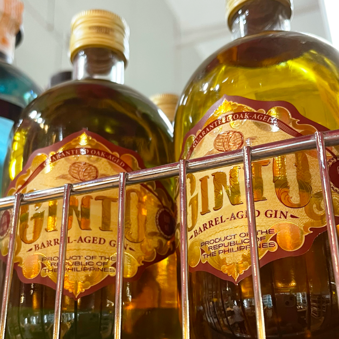
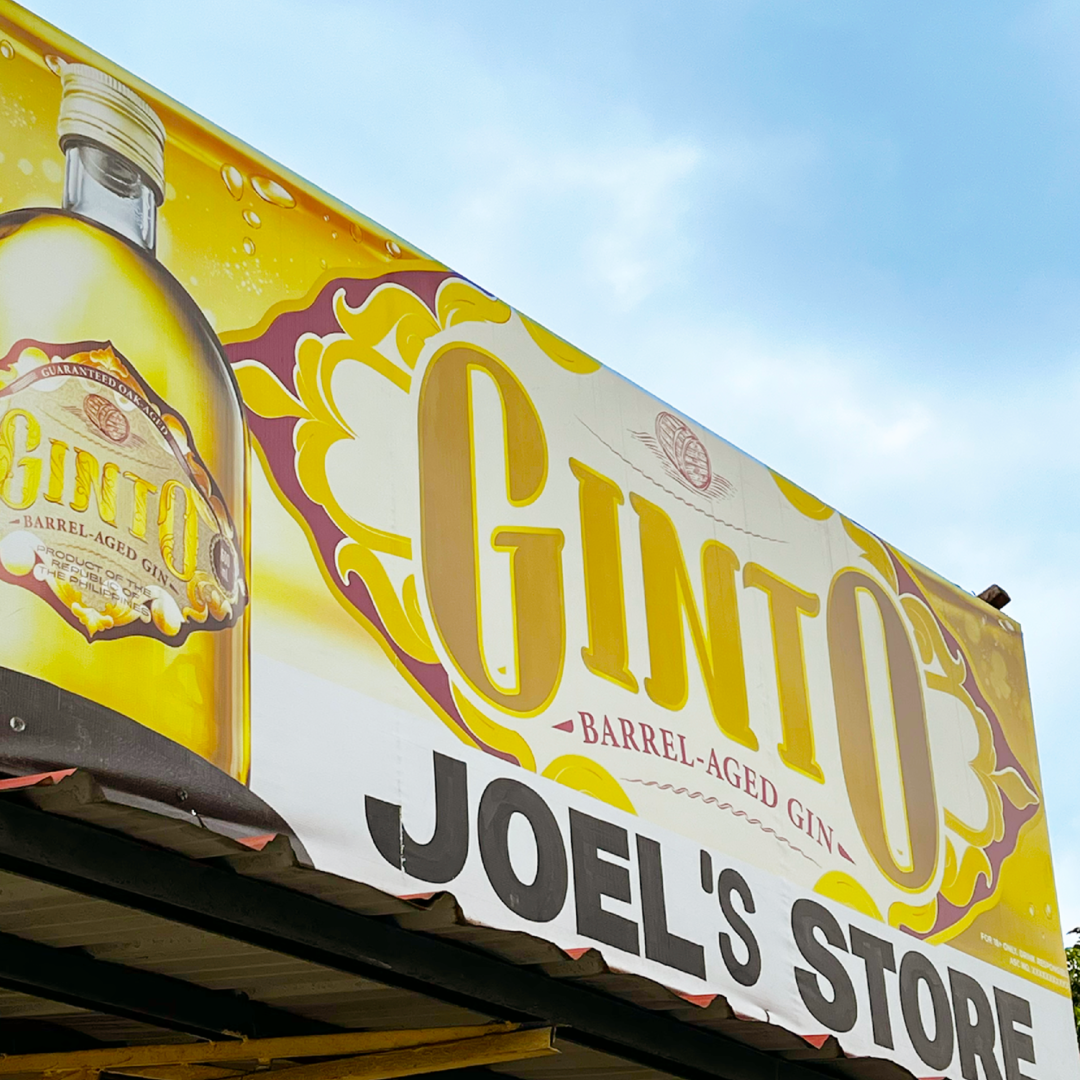
The flavors and notes of the gin were still in their testing phase, and we were tasked to create a design that would appeal to the masses while standing out on shelves from convenience stores to sari-sari stores.
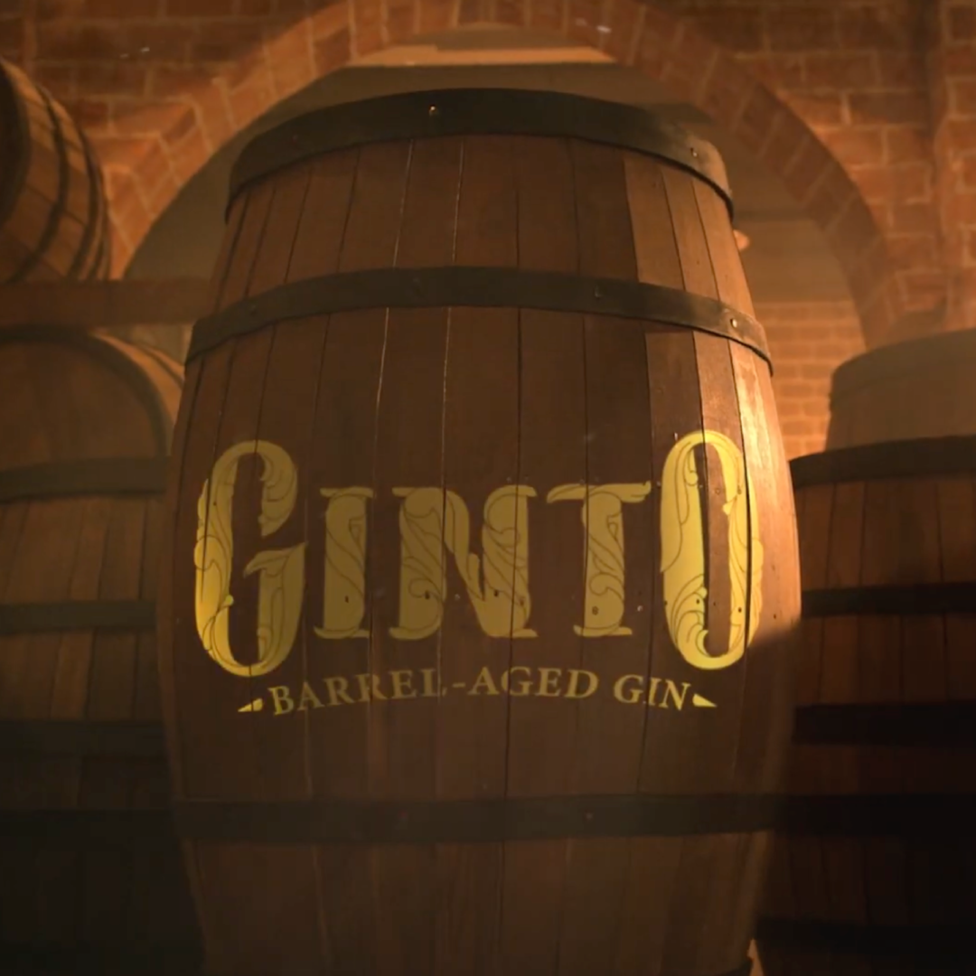
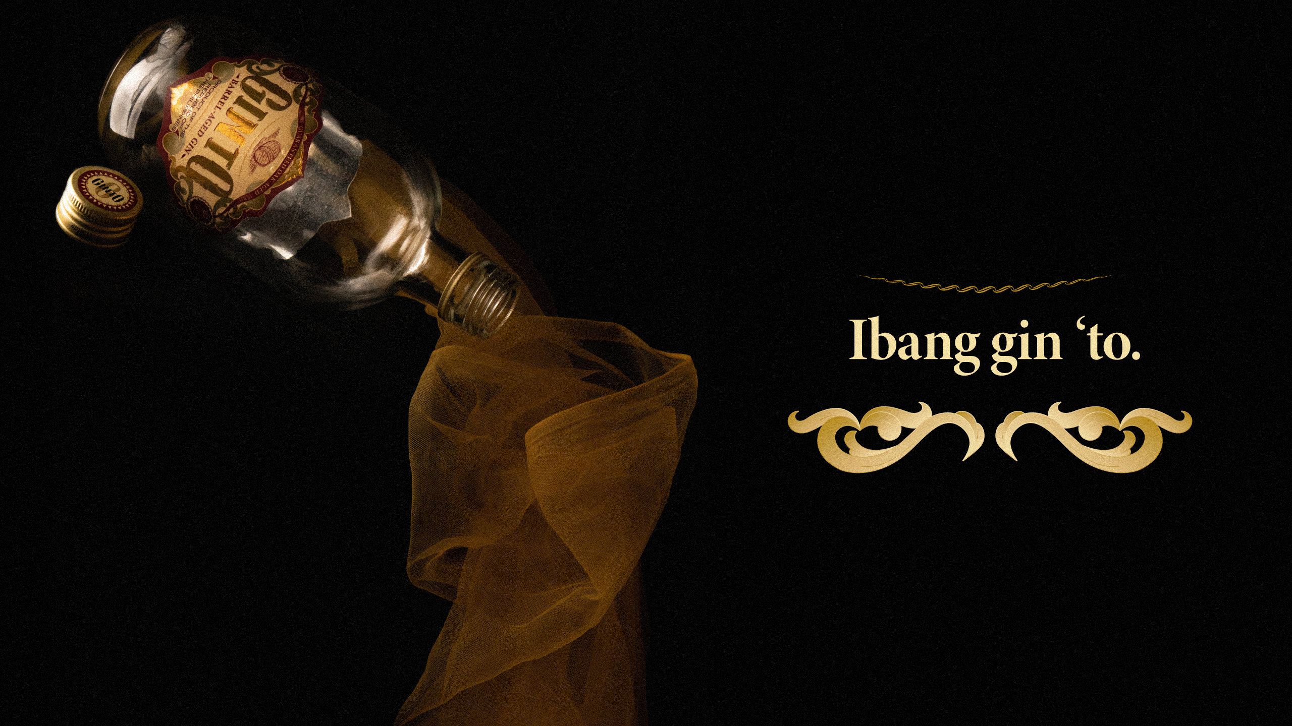
How might we design a brand that introduces a new kind of Filipino gin while also conveying its distinct distilling process?

Premiumization doesn’t always have to mean more expensive.
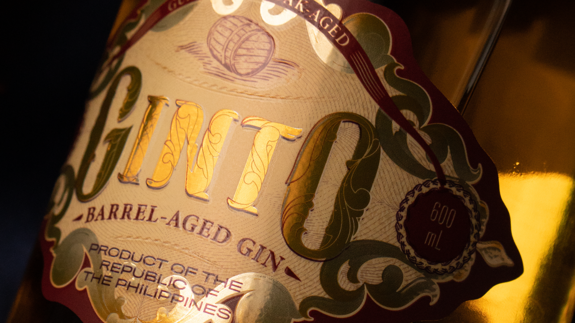
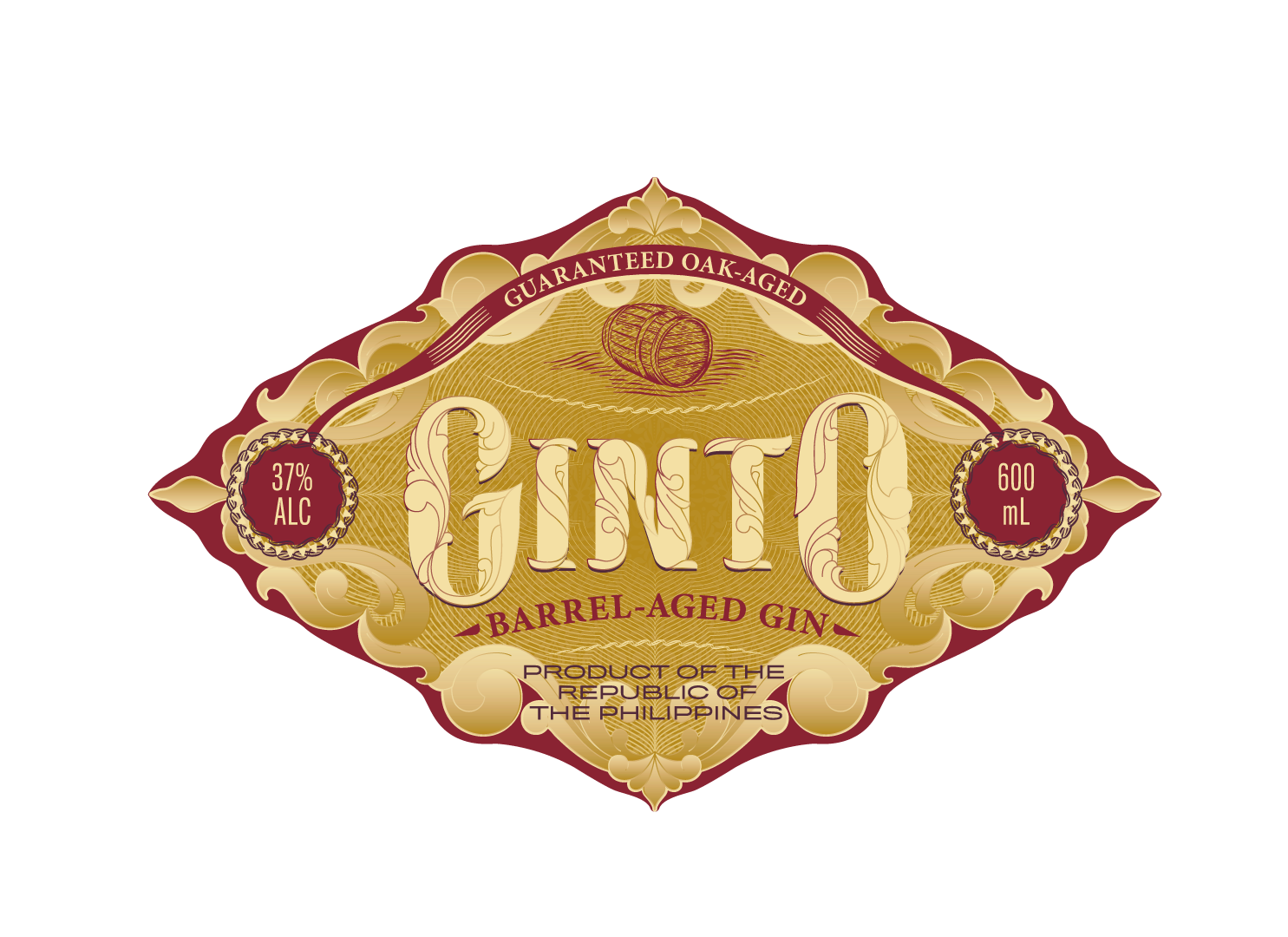
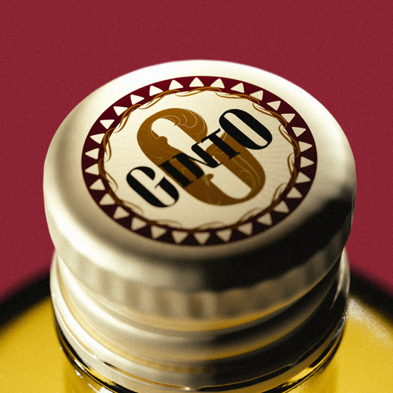
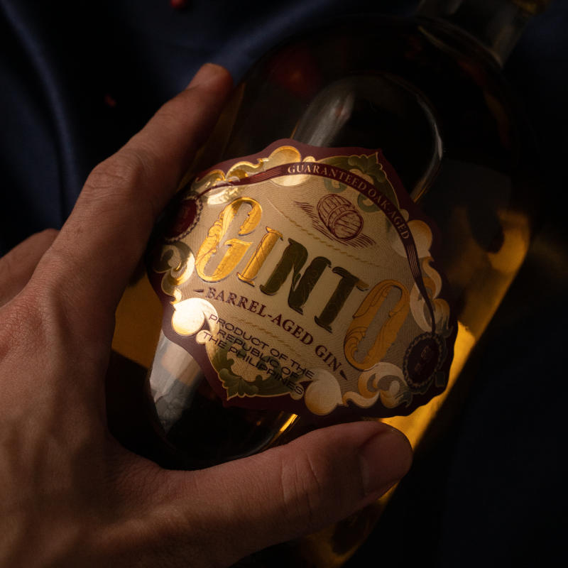
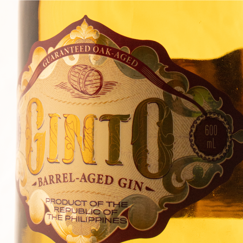
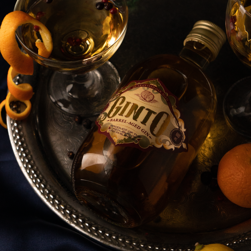
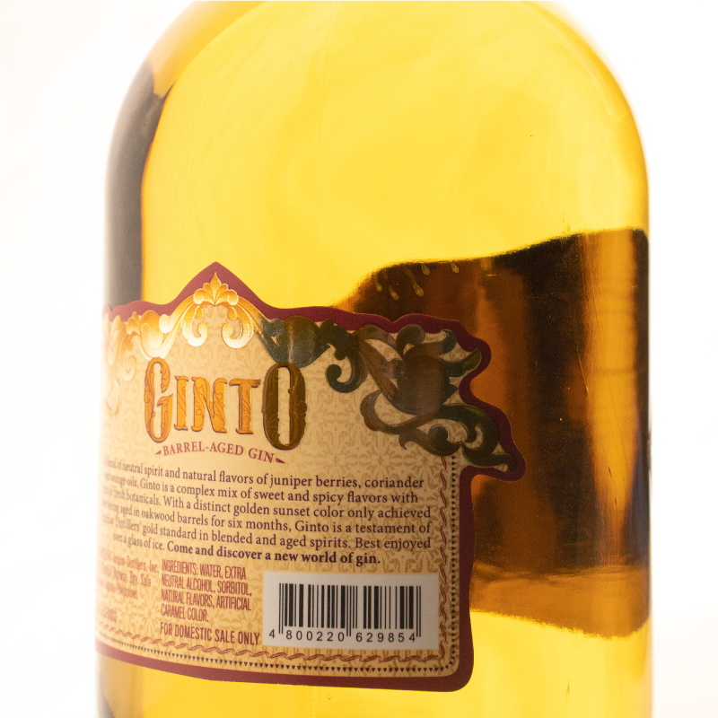
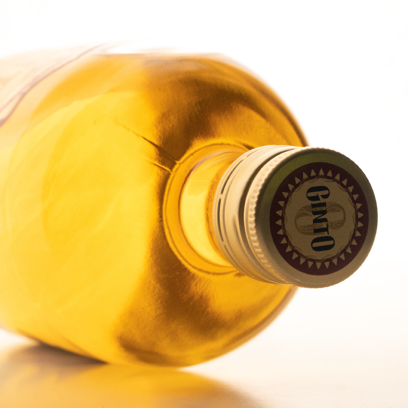
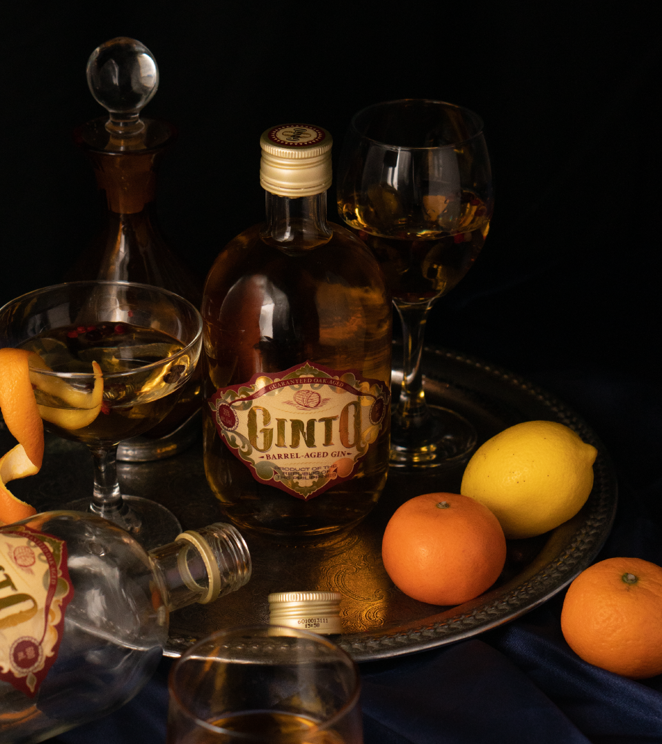

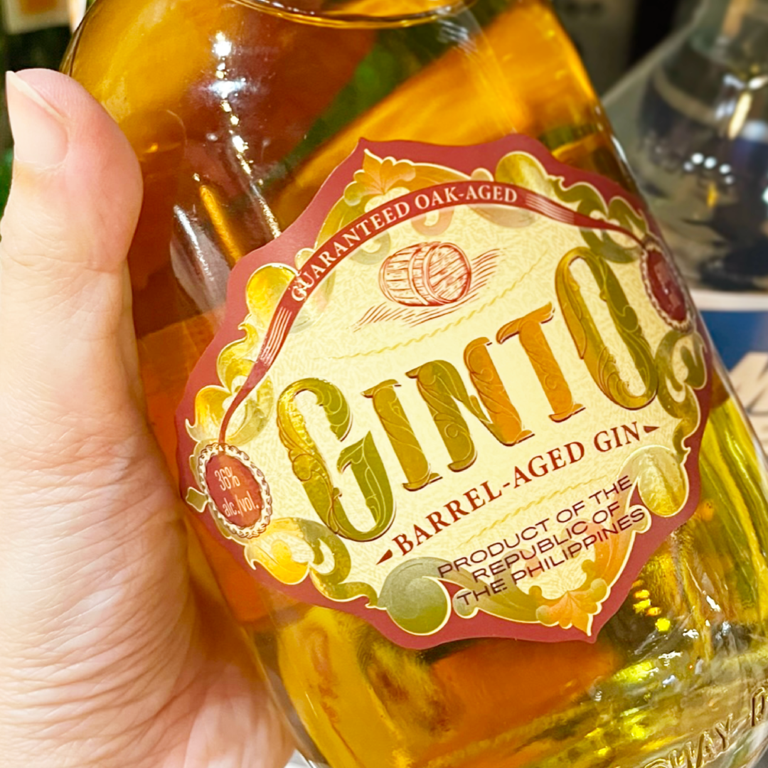
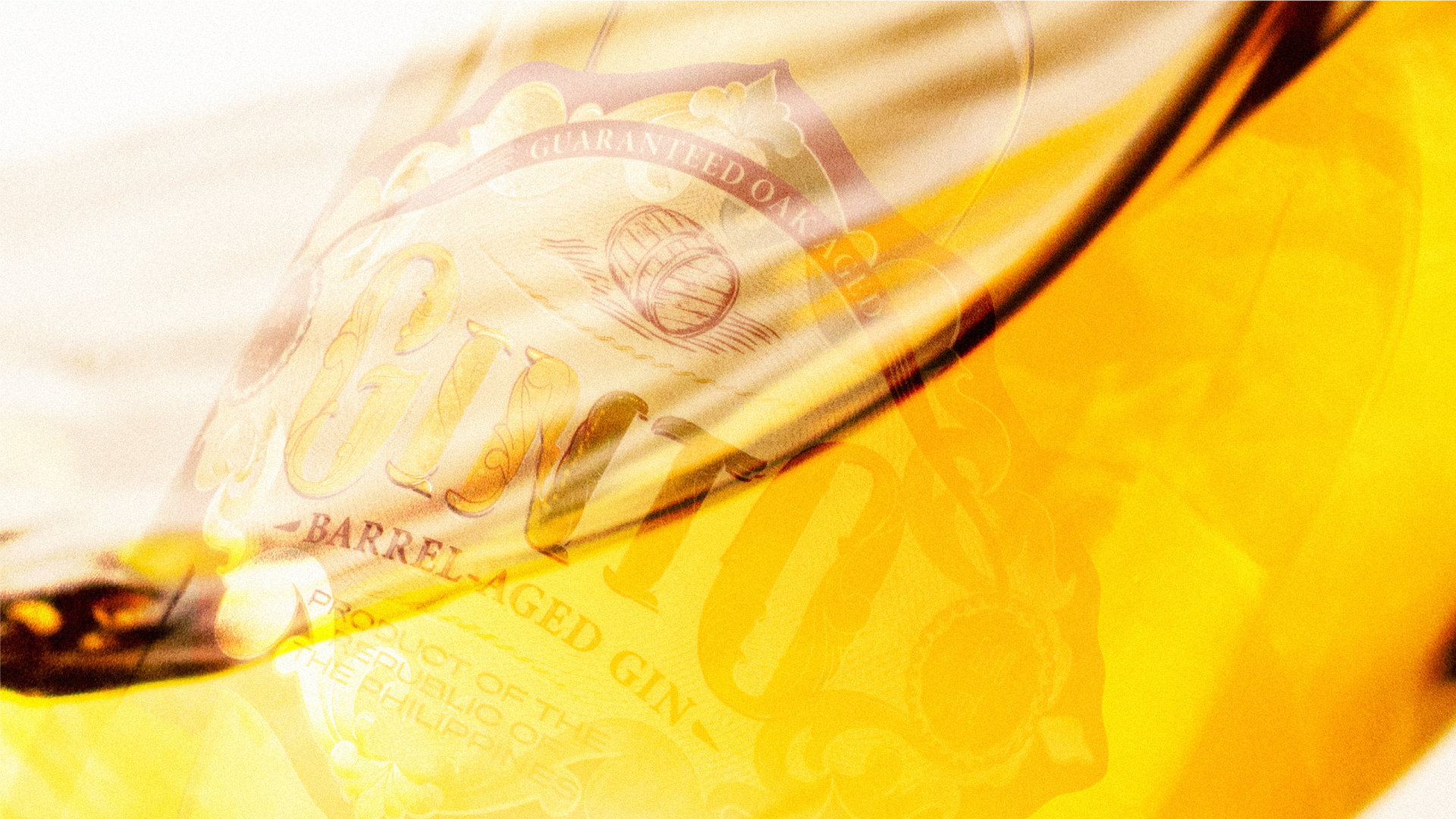
The color palette of the brand is composed of deep and rich colors meant to evoke the brand’s story.