CRIT
2026
BOOK DESIGN
Jad Maza
Bea Pangandian
Jenny Rala
COLLABORATORS
Kanto.PH
Judith Torres
CRIT is a book that is about paying it forward.
Every year since 2015, Filipino architects have been putting one another through practice critique sessions before heading out as the Philippines’ representatives and finalists to the World Architecture Festival.
The CRIT book is anchored on this annual tradition, arguing for a culture where architects and interior designers question one another’s works openly.

The book’s contributors are a mixed group. Twenty-five established and emerging voices in Philippine architecture and design, all who have taken part in practice crits as coaches or jurors, came together to write about what their practice has taught them, for the next generation of designers.
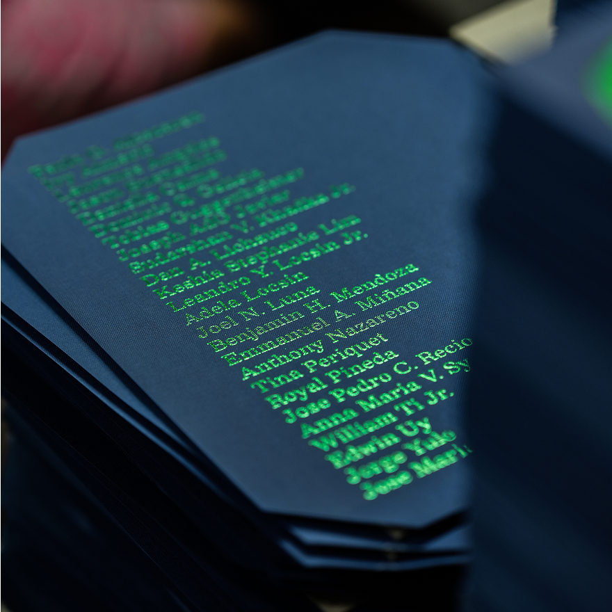

How might we reflect the coexistence of multiple and diverse architectural identities, practices, and point of views?
Designing CRIT
"Far from a weakness, the diversity is the book’s proof of concept that all manner of architectural beauty can coexist," Patrick Kasingsing, Editor-in-Chief of Kanto, Creative Director of CRIT Design values grounded the design decisions. CRIT is a book that is bold and contemporary, while also disciplined and composed.
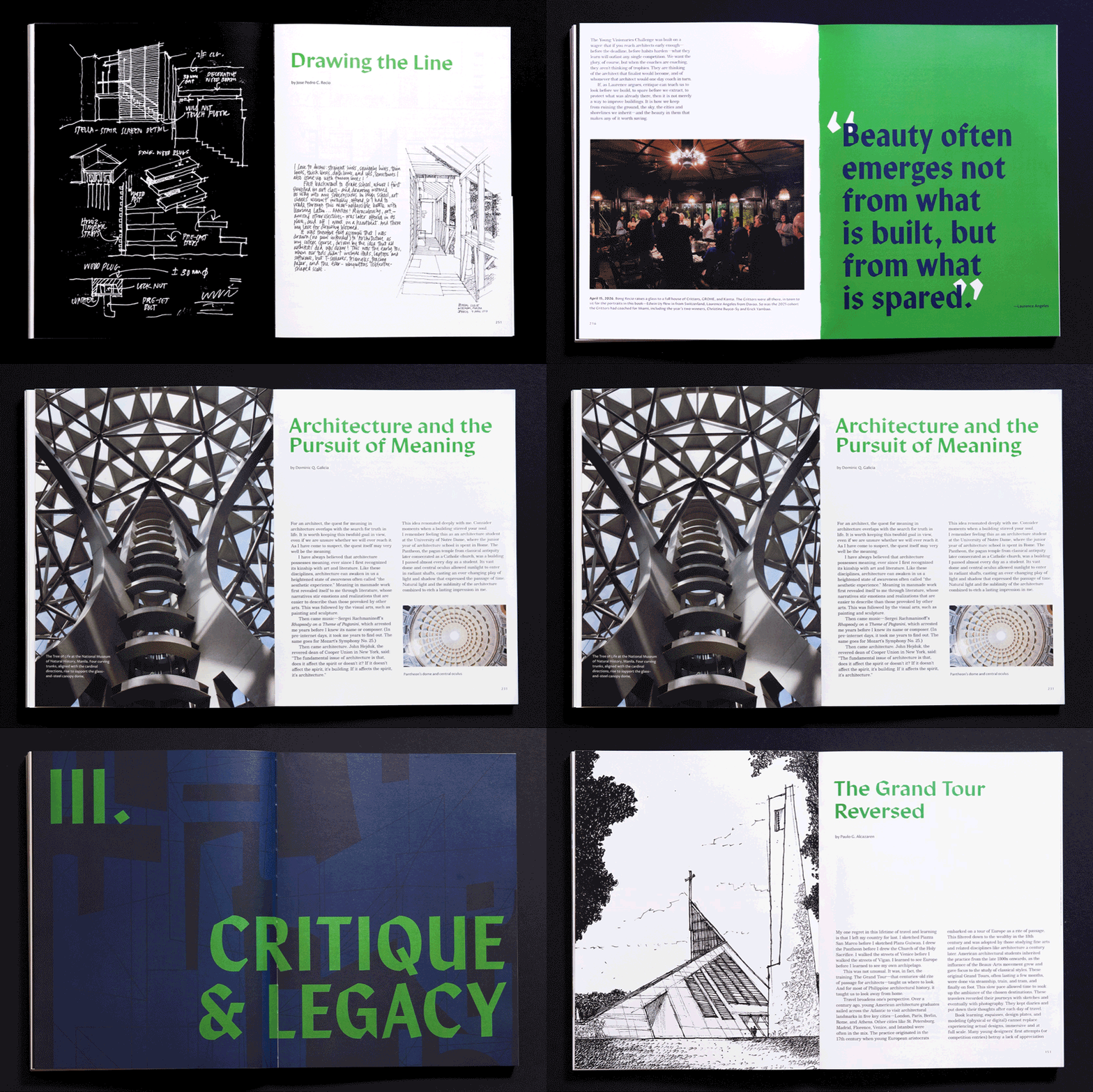
A plural, archipelagic expression
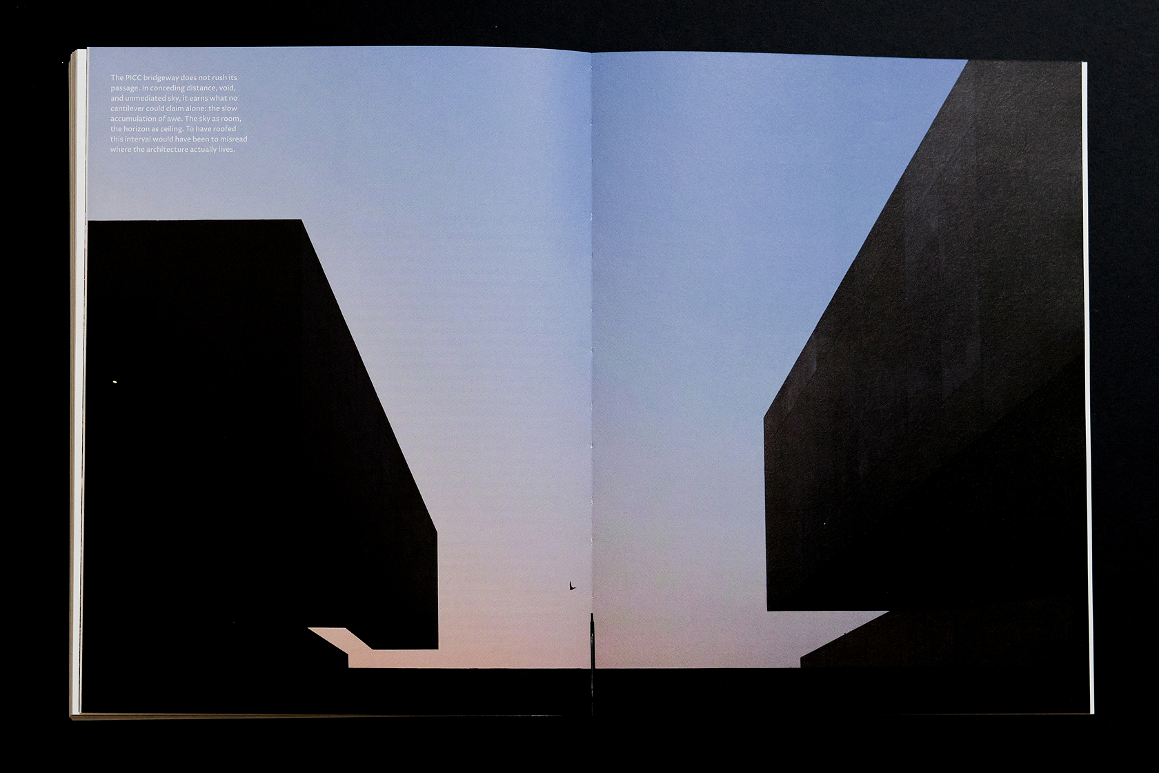
Expressed through a distinct visual identity of each chapter while maintaining an underlying system that holds the book’s layout together.


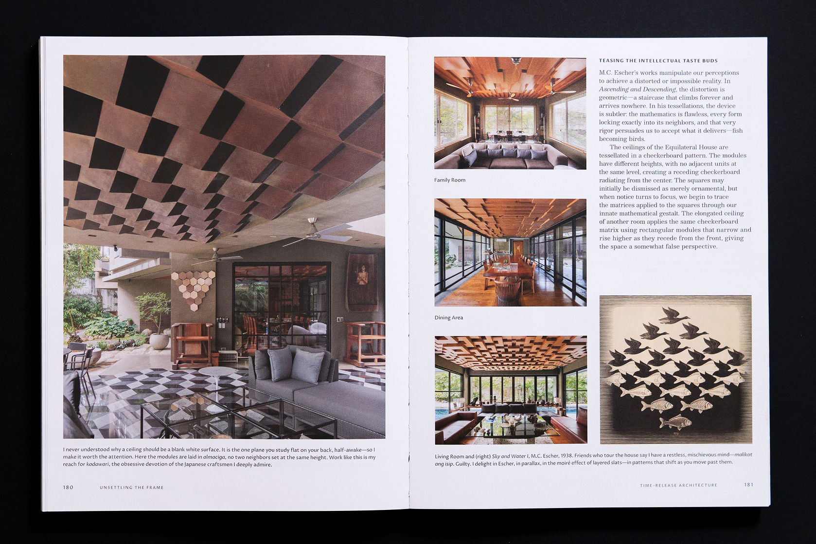
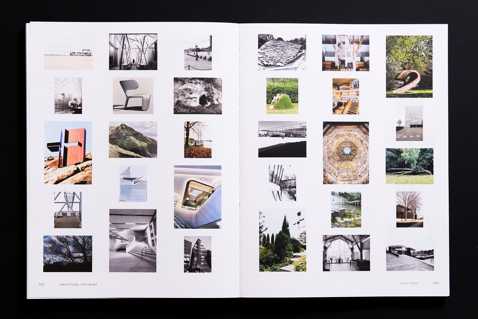

Reflective and memory-aware
Expressed through pacing, restraint, and the use of flow and pause to allow ideas and images to move or settle.
Expressed through the use of imagery, transporting readers to the space that holds the book’s layout together.
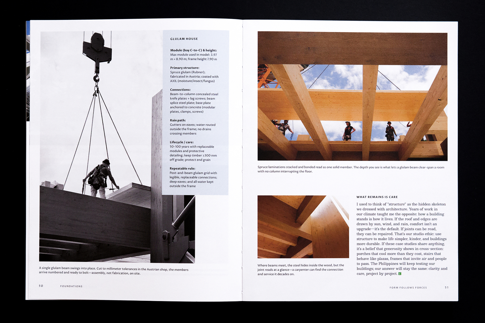
Clear, generous, and readable
Expressed through strong hierarchy, legible typography, and consistent navigation that supports learning.
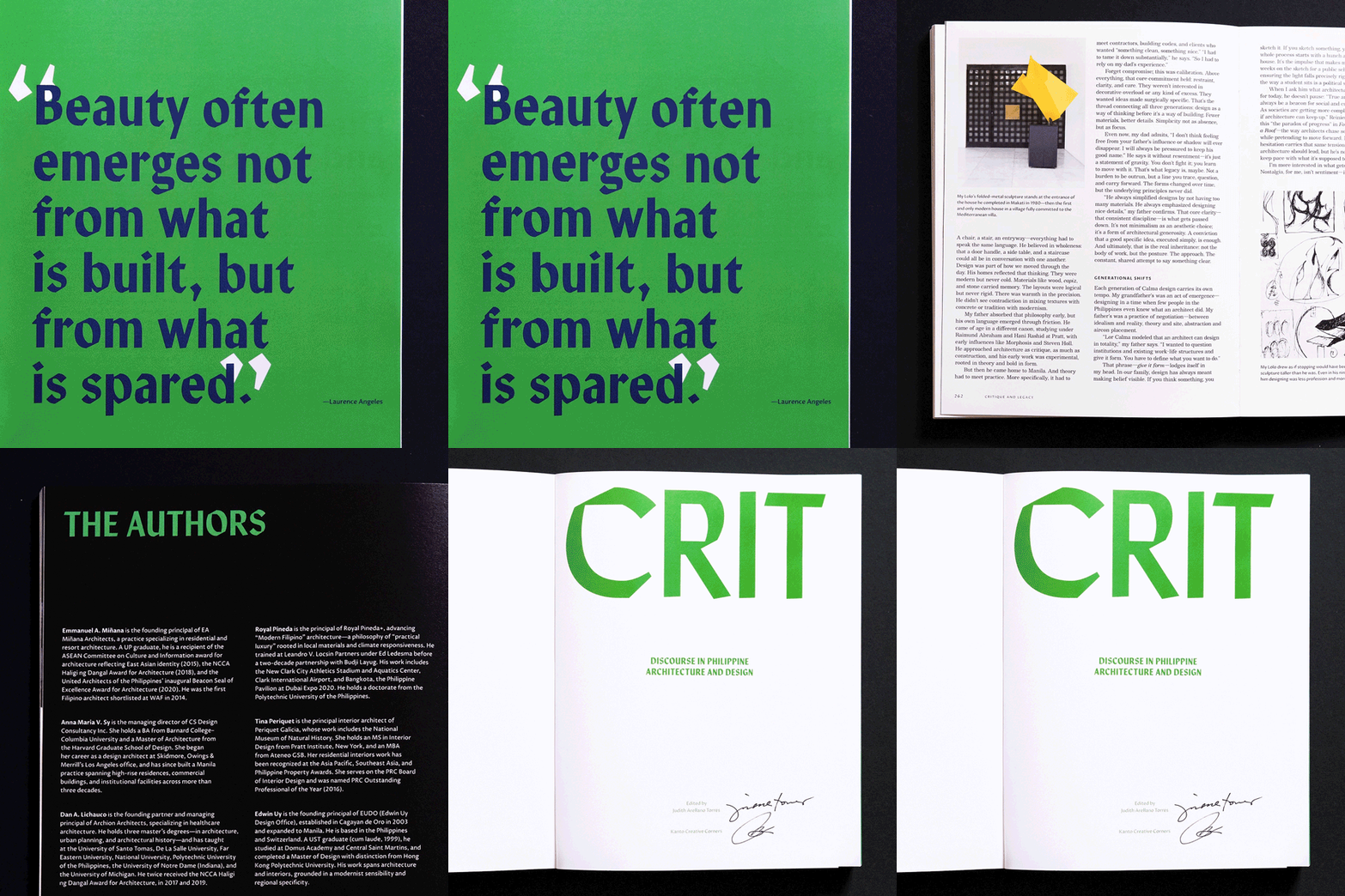
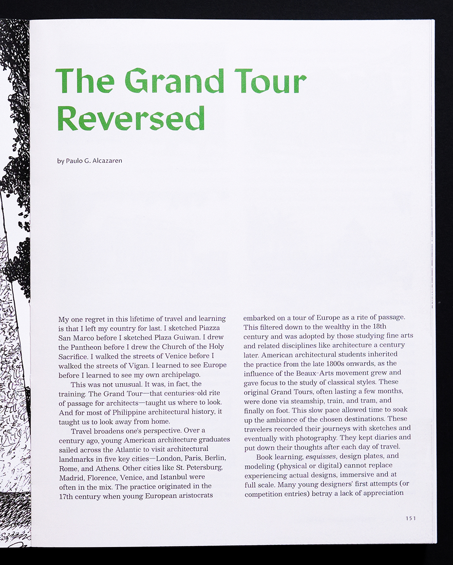
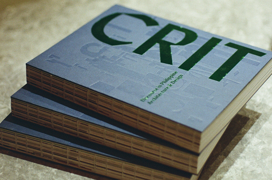
Manofa, a sharp and calligraphic sans-serif typeface, is used as a display. Appearing on the cover, chapter and article titles, it brings out the strong and willed character of the book.
It is contrasted by Besley, a humanist serif, that warmly flows throughout the book as the typeface choice for the body.
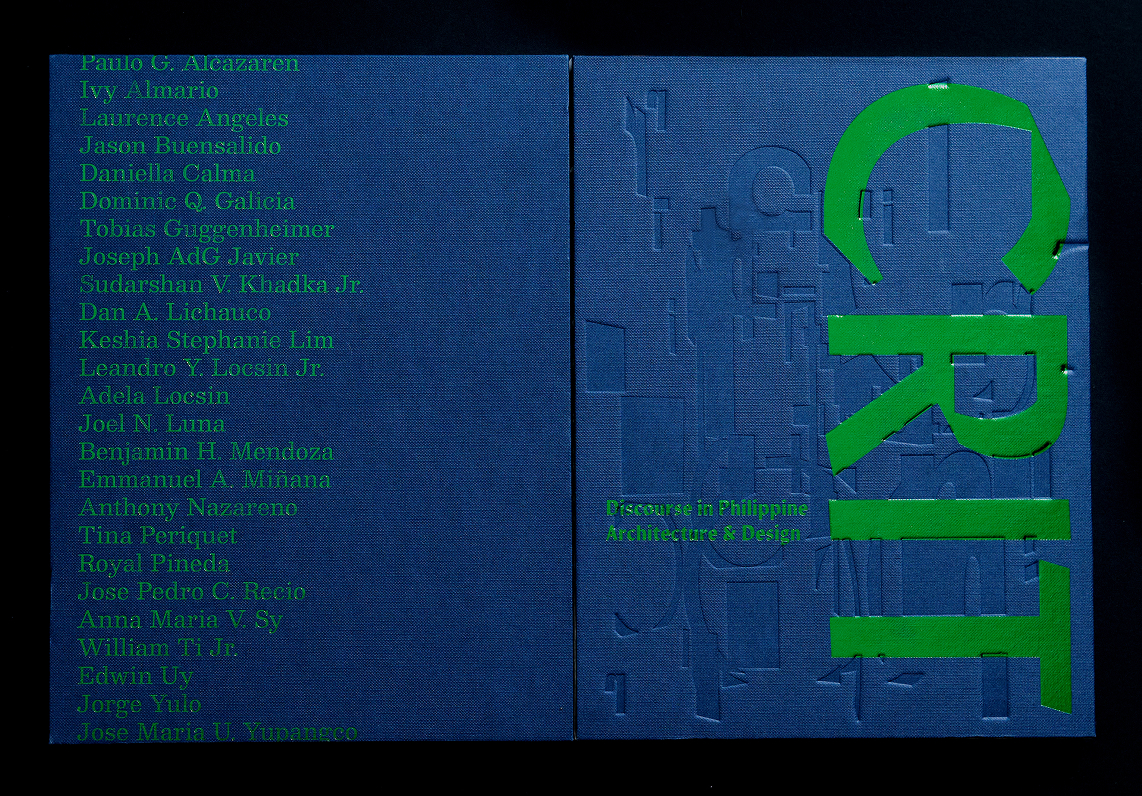
A rich, subdued blue and a daring, contrasting green that peeks through it colorfully weave across the book. These colors honor the country’s tropical context, surroundings, and materials, all of which are presented and discussed by the authors in their respective articles.
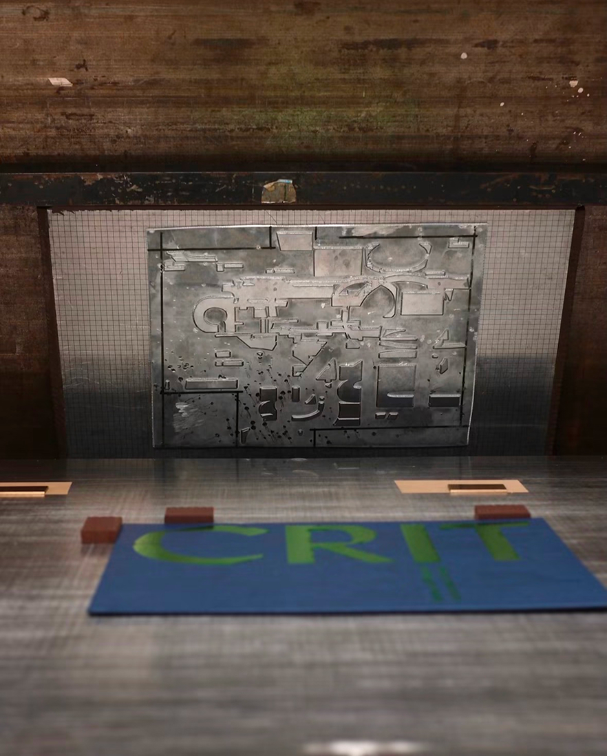
The cover design interprets the book’s quality of having diverse voices that shape the discourse. The letters of CRIT are placed in different planes and perspectives, layered to create an abstract image.
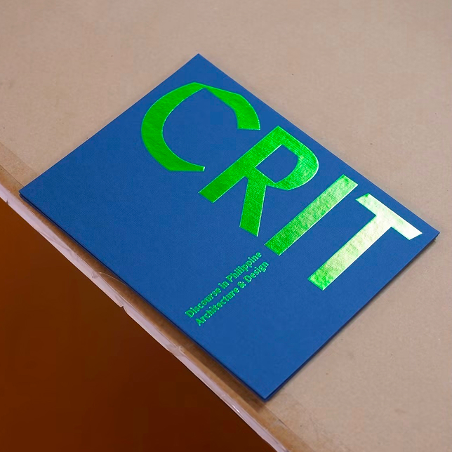
In print, this abstract image takes on a debossed effect. Above it are book details, the title CRIT and the name of the authors, foil stamped in a vibrant green.
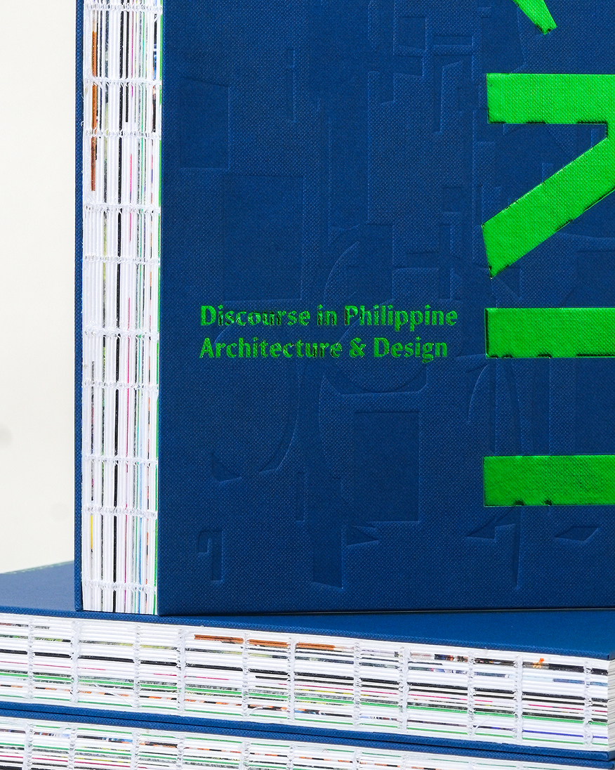
The book also features a smyth sewn binding, allowing its pages to open and lay flat for reading comfort.
"A crit can't redesign a building, but it can change what an architect does in the next one,"
shares Judith Torres, editor-in-chief of CRIT.
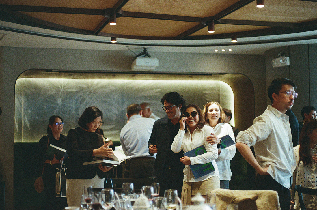
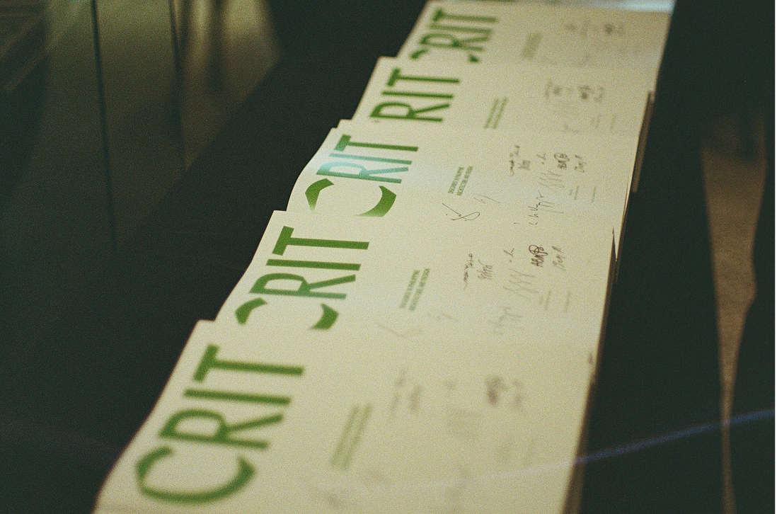
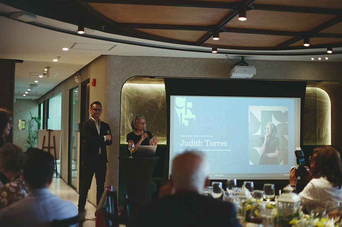
Published by Kanto with support from GROHE Philippines, the book is set to find their way to the libraries of the country’s architecture and design schools in 2027.