Ayala Malls Custom Typeface
2025
Branding, Type Design
CREATIVE DIRECTION
And A Half
TYPOGRAPHY
JO MALINIS
JAD MAZA
BRAND IDENTITY
BJ ABESAMIS
PETRA GANA
JAYRENE CRUZ
TIM LOPEZ
MARK ANDRES
JO MALINIS
JAD MAZA
Ayala Malls is one of the largest shopping retailers in the Philippines, with pioneering retail spaces and experiences situated across the country. In this next phase of their growth, how might we elevate Ayala Malls as a global leader in retail experiences?
With each mall being centrally located, we envisioned Ayala Malls as the Heart of Amazing - a place of convergence for communities that are constantly inspired and excited.

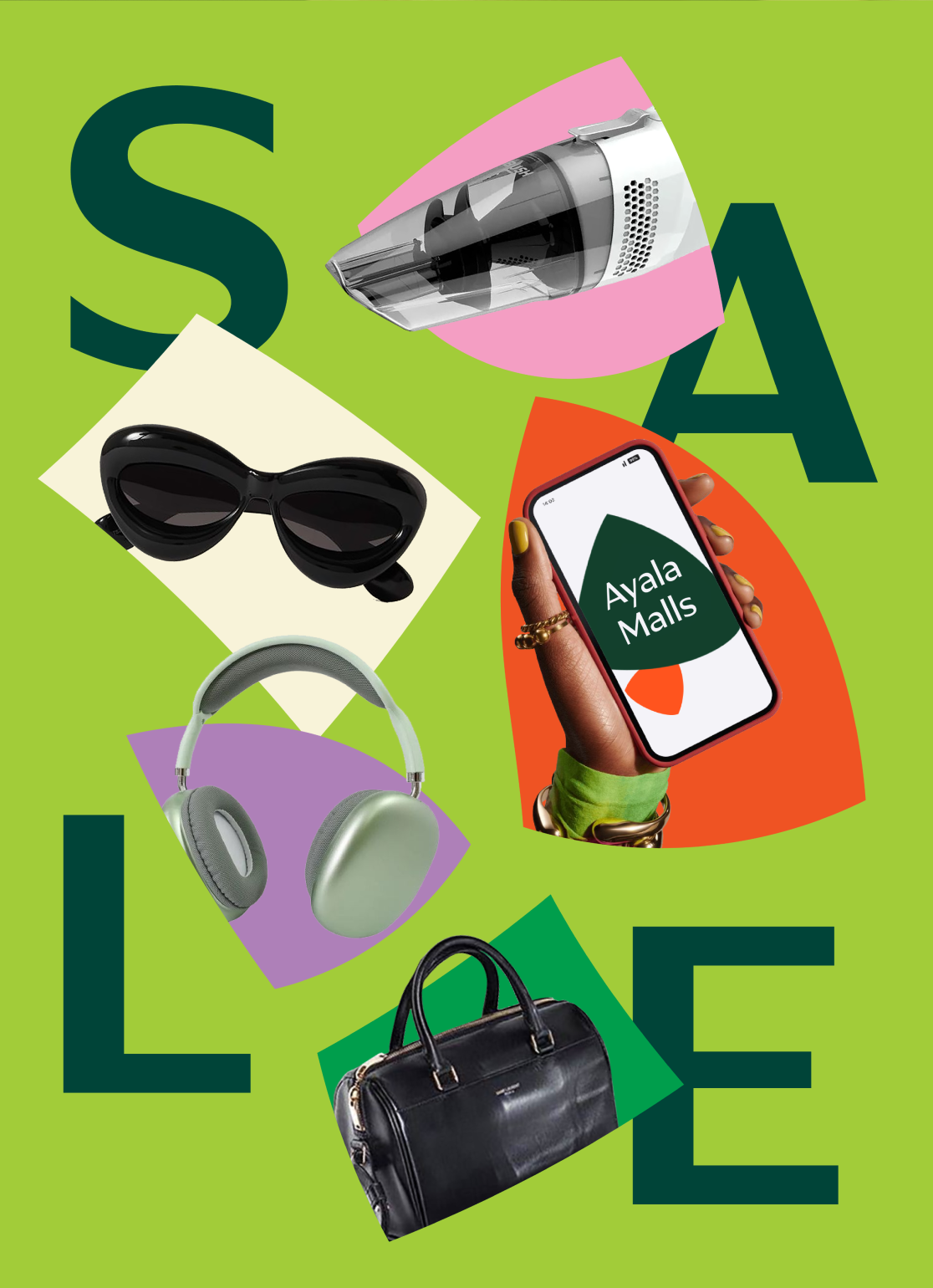
A hallmark characteristic of Ayala Malls is how they are sprawling with vibrant spaces such as activity centers, gardens, and areas for art & culture.

Our key visual, Enriching Spaces, draws inspiration from the organic forms and flowing architecture found throughout Ayala Malls—from open courtyards and garden pathways to curved facades and light-filled interiors. These shapes come together in dynamic compositions that mirror the energy and movement within each mall, reflecting how spaces evolve as people gather and connect.
Custom Typeface
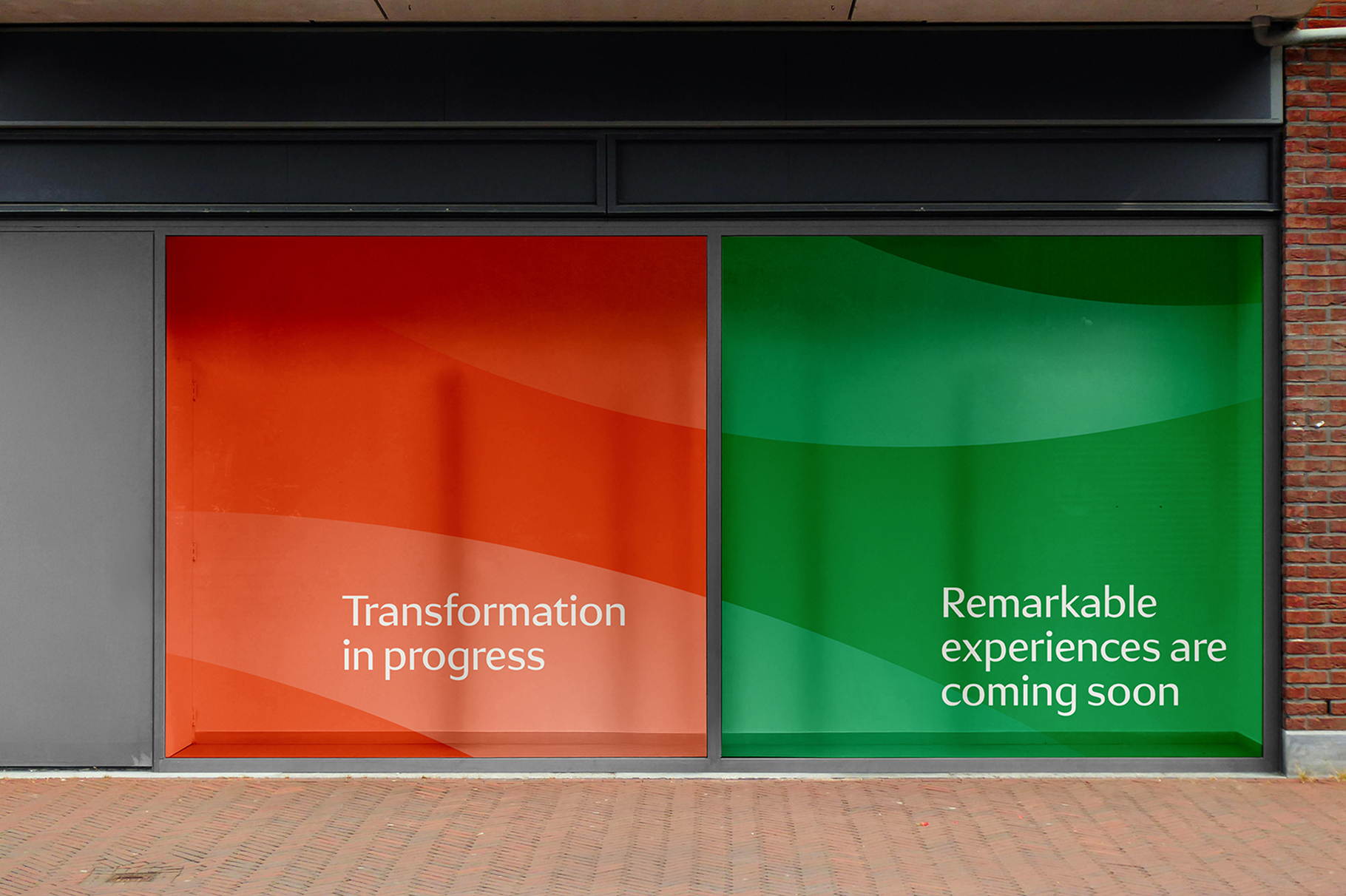
Ayala Display Sans and Ayala Sans is a custom typeface for Ayala Malls is designed to be classic yet contemporary, embodying a timeless quality without feeling dated. The typeface balances traditional humanist influences with a modern aesthetic that avoids fleeting trends, resulting in a warm and personable design. Unlike geometric or neo-grotesque styles that can feel cold and impersonal, this humanist typeface exudes distinctiveness and approachability, aligning perfectly with Ayala Malls’ contemporary yet inviting brand identity. The typeface family includes two main styles, each available in three weights: regular, bold, and black.
This key visual is the foundation for the Ayala Malls custom typeface.
Drawing from the brand’s core idea of Enriching Spaces, the typeface reflects the organic softness and gentle movement found throughout Ayala Malls’ architecture—from flowing walkways and curved facades to bright, open interiors.

These influences appear in the typeface’s sculpted contours, soft angles, and balanced proportions, resulting in forms that feel intentional, welcoming, and alive.

Ayala Display Sans is the primary typeface. It incorporates tapered shapes and sharp, clean cuts, giving the brand a unique and recognizable visual language. It is a display sans serif with carefully balanced contrast, making it effective across various sizes.
The secondary style, Ayala Sans, features a much lower contrast and thicker exit strokes that echo the sharp, clean cuts of its counterpart. Ayala Sans serves as a workhorse typeface, providing flexibility and functionality in smaller sizes, making it particularly well-suited for digital platforms such as web and app interfaces. Its design ensures that it pairs seamlessly with the primary style, enhancing the overall cohesiveness and adaptability of the brand’s typographic system.
.gif)
%20(1).gif)
The Display Sans and Sans typefaces are designed to complement each other seamlessly. With both existing in three weights, they offer flexibility in mixing and matching for a dynamic yet cohesive look.


The key to using them effectively is to be mindful of their contrast—balancing their differences to create visual interest while maintaining harmony in the design.
Visual Elements
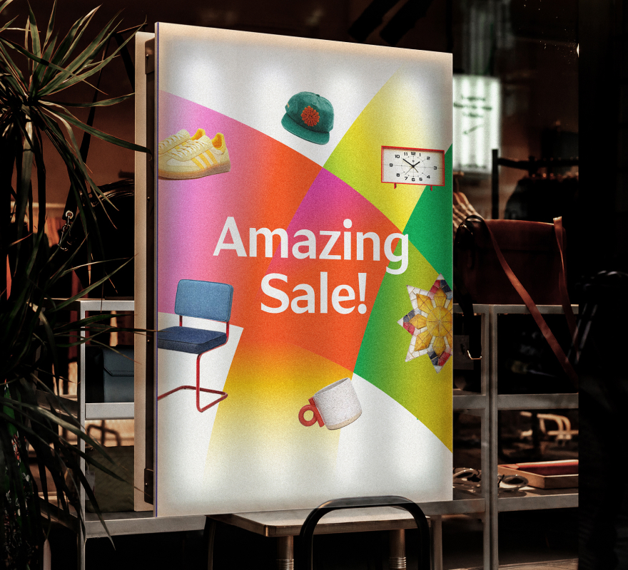
Across the system, overlapping colors and textured illustrations bring depth and vibrancy, echoing the layered experiences found in every visit. The customized typography takes cues from the soft angles and openness of Ayala Malls’ architecture, balancing elegance with approachability.


Beyond the core Ayala Malls identity, the custom typeface is also applied to the new Glorietta and Greenbelt logos, featured in their respective project pages.
The typography comes alive alongside the Ayala Malls color palette and illustration system, where layered colors and textured forms bring added depth and vibrancy.