Para Font
2019
Typography
Mike Parker
Addi Panadero
Clara Cayosa
Bj Abesamis
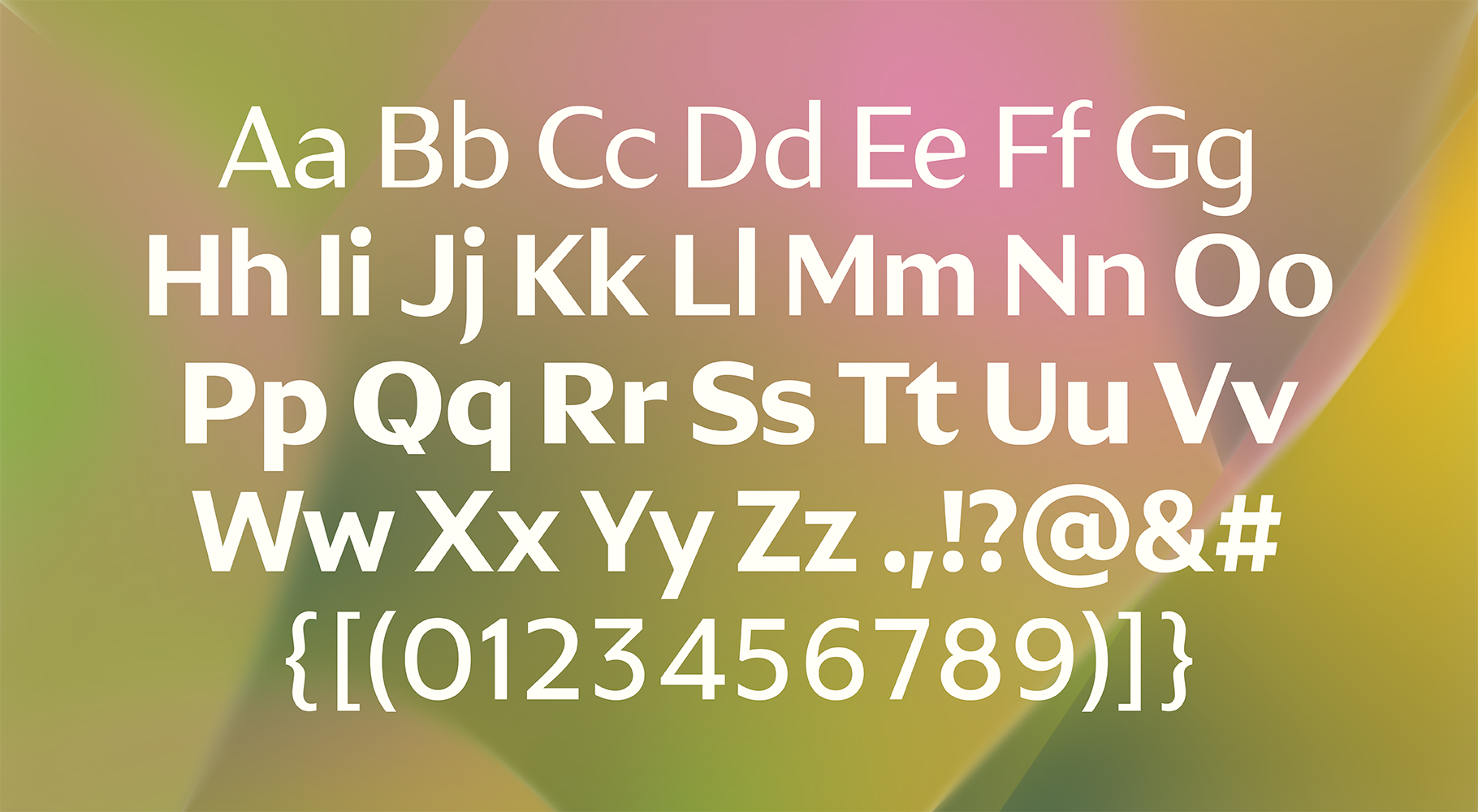
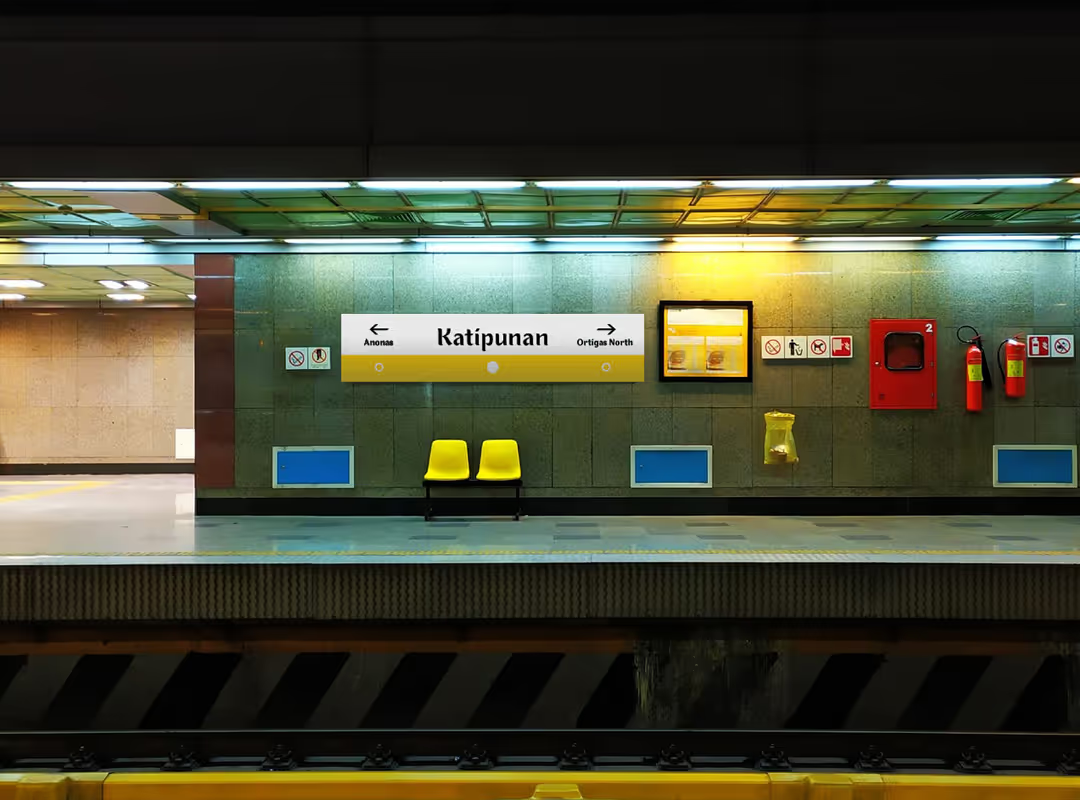
Para Font is our take on a typeface for mass transport, built for signs on trains, buses, jeepneys, and tricycles. We studied hand-painted lettering and signs found across Metro Manila, drawing from their rhythm, texture, and character. These signs, while often improvised, reflect a rich visual language that’s uniquely ours. Para Font doesn’t aim to clean that up or standardize it, but to honor it. Offering a system that respects tradition while improving legibility and function for the everyday commuter.
Watch our Para Font feature:
Youtube


Para Font takes cues from hand-painted signs on jeepneys, buses, and tricycles across Metro Manila. We designed its letterforms to look like paint laid on metal. Built for clarity and character, the typeface brings structure to a visual language shaped by movement and everyday use.


Para Font draws from a visual language born out of necessity: improvised, resourceful, and distinctly Filipino. While the daily commute is far from easy, this typeface is our small wish for a future where design helps create a more humane journey. It offers a system that’s expressive yet functional, honoring what’s been there while imagining what could be.