Tags:
2022

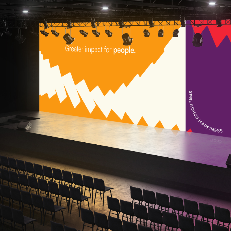
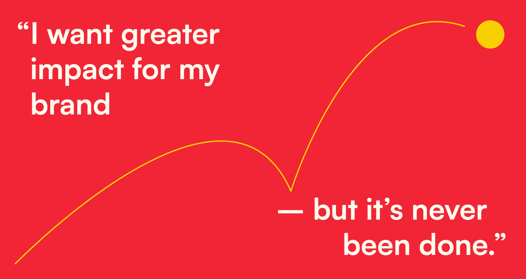
As they gear up for global expansion, Activasia wanted a rebrand that could reflect their bold spirit and bigger vision.
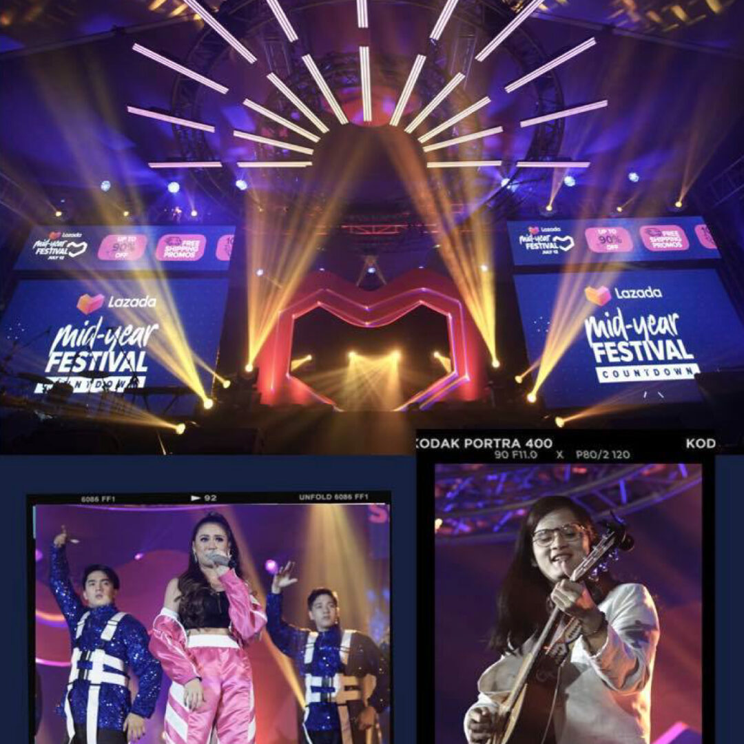
How might we showcase and strengthen ActivAsia’s unique ownership of Brand Activation?
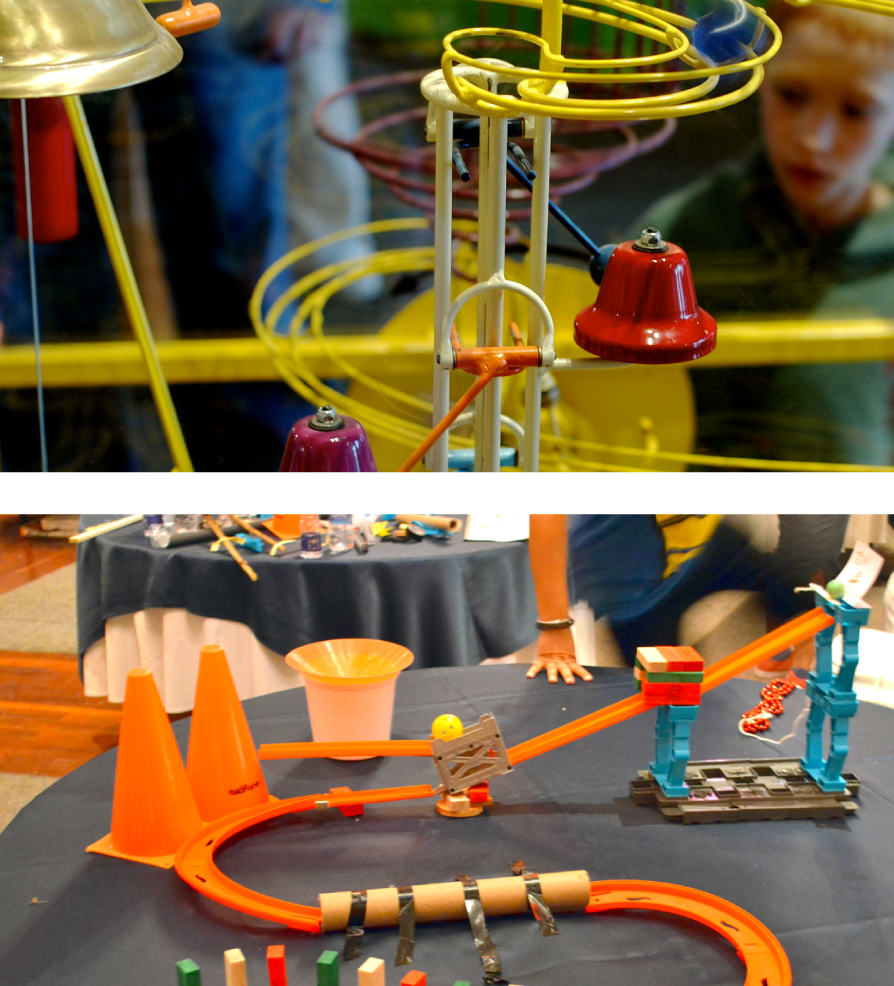
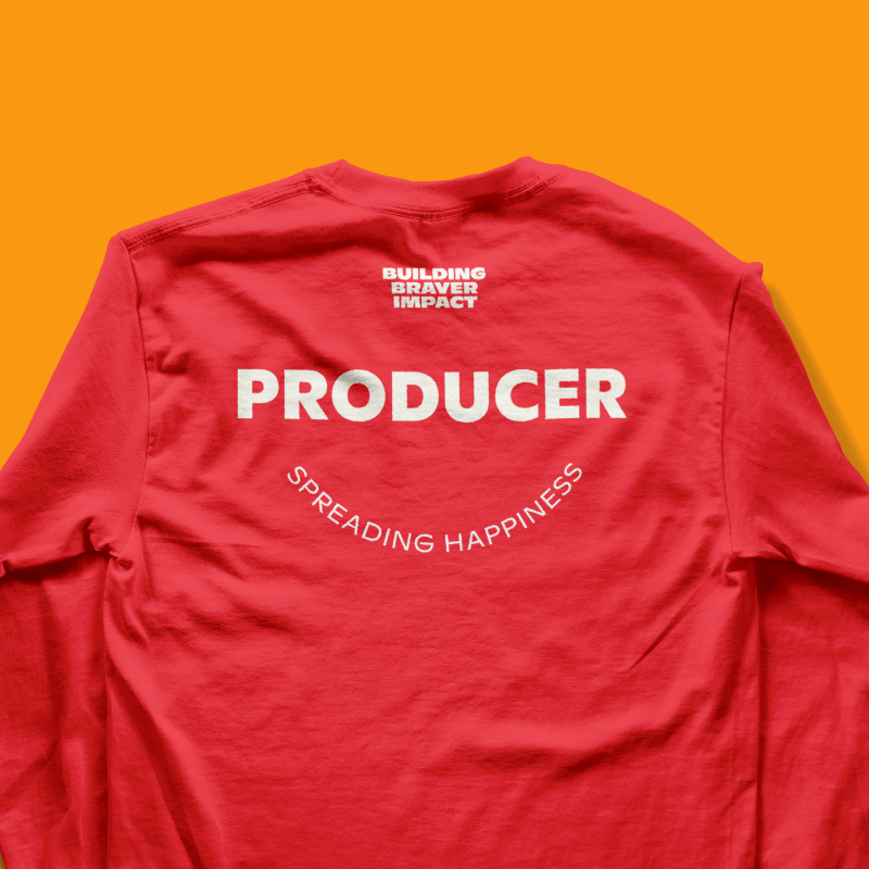
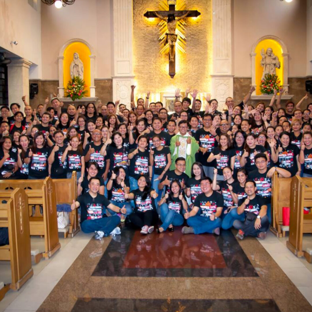
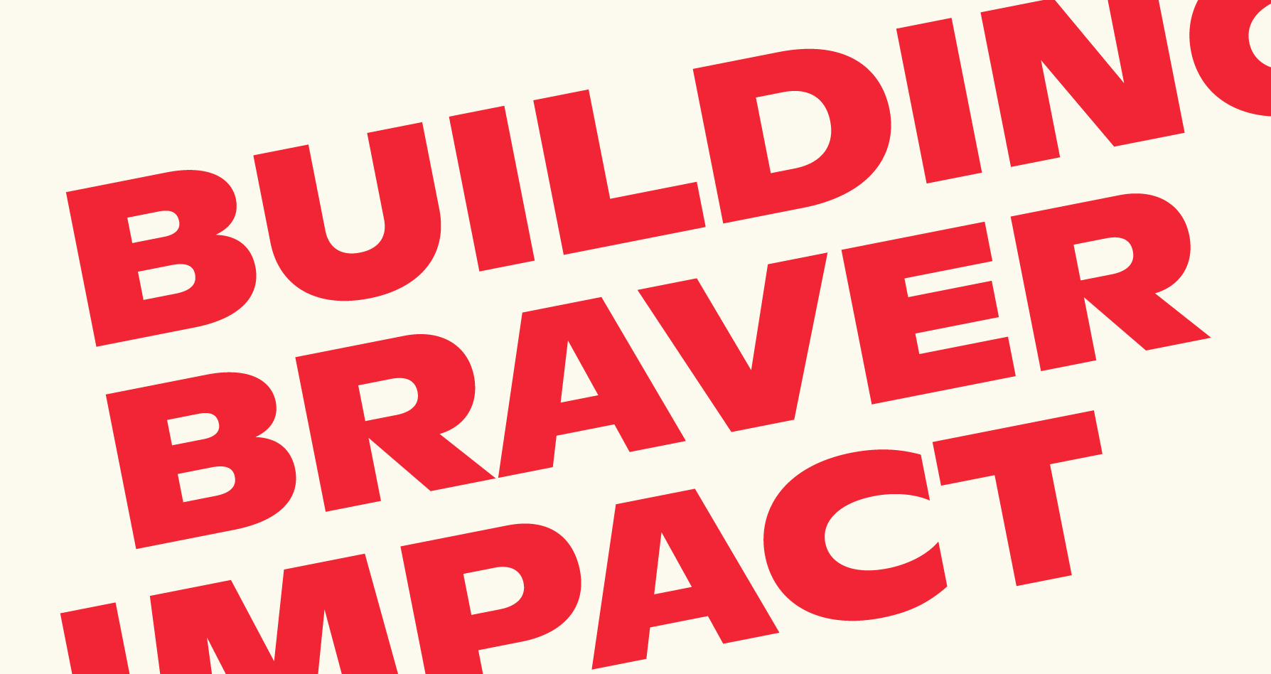
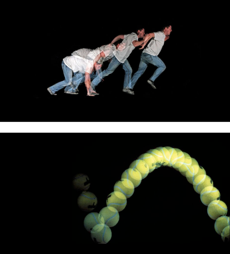
ActivAsia is relentless in their pursuit of happiness among their team & those they work with. Their ecosystem grows and empowers them to bring brands closest to the ground – impacting people everyday, in new and braver ways. Inspired by a ball running through a Rube Goldberg machine, the rebrand shows all the moving parts in brand activation and how their spirit sparks a chain reaction of happiness.
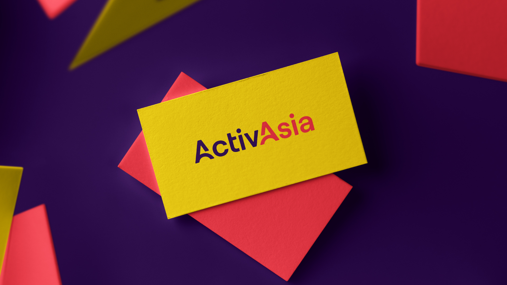
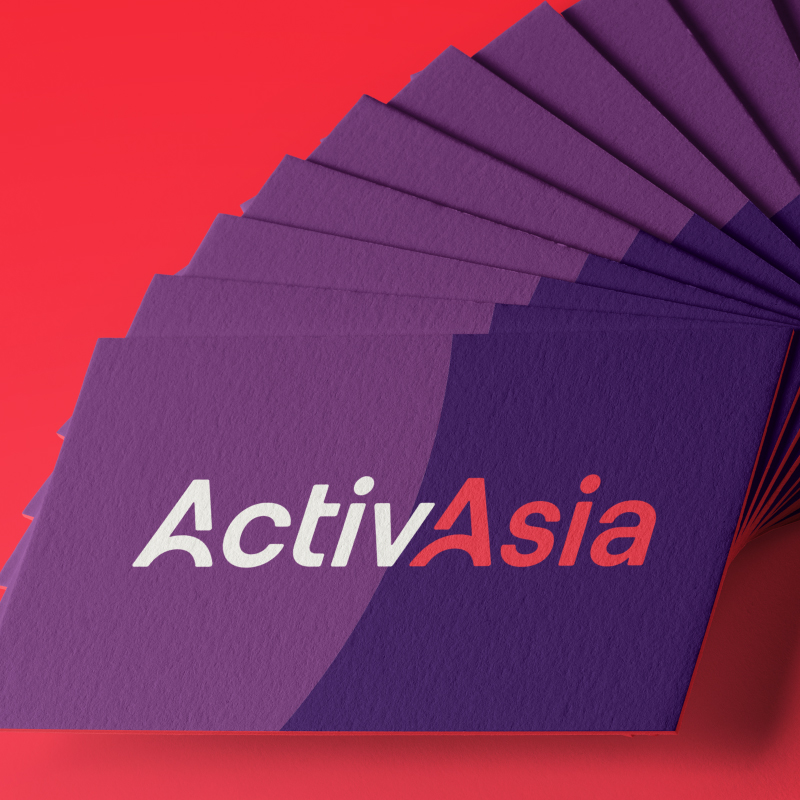
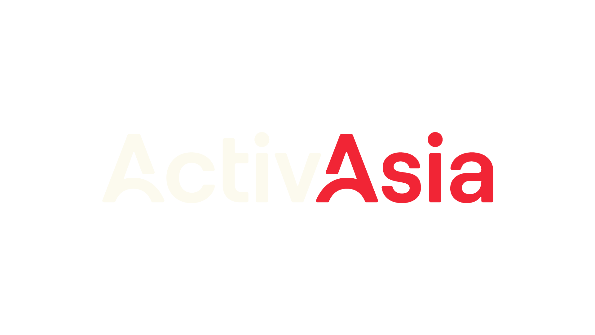
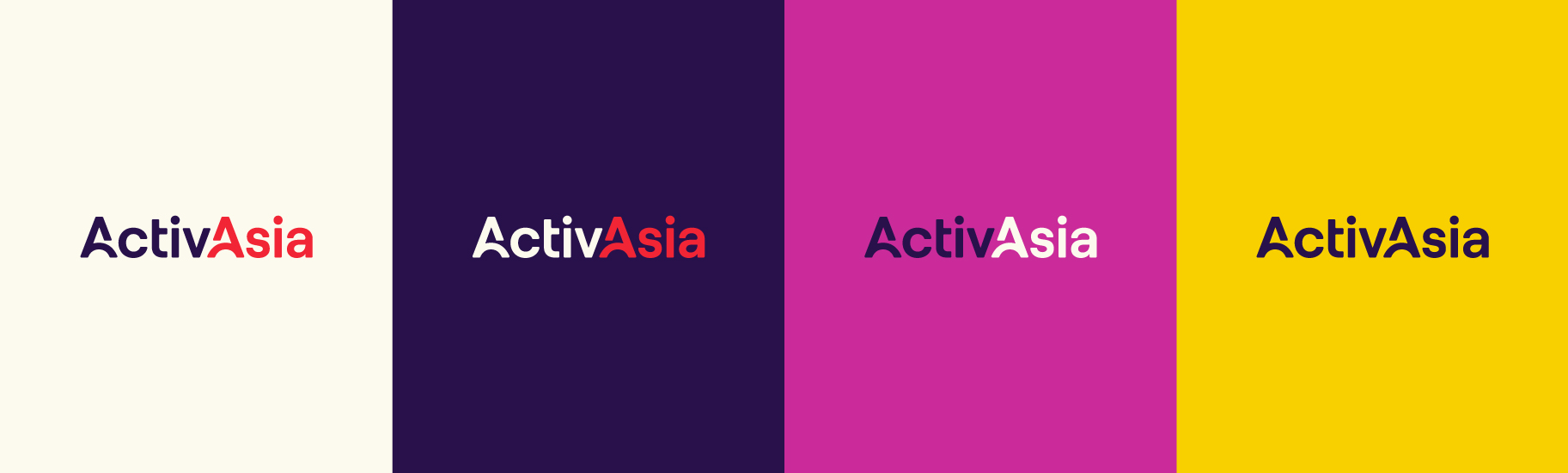
The ActivAsia logo shares the warmth and humanness of the brand. It shows what makes their team strong: the people behind the A+ team culture that has built lasting relationships. Inspired by Rube Goldberg machines, its two A’s illustrate a bounce that connects from the first A to the next, alluding to ActivAsia’s work ethic and the strength of their end-to-end service.
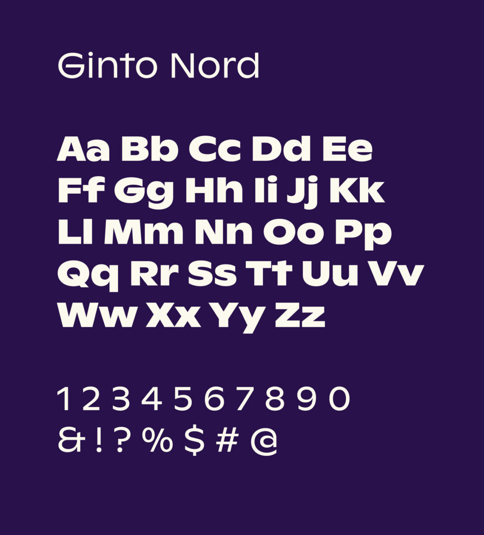
Ginto Nord provides a voice that matches ActivAsia’s spunk and attitude. Its width paired with its sweeping arcs allude to the wordmark’s arc.
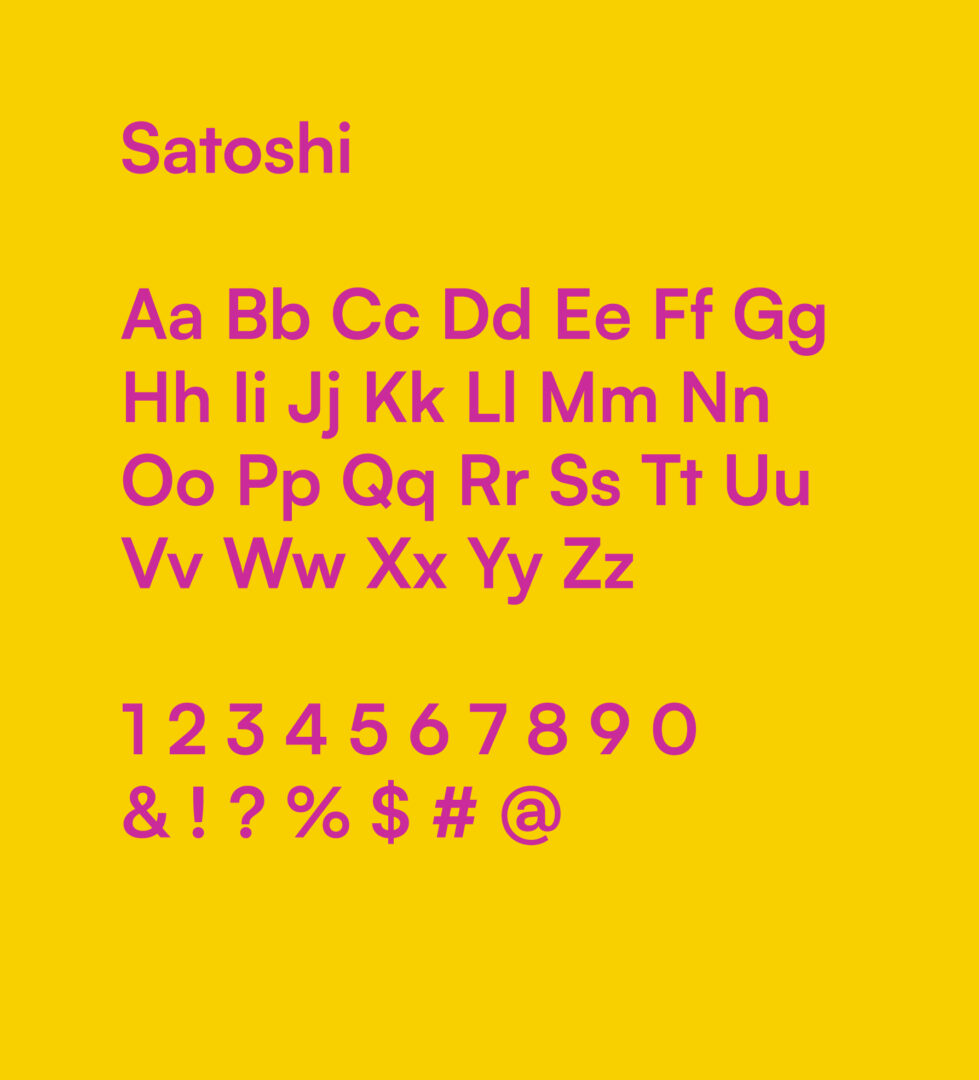
Satoshi grounds the headline type by giving a composed and reliable tone to ActivAsia. It jives with Ginto Nord and the wordmark with its roundness, but still has a very professional and clean-cut texture overall.
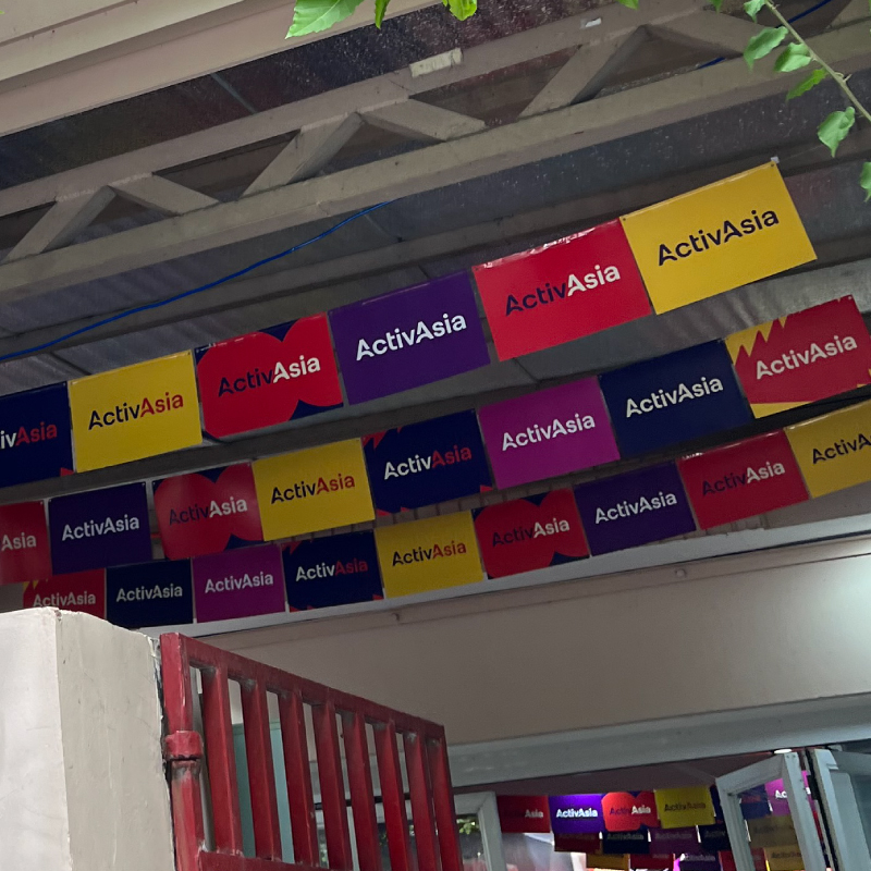
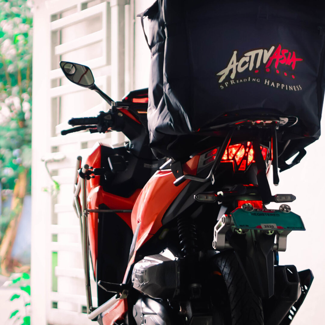
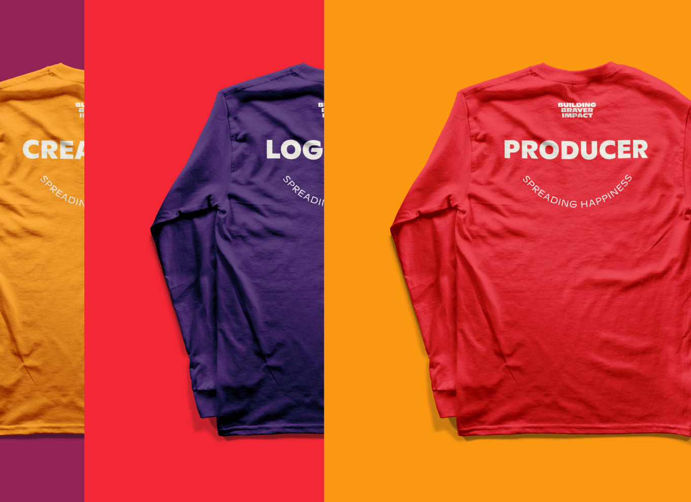
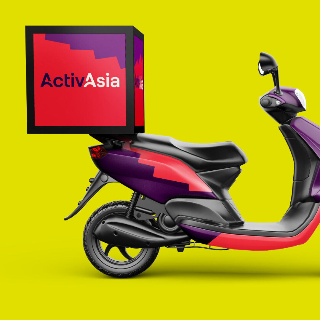
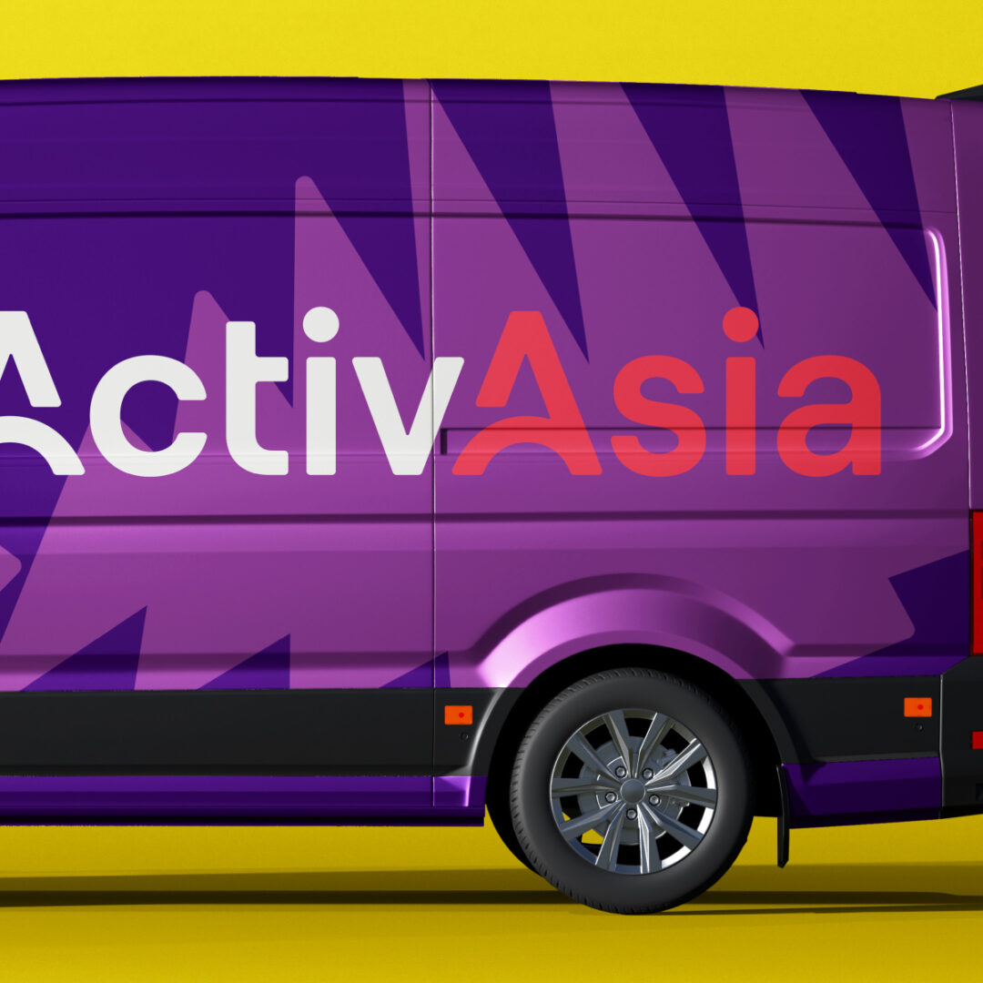
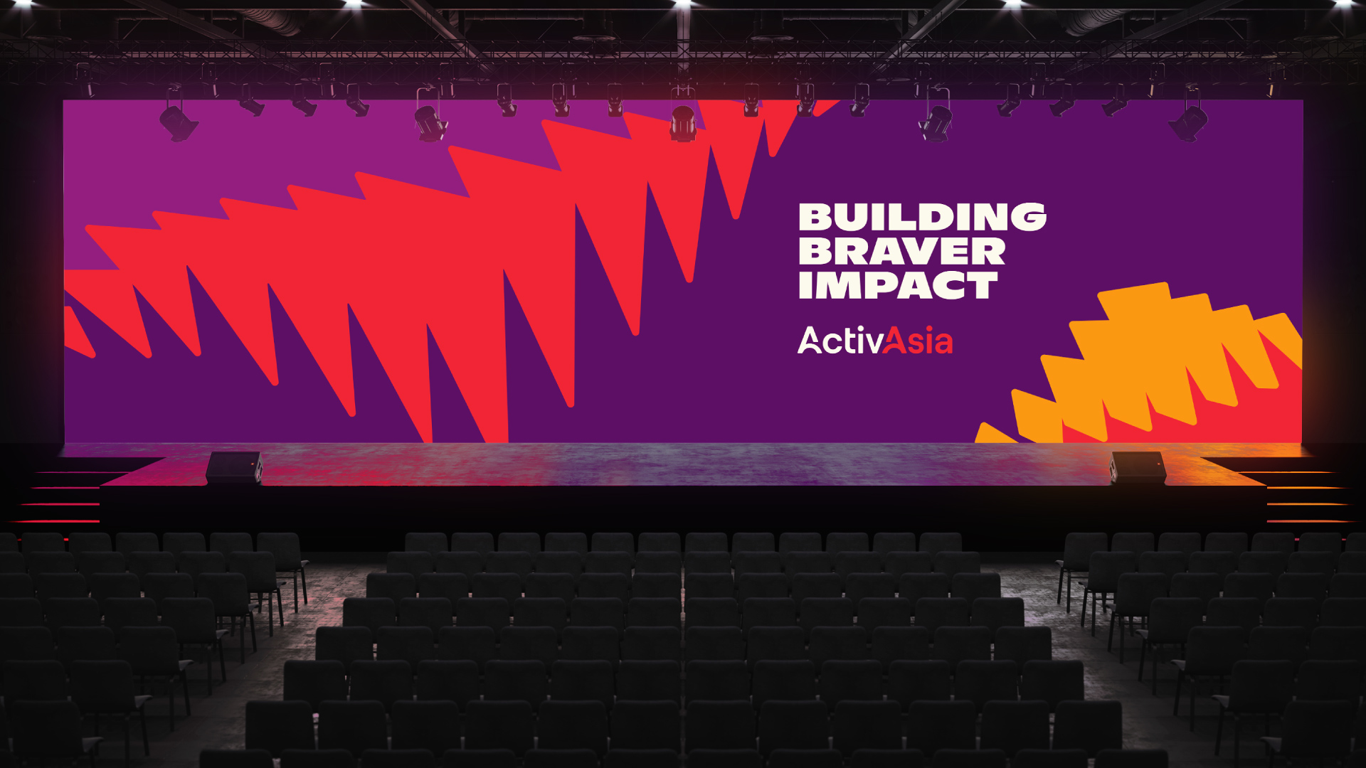
ActivAsia’s color palette conveys the joy of how the brand treats people within the organization and its partners. Its bright red calls back to the previous identity, and partnered with colors that help bring out ActivAsia’s attitude and warmth.

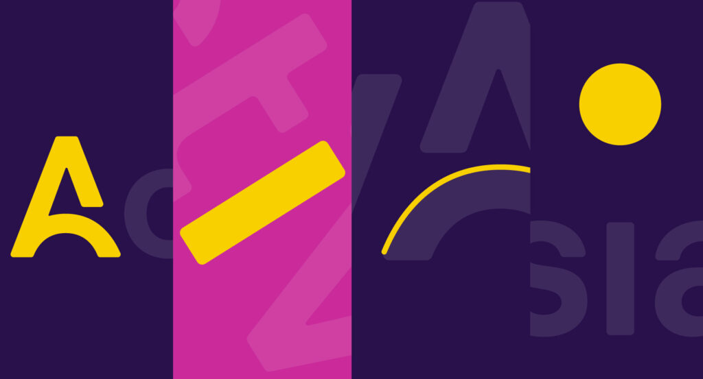
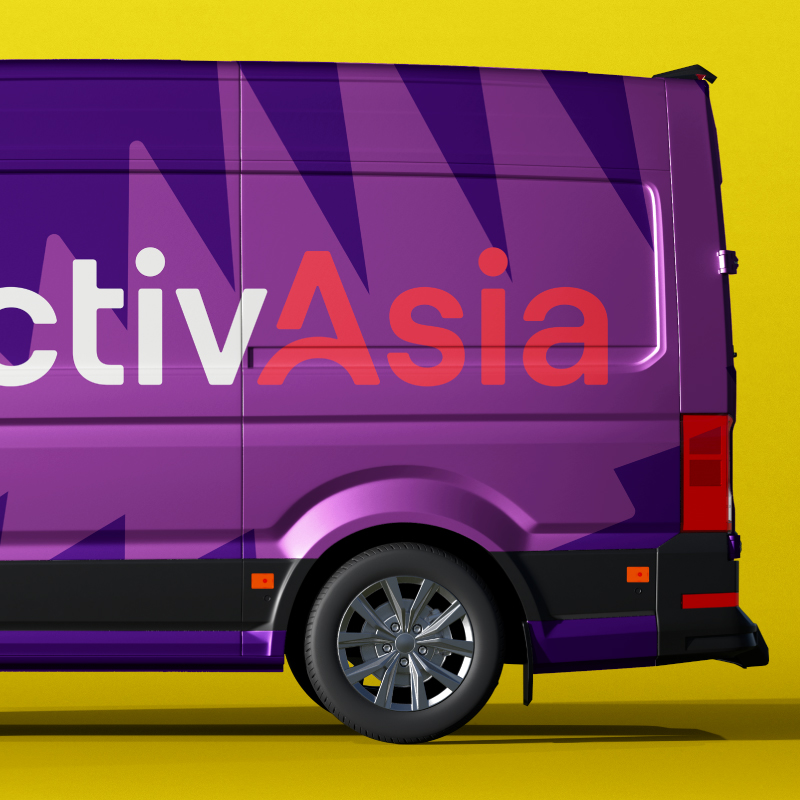
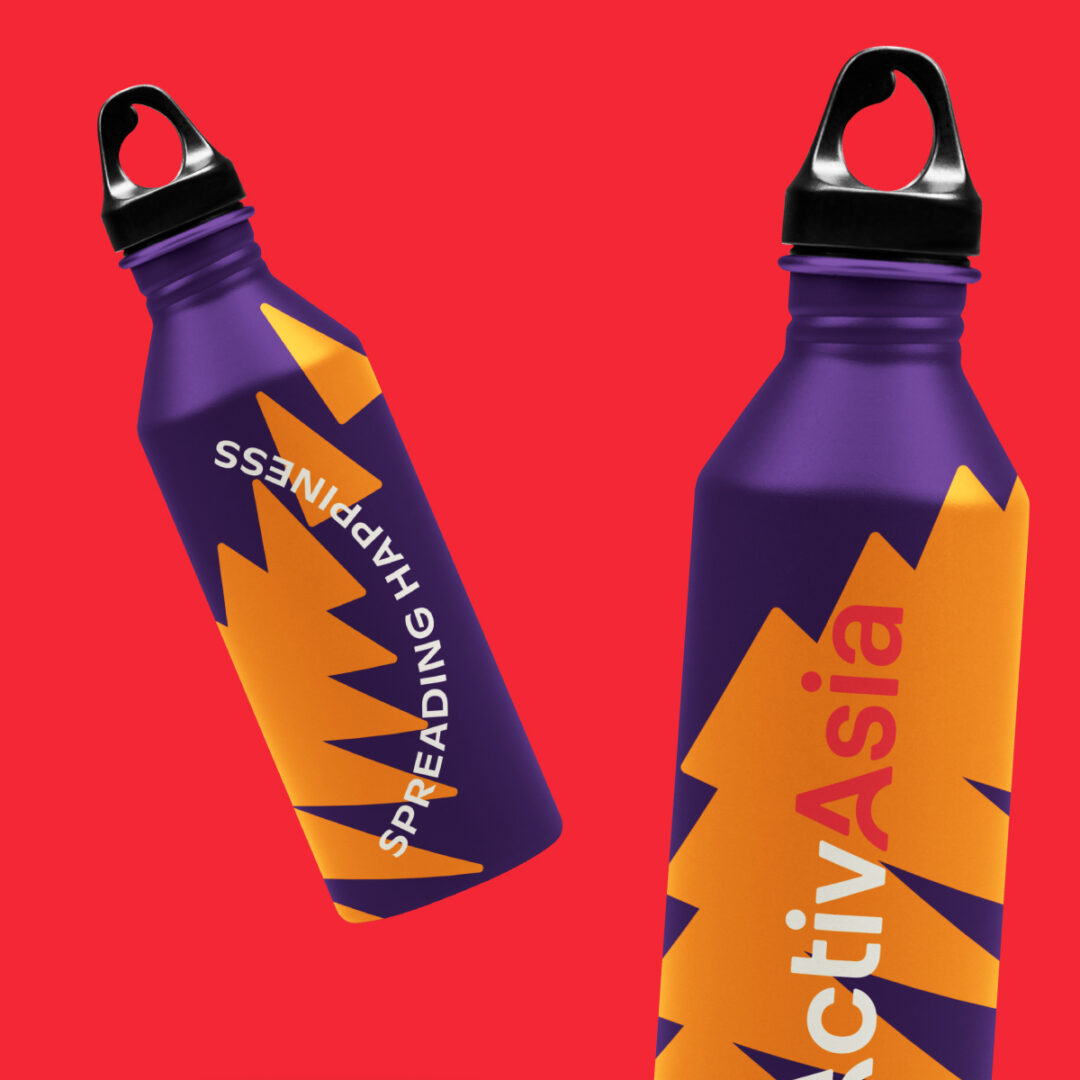
The key visual system has been pulled from the main shapes of the wordmark. These shapes can be used as a storytelling tools & reliable graphic elements.
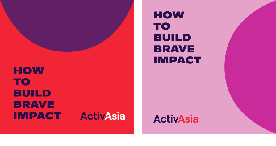
Patterns can be made from the three main whole shapes that interpret ActivAsia’s impact. Blended together, they show motion and transition – echoing the idea of building braver, gaining strength & momentum with each bound.


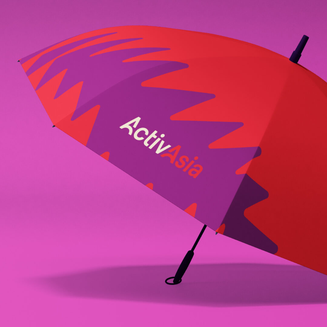
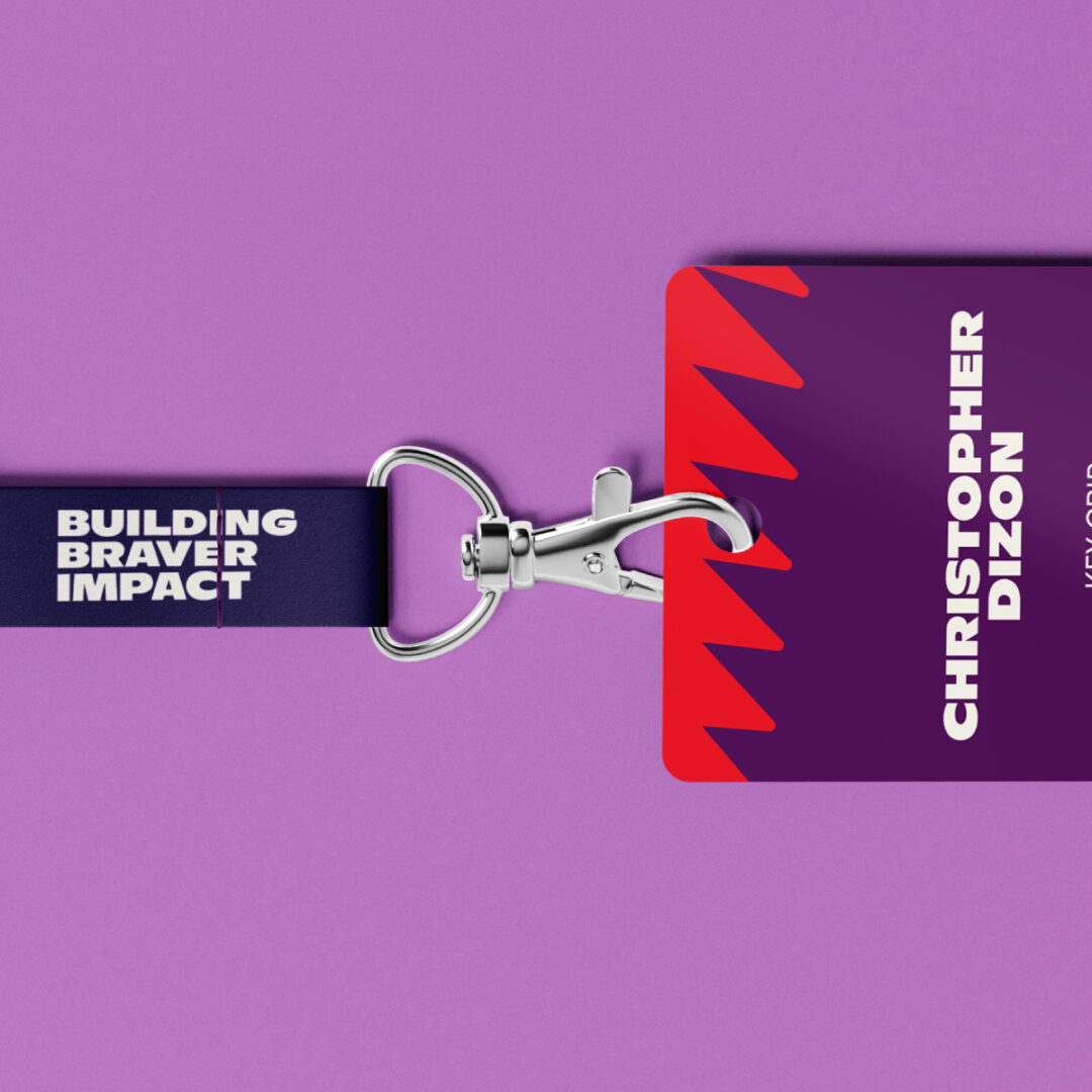
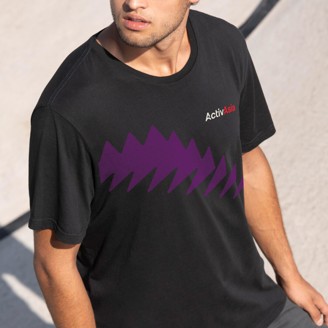
At different sizes and angles, the shapes become dynamic & diverse, similar to the diverse team of ActivAsia making the whole ecosystem stronger.
“The rebrand gave all of ActivAsia a renewed sense of pride. Apart from the story behind the logo that we believe in, the brighter, more modern color palette represent our true personality. Seeing the brand splashed onto the walls of our office, our presentations, and our merch significantly increased our pride for doing what we do. We thank And A Half for deeply understanding our story and purpose and helping bring them to life!” – Mille de Luna-Daluz