Context
Yano Que (Founder, CEO) and Timmy dela Cruz (Chief Investment Officer) started Qatalyst, anchoring it on the thoughtful partnerships they’ve forged in their careers.
Their approach to mentoring is personal and immersive. They prefer casual coffee dates over strict conference meetings and they like working with people who “have been burned at least once in their journey”– the true test of business prowess and character.
Timmy: We are a private market investor with the clout and professionalism of international VCs but the personal touch and dynamism of a boutique VC. Our team-based and hands-on approach — without the rigidity of a traditional corporation — helps us understand the true needs of our portfolio companies; thus, more effectively assisting them to grow.
Client’s Note
Identity
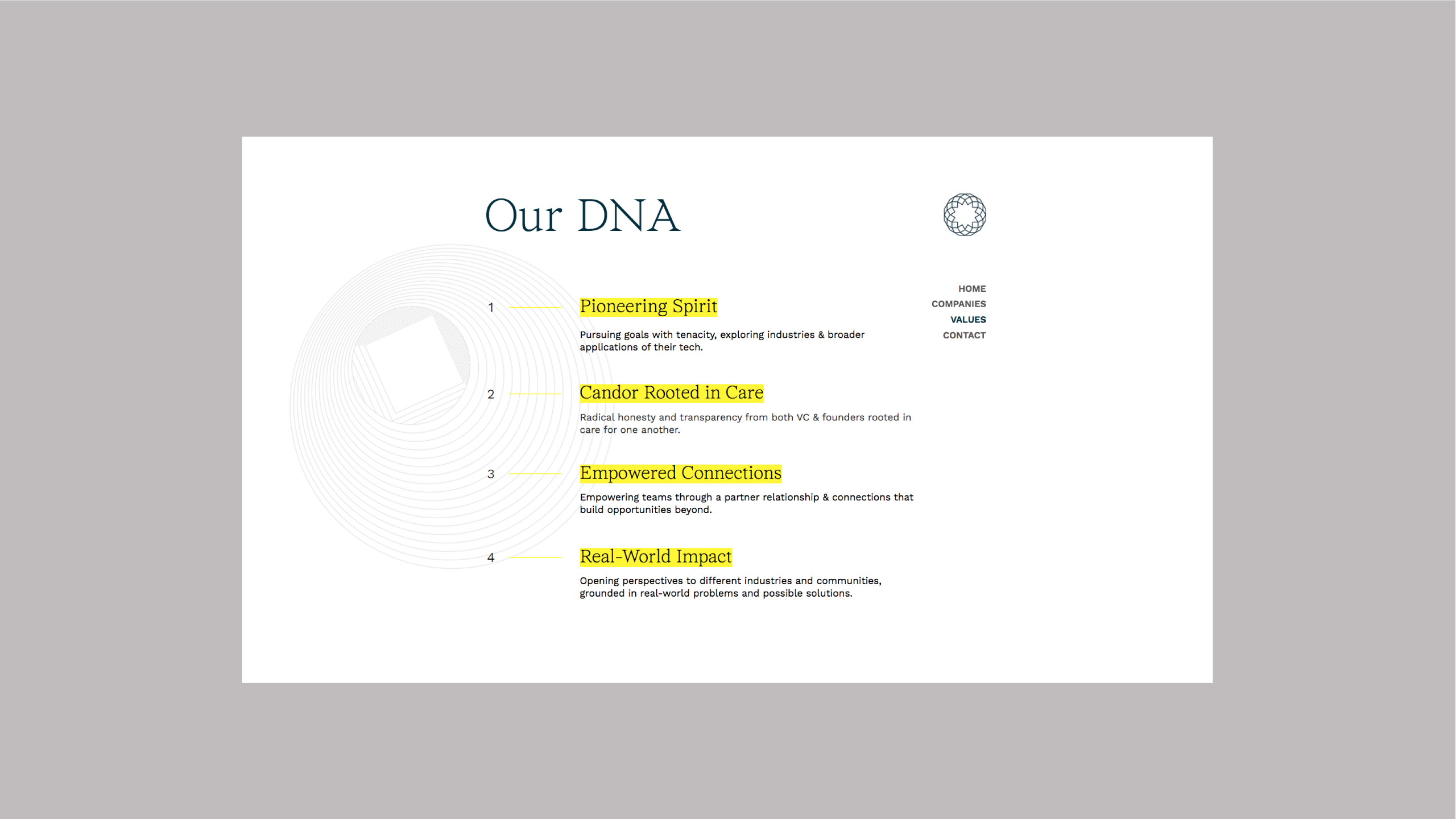
Our identity weaves together Qatalyst’s ambition of being innovation-forward and community-centered. Qatalyst is not just about improving business success, but focusing on the connections of impact that lead to exponential growth.
Our approach involved visualizing the Qatalyst’s perspective on connection and growth. They wanted relationships to be less transactional and more empowering. For them, growth isn’t strictly a linear path, but is instead expansive and interconnected.

The brand icon was inspired by the form and movement of a Hoberman sphere. It is made up of many parts and they all work fluidly together to expand.
Addi: I’m happy that we thought of shapes – both 3D and wireframes, to visualize the brand’s values. We used these shapes to serve as a visual framework for the brand – wireframes for the work in progress, 3D for the finished output
Designer’s Note
Another challenge we encountered was figuring out the right temperature for the brand’s energy. We wanted to balance professionalism and innovation.


Qatalyst Today
With their brand new look and narrative, Qatalyst leads a new generation of mindful businesses that positively impact their communities. Their portfolio of companies includes MedGrocer, Urban Greens, and an old client, Fort & Tailler, to name a few.
“Working with And A Half felt both methodical and conversational. AAH had a genuine interest in learning our perspective. I felt care was put into the communication materials (decks, videos) presented to us and the team was accessible and open to feedback in between milestones, despite the pandemic and its limitations.”
– Timmy dela Cruz, Qatalyst Chief Investment Officer
