
Pina is a brand built on hometown pride. Pina sells and packages local specialties from micro and small businesses all across the country, bringing it to a bigger market. Drawing inspiration from folk art, welcome arches, and snacks from our Lola’s pantry, the whole identity is an homage to the things that make us proud of where we come from.

Context
Seeing a gap between the local business owner and the Filipino inter-island traveller, founder Alexa Pastrana thought of a way to bring specialty food products of different locales to a wider audience. Partnering with FastCat, a leading inter-island passenger ferry company in the Philippines, she forged connections with many small, local businesses in different parts of the country. Through Pina and with FastCat’s network, a banana chip maker from Oriental Mindoro can reach consumers from Manila all the way to Zamboanga and beyond.
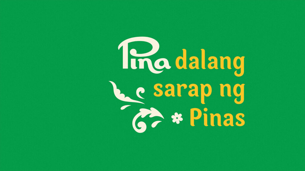
“Pina”
We thought of the Filipino prefix pina-, or to have someone do something for you, and the word pinadala, or to have something sent to you. “Pina” thus became the name to encapsulate the brand’s reason for being – to bring local goods from small enterprises to a wider audience. Alexa said it was like a relative bringing home souvenirs, or your lola offering you a snack from her province.
More than the brand name, we also introduced a naming system for the brand’s products. Pina’s products range from pantry favorites like Spanish sardines to health supplements like Moringa powder. There are three classifications of products – Pina Papak for finger food and snacks, Pina Natural for organic and health-focused products, and Pina Spesyal for spreads and jarred food. Playing with the pina- prefix, pinapapak means to nibble on, pinanatural to make more natural, and pinaspesyal to make even more special.
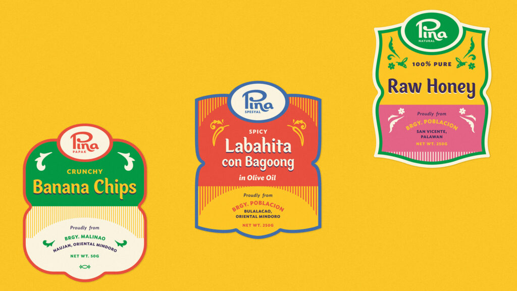
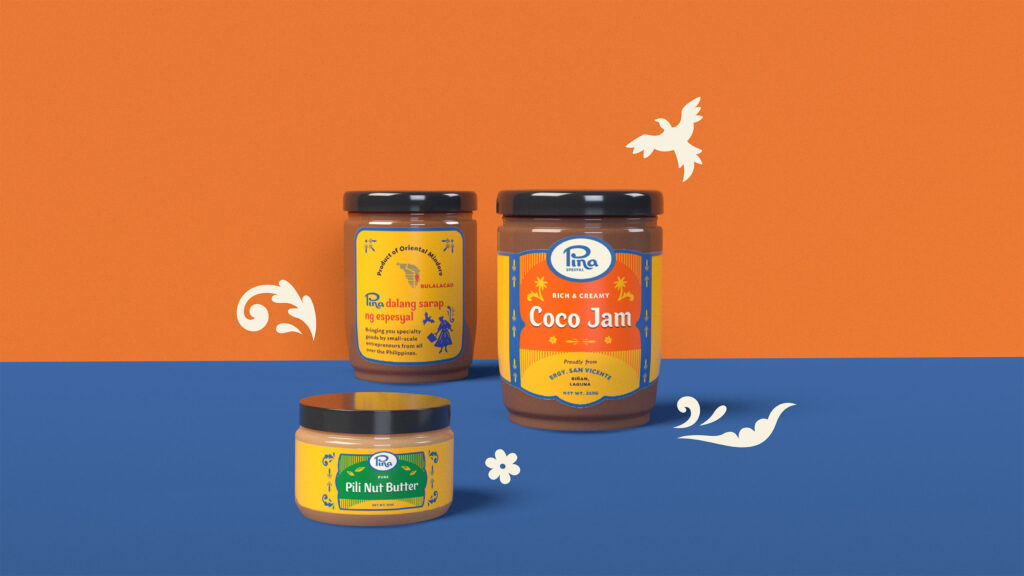
Our illustrations drew inspiration from the art of Pabalat found in San Miguel, Bulacan. An example of folk packaging, it is the creation of colorful, elaborate pastillas wrappers with cut-out shapes of local scenery. We also created flourishes and ornaments inspired by the calados or cut-out woodwork in ancestral houses.
Meanwhile, the typography is inspired by local sign painting but with softer strokes and gentler curves. The custom typeface we created called Pina Sarap features prominently in the labels of all Pina products.
Working on Pina allowed us to tap into a wealth of local inspiration. We wanted the brand to feel like a reinterpretation of familiar Filipino things.
Addi, Designer
Pride of Place

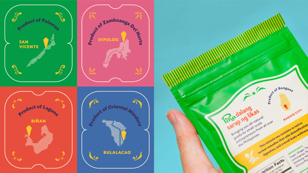
More than local products, Pina is about pride of place. The labels of each product show exactly where it originated: the province, city, and even barangay, similar to welcome arches found all over the Philippines. We also added the maps of the different provinces of origin to make people from these places feel seen and their hometowns more visible. It’s easy to say that something is “proudly Filipino,” but we wanted to bring that pride all the way to its source and show exactly where in the Philippines it came from. We wanted Pina to be “proudly local” – down to the barangay, town, city, and province where a small business owner creates favorites for Filipinos all over.
