Shining a light on the way forward
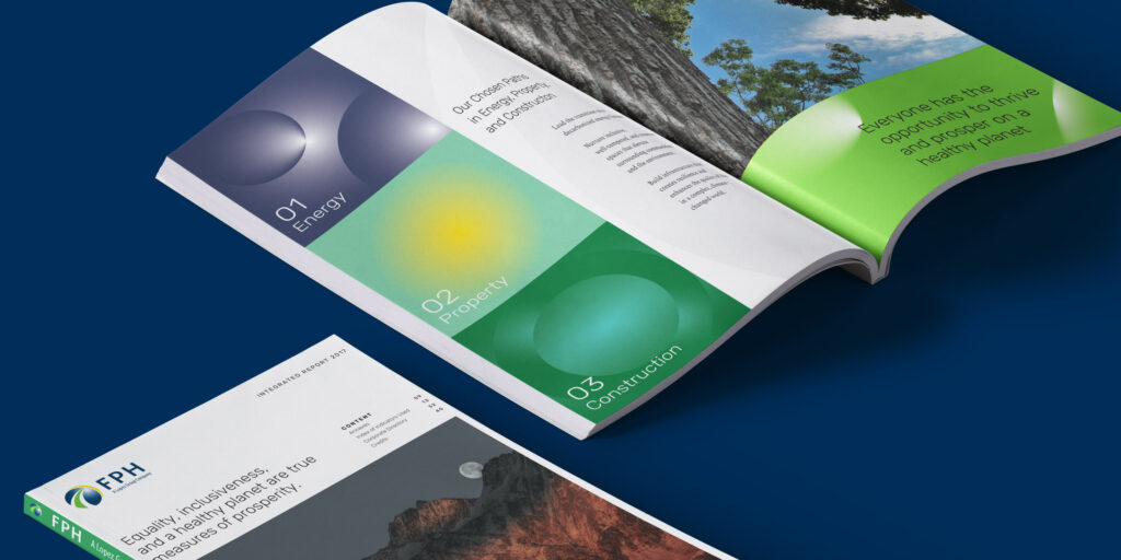
Our work with FPH started first with their company vision—that all of their businesses become pathways to a decarbonized and regenerative future, be it their energy, property, or construction holdings. They recognize, in light of the global situation, the need for a paradigm shift in the way we live and do business.
To communicate this vision, we wanted to help them expand their brand in a way that could inspire hope without taking away from any of the gravity or urgency of the climate crisis. The brand had to show that transformation was possible by showing that there was a way to achieve it.
Illuminating, life-giving light
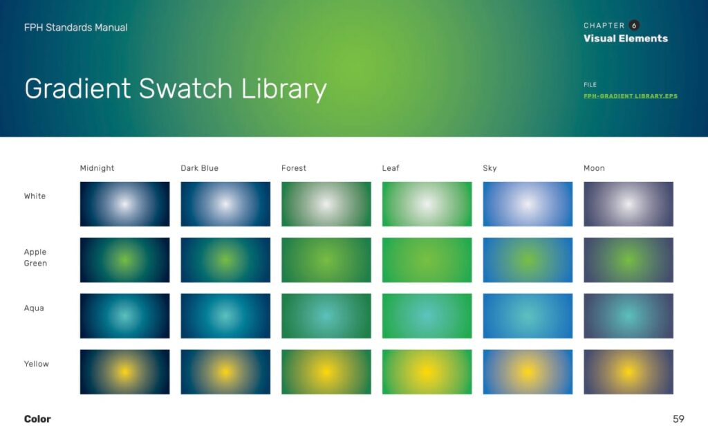
The brand’s visual anchor is an illuminated arc. It is used in the FPH company icon, as a key visual element, and an application for color. It stands for two things: How FPH strives to be a shining light for their community, investors, and stakeholders, and as a pathway towards a cleaner and brighter future for the Philippines.
FPH recognizes that the company isn’t just about kilowatts, but they ask: What is our purpose beyond power? During our design process, we drew inspiration from our most natural source of energy: the sun. A source of light, yes, but also something essential for life on earth to grow and flourish.
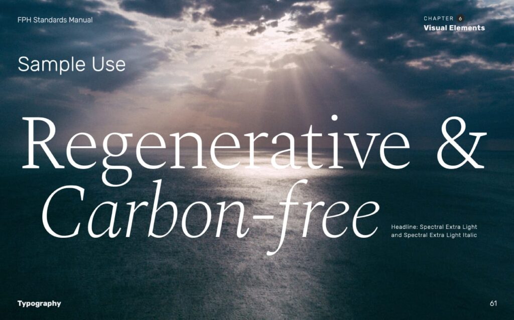
It is this motif of light that guided our expansion. The brand’s key visual elements are these illuminated gradient pathways that can be likened to the rays of the sun or the movement of energy. Even in photography, we recommend the use of photos where a light source is always present. We balanced a treatment that was rooted in nature but still ready for the future.
Streamlining the message and visuals
The FPH brand manual was an important aspect of the project. As a holding company with several subsidiaries, properly cascading the identity to different departments was a vital part in the brand roll out.
The result is a comprehensive standards manual that could be used by new employees alike and the company’s production partners. Sections are organized by user, providing links to all of the brand assets of FPH.
The manual ends with a guide for both designers and supervisors to assess design work together. It is a tool we’ve used to help clients and creatives get on the same page when it comes to visualizing and expanding the FPH brand. The goal is to make the internal process as collaborative as possible.