Cebu Pacific
2021
Illustration
SOFI BAUTISTA
TIM LOPEZ
TRIXIA DELA CRUZ
CLARA CAYOSA
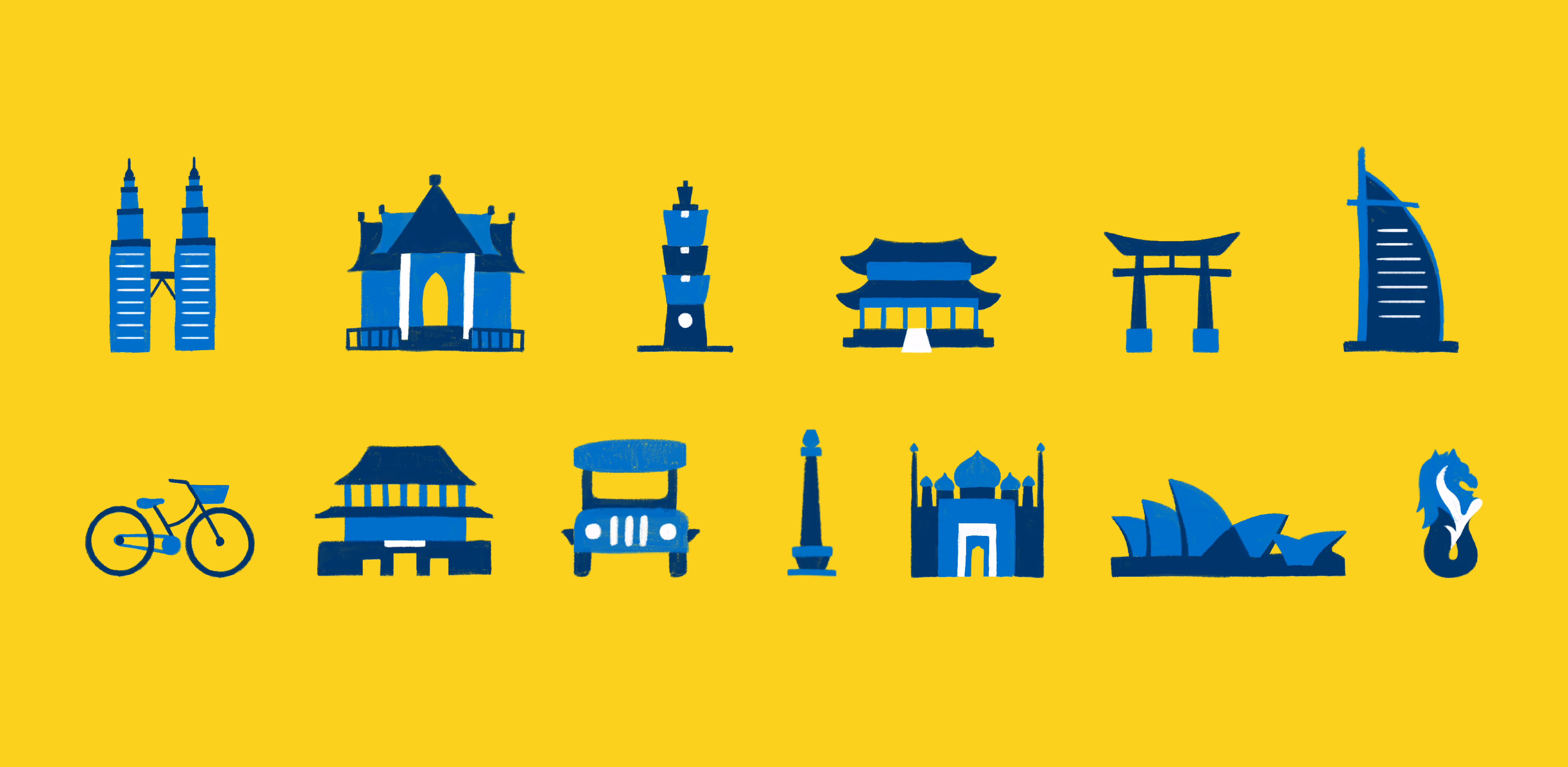
In 2021, Cebu Pacific launched a new digital platform to make booking and check-in easier for passengers. We brought the experience to life by creating a cast of illustrated characters and icons that added warmth, clarity, and ease to every touchpoint. Flying can be stressful, so we designed each element to bring back the joy of travel.
Collaborated with:
Make Technology — UI/UX


Cebu Pacific, one of the largest airlines in the Philippines, wanted their app and website relaunch to reflect what they value most: Fun and Filipino hospitality.
How might we illustrate an exciting and guided experience for booking flights?
Flying with Friends
To make the experience feel more like flying with friends, we introduced a cast of characters to guide users through the online booking journey. Each one was designed to offer help, ease, and a bit of cheer along the way.


We designed each character to feel warm, approachable, and easy to relate to. Soft curves, brushed textures, and varied facial features give every illustrated traveler a sense of personality and charm.


We designed the illustrations to sync seamlessly with Cebu Pacific’s brand. We borrowed visual cues from the logo and the flowing lines of airplane contrails to create a style that fits naturally into the website experience.


We matched the illustrations to Cebu Pacific’s voice: a well-traveled friend. The kind who knows the ropes and wants you to make the most of every trip.


We infused the illustrations with Filipino culture and familiar Cebu Pacific references to help local travelers feel at home from the start.

Icons That Move You Through
We designed a full set of icons to support Cebu Pacific’s digital platform. Each icon serves a specific role (navigation, instruction, or emphasis) while staying consistent in tone and style.