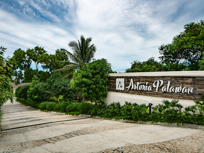
Astoria is a hotel and resort group with 8 boutique properties all over the Philippines. We approached the brand by bringing out the distinct qualities of every property while unifying them under the umbrella of Astoria—a brand of excellent service and Philippine hospitality.
Tags:
2022


The Astoria rebrand unites the group’s different sub-brands under the overarching concept of “fulfilling experiences.” Instead of focusing on the idea of value for money, we anchored the rebrand on the different experiences of value that Astoria offers.
We began the rebrand by creating a brand architecture that organized the different sub-brands under the Astoria mother brand.
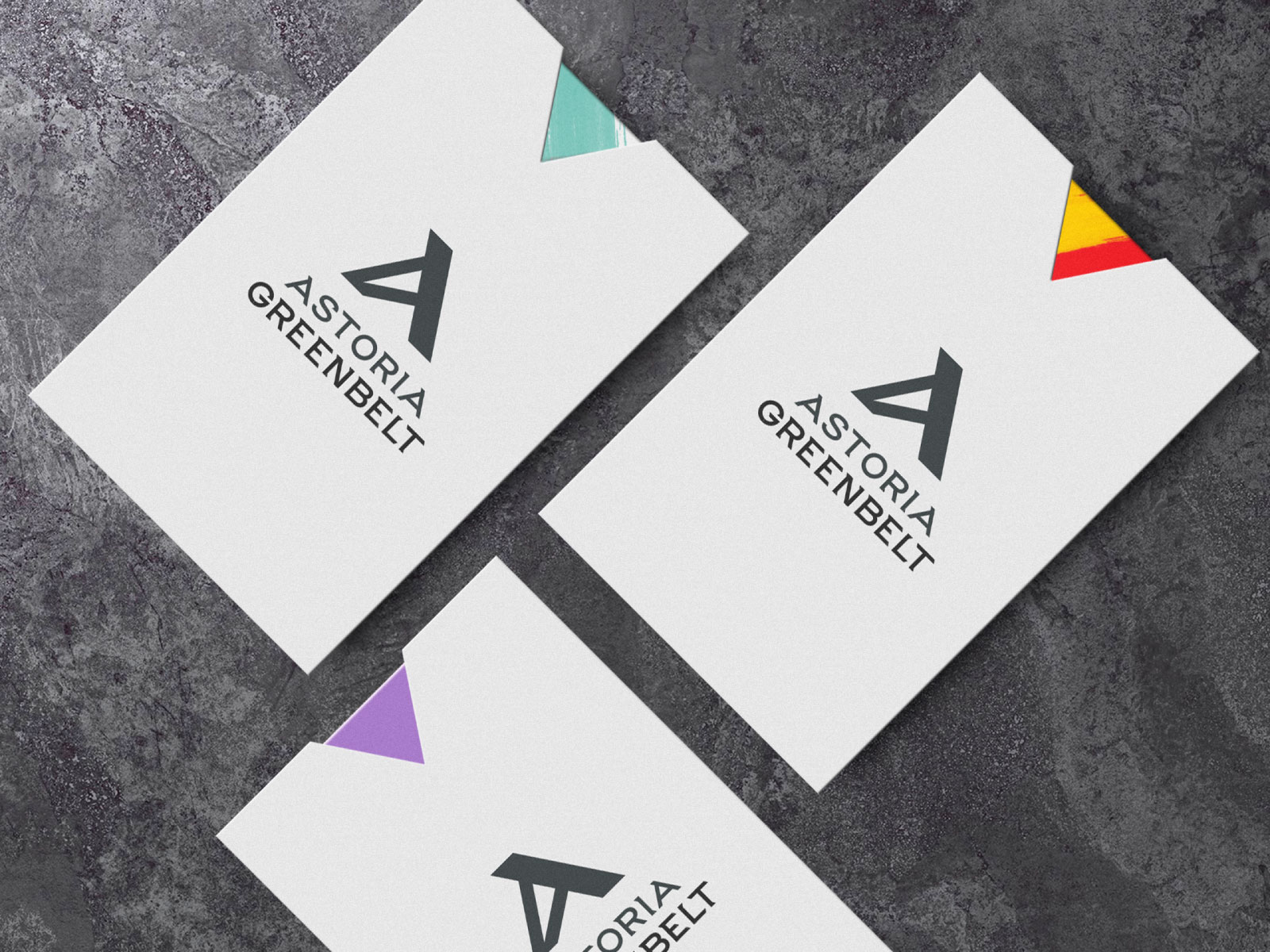
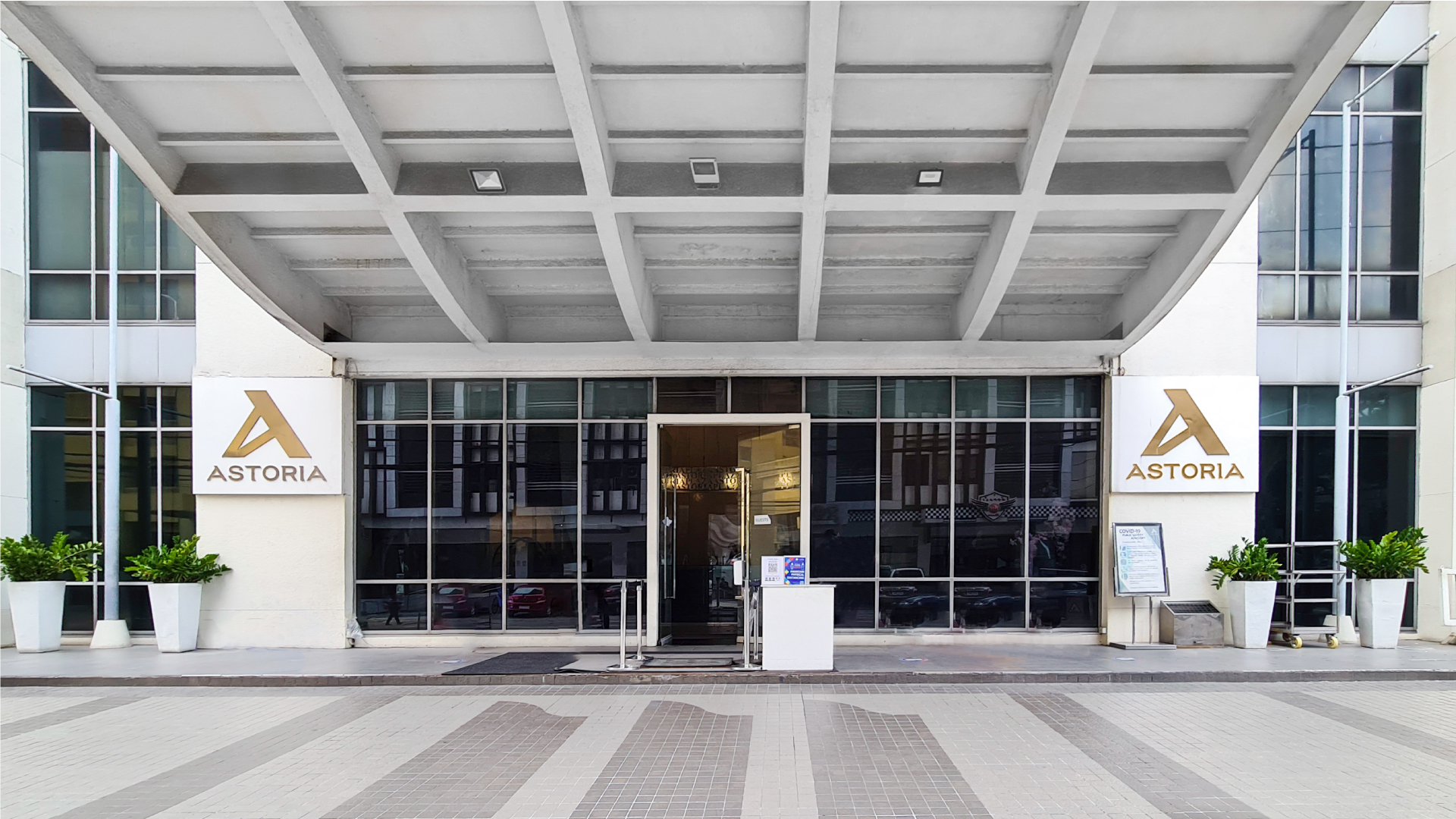
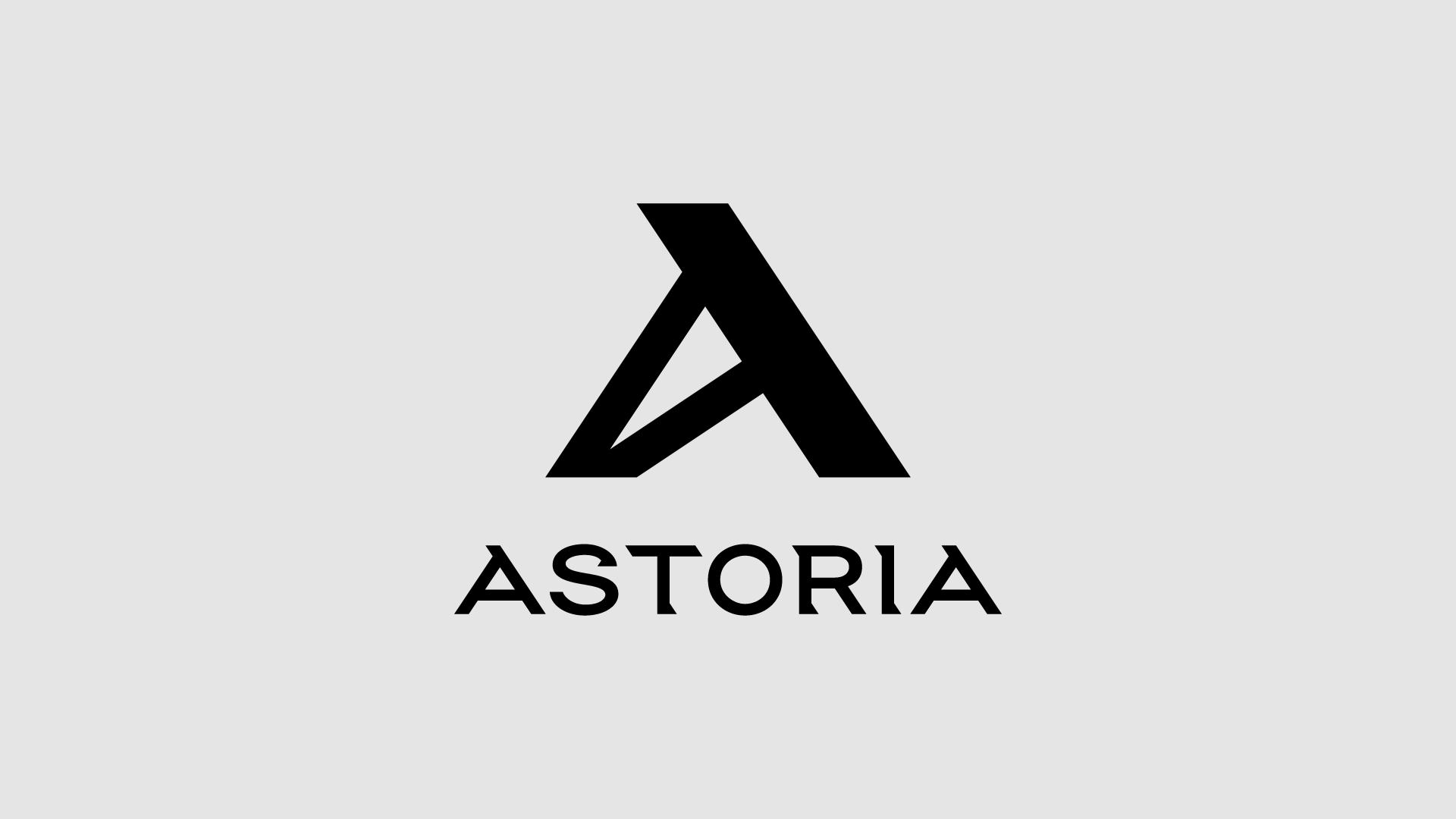
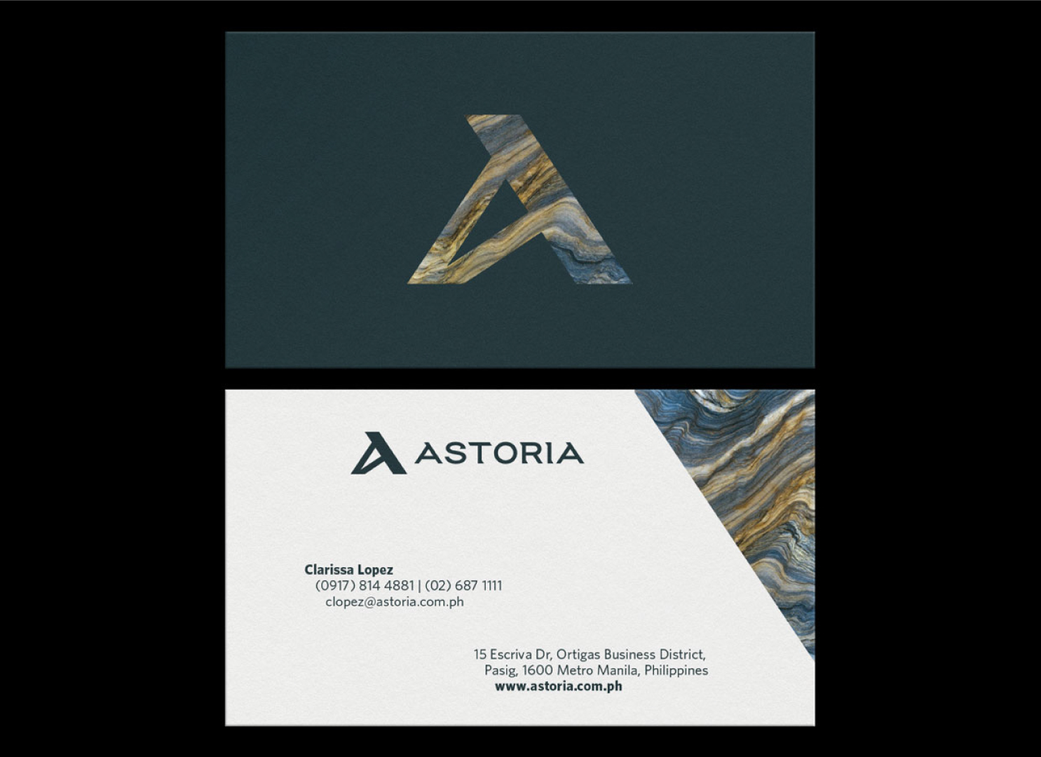
After creating the brand architecture, it became clear to us that the mother brand needed a strong yet flexible visual identity that can be scaled and applied across the sub-brands. To serve as an anchor for the visual identity, we sought to create a solid mark that would assert the Astoria mother brand.


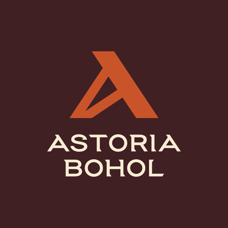
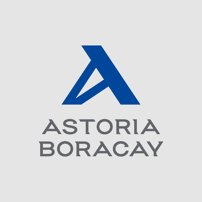
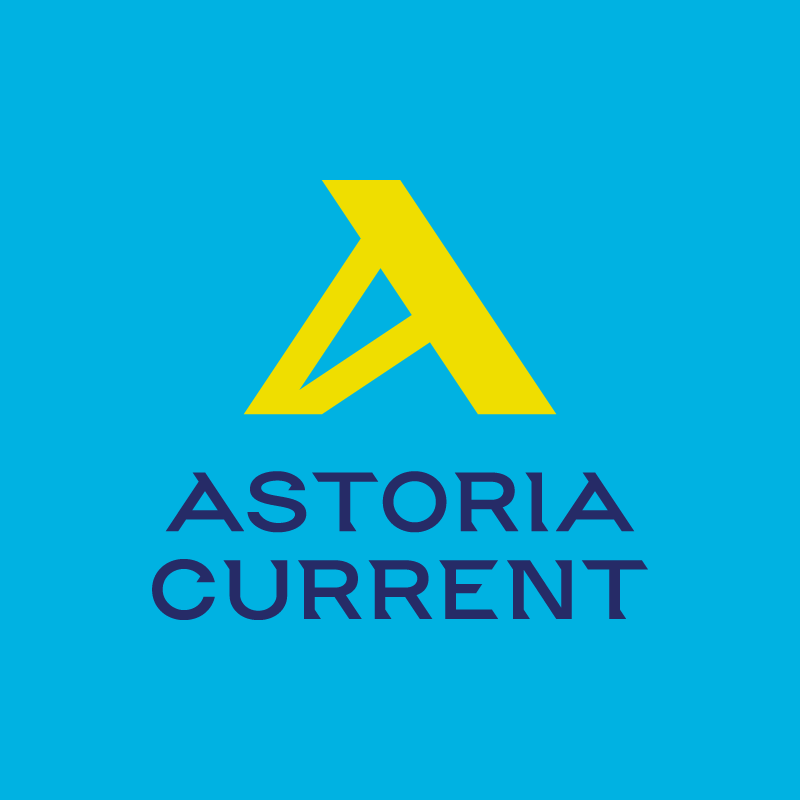
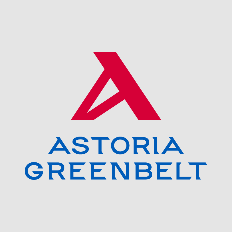
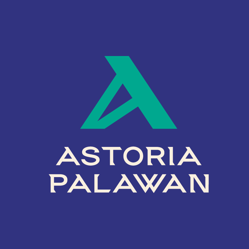
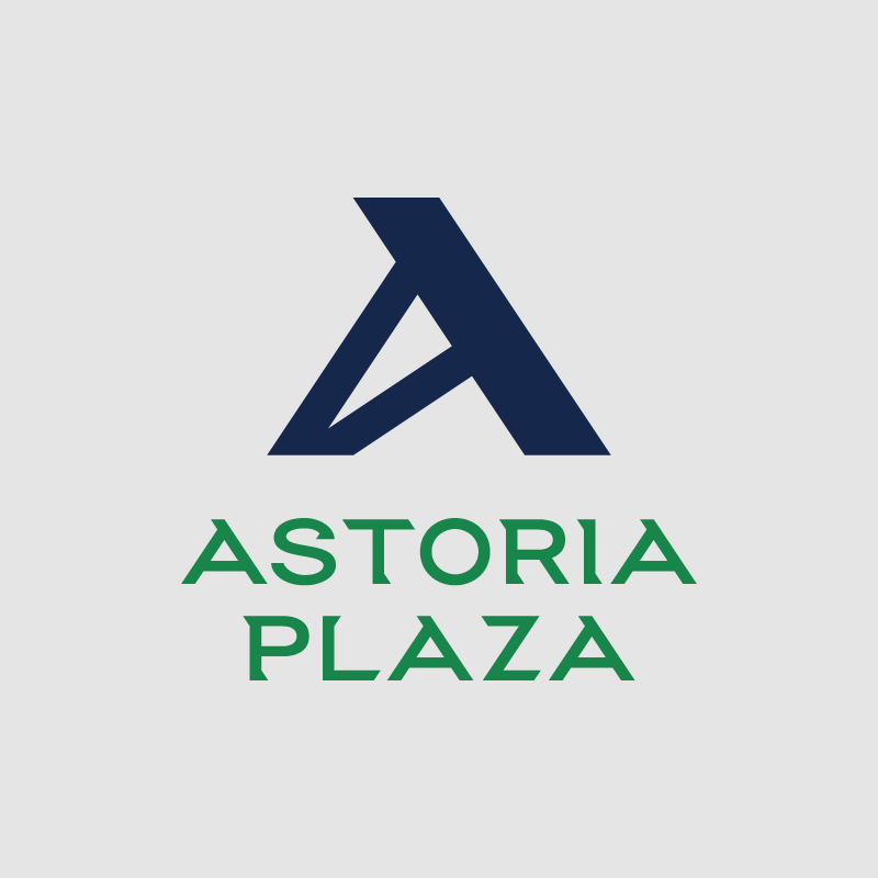
The new Astoria logo mark is derived from the uncial alphabet 4th to 8th centuries AD. The clients challenged us to create an “A they’ve never seen before” as feedback to an initial study. To create something new, we looked back into the historical writing style for a mark that’s solid and impactful yet timeless.
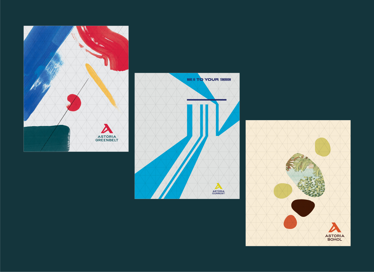
For flexibility, we created a custom grid based on the logo structure. Consequently, the grid can be stretched and filled out in any way. It is then the foundation for all sorts of graphic treatments and executions.
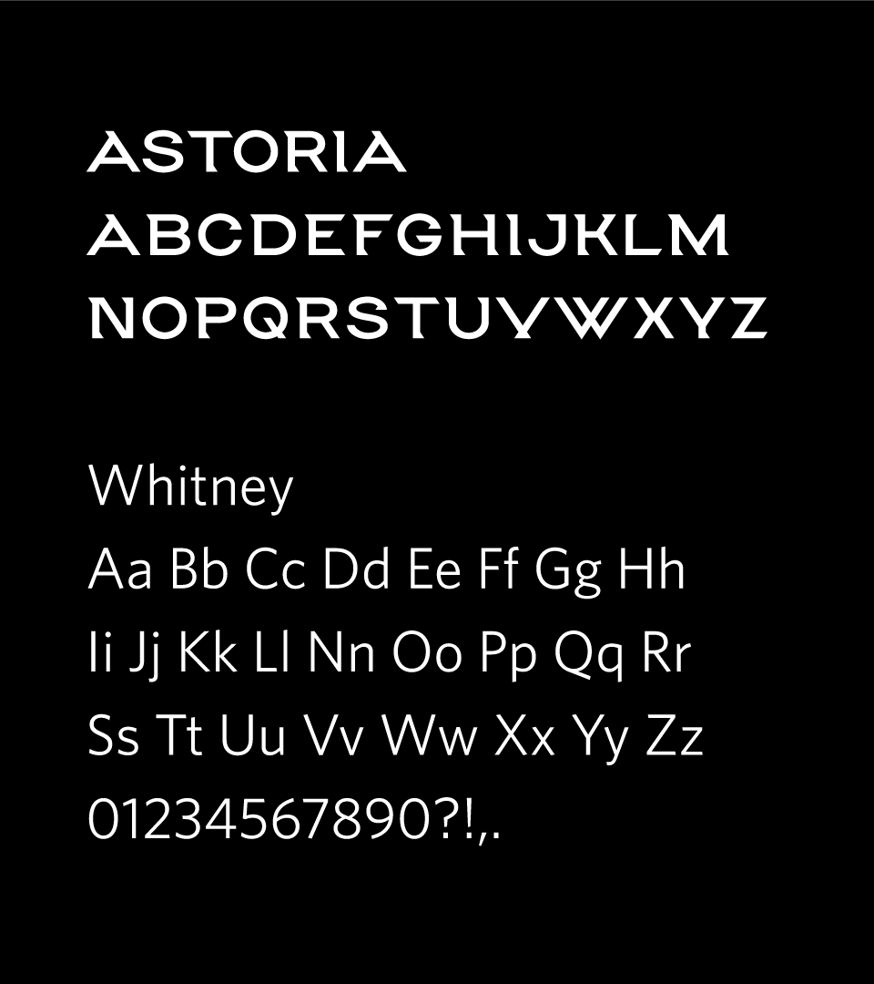

We created a custom font based on the monogram’s angles. This font appears in the wordmark of the motherbrand and sub-brands.
To go with the custom font, Whitney serves as the brand’s workhorse font and is used in a variety of brand collateral across Astoria’s different sub-brands.
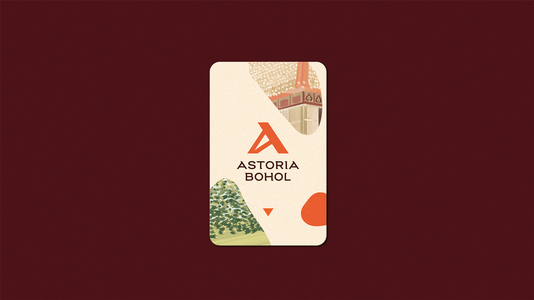
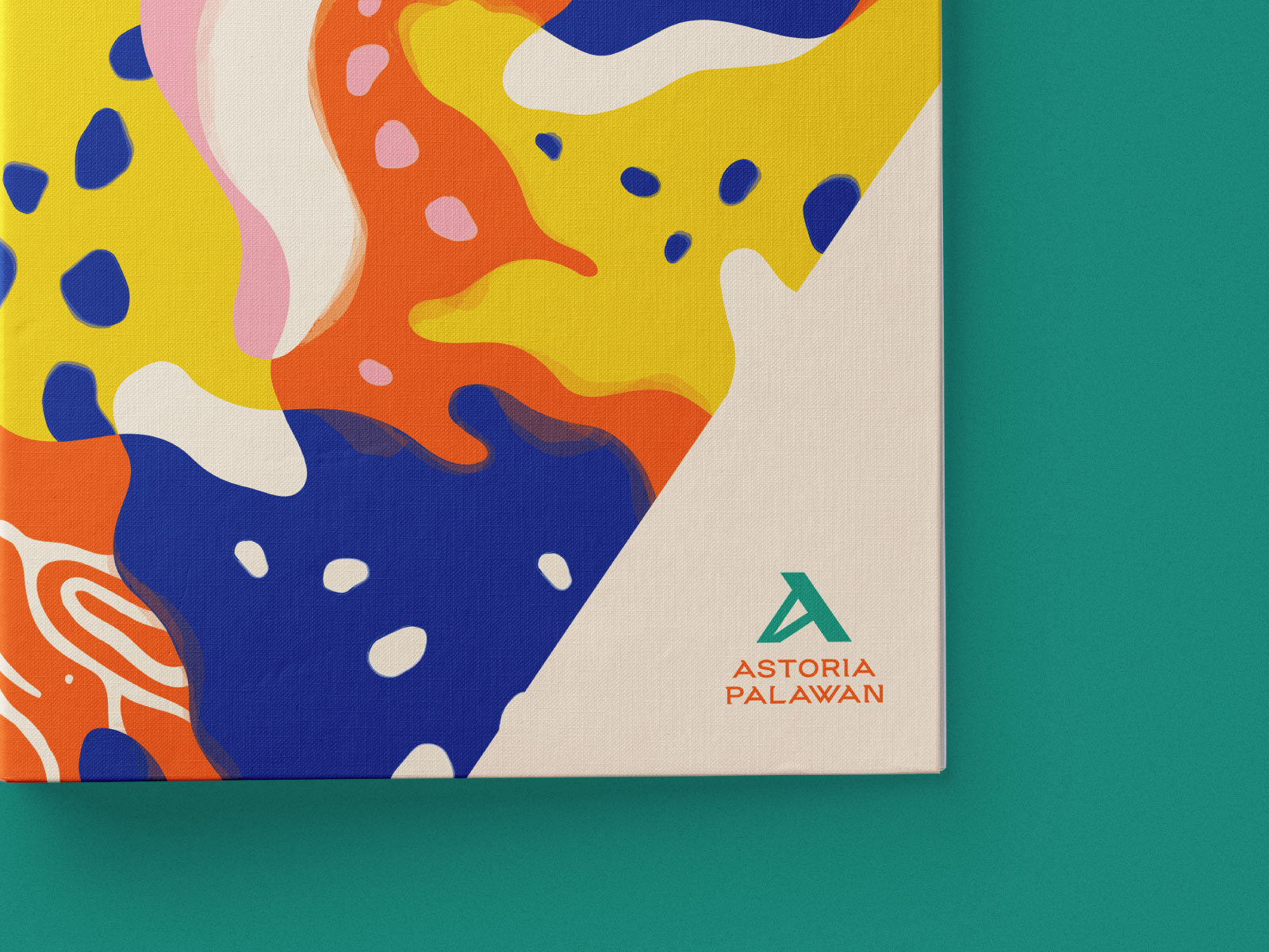
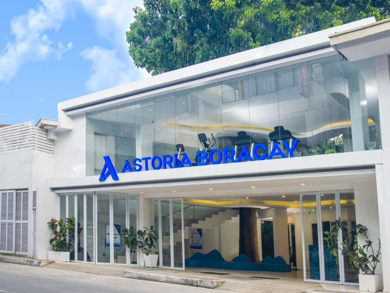
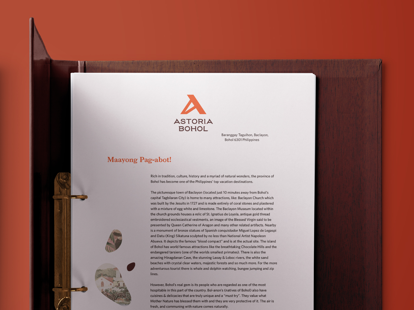
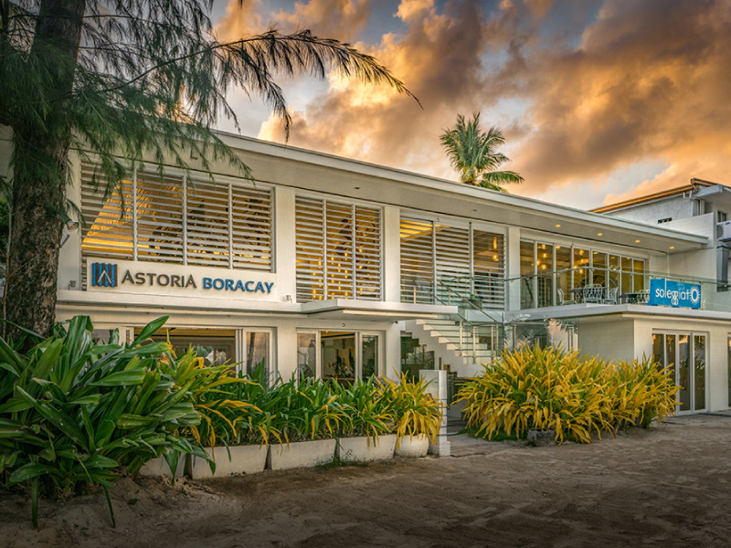
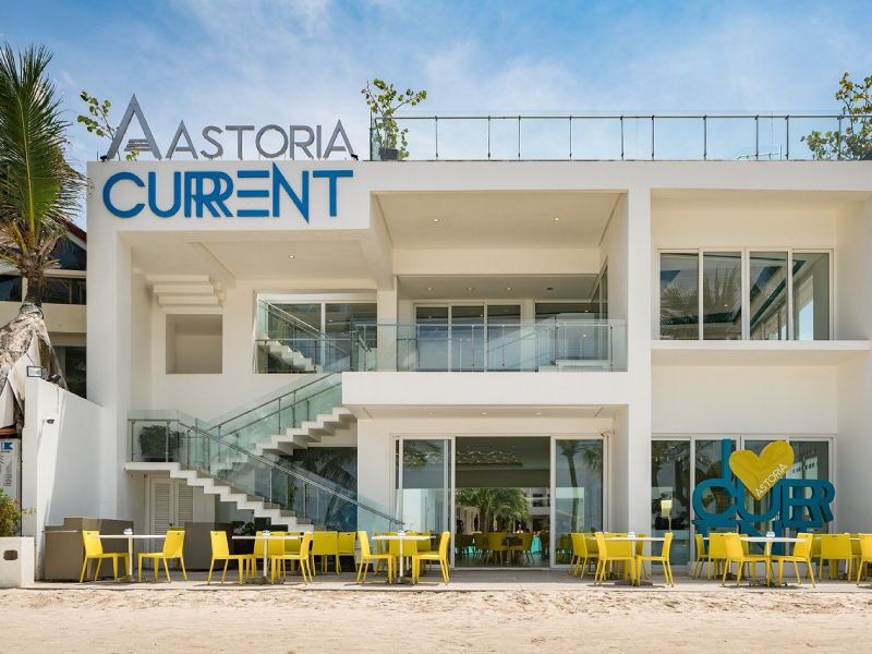
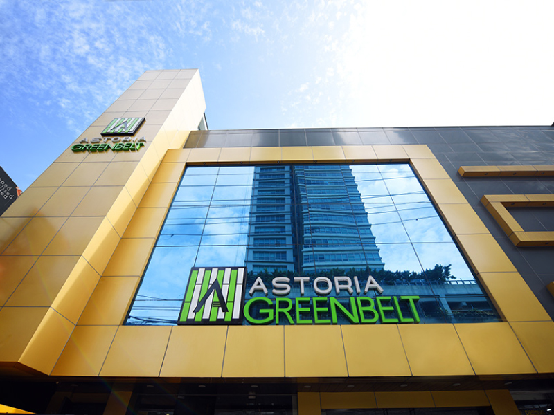
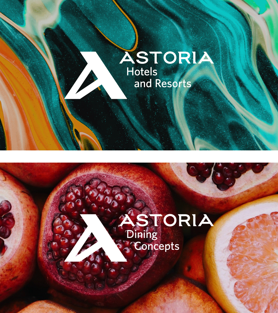
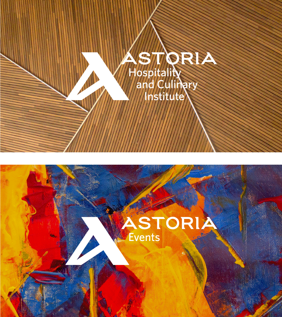
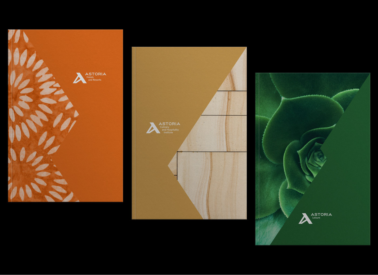
In expanding the Astoria mother brand, to the sub-brands, we created unique visual identities to capture the fulfilling experiences in the different Astoria locations. We crafted unique key visuals using the Astoria grid system.